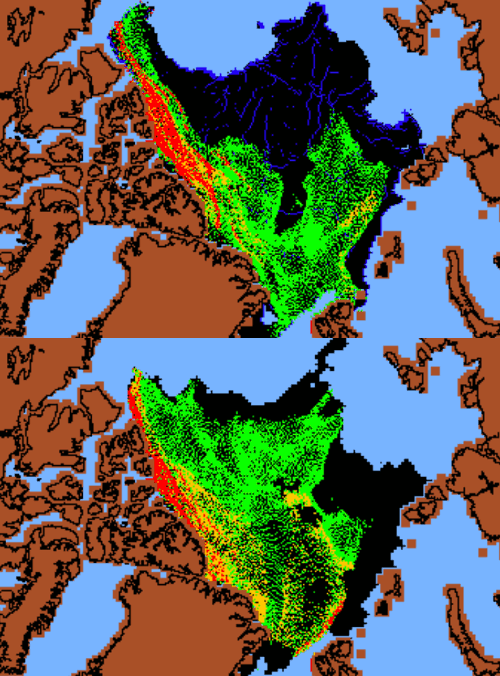
I noted in my previous article that NSIDC did not advance the age of the week 37, 2010 ice in the animation in Walt Meier’s WUWT article. The week 37 blink comparator above makes two important changes to the ice representation.
First I, advanced the age of all of ice marked as 2+ on the NSIDC week 37, 2010 map. Second, I changed the colour of all non-MYI ice to black, in both maps. This makes it much easier to see what is going on. What becomes clear is that the 3 year old ice (green) is much better situated in 2010 than it was in 2009. In 2009, most of it was doomed to be pushed out the Fram Strait east of Greenland. In 2010, it is much further west, where most will probably survive the winter.
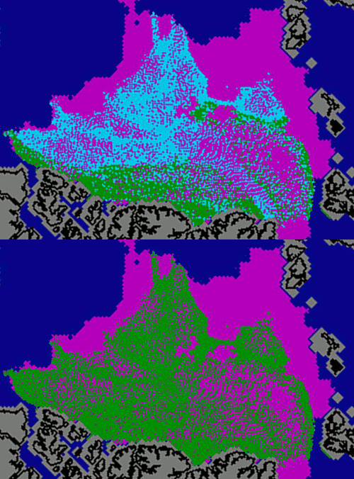
The animation below is one I created last week – which advanced the age of the “end of September” ice from the NSIDC October 4 newsletter.
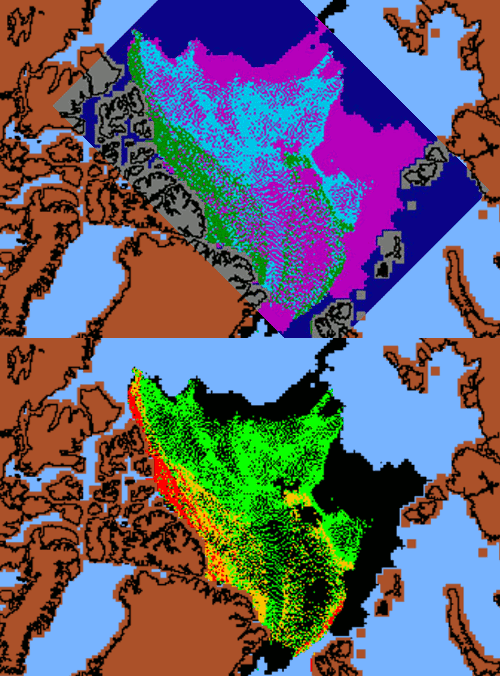
Again, NSIDC had not advanced the age of the ice by the end of September, so I had to do it for them. Note in the blink comparator below that the position of the ice in the “end of September” map and the “week 37” map are identical.
What this tells us is that NSIDC’s “end of September” map from their October newsletter was actually a week 37 map, and probably did not accurately represent the age of the ice at the end of September.
Below is their original animation.
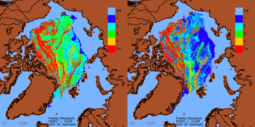
The blink comparator below from 1995 shows how NSIDC normally advances the age of the ice around week 37. Note that all the surviving ice gains a year in age between week 33 and week 37.
————————————————————————
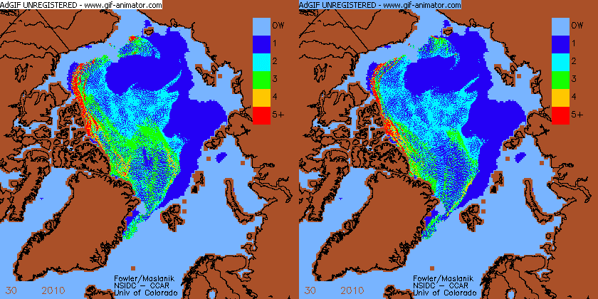
Reader “diablobanquisa” posted some more information on his blog, showing another inexplicable change in two different versions of the week 30 map.


I think it’s funny that you have so much trouble understanding this.
If you don’t have anything intelligent to say – why bother to post?
Obviously struggling to find anything relevant to say, Brendon.
” Reader “diablobanquisa” posted some more information on his blog, showing another inexplicable change in two different versions of the week 30 map.
http://stevengoddard.files.wordpress.com/2010/10/animateanda.gif?w=420&h=420 ”
Thanks Steven.
I would like to add that to do this new animation posted yesterday by Walt Meier, they (NSIDC) have changed all their previously published maps of sea ice age.
Look at the map of the week 36 of 2009, at the minimum, as published in Tschudi et al. 2010, page 6: http://soa.arcus.org/sites/soa.arcus.org/files/sessions/2-1-observations-arctic-change/pdf/2-1-3-tschudi-mark.pdf
Direct link to the map: http://img218.imageshack.us/img218/76/image002fl.gif
And this is the map of the week 37 of 2009 as shown in Walt Meier´s animation:
http://stevengoddard.files.wordpress.com/2010/10/paintimage3255.jpg
Where are the lost red and green pixels???
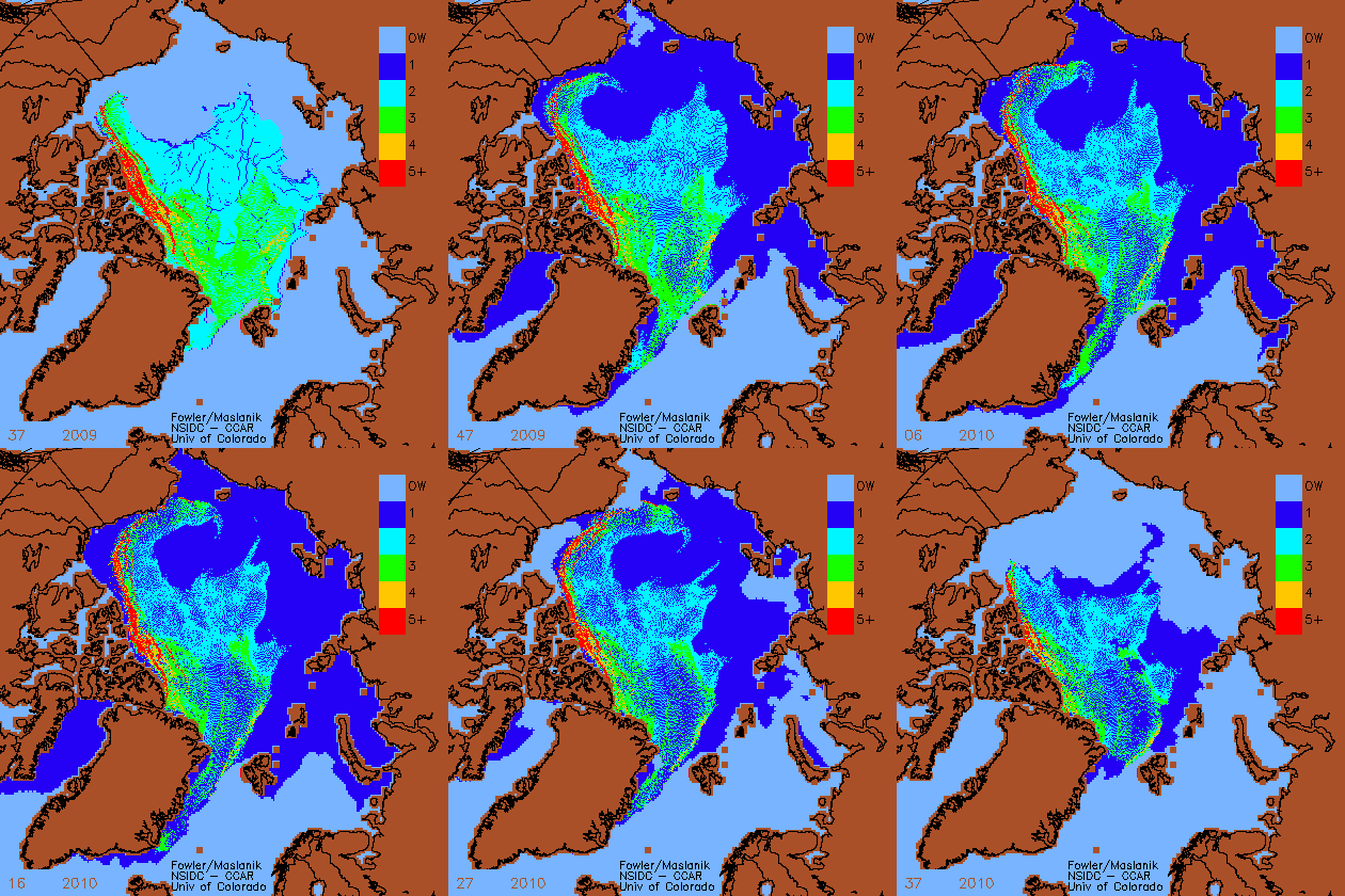
Here is the previous version of the week 17 – 2010 : http://www.arcus.org/files/search/sea-ice-outlook/2010/06/images/pan-arctic/fig2new.png
Here the previous version of the week 25 – 2010 : http://www.arcus.org/files/search/sea-ice-outlook/2010/07/images/pan-arctic/figure6.png
And the previuos version of the week 8 -2010 (published in Tshcudi et al. 2010): http://img515.imageshack.us/img515/4228/image006s.gif
If we compare them with the frames used in Walt Meier´s animation for the same weeks, the result is astonishing too.
As discussed in the previous post, the ice motions that go into the ice age tracking algorithm are reprocessed when additional data becomes available such as buoy data. Reprocessing happened this summer using IABP buoy data from at least the last 2 years (and perhaps even longer). These data will also be reprocessed as soon as the AVHRR polar pathfinder product is updated through 2010. The goal is always to try to make the most accurate climate data product available.
Good job! Looks like we will see quite a rapid increase build of arctic ice this winter.
It would appear the Fram Straight is the sole reason halting an advancing NH ice cap.
Pingback: Más sobre las inconsistencias en los datos de hielo multianual | Banquisa en el Ártico: el blog del hielo marino