
The graph below plots Antarctic sea ice extent vs. atmospheric CO2 on a month by month basis.
Never has the death spiral been so clear.
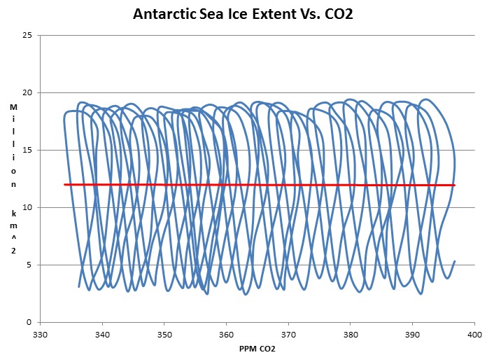
The graph below plots Antarctic sea ice extent vs. atmospheric CO2 on a month by month basis.
Never has the death spiral been so clear.

We are doomed!
Only 135ish days left till refreeze!
Great graph Mr Goddard. Well done.
Very cool graph!
I like it!
Now THAT is truth on steroids. You see where the squiggles are close? It’s a secret.
What a wonderfully silly graph! : )
Unfortunately NOAA and GISS are even better at silly graph production than you are, Steve. The difference is they want to bill us $84 trillion and you charge nothing!
And I was about to sign off on $93 trillion. Where did you get the big cost reduction Bruce? Common sense? Using resources more efficiently? You’re not going to make many friends in the Green world undercutting the competition. Call me at once.
No, no, sorry, you are correct. The $84 trillion is for the EU only. You should add $5 trillion for the US, $3 trillion for most of Africa, South America and Asia, and $1 trillion for us here in Oz. And two small fortune cookies for the Chinese, who tend to be more realistic about such things.
Correlation between CO2 and Antarctic Ice looks to be zero!
Isn’t that another nail in the CAGW coffin!
Laztoo will still be saying ” just wait till September”.
😆
Reblogged this on Rnm101's Blog.