
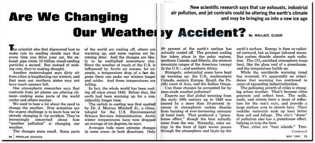
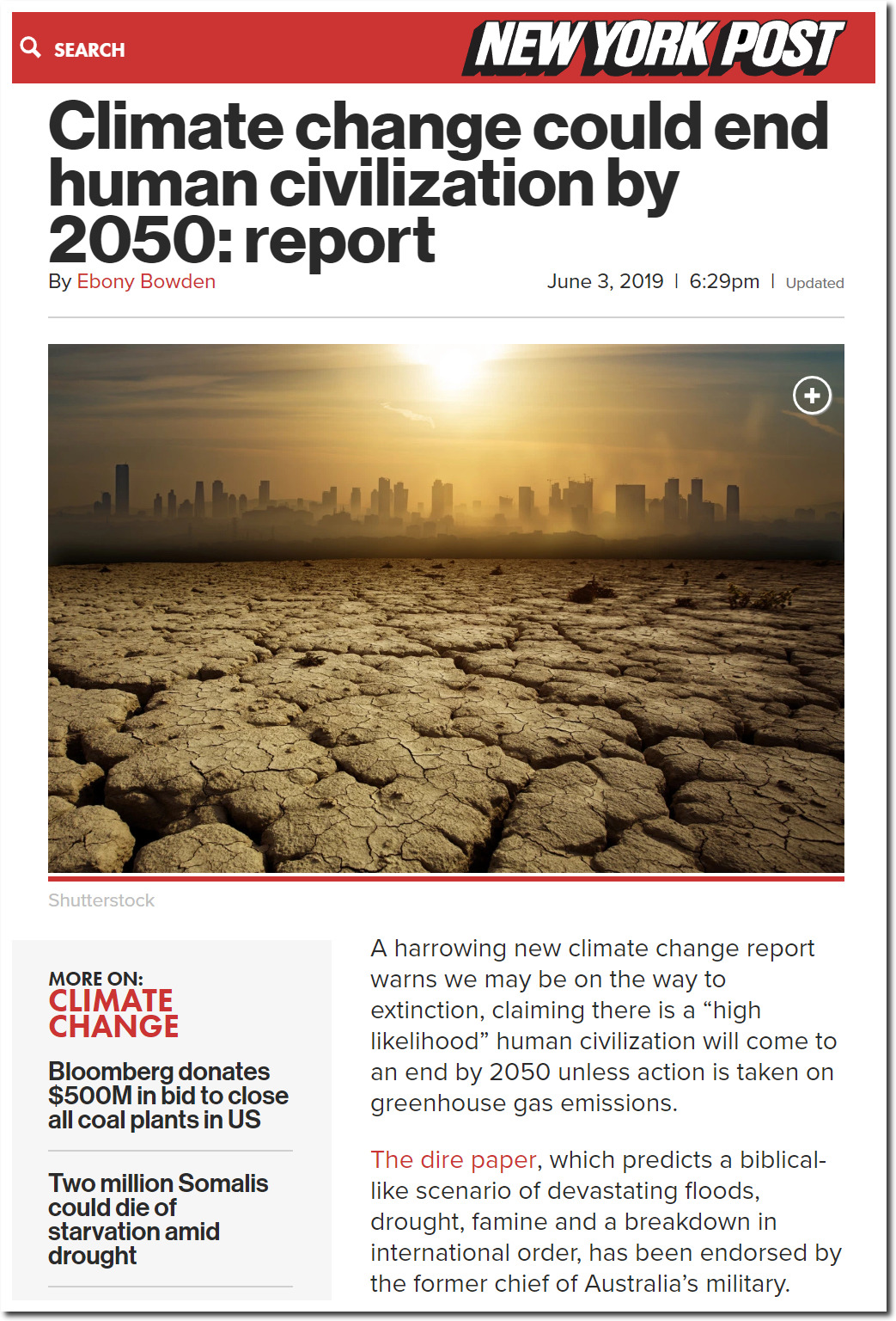
In this 1969 article, Popular Science blamed both global warming and global cooling on burning fossil fuels.
“the whole world has been cooling off since about 1940. Before that, the earth had been warming up for a considerably longer time. The switch to cooling was first spotted by Dr. J. Murray Mitchell Jr., a climatologist for the U.S. Environmental Science Services Administration. Arctic winter temperatures have now dropped an average of six degrees, he says.”
“Experts say that global warming from the early 19th century up to 1940 was caused by a more than 10-percent increase in atmospheric carbon dioxide from burning of ever-increasing amounts of fossil fuels. That produced a “greenhouse effect.”
“Another meteorologist says dirty air from cities is lengthening our winters, and that soon our northern states may not have much summer left.”
“New scientific research says that car exhausts, industrial air pollution, and jet contrails could be altering the earth’s climate and may be bringing us into a new ice age”
Popular Science – Google Books
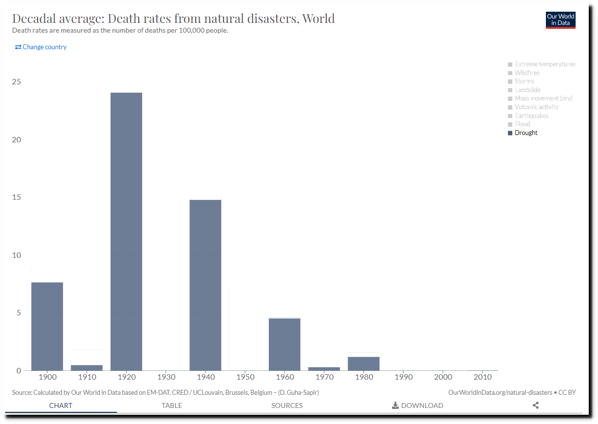
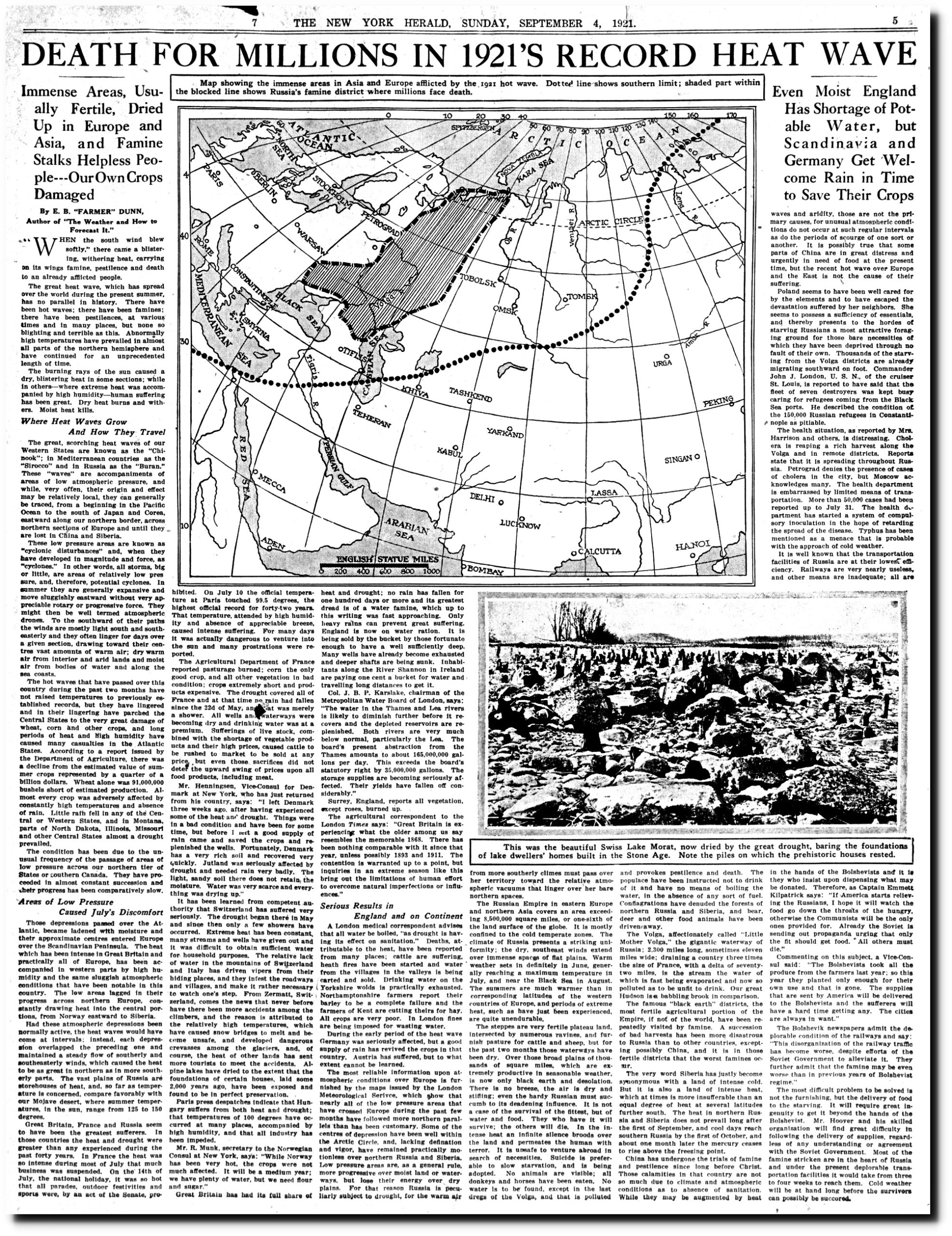
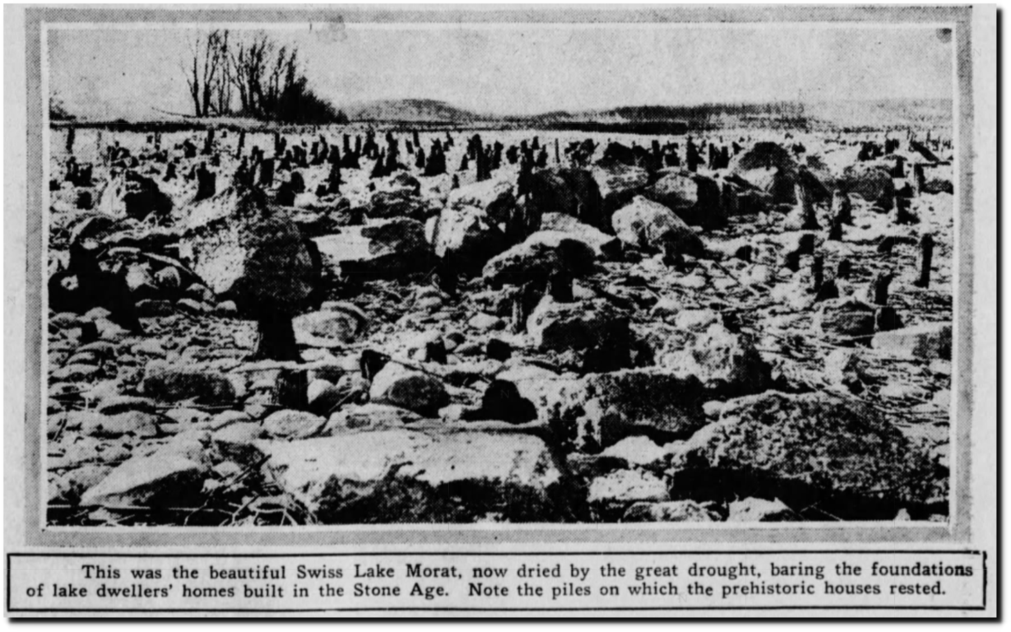
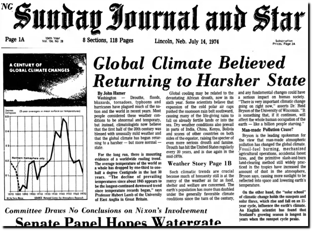
The warming prior to 1940 was well documented.
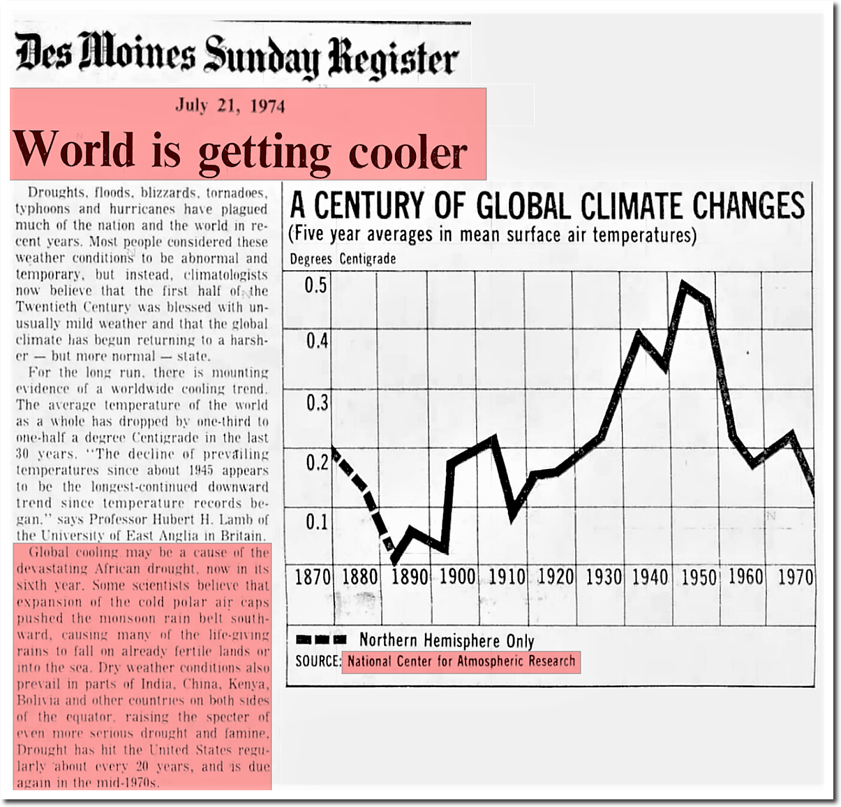
21 Jul 1974, 13 – The Des Moines Register at Newspapers.com
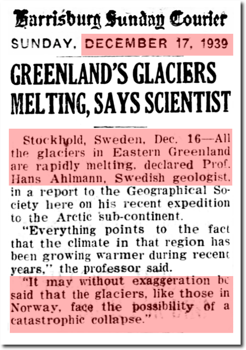
17 Dec 1939, Page 15 – Harrisburg Sunday Courier at Newspapers.com
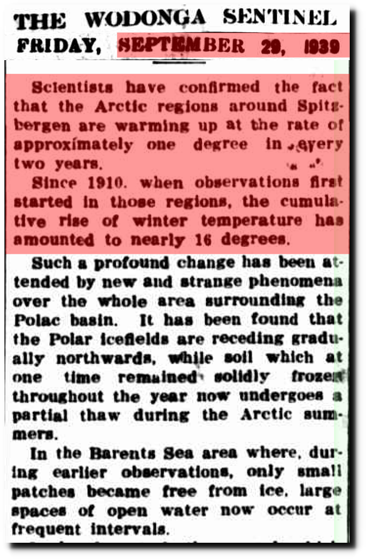
29 Sep 1939 – What is The World Coming To? – Trove
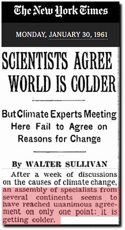
As was the cooling after the 1940s.
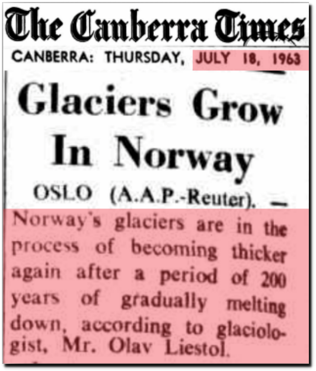
18 Jul 1963 – Glaciers Grow In Norway
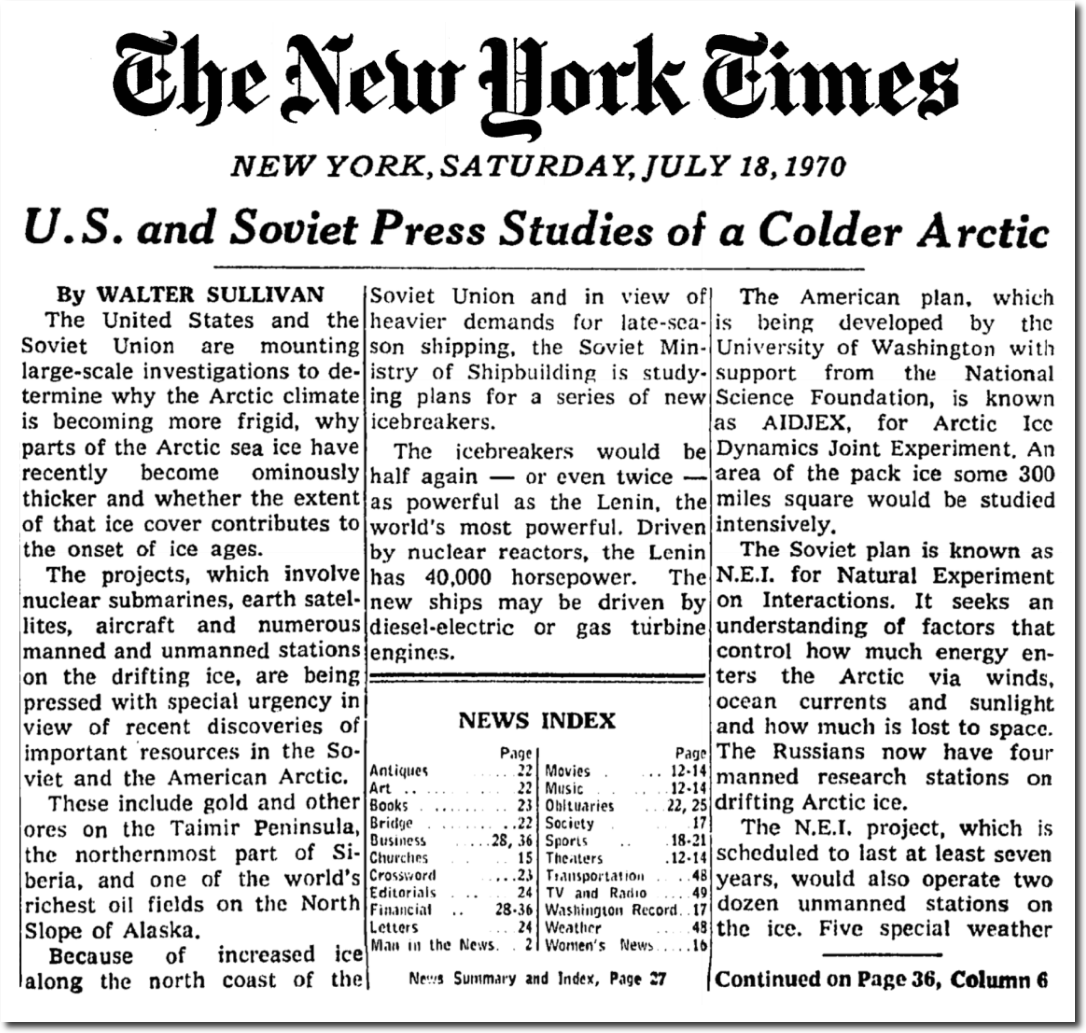 U.S. and Soviet Press Studies of a Colder Arctic – The New York Times
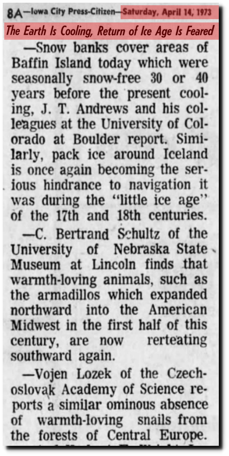
14 Apr 1973, Page 8 – Iowa City Press-Citizen
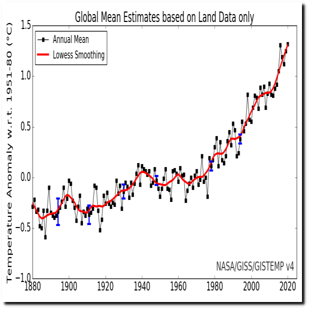
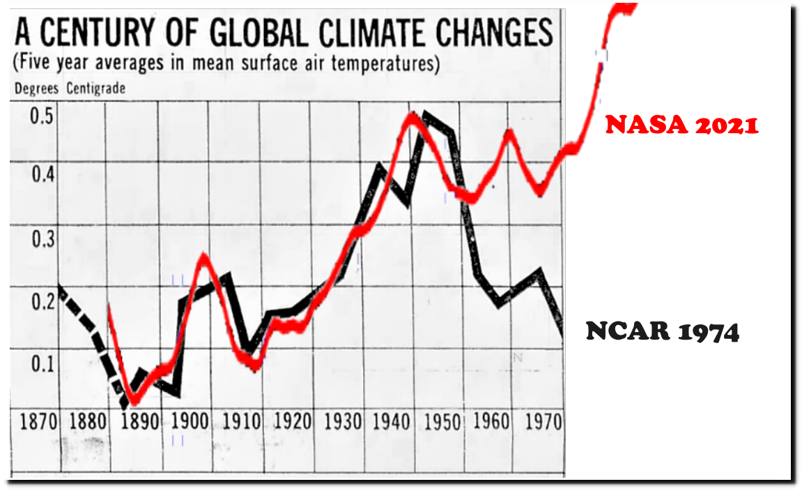
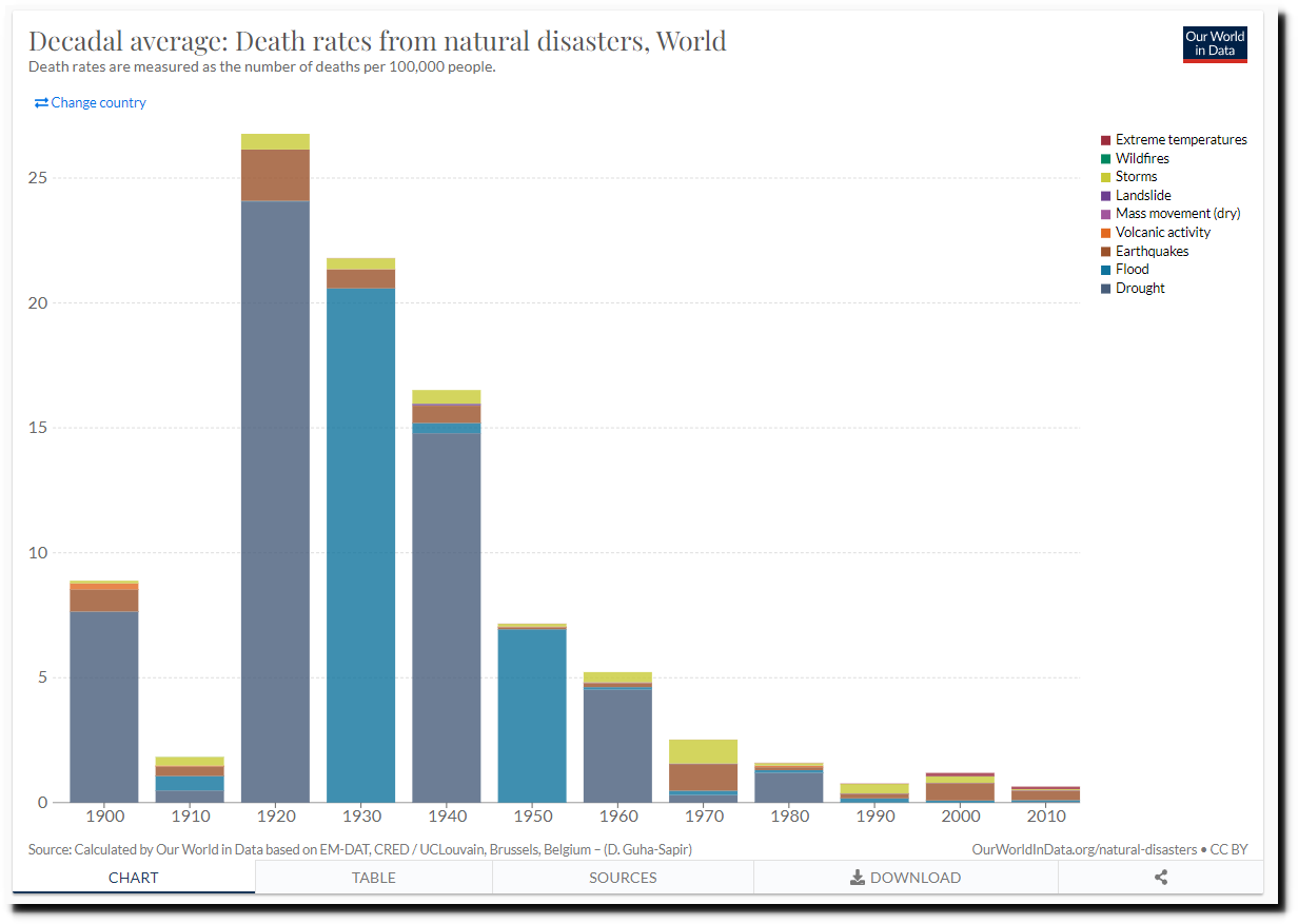
NASA resolved this conflict by erasing most of the warming prior to 1940 and all of the cooling after 1940.


