http://ice-glaces.ec.gc.ca/Ice_Can/CMMBCTCA.gif
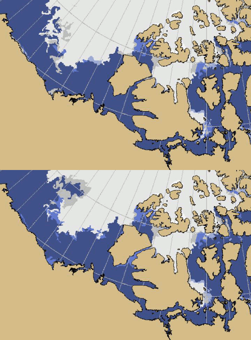
The blink comparator above shows one day changes in the ice pack. Note that not only is the ice forming rapidly out in the ocean, but also is appearing along the shore.

Long Island shown at the same scale, to provide the all-important Manhattan reference.
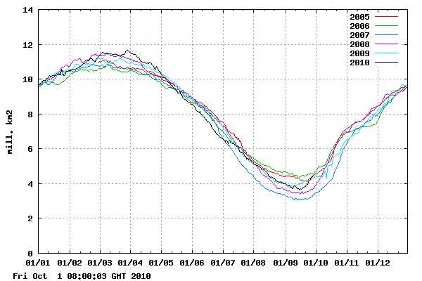
DMI shows that early season record fast ice growth continues unabated, and is now back to 2005 levels.

http://ocean.dmi.dk/arctic/icecover.uk.php

http://www.ijis.iarc.uaf.edu/en/home/seaice_extent.htm
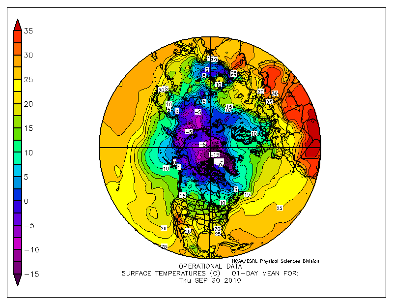
The entire Arctic and most of Russia, Alaska and the Canadian Arctic is now well below freezing.

http://www.esrl.noaa.gov/psd/map/images/fnl/sfctmp_01.fnl.gif
I’m looking forward to the GISS September temperature map, which will most likely extrapolate all kinds of hot weather into Arctic regions where they have no data.


Someone was moaning about your posts here vs WUWT…I personaly love your Rapid fire Info you keep putting out!..If you let a post hang too long Folks just sit there & try to disect it to death. I don’t need someone to write a full page comment on what happens to a piece of ice on a rock thats melting on a sunny day..I just want to read predictions & facts.
Thanks. Things are happening fast and a picture is worth a thousand words.
Presumably the DMI 30% coverage plot is a much better proxy for thickness/volume than the more widely reported NSI/JAXA 15% plot.
Is that true?
Completely agree. We saw how flaky the 15% ice graphs are a few weeks ago.
It’s really a tough call as to what the best metric is. If measurement precision was perfect, the importance would go as:
Mass > Volume > Area > Extent
However, measurement precision goes as:
Extent > Area >> Volume > Mass
Consequently, it’s a tossup between area and extent, particularly in the summer where meltponds can mess up area values considerably. Presumably, 30% extent falls somewhere in between 15% extent and area, and therefore may be the best compromise between measurement precision and relevance to ice health. Disclaimer: I’m not an ice expert…maybe one of them should weigh in.
IMO, each database should report 15% extent, 30% extent, 50% extent, and ice area. Presumably this wouldn’t be that much harder than doing what they’re currently doing.
-Scott
Looking at the JAXA graph I was struck this morning by the similarity between the summer extent change of 2007-2010. The loss stopped late in both with a sudden upswing at the end of Sep. Could that be due to winds or just sunlight?
Since the ice edge has been further north, it freezes earlier and faster.
Phil says Beaufort Sea ice is rotted. He’s believing that Barber dude. He thinks we all should believe him. Poor guy.
I’ve always wondered how ice could be rotten at -35C
And I wonder how previously rotten ice that melted last summer (or during an earlier summer) could be rotten when it refreezes. Is the composition of the water in that area irreversibly ruined so that it always yields rotten ice?
I don’t know if rotten ice is significant or not, but one thing I’m sure of is after rotten ice melts, any ice freezing where the rotten ice was originally located will be normal ice.
-Scott
The McClure Straits froze up quick!