h/t to reader “Green Sand”
Disrupting the Borg is expensive and time consuming!
Google Search
-
Recent Posts
- The Real Hockey Stick Graph
- Analyzing The Western Water Crisis
- Gaslighting 1924
- “Why Do You Resist?”
- Climate Attribution Model
- Fact Checking NASA
- Fact Checking Grok
- Fact Checking The New York Times
- New Visitech Features
- Ice-Free Arctic By 2014
- Debt-Free US Treasury Forecast
- Analyzing Big City Crime (Part 2)
- Analyzing Big City Crime
- UK Migration Caused By Global Warming
- Climate Attribution In Greece
- “Brown: ’50 days to save world'”
- The Catastrophic Influence of Bovine Methane Emissions on Extraterrestrial Climate Patterns
- Posting On X
- Seventeen Years Of Fun
- The Importance Of Good Tools
- Temperature Shifts At Blue Hill, MA
- CO2²
- Time Of Observation Bias
- Climate Scamming For Profit
- Climate Scamming For Profit
Recent Comments
- arn on The Real Hockey Stick Graph
- Bob G on The Real Hockey Stick Graph
- arn on The Real Hockey Stick Graph
- Bob G on The Real Hockey Stick Graph
- Bob G on The Real Hockey Stick Graph
- Gordon Vigurs on The Real Hockey Stick Graph
- arn on The Real Hockey Stick Graph
- arn on The Real Hockey Stick Graph
- Gordon Vigurs on The Real Hockey Stick Graph
- Peter Carroll on The Real Hockey Stick Graph


Ahh, just weather.
Now if it was the hottest night in 17 years then that’s global warming climate.
;o)
I would say it’s the long term trend since the emissions of GHG’s that’s more relevant to global warming.
That said, a new record hot temp is noteable, just as a new record low temp would be noteable. A new high/low for XX years is not very exciting.
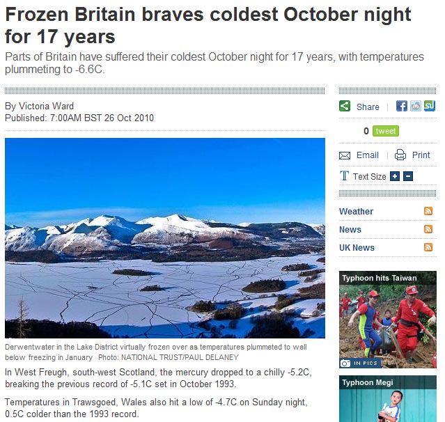
The picture of Derwentwater is from January (as the caption says). Very pretty though.
Even our much maligned Met Office say it is getting colder: –
http://hadobs.metoffice.com/hadcet/cet_info_mean.html
and has been doing so for at least 6 years:-
http://hadobs.metoffice.com/hadcet/graphs/HadCET_graph_ylybars_uptodate.gif
Please send pelts, we can’t even skin a squirrel:-)
While digging out info about climate models I rembered that back in 2006 the BBC tried an experiment using a computer model that used spare processing power on anyone who downloaded it to predict future climate. They initially had to withdraw it because they’d got the sulphur dioxide (I think) effects wrong and the models were sliding way off. It was a bit of a blooper because I don’t think anywhere near as many people signed up for version 2.
The site isn’t a bad primer for understanding climate models… and how crap they are.
The model starts at least in 1920 (didn’t download it so I’m going on the graphics) and runs up to 2080. But they started the graphs in 1960.
http://www.bbc.co.uk/sn/climateexperiment/theexperiment/abouttheexperiment.shtml
If you look at the results for the UK
http://www.bbc.co.uk/sn/climateexperiment/theresult/abouttheresults.shtml
The values are already well off the mark. We’re now at or below zero anomaly and the last two years were towards the lower end of the model. Still I expect that’s just natural variation. Ha, ha. /sarc.
http://www.metoffice.gov.uk/climatechange/science/monitoring/hadcet.html