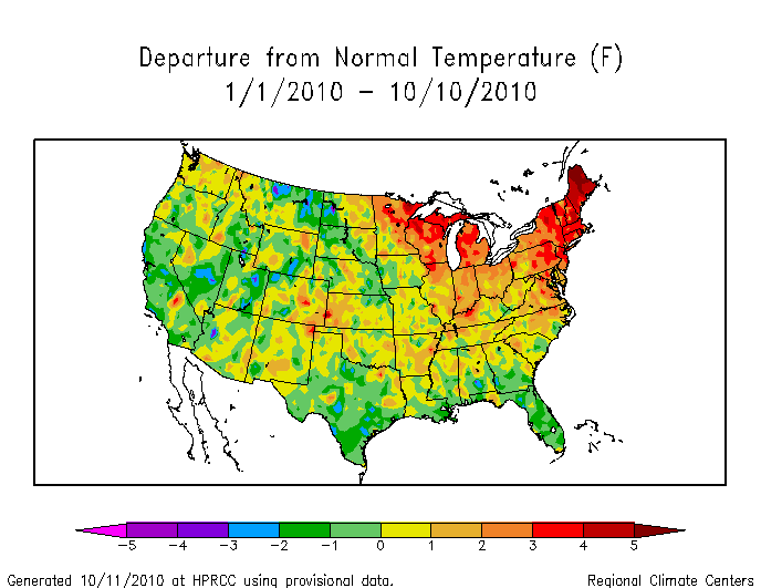
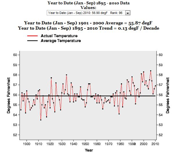
Thanks to reader “bbttxu” for this idea. He pointed out a discrepancy between the NOAA year to date temperature anomaly map and the NCDC year to date anomaly number.
http://www.hprcc.unl.edu/products/maps/acis/YearTDeptUS.png
When I numerically integrated the NOAA map above, I came up with a YTD anomaly of 0.38ºF. But NCDC shows a much larger anomaly of 1 .03ºF for the current year, as seen below.
http://climvis.ncdc.noaa.gov/cgi-bin/cag3/hr-display3.pl
So why the discrepancy?
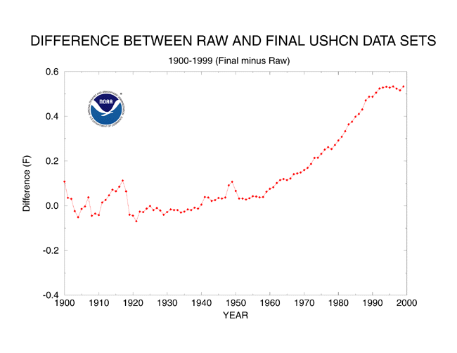
The NCDC data uses USHCN adjustments, which add almost 0.6ºF on to recent temperatures, and subtract from older temperatures. This accounts for much of the claimed upwards temperature trend, and accounts for the entire discrepancy between the NOAA map and the NCDC graph.
http://www.ncdc.noaa.gov/img/climate/research/ushcn/ts.ushcn_anom25_diffs_urb-raw_pg.gif
So there you have it. The thermometers show temperatures close to normal, but the people in charge of the NCDC data adjust the temperatures upwards. Here is their rationale.
http://www.ncdc.noaa.gov/oa/climate/research/ushcn/ushcn.html#QUAL


So the warming over the 20th C. was .4C of which .55C was adjustment?
Allow for UHI and surely the Ice Age cometh?
Oops, I see, F.
“Manmade warming is real! But the men are in East Anglia, Asheville, and New York City.”
Adjustment, and homogenization talk begins at 1:08 of this video:
http://www.youtube.com/watch?v=OTxCg6YHOCI
You mean “Mann”Made
Non agreement between satellite and surface station, showing opposite of what theory states it should be:
http://www.youtube.com/watch?v=FsHOuzwQFmk
Sandy Rham says:
October 12, 2010 at 4:13 am
So the warming over the 20th C. was .4C of which .55C was adjustment?
Allow for UHI and surely the Ice Age cometh?
Well it will start with a Little Ice Age…. and then keep your fingers crossed… because a Nuclear Winter could then tip the balance further down… in which case just put your head between your knees and kiss your arse goodbye…
Steve,
For the NCDC temperature adjustments chart, are the raw data still available in digital form to calculate each year’s adjustment?
I assume the chart represents a cumulative adjustment total. If so, does that mean the actual 2000 “raw” temperature would have been close to 56.5 instead of 57 degrees? Or is that an over simplification?
The NOAA press release for September states: “The nationally averaged temperature for January-September 2010 was 56.9 F, one degree above the long-term mean.” This number agrees with the one you state for NCDC in this post, no surprise since they are under NOAA.
The only discrepency, apparently, is that your “numerical integration” does not work at reverse-engineering the original data using your pixel counting technique.
Moreover, the result of that numerical integration today is +0.38F, whereas yesterday, you claimed it was +0.032F. What is the discrepency there?
0.38 is the correct number