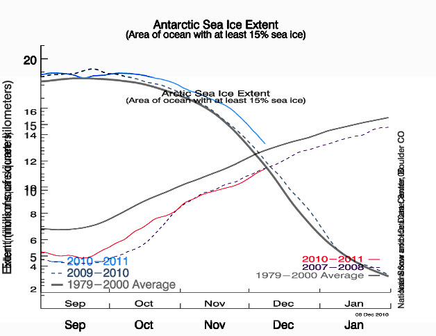
The poles are in a death spiral, but are healthier than normal as they die.
Disrupting the Borg is expensive and time consuming!
Google Search
-
Recent Posts
- 65 Years Of Progress!
- El Nino To The Rescue?
- Worst March Drought On Record
- ChartGL Process Control Demo
- The Biggest Money Laundering Scam
- Drought In The Headwaters Of Lake Powell
- Unrealistic Expectations Of Water Availability
- Did Bill Gates Do This?
- Worst March Drought On Record In The US
- The Real Hockey Stick Graph
- Analyzing The Western Water Crisis
- Gaslighting 1924
- “Why Do You Resist?”
- Climate Attribution Model
- Fact Checking NASA
- Fact Checking Grok
- Fact Checking The New York Times
- New Visitech Features
- Ice-Free Arctic By 2014
- Debt-Free US Treasury Forecast
- Analyzing Big City Crime (Part 2)
- Analyzing Big City Crime
- UK Migration Caused By Global Warming
- Climate Attribution In Greece
- “Brown: ’50 days to save world'”
Recent Comments
- arn on 65 Years Of Progress!
- Gordon Vigurs on 65 Years Of Progress!
- arn on 65 Years Of Progress!
- conrad ziefle on 65 Years Of Progress!
- Robertvd on 65 Years Of Progress!
- Robertvd on 65 Years Of Progress!
- Robertvd on 65 Years Of Progress!
- arn on 65 Years Of Progress!
- Bob G on 65 Years Of Progress!
- Gordon Vigurs on 65 Years Of Progress!


yah! And that’s a lot of rye and vermouth!!!
More than 1000 dissenting scientists have now challenged the IPCC’s claims.
Check out some of the comments below – they really are scathing.
Perhaps Tony D would like to comment as he holds so much respect for scientists.
http://wattsupwiththat.com/2010/12/08/shredding-the-climate-consensus-myth-more-than-1000-international-scientists-dissent-over-man-made-global-warming-claims-challenge-un-ipcc-gore/#more-29110
Hey Steven, even funnier, bigger lies are better!
?
This is a wonderfully instructive graph, the scales are lined up well, and I hate to be such a complainer, but somewhere in the legend or caption it should say that the red line is Arctic sea ice extent, and the blue line is Antarctic sea ice extent. It should be obvious, but it won’t be for everyone. On my screen the label “Arctic Sea Ice Extent” falls right on the blue Antarctic curve. Sorry I didn’t catch that before.
That chart boggles my undersized brain, but anything you say, Steve.