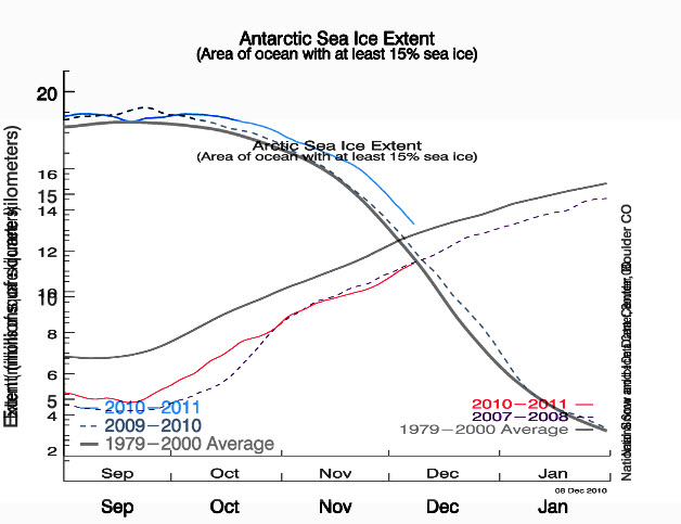
This is a wonderfully instructive graph, the scales are lined up well, and I hate to be such a complainer, but somewhere in the legend or caption it should say that the red line is Arctic sea ice extent, and the blue line is Antarctic sea ice extent. It should be obvious, but it won’t be for everyone. On my screen the label “Arctic Sea Ice Extent” falls right on the blue Antarctic curve. Sorry I didn’t catch that before.



yah! And that’s a lot of rye and vermouth!!!
More than 1000 dissenting scientists have now challenged the IPCC’s claims.
Check out some of the comments below – they really are scathing.
Perhaps Tony D would like to comment as he holds so much respect for scientists.
http://wattsupwiththat.com/2010/12/08/shredding-the-climate-consensus-myth-more-than-1000-international-scientists-dissent-over-man-made-global-warming-claims-challenge-un-ipcc-gore/#more-29110
Hey Steven, even funnier, bigger lies are better!
?
This is a wonderfully instructive graph, the scales are lined up well, and I hate to be such a complainer, but somewhere in the legend or caption it should say that the red line is Arctic sea ice extent, and the blue line is Antarctic sea ice extent. It should be obvious, but it won’t be for everyone. On my screen the label “Arctic Sea Ice Extent” falls right on the blue Antarctic curve. Sorry I didn’t catch that before.
That chart boggles my undersized brain, but anything you say, Steve.