Disrupting the Borg is expensive and time consuming!
Google Search
-
Recent Posts
- The Real Hockey Stick Graph
- Analyzing The Western Water Crisis
- Gaslighting 1924
- “Why Do You Resist?”
- Climate Attribution Model
- Fact Checking NASA
- Fact Checking Grok
- Fact Checking The New York Times
- New Visitech Features
- Ice-Free Arctic By 2014
- Debt-Free US Treasury Forecast
- Analyzing Big City Crime (Part 2)
- Analyzing Big City Crime
- UK Migration Caused By Global Warming
- Climate Attribution In Greece
- “Brown: ’50 days to save world'”
- The Catastrophic Influence of Bovine Methane Emissions on Extraterrestrial Climate Patterns
- Posting On X
- Seventeen Years Of Fun
- The Importance Of Good Tools
- Temperature Shifts At Blue Hill, MA
- CO2²
- Time Of Observation Bias
- Climate Scamming For Profit
- Climate Scamming For Profit
Recent Comments
- Bob G on The Real Hockey Stick Graph
- arn on The Real Hockey Stick Graph
- Bob G on The Real Hockey Stick Graph
- arn on The Real Hockey Stick Graph
- Bob G on The Real Hockey Stick Graph
- Bob G on The Real Hockey Stick Graph
- Gordon Vigurs on The Real Hockey Stick Graph
- arn on The Real Hockey Stick Graph
- arn on The Real Hockey Stick Graph
- Gordon Vigurs on The Real Hockey Stick Graph
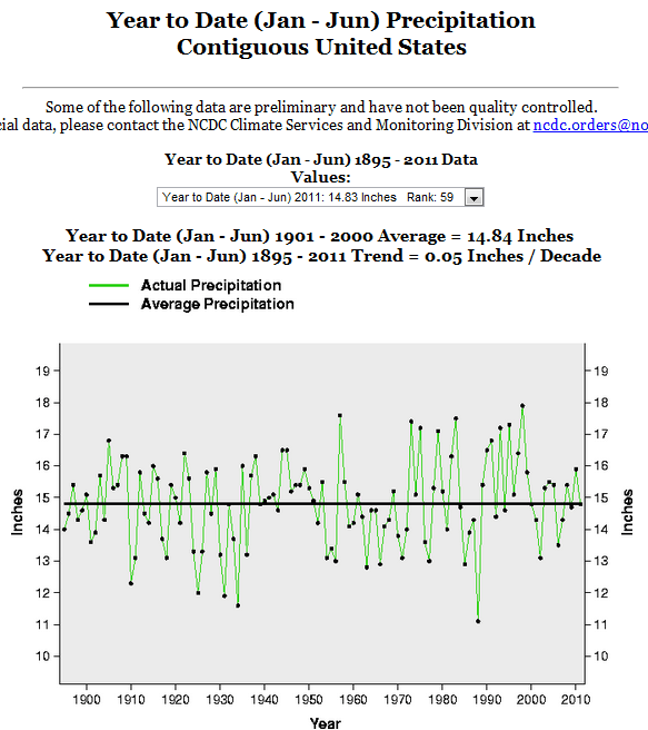
CO2 Makes US Precipitation Higher And Lower And Exactly The Same
This entry was posted in Uncategorized. Bookmark the permalink.


No correlation between CO2 and total precipitation. The difference is that in a low CO2, you have perfectly even rainfall , while with high CO2 you have global weirding with droughts and floods, but nothing in between.
You need to amend your title, CO2 also makes US precipitation average as well. We have said this all along.
What does the chart look like if you use ALL the data – ie, annual instead of year-to-date?
I get 0.18 inches/decade increase in precip, and 0.12degF/decade for temp.
You seemed to have picked the two seasons with the smallest trend in precipitation…
hmmm….
So the data show increasing trends for both temp and precipitation for the contiguous US, not lower, and not flat, right?
Whether it is due to CO2 is more debatable, but first it would be nice for all of us to be able to look a the same data and get the same answer for slope.
Do you know the numbers for the rest of 2011?
Try the “most recent 12 month period” (Jul-Jun) option. You get the same trends (0.18 in/dec and 0.12 degF/dec).
When you choose annual, it doesn’t seem to use 2011 data – it looks like the last datapoint is 2010. Using the most recent 12 month period, it does look like it has a 2011 data point.