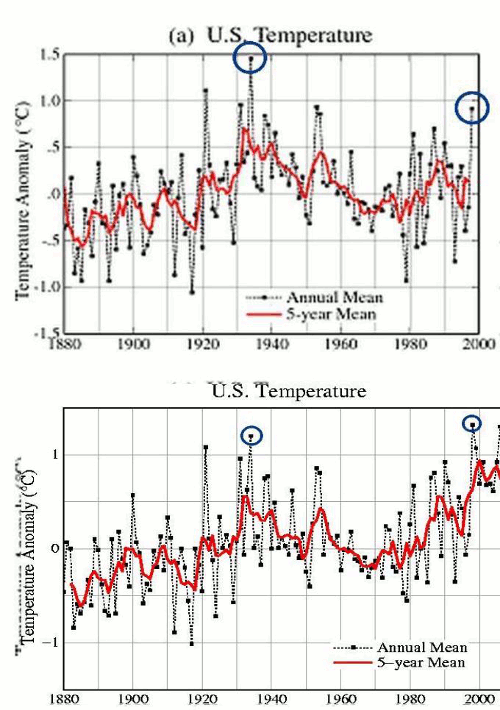
Red line is USHCN raw data. Blue line is Hansen’s 2001 adjustments to the data. Green line is Hansen’s 2011 adjustments to the data, normalized to 1934.
http://pubs.giss.nasa.gov/docs/2001/2001_Hansen_etal.pdf

Red line is USHCN raw data. Blue line is Hansen’s 2001 adjustments to the data. Green line is Hansen’s 2011 adjustments to the data, normalized to 1934.
http://pubs.giss.nasa.gov/docs/2001/2001_Hansen_etal.pdf

The point is to make the temperature – CO2 correlation better, so the temp record must get smoother.
I just love Hansen. No matter how many people call him out on his scam, he just keeps plodding along totally deaf dumb and blind to criticism.
The man has unshakeable determination to warm the planet, and warm it he will.
Climate isn’t sensitive to CO2, it’s sensitive to Hansen, by about 2DegC per century.
I welcome Hansen’s efforts to warm the planet.
Especially if it is by “heat of decomposition”
Compost thyself, jim-bo