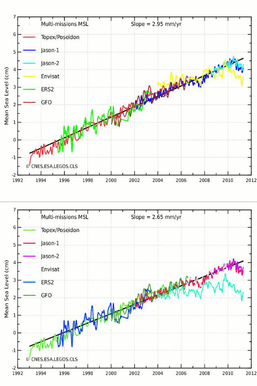
From : http://www.aviso.oceanobs.com/
The blink comparator below flashes between the standard Aviso multi-mission sea level graph – and what it should look like.
I removed the bogus GIA, made the inconvenient Envisat data visible, and normalized the left edge of Envisat in the same fashion as was done for the other data sets.
Isn’t science grand, when the purveyors feel like it is OK to obfuscate critically important data?


You need to read this oh mighty one………
C:\Users\Jorge\AppData\Local\Temp\annual_report_en_2008-1.pdf
The first 22 passes, Envisat was showing a decline in sea level.
They adjusted it up to match Jason.
Without the adjustment, Envisat has never showed a rise in sea level…..
Go down to 7.1.2 and start reading…………
(we’re all very glad you used a Windows NT derived operating system, but we can’t see files on your local hard drive) 😉
sorry, Stark, I forgot that’s one of mine….
google the title, it should be on the internet
can’t get that link to work either.
Here’s the title, use google or bing
Envisat RA2/MWR ocean data validation and cross-calibration activities. Yearly report 2008
read the 2008 report….
…then the 2009
http://bit.ly/iercui
should be a good link for now.
Sorry, the above was 2009
http://bit.ly/j33fQv
should be 2008
BTW I’m almost sure that Jason is just measuring gravity….
…that is unless water it just piling up where GOCE says it should. 😉
This sort of thing happens with just about every climate data metric, including OHC data from ARGO in 2006/2007. Ever notice it is nearly always in favor of AGW?
Never trust government science.