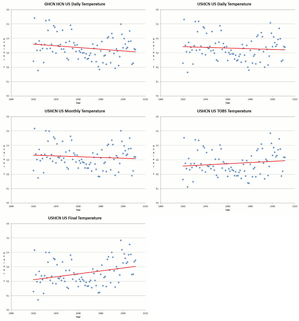
USHCN thermometers show a significant decline in US temperatures since 1920, with 1921, 1931 and 1934 being the three hottest years.
NOAA decided that this simply wouldn’t do, so about a decade ago they started adjusting the data in the four steps shown below. Remarkably, each adjustment step causes the past to get cooler.
By the time they are done corrupting the data, they have hidden the decline and created a strong warming trend, with 1998, 1999 and 2006 being the three hottest years. Prior to corruption, 1999 and 2006 aren’t even in the top ten.
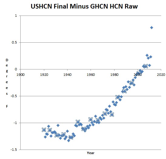
You can think of USHCN as being the Enron of US temperature data. The graph below shows the total adjustment. Note the massive cheat going on in 2012, which is needed to proclaim 2012 as the hottest year ever.


Older temperature data degrades over time, and the new data is simply having some growing pains.
The old temperature readings are so old that they can be “carbon dated” and “adjusted” so they fit the chart better. Just one of the Miracles of Modern Climate Science.
How the hell is the media letting them get away with this?
These are our “experts” at the top of their field.
It’s a kool-aid concocted in witches cauldrons from the ivory towers of PHD’d academia,
a sordid mix of self-aggrandizement, self-delusion, corruption, and a self-serving agenda.
Drink it or challenge it.
The media is complicit.
+1
According to David Appell and Physicist, the rapid increase of upward adjustments from actual temperatures proves their case for catastrophic warming.
Also, you also have to recognize that the upward temperature adjustments have been peer reviewed by hundreds of thousands of the best climate scientists. That is conclusive proof of warming, even if the thermometers say there is no warming. Anyone believing the data rather than the strongly warming biased adjustments to the data is obviously a paranoid right wing denier!
Look, you’ve missed the point! Higher C02 levels cause spreadsheet data to change (always for the worse). It’s called “data weirding”. Have you known it worse in living memory?
QED
You’re all forgetting the very real possibility that every one of these adjustments was to correct a very valid error (caused by moving stations, change in technology, etc) and that it is pure coincidence that every adjustment happens to result in the past getting cooler.
Nah, you’re right – there’s no getting around this. At best it’s confirmation bias; at worst it’s fraud.
They’re approaching the last gasps and it is a splendid show.
Was there a dataset you would like to include, or are we supposed to just take your word for the graphs being the truth. (Goose v. Gander)
Yes there is a data set
To AndyDC from OCT 2012, there are not ‘hundreds of thousands of the best climate scientists’.