
There is a lot less thick ice in the Arctic than there was in 1979. Alarmists mindlessly spew that it melted in the summer sun, but that is incorrect.
Most multi-year sea ice is lost during the winter, not the summer. Strong winter winds blow it out into the North Atlantic, where it quickly melts. Most of the thick ice was lost during the winters between 1988 and 1996, due to unusual winds.

2007_seaiceminimum/images/20070822_oldice.gif
This coincided with a period of high ENSO.


Anna Maria Tremonti is an unrepentant CBC climate changer. Just this morning she interviewed Andrew Desrocher a polar bear “scientist” who’s actually got climate models (wow!) that show that the Arctic melting will result in the extinction of 2/3 of the bear population by mid-century and he’s asking seriously how we can keep them going by shipping frozen seals north to hand feed them.
Desrocher is one of the guys that’s actively blocked the real and experienced polar bear scientists from attending conferences with opposing view points from his own.
http://www.cbc.ca/thecurrent/2013/02/18/should-we-save-polar-bears-from-starvation-by-feeding-them-ourselves/
So while guys like Desrocher are pounding this podium and venues like the CBC amplify it, no one ever actually gets asked for the actual historical perspective on the state of the Arctic, nor on the bear population. I doubt Desrocher has ever looked at the summer ice free proxy papers. It drives me crazy!!
Thank you Steve!
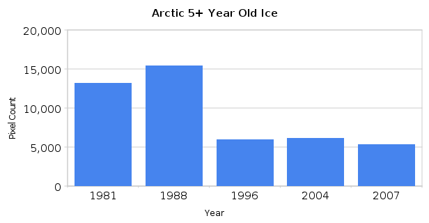
That sequence of ice flows can be found elsewhere, continuing until present times with almost no 5 year ice. Why did you stop it at 1996?
There was very little loss of old ice after 1996. Look at the graph below.
http://www.sciencedirect.com/science/article/pii/S1352231004010015
Fig 5 Shows the frequency of dust storms and droughts in Australia. Notice a couple of things which are well known already.
1. When ENSO is negative, Australia is generally not in drought.
2. When ENSO is positive, Australia experiences repetitive droughts.
3. Australia even had droughts throughout the 60’s when ENSO was neutral and CO2 was low.
We can’t see the last 4 years, but whilst ENSO has been in La Nina phase, Australia has been experiencing excellent tropical wet seasons and the great salt lakes filled with water from the floods. ENSO drives the Australian climate and CO2 forcing is a furphy.
http://wattsupwiththat.com/2012/05/16/hurricane-drought-days-at-an-all-time-high-katrina-karma/
Global Hurricane Frequency Chart by Dr Ryan N Maue.
If this chart and data record doesn’t make warmists pause and start thinking “hey maybe CO2 is a scam”, nothing will. In which case I write them off as CO2 nitwits.
PS The energy chart correlates exceptionally well with Steven’s ENSO oscillation.
Not sure where the energy data comes from, but it is pretty compelling.
Last one! Plenty of charts on storm frequency, Hansen Ice predictions,etc.
http://www.abc.net.au/unleashed/2738910.html
Please note the frequency of earthquakes is rising along with CO2 emissions according to Munich Reinsurance. LOL. That whole chart is constructed so they can put insurance premiums up!!!
And climate scientists believe them!!
This is a summary report from Andrew Glickson – Earth and Paleo Climate Scientist from ANU, Canberra. He points out that reductions in Australian CO2 emissions will make “hardly a dent” in global emissions. And Obama’s girlfriend brought in a carbon tax here that if kept, will smash the Aussie economy in a few years time. Aussie Election is coming soon and Obama’s girlfriend is on the nose.
http://www.rgsq.org.au/node/271
Royal Geographical Society of Queensland records of Australian drought land area effected. Charts show that the percentage of land area effected has been falling since the 1930’s. Really the last one, this time.
http://www.bom.gov.au/climate/current/soihtm1.shtml
ENSO monthly numbers going back to 1876 from BoM Australia
I know this comes late to the discussion, but I too would like to see the animated ice flow pattern continued to the present time. I understand that there is no significant long term ice after 1996. That indicates to me that the annual “pulsing” of ice temporally is matched with a circulation and loss pattern spacially that (1) sustains long term ice percentages and (2) purges long term ice from accumulating.
I think it is important to have that animated graphic as a counter to the refrain from the warmists about arctic ice gradually disappearing. It also provides support for the observed temperature being static for the past 15+ years. Temperature static equals long term ice static.