Last year, alarmists loved this statistic. This year, they completely forgot about it.
Disrupting the Borg is expensive and time consuming!
Google Search
-
Recent Posts
- Drought In The Headwaters Of Lake Powell
- Unrealistic Expectations Of Water Availability
- Did Bill Gates Do This?
- Worst March Drought On Record In The US
- The Real Hockey Stick Graph
- Analyzing The Western Water Crisis
- Gaslighting 1924
- “Why Do You Resist?”
- Climate Attribution Model
- Fact Checking NASA
- Fact Checking Grok
- Fact Checking The New York Times
- New Visitech Features
- Ice-Free Arctic By 2014
- Debt-Free US Treasury Forecast
- Analyzing Big City Crime (Part 2)
- Analyzing Big City Crime
- UK Migration Caused By Global Warming
- Climate Attribution In Greece
- “Brown: ’50 days to save world'”
- The Catastrophic Influence of Bovine Methane Emissions on Extraterrestrial Climate Patterns
- Posting On X
- Seventeen Years Of Fun
- The Importance Of Good Tools
- Temperature Shifts At Blue Hill, MA
Recent Comments
- Scott Allen on Drought In The Headwaters Of Lake Powell
- conrad ziefle on Unrealistic Expectations Of Water Availability
- Gordon Vigurs on Did Bill Gates Do This?
- Bob G on Did Bill Gates Do This?
- conrad ziefle on Did Bill Gates Do This?
- Bob G on Did Bill Gates Do This?
- Jack the Insider on The Real Hockey Stick Graph
- scott allen on Worst March Drought On Record In The US
- conrad ziefle on The Real Hockey Stick Graph
- Francis Barnett on The Real Hockey Stick Graph


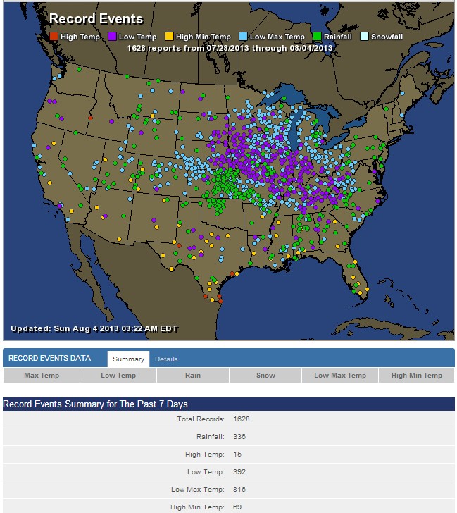
Steven, do you know of a source that tabulates the number of record highs vs record lows for the entire summer and for the entire year?
As everyone on this blog is fully aware, the media consistently report record highs as “climate change”, and record lows (if reported at all) as just “weather”. So, what is the statistical trend?
The high temp in Idaho is suspect. Lows on either side.
Probably had the thermometer next to a frying pan.