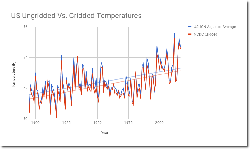
One of the many excuses used by climate alarmists (and some skeptics) to ignore my data tampering graphs, is that I don’t grid the data. What I do is take a straight numerical average of temperatures at all stations, which is the cleanest and easiest way to understand and interpret the data. The graph below compares my numerical USHCN average vs. NCDC gridded US temperatures. The trends are nearly identical.
As you can see, gridding has very little effect on the trend.
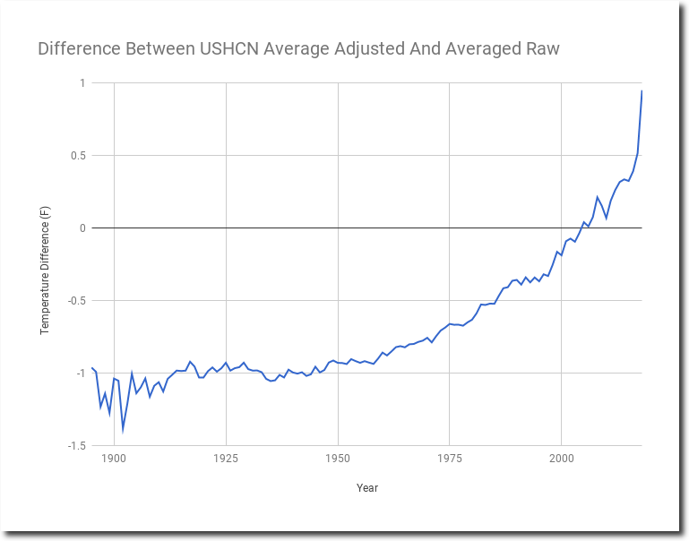
What alarmists choose to ignore is the data tampering, which makes a huge difference.
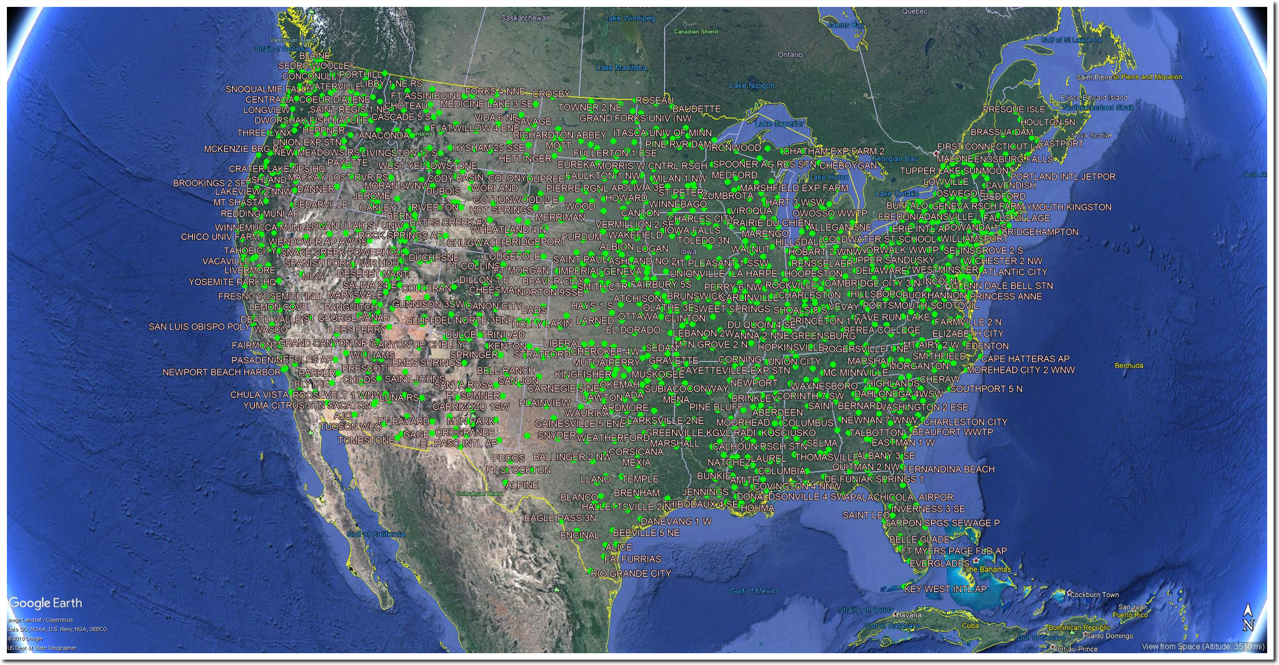
So why doesn’t gridding matter? Because USHCN stations are relatively evenly spaced around the country.
Climate alarmists can’t stand clean, unadjusted data – and the fact is that gridding obfuscates and contaminates data and hardly makes any difference to the trend.


