http://www.epa.gov/climatechange/
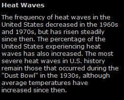
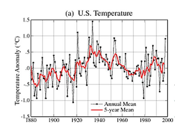
Let’s see – hottest in the 1930s, coolest in the 1960s, and now increasing again. Isn’t that what we call “cyclical behaviour?”
Before the USHCN experts made the very wise decision to add nearly half a degree C to recent temperatures while decreasing older temperatures, the US graph appeared as above – with the 1930s as the hottest decade. They have since fixed that, so now the EPA can claim that “average temperatures have increased” – despite the fact that actual thermometer readings disagree.
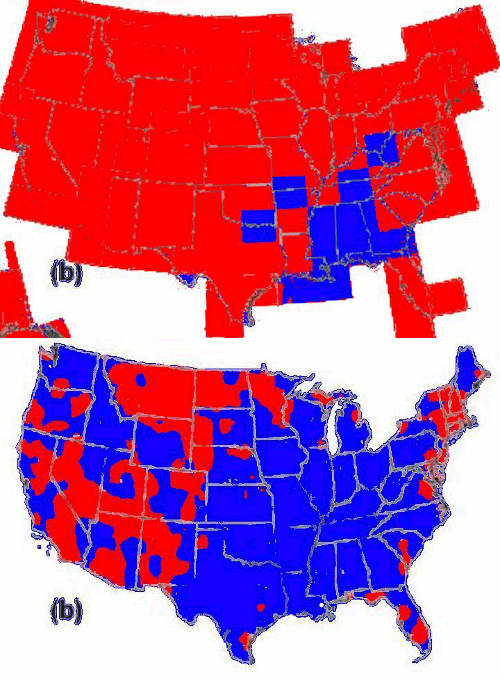
The blink comparator below shows areas of increasing temperatures in red, and steady or decreasing temperatures in blue. It flashes back and forth between flattened versions of the USHCN unadjusted high temperature data, and the EPA’s published red hot warming map.
Unadjusted thermometer data shows most of the country cooling since the 1930s, but the experts have thankfully cleared up that confusion. Someone needs to teach those thermometers to stop lying so much.


Face it, we’re gonna die.
….no, really.
Do you have a link that explains the USHCN’s rationale for changing these temp records? What was happening world wide to temperatures? Were the droughts in the dust bowl related to the high temps back in the 30’s? What is the physical reason for this 60 year temp cycle?
You are mostly making a great point but it will be even greater when the complete story is explained.
Thanks, the link was broken in the article. I fixed it and here it is again.
ftp://ftp.ncdc.noaa.gov/pub/data/ushcn/v2/monthly/menne-etal2009.pdf