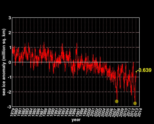
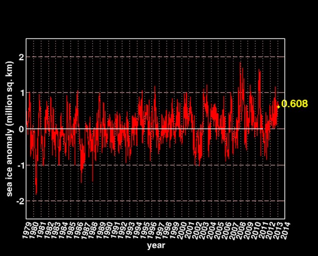
Cardinals Tamino and Appell warn you again, that there are only two points in the Arctic ice graph (marked in yellow) which you are allowed to look at. Do not look at any other portion of this graph.
And you are absolutely forbidden to ever look at the Ozone-hole trained Antarctic graph. Avert your eyes. If lay people realized that the total amount of sea ice on earth is right at the 30 year mean, they might quit allowing us to steal their money.


Those graphs compare something to something, but it is not apples to apples. Unless it is comparing Granny Smiths to Red Delicious. Then comparing both them to Golden Delicious, Gala, Rome,Macintosh, Pipin, Ambrosia, Arkansas Black, Beacon and the Hundreds of other Apple Varieties.
I know that is what we have to talk about, such as it is. Also that is what they use to promote their alarmism.
My eyes are stinging!
All of 34 years of records that prove what? That ice at the poles varies.
With such a paucity of data can anything be shown? I think not.
Reblogged this on Climate Ponderings.
Steven have you noticed DMI mean temp above 80 N is below the average line … you don’t see that often and it has lead me to wonder how they calculate their temperatures ( it seems all the warmth effect comes from southeast of Svallbard ) but none the less we have a very cold winter in full stride currently.