
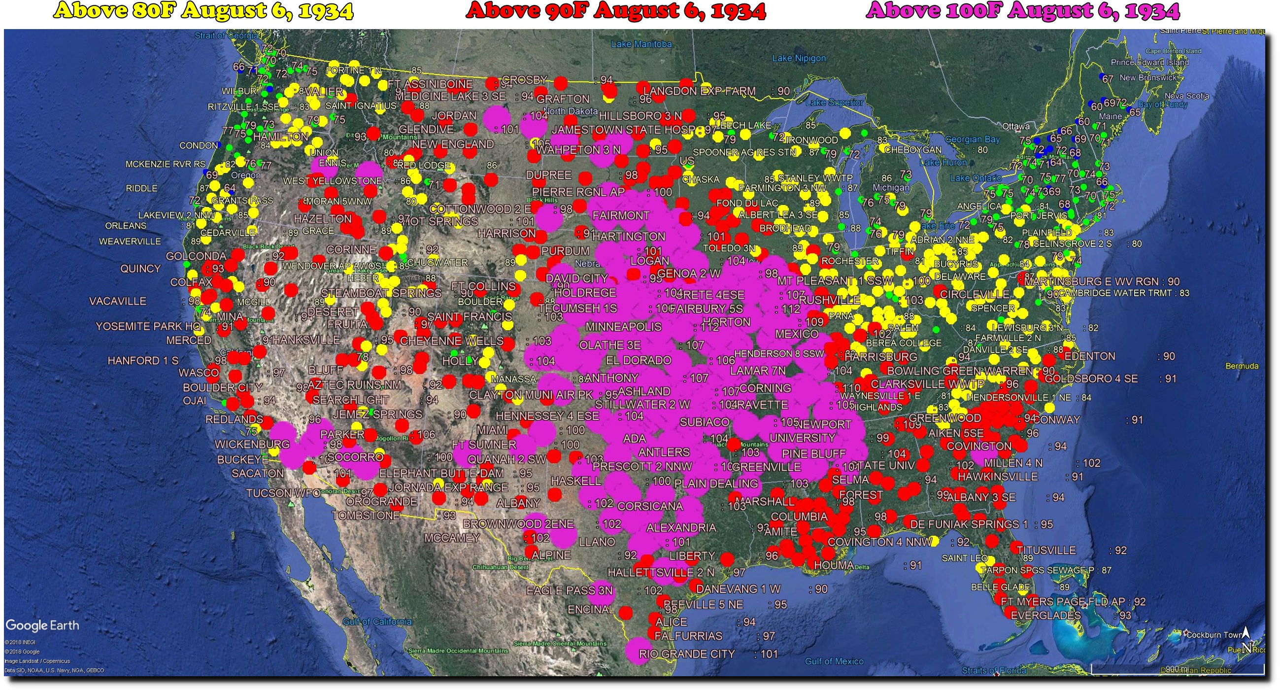
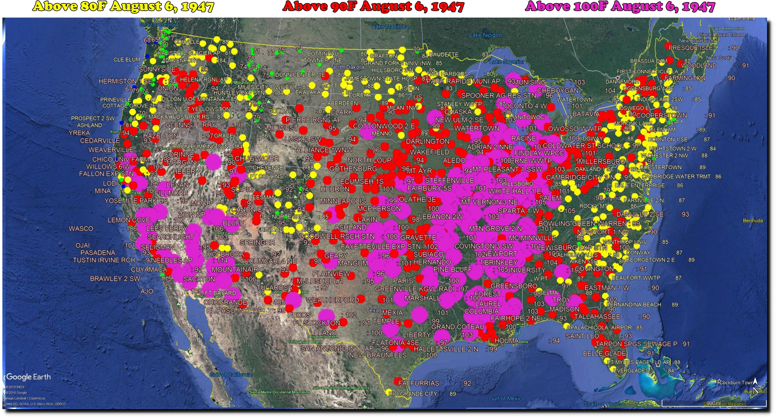
On August 6, 1947 – forty-three states were over 90 degrees.
Paris was very hot that summer too.

On August 6, 1947 – forty-three states were over 90 degrees.
Paris was very hot that summer too.
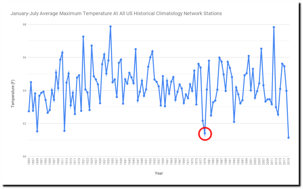
NASA likes to start their trends in 1979, during the second coolest January-July on record in the US. They have determined that CO2 emissions are making the fire sason longer.
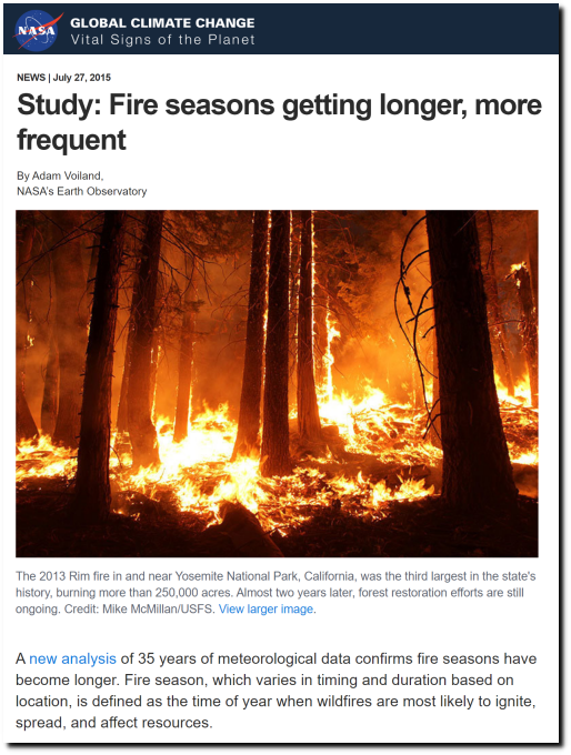
Study: Fire seasons getting longer, more frequent – Climate Change: Vital Signs of the Planet
Like in early May, 1884. When there were massive forest fires burning in the Midwest and eastern US.
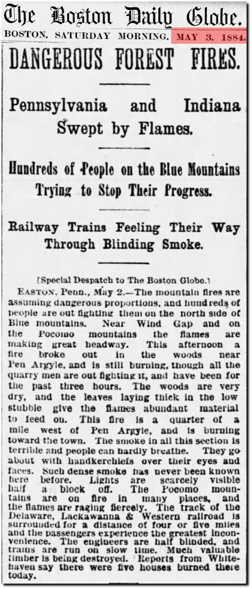
03 May 1884, 1 – The Boston Globe at Newspapers.com
Or in April, 1889 when there were forest fires burning all over Wisconsin.
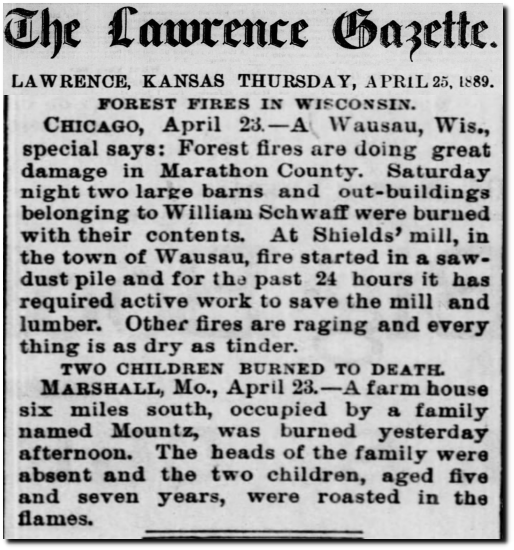
25 Apr 1889, Page 6 – The Lawrence Gazette at Newspapers.com
Or in April 1880 in New Jersey.
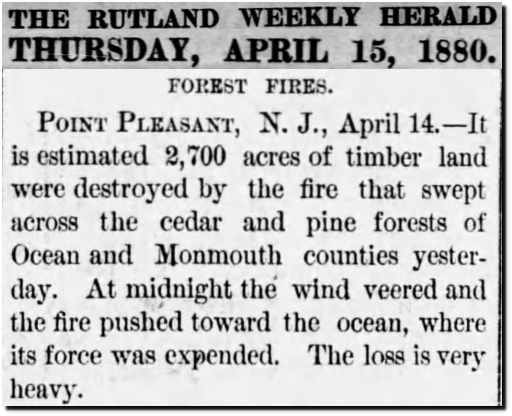
15 Apr 1880, 5 – The Rutland Weekly Herald and Globe at Newspapers.com
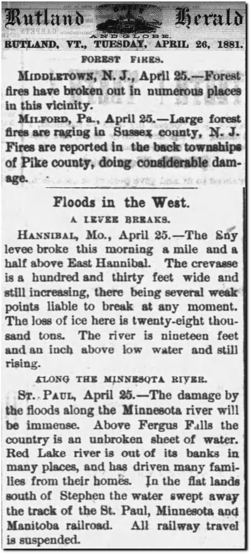
Or in 1881 in New Jersey.
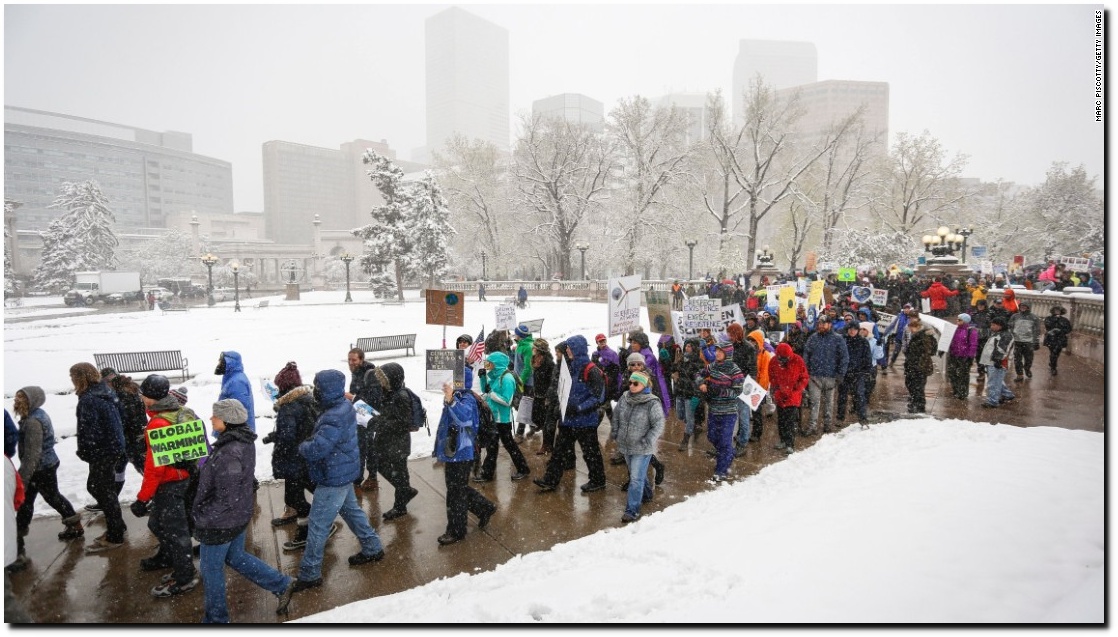
This video is a must watch for anyone wanting to understand the climate crisis scam.
There have been fewer than 30,000 fires this year – the majority being in Alaska (which is now cold and wet.)
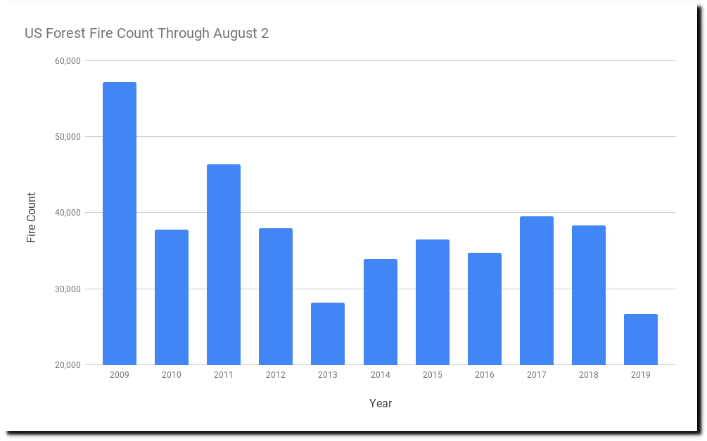
National Interagency Fire Center
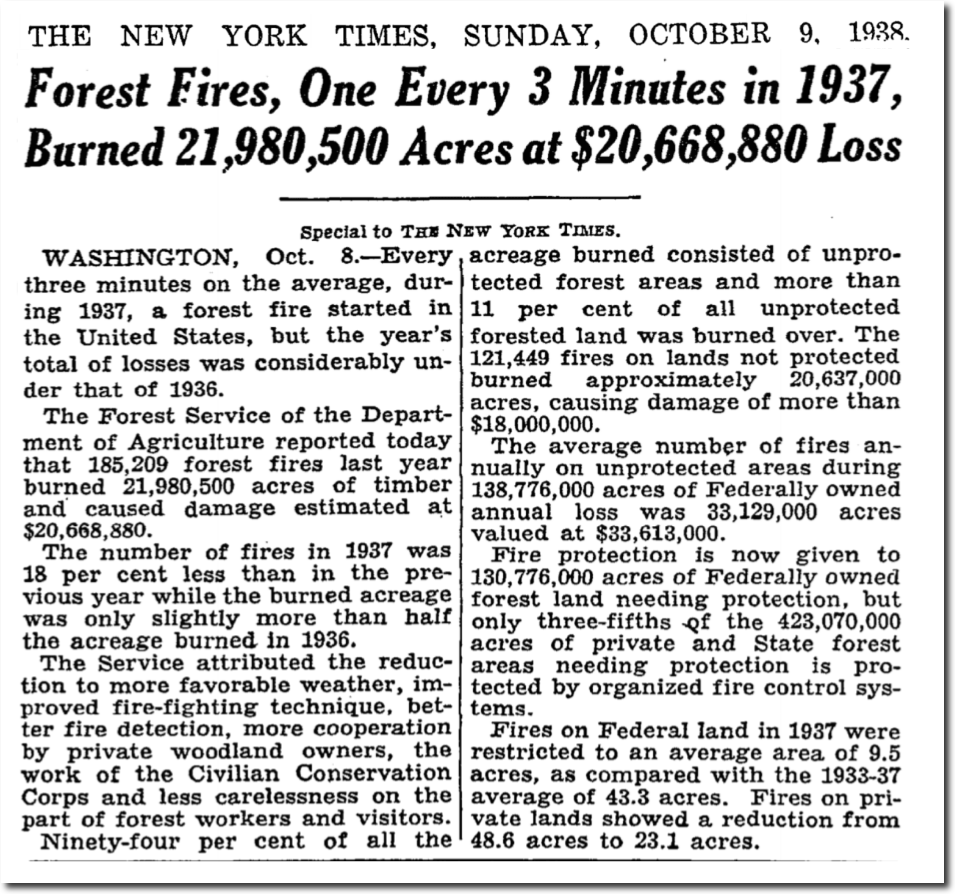
In 1937, there were 185,000 fires – and that did not include Alaska.
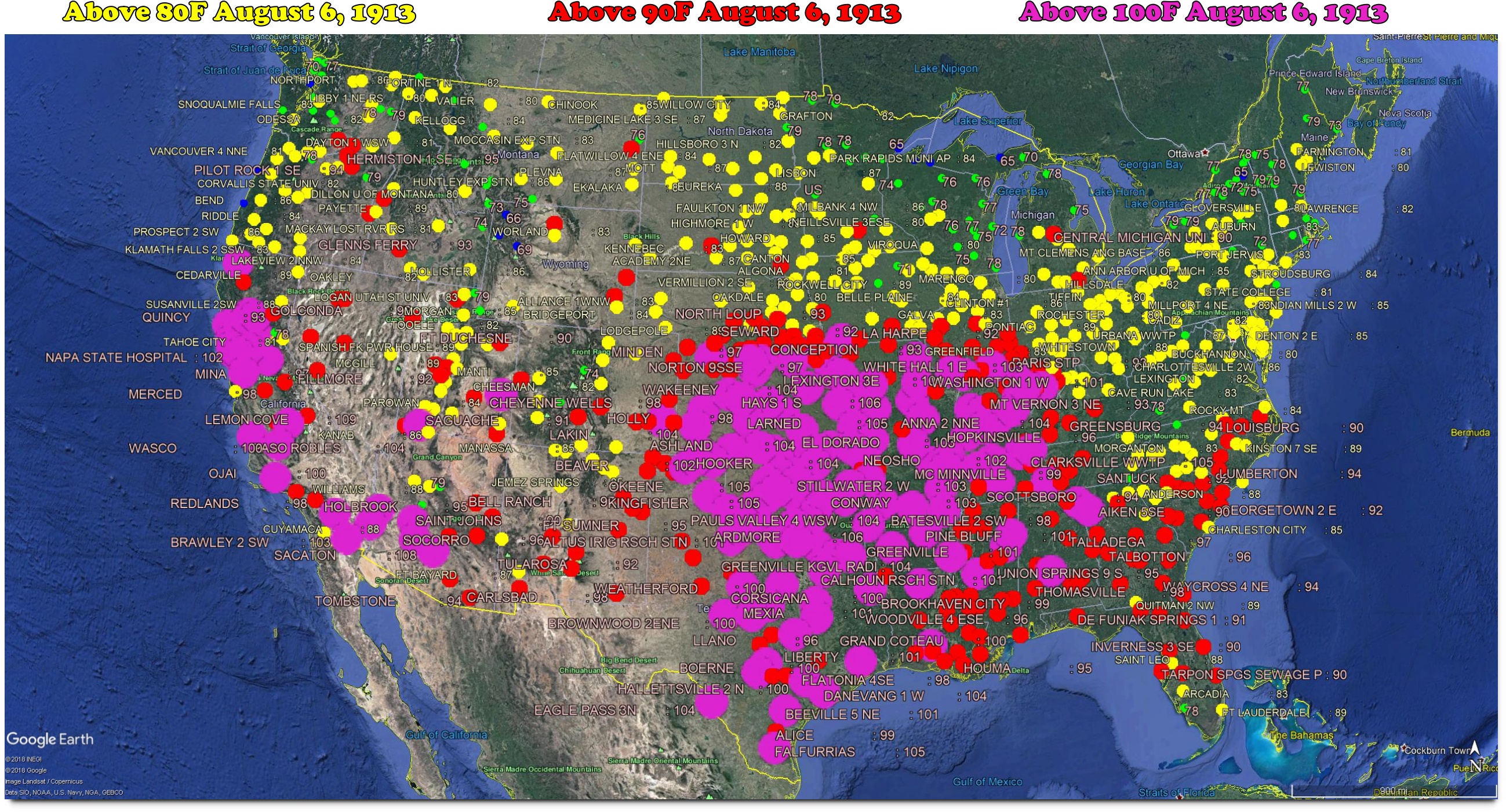
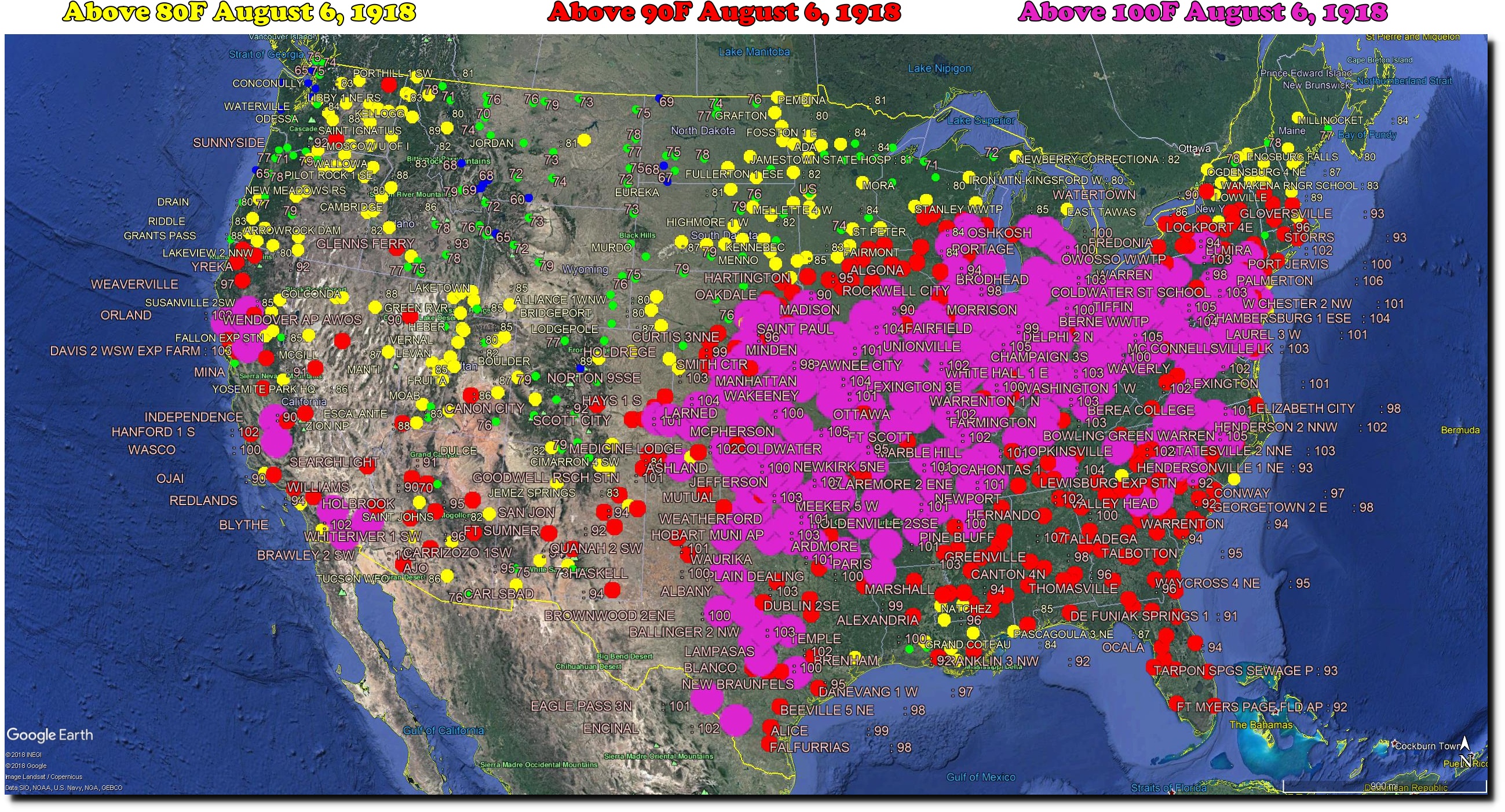
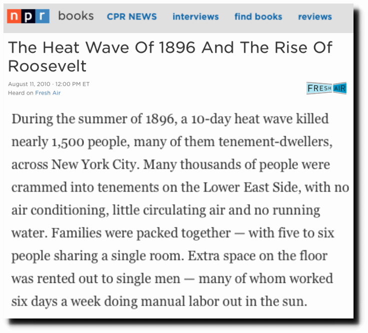
During August, 1918 the eastern half of the US was having one of the worst heat waves on record.
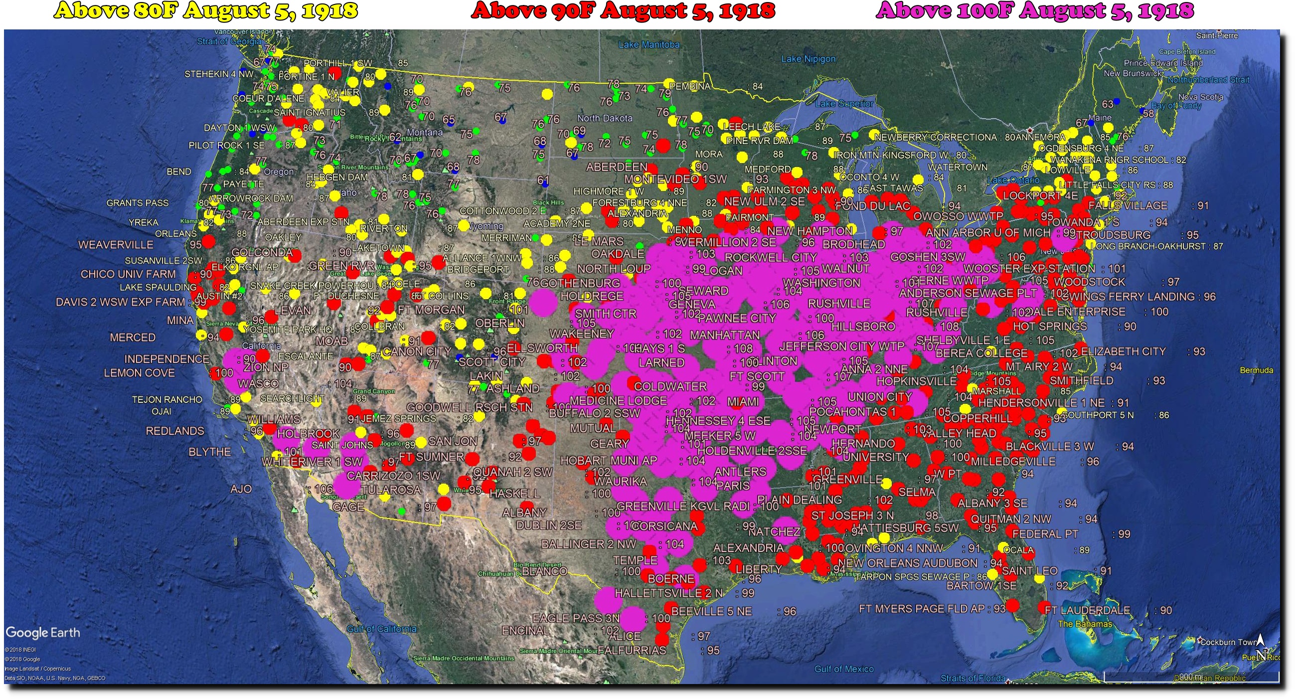
Temperatures were over 110 degrees in the Midwest day after day. But there was not much hysteria about it in the press.

People had real problems to worry about then. Nearly 40 American soldiers were dying every hour in Europe.

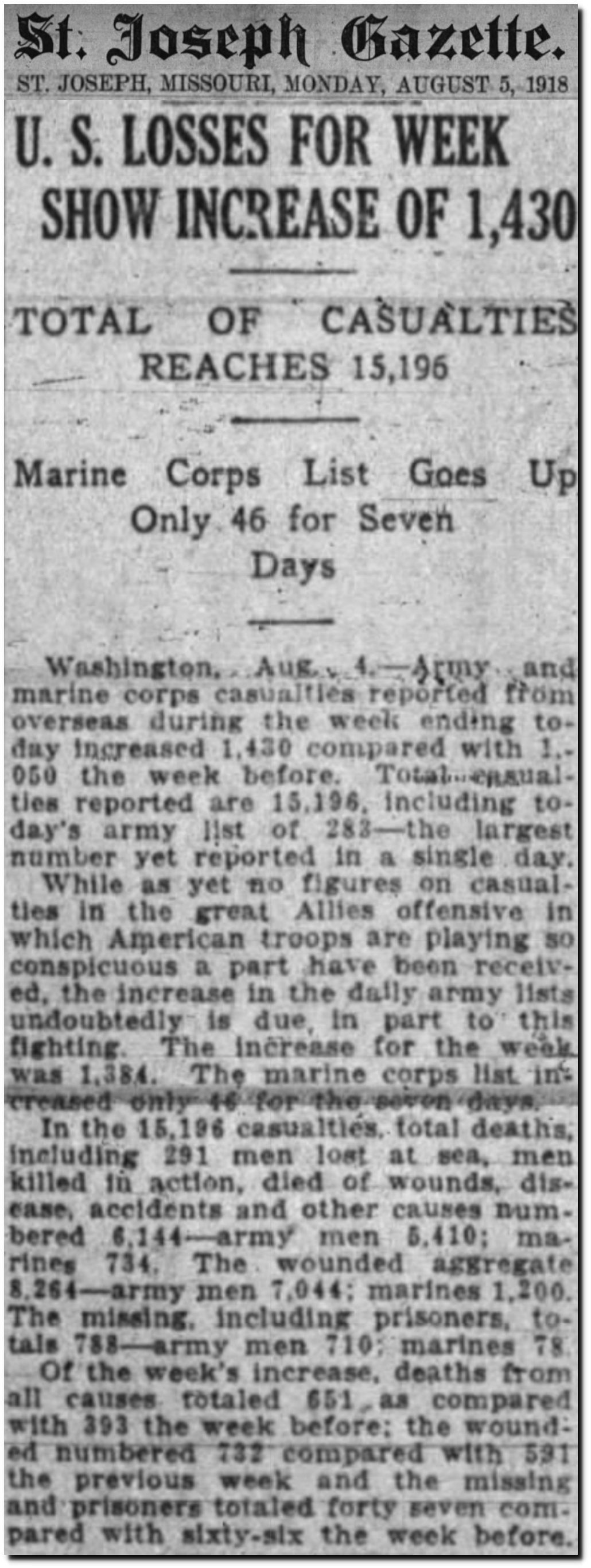
05 Aug 1918, 1 – St. Joseph News-Press/Gazette at Newspapers.com
Temperatures as hot as 1918 are incomprehensible now in the Midwest, just as the current levels of ignorance, superstition, navel gazing and stupidity would have been incomprehensible to people in 1918.
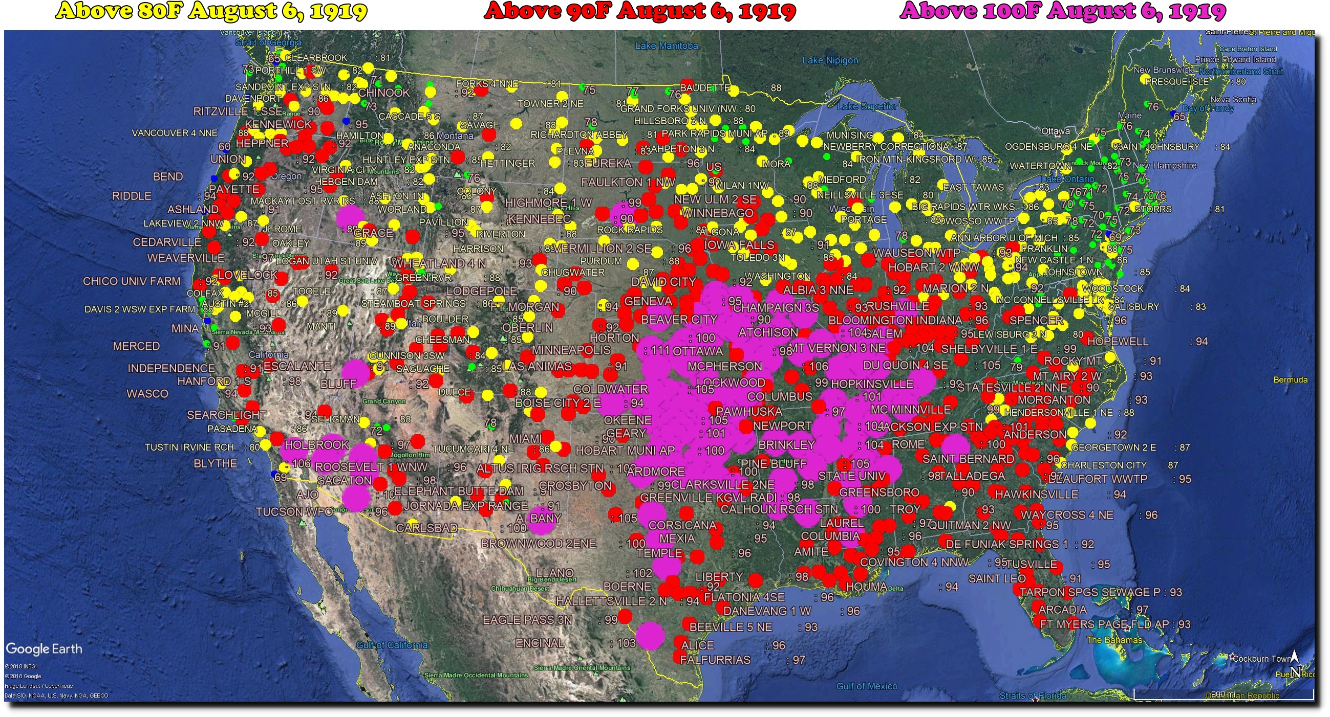
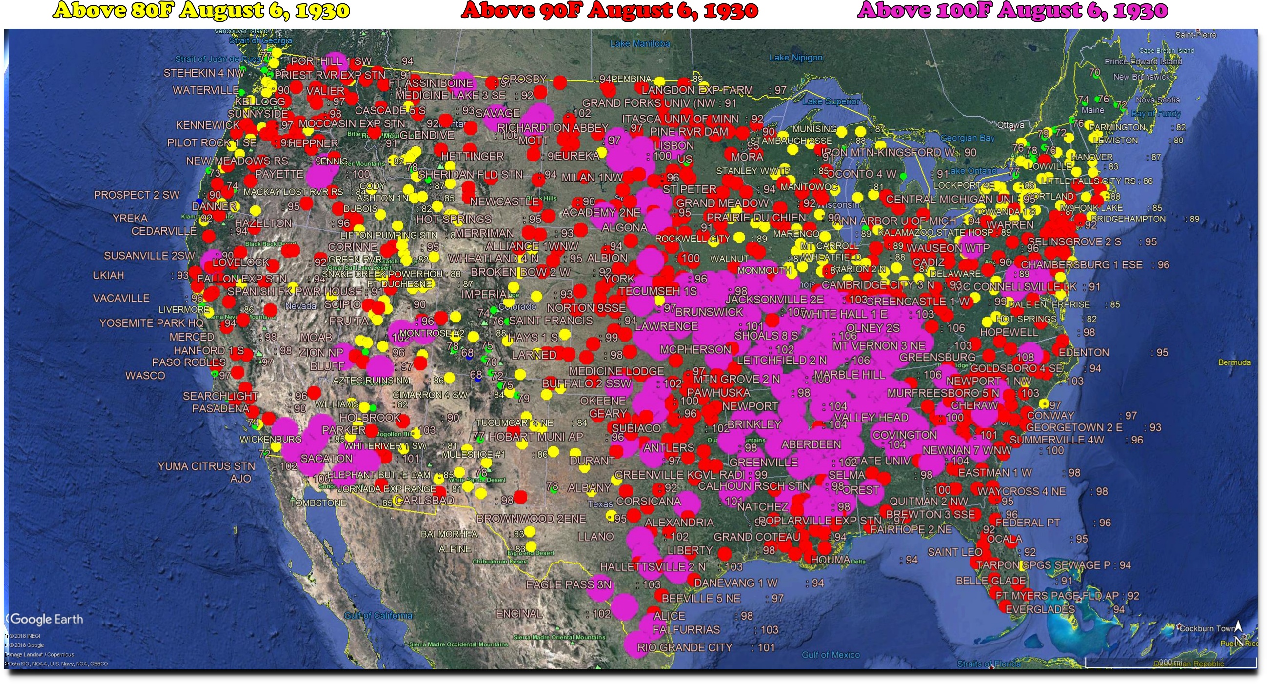
The US used to have many very hot summers, with the worst being 1936.

The Bulletin – Google News Archive Search
There were many other extremely hot years which occurred at low CO2 levels.
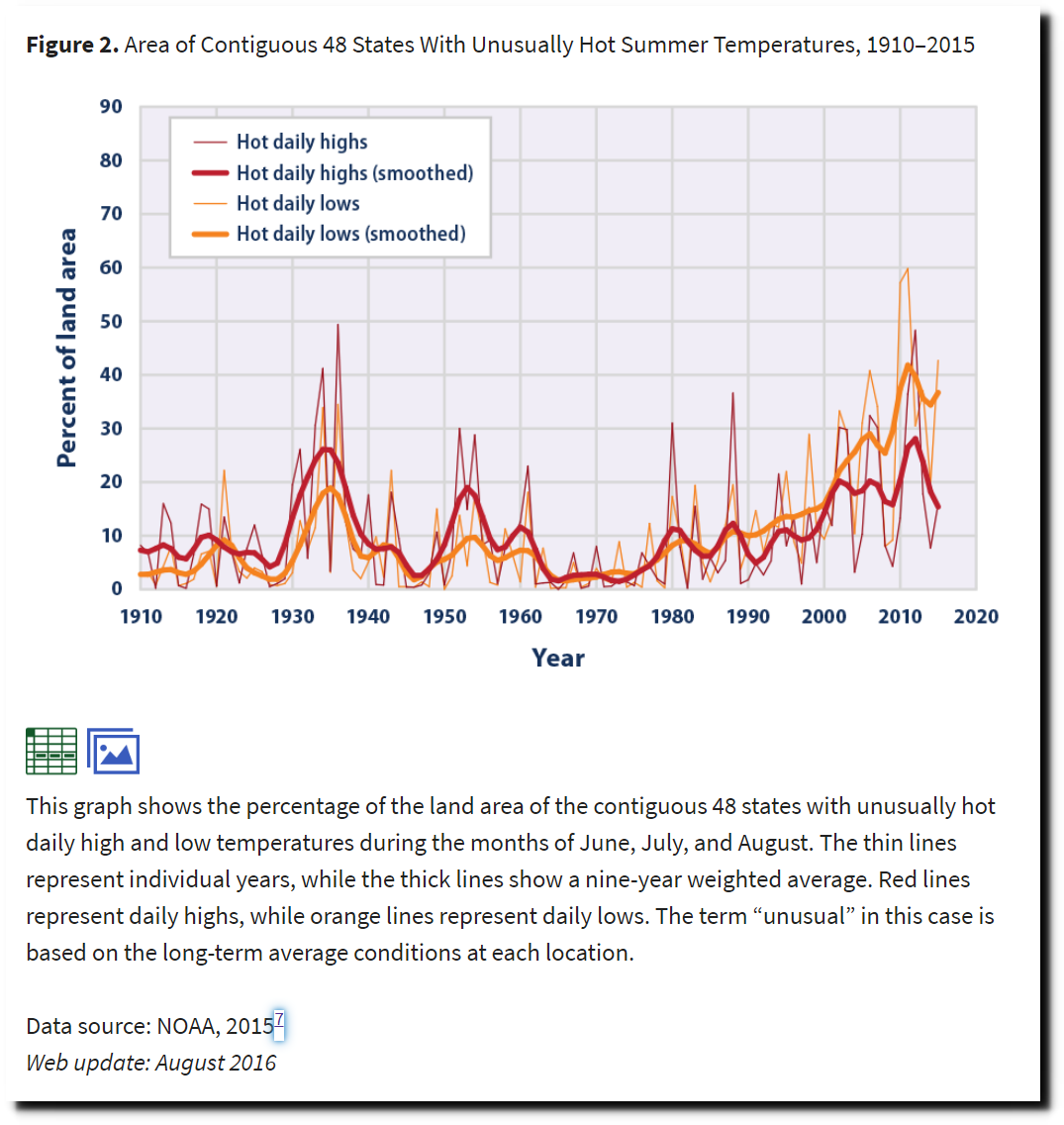
The National Climate Assessment (NCA) shows that summers used to be much hotter in the US.

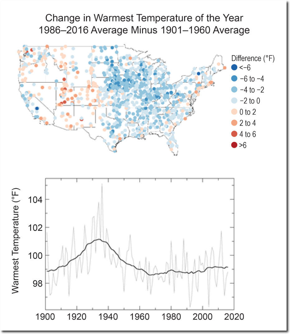
Temperature Changes in the United States – Climate Science Special Report
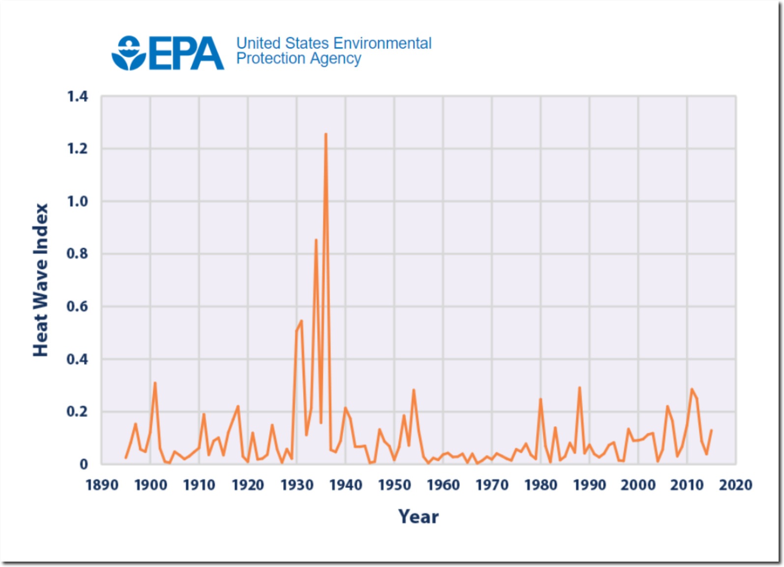
The EPA shows the same thing.

But another EPA page, using data taken from NOAA’s Climate Extremes Index (CEI) shows that summers are hotter now. This directly contradicts the other two EPA pages.
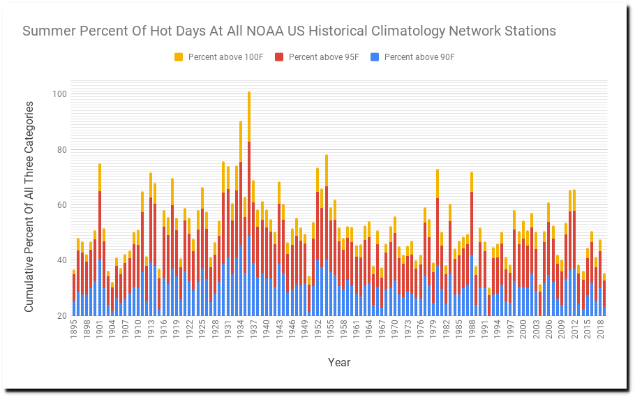
The NOAA US Historical Climatology Network (USHCN) daily temperature data shows the frequency of hot days has plummeting in the US over the past century – in agreement with the NCA and EPA data, but in disagreement with the NOAA CEI graph above. Also note that the numbers on the right side of the graph are inflated, because of the late addition of several hot stations like Death Valley.
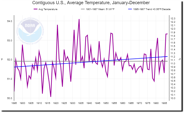
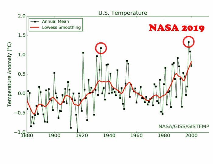
So let’s look at what is wrong with NOAA data. Their current graph shows a lot of US warming since 1895.

Climate at a Glance | National Centers for Environmental Information (NCEI)
But thirty years ago, NOAA reported that the US was not warming.
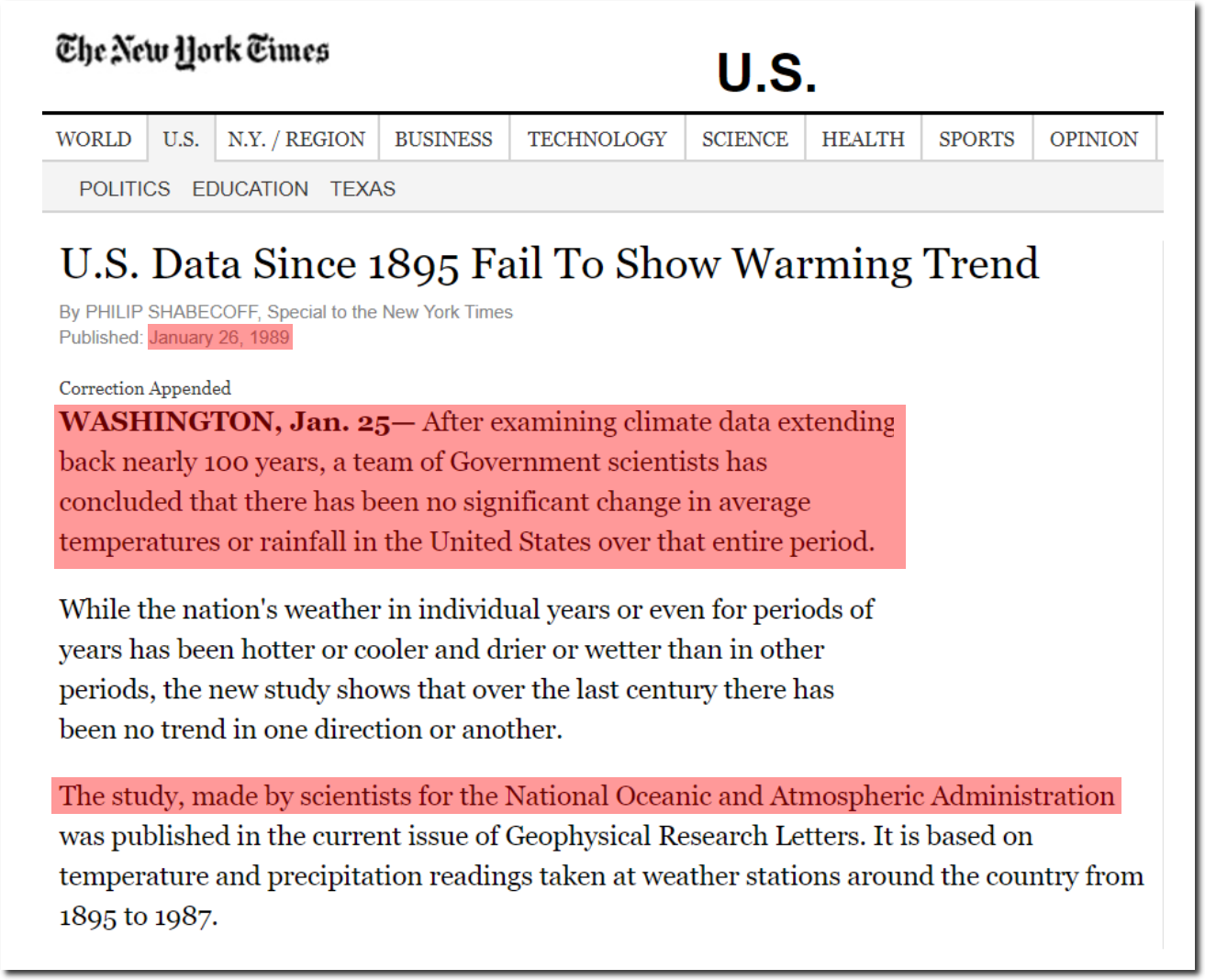
U.S. Data Since 1895 Fail To Show Warming Trend – NYTimes.com
Their current graph from 1895 to 1987 shows warming during that period, so we know that NOAA has altered their data over the past 30 years.
Climate at a Glance | National Centers for Environmental Information (NCEI)
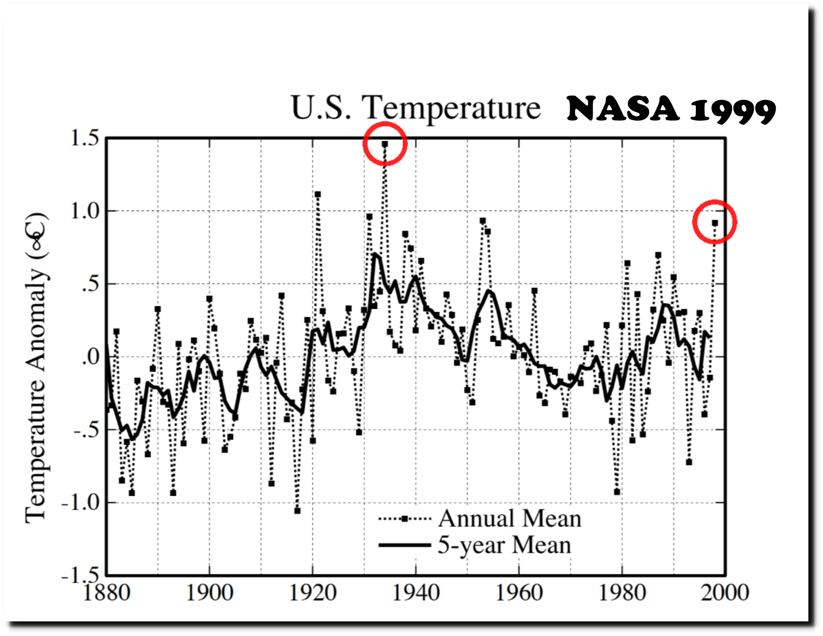
Twenty years ago, NASA’s James Hansen was upset that the US was cooling – even as CO2 increased.
How can the absence of clear climate change in the United States be reconciled with continued reports of record global temperature?
in the U.S. there has been little temperature change in the past 50 years, the time of rapidly increasing greenhouse gases — in fact, there was a slight cooling throughout much of the country
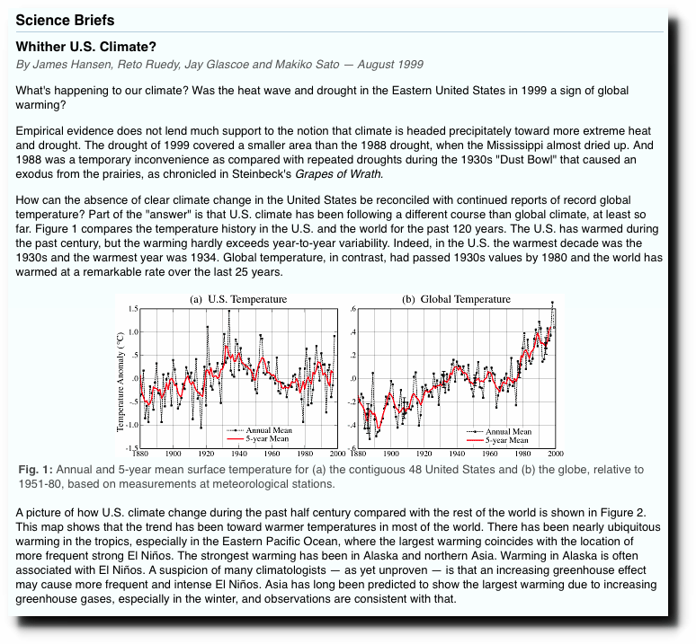 NASA GISS: Science Briefs: Whither U.S. Climate?
According to NOAA, the vast majority of high quality long term daily temperature data is from the US, and in fact there is little or no high quality data over most of the Earth.
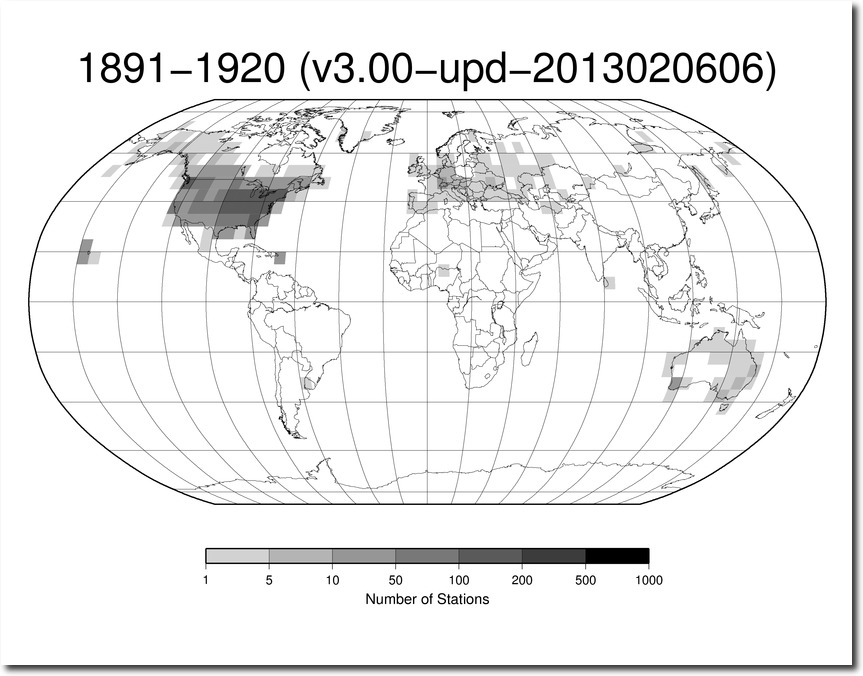
Index of /pub/data/ghcn/daily/figures/
So the obvious answer to Hansen’s question is : the reason the NASA US temperature graph differed from their global graph, is because their global graph was defective.
But that wasn’t the answer Hansen wanted, so instead of correcting the global temperature graph, he and NOAA chose to corrupt the US temperature data. The turned seventy years of cooling into warming.
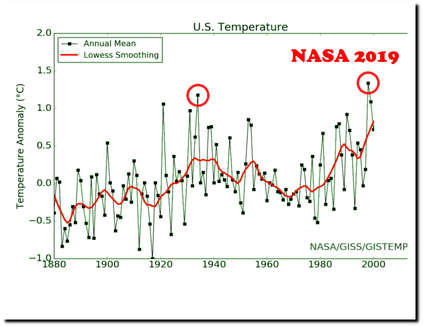
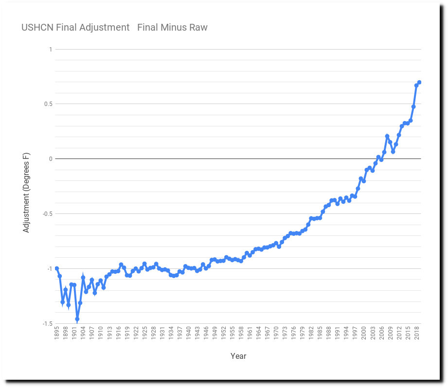
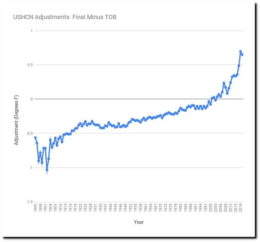
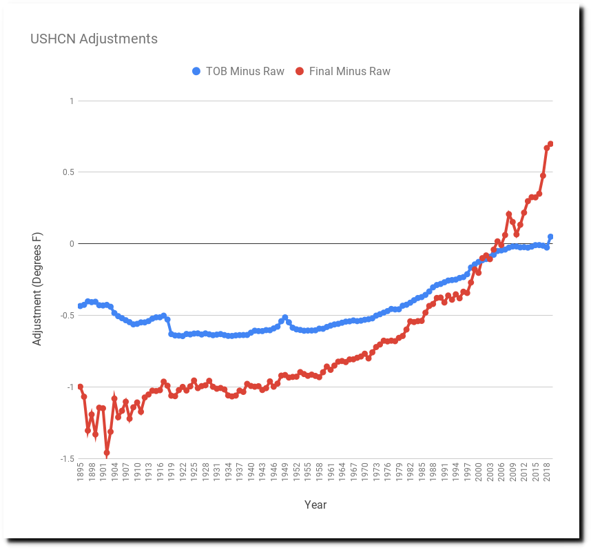
They did this through a set of adjustments which can bee seen in the graph below. The blue line is the measured (raw) temperatures, and the red line is similar to the graph they release to the public. They turn cooling into warming – by cooling the past and warming the present.

The graph below shows the magnitude of the adjustments.
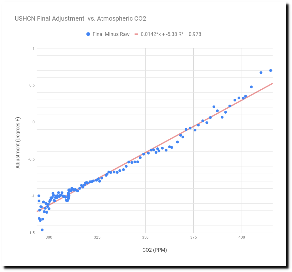
When plotted against atmospheric CO2 below, you can see that they are altering data to precisely match their theory.
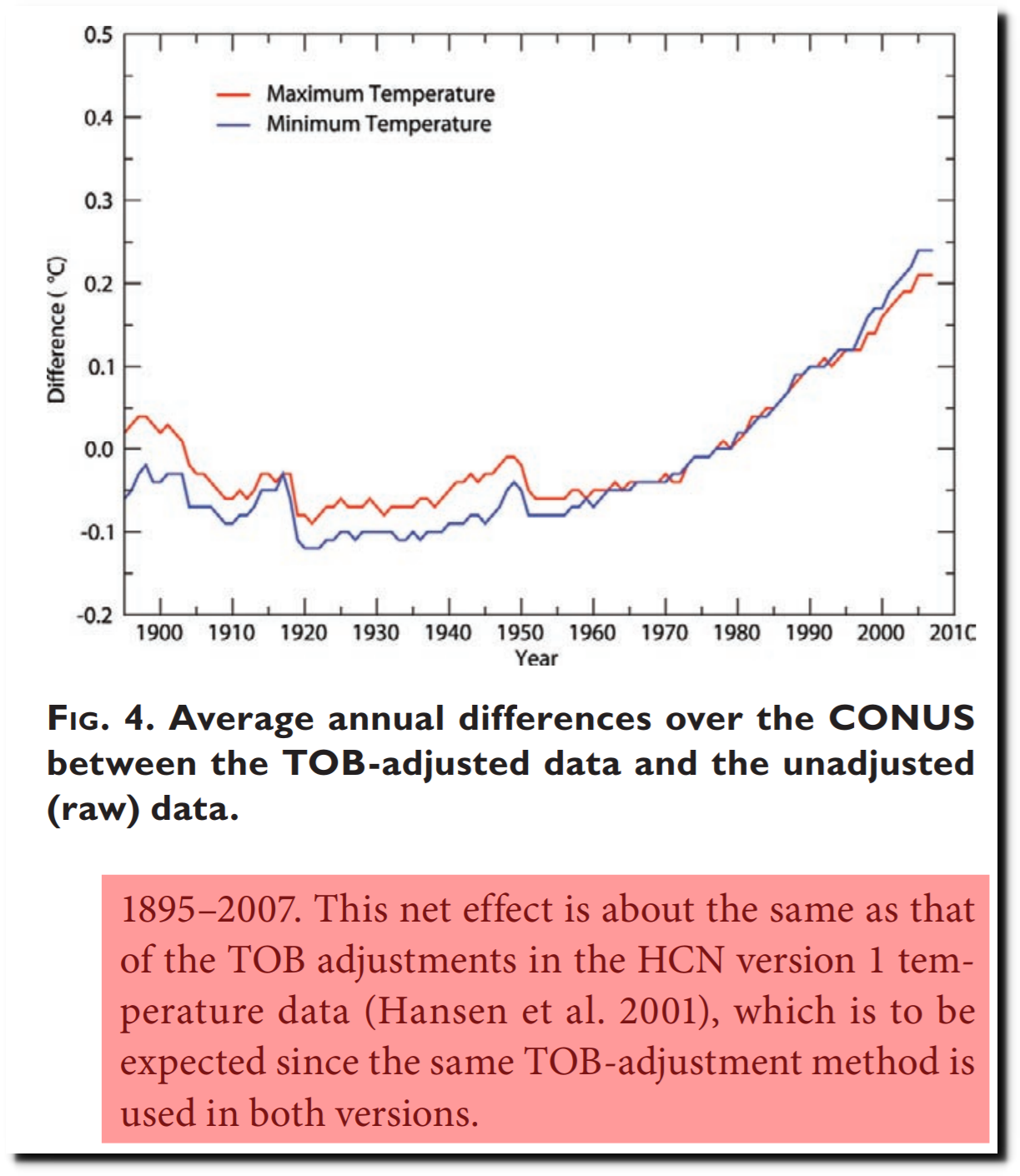
The adjustments are done in two steps. The first one called the “Time Of Observation Bias” (TOB) adjustment, and the other is the “Final” adjustment.
The TOB adjustment is based around a belief that the time of day when observers reset their min/max thermometers has changed over time. NOAA believes that most observers used to reset their thermometers in the afternoon, but now they do it in the morning.

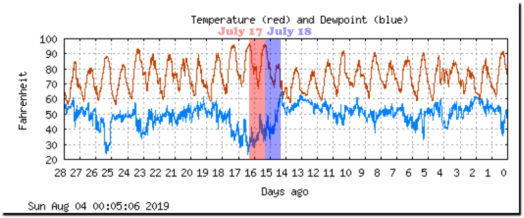
The graph below of Boulder, CO temperatures shows the potential problem with resetting your thermometer only once per day in the afternoon. If you did that, you would have recorded maximums of 93 degrees on both July 17 and 18, even though the maximum temperature on July 18 was only 81 degrees. This would be an incredibly dumb thing to do, and would tend to bias your average temperature upwards. Similarly, if you reset your thermometer in the morning you would have the opposite problem. I had a min/max thermometer when I was seven years old, and it took me about one day to realize that you have to reset the maximum temperature in the morning, and the minimum temperature in the afternoon. That is the only way to get consistently accurate readings.
NCAR Foothills Lab Weather (english, monthly)
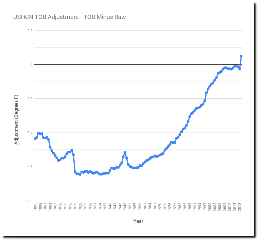
During the 1990s, NOAA started altering US data for their model of TOB – apparently based on a belief that 80% of observers in the 1930s were stupid and ignorant. The black line below shows the 0.3F adjustment they made – cooling the past and warming the present. Note that the adjustment stopped changing after 1990.
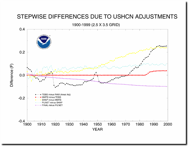
Their current adjustment is almost twice that large, 0.3C (0.54F) – though they claim it is the same algorithm. Government math at its finest.
Here is the current TOB adjustment from the most recent NOAA monthly data.
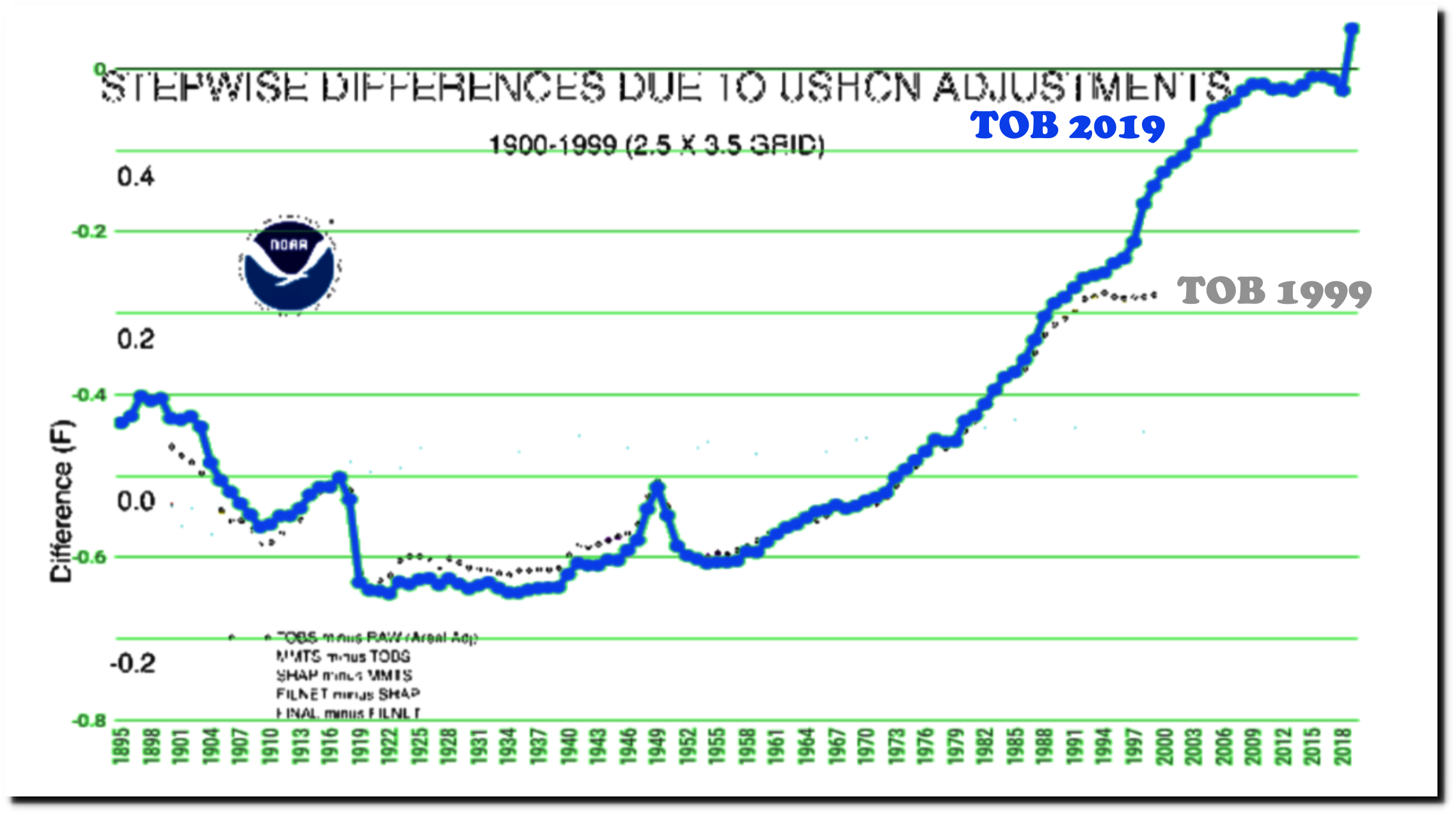
The graph below compares the original TOB adjustment in black, with the current adjustment in blue. The adjustment used to go flat after 1990, but now forms a hockey stick.
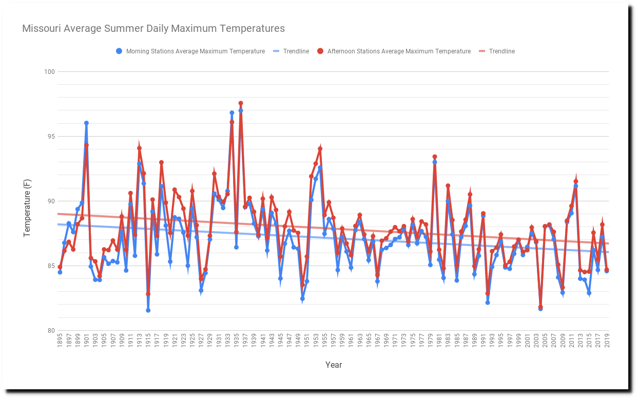
I have new tools in place which allow me to do detailed analysis of the TOB adjustment, to test its validity. The graph below plots the summer 1936 average daily maximum temperature of all Missouri stations which took their readings during morning/night in blue, and all stations which took their readings during afternoon/evening in red. The yellow line is the average for all Missouri stations this summer. The reasons I used Missouri are : they have an excellent temperature record, the state is small, and had a relatively even mix of morning and afternoon stations during 1936.

As you can see, there is very little difference between the morning and afternoon stations from 1936, but there is a huge difference between 1936 and 2019. This summer has been thirteen degrees cooler than 1936 in Missouri.
The afternoon stations in the graph above, average about 0.7F warmer than the morning stations. Let’s look at what is causing this. The trend since 1895 is nearly identical for both groups, with the set of afternoon stations consistently warmer by about 0.7F, until the most recent decade.
The cause of this is that the afternoon stations in 1936 averaged about half a degree of latitude (35 miles) further south, which corresponds to about 0.9F warmer temperatures. The rule of thumb is that one degree latitude corresponds to 1C (1.8F) change in temperature.
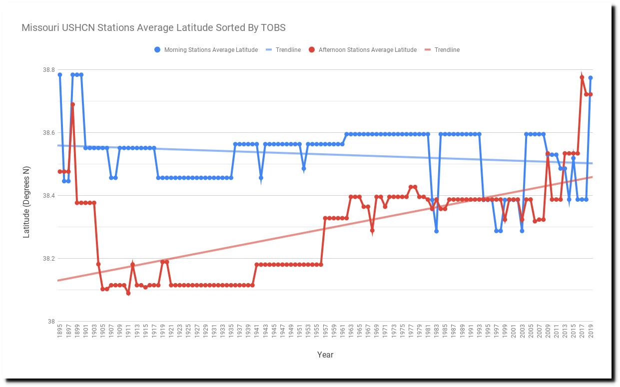
The entire (tiny) difference between morning and afternoon stations can be completely accounted for by differences in latitude. There is no indication TOB has any impact on measured temperatures.
Station information was taken from here. NOAA is making it harder and harder to find this information, so I had to pull it off the web archive.
1936 Morning Stations
USC00232809.dly : FARMINGTON MO 37.7922 -90.4103
USC00234271.dly : JEFFERSON CITY WTP MO 38.5853 -92.1825
USC00234705.dly : LAMAR 7N MO 37.5983 -94.2842
USC00234825.dly : LEBANON 2W MO 37.685 -92.6939
USC00234850.dly : LEES SUMMIT REED WR MO 38.8803 -94.3358
USC00234904.dly : LEXINGTON 3E MO 39.1828 -93.855
USC00235541.dly : MEXICO MO 39.1756 -91.8861
USC00235671.dly : MOBERLY MO 39.4194 -92.4369
USC00235834.dly : MTN GROVE 2 N MO 37.1542 -92.2619
USC00238523.dly : UNIONVILLE MO 40.475 -93.0031

1936 Afternoon Stations
USC00230204.dly : APPLETON CITY MO 38.1872 -94.0283
USC00230856.dly : BOWLING GREEN 1 E MO 39.3444 -91.1711
USC00231037.dly : BRUNSWICK MO 39.4247 -93.1331
USC00231364.dly : CARUTHERSVILLE MO 36.1875 -89.66
USC00231711.dly : CLINTON MO 38.395 -93.7711
USC00231822.dly : CONCEPTION MO 40.2394 -94.6833
USC00232289.dly : DONIPHAN MO 36.6206 -90.8125
USC00235027.dly : LOCKWOOD MO 37.3908 -93.9492
USC00235253.dly : MARBLE HILL MO 37.3036 -89.9664
USC00235976.dly : NEOSHO MO 36.865 -94.3603
USC00237263.dly : ROLLA MISSOURI S&T MO 37.9567 -91.7761
USC00237963.dly : SPICKARD 7 W MO 40.2472 -93.7158
USC00238051.dly : STEFFENVILLE MO 39.97 -91.8875
USC00238223.dly : SWEET SPRINGS MO 38.9664 -93.4194
USC00238466.dly : TRUMAN DAM & RSVR MO 38.2597 -93.4136
USC00238725.dly : WARRENTON 1 N MO 38.835 -91.1386
Missouri is only one state. But if TOB adjustments are invalid there, then the adjustment is bogus. But this story gets worse. Even with the TOB adjustment, the US has been cooling for the past 20 years. However the final adjustment, which is what the public sees, NOAA shows the US warming rapidly over the past 20 years.
The TOB and final data have diverged in a hockey stick over the past 20 years.
The final adjustment is very poorly defined, but it appears to be an artifact of fabricating data. Every month, a certain percentage of the 1,218 USHCN stations does not report, or NOAA chooses to alter the station’s data that month. When they do that, they mark the data with an “E” (estimated.) The data below is for Bruceton Hill, West Virginia. Every month so far this year is either missing or altered by NOAA for some other reason.
![]()
The graph below shows the percent of fabricated data in the final data base. They used to fabricate about 10% of data, but now they fabricate about half of it.
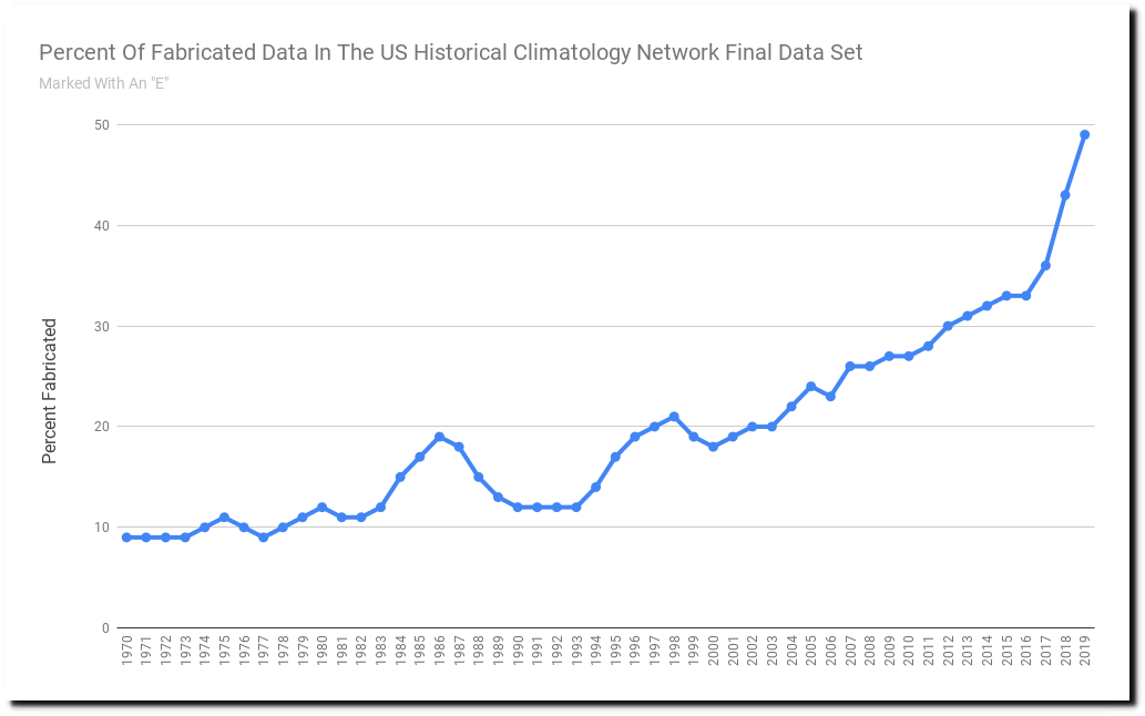
Between the bogus TOB adjustment and the 50% fabricated data in the final adjustment, NOAA can create any shaped graph they want. And that is how they turn cooling into warming. And remember that all of this was done to make the high quality US temperature record match the bogus global temperature graph – which James Hansen wanted the world to believe. And as an extra bonus, Michael Mann used the fake global temperature graph to make the MWP disappear.
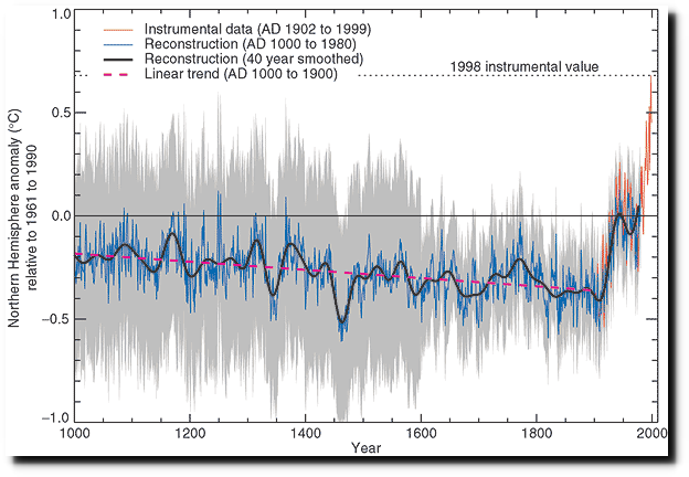
IPCC Third Assessment Report – Climate Change 2001
It is like the losing sports team altering the score after the game is over, to make themselves the winner. If LA was allowed to do that, they would be Super Bowl and World Series champions.
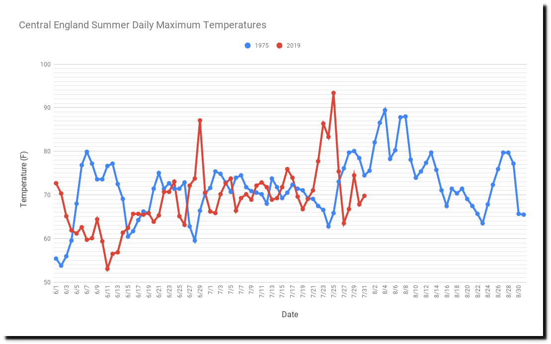
The summer of 1975 had two prolonged heatwaves in Central England, and averaged three degrees warmer than this year’s “record hot summer.”

12 Aug 1975, 6 – The Guardian at Newspapers.com
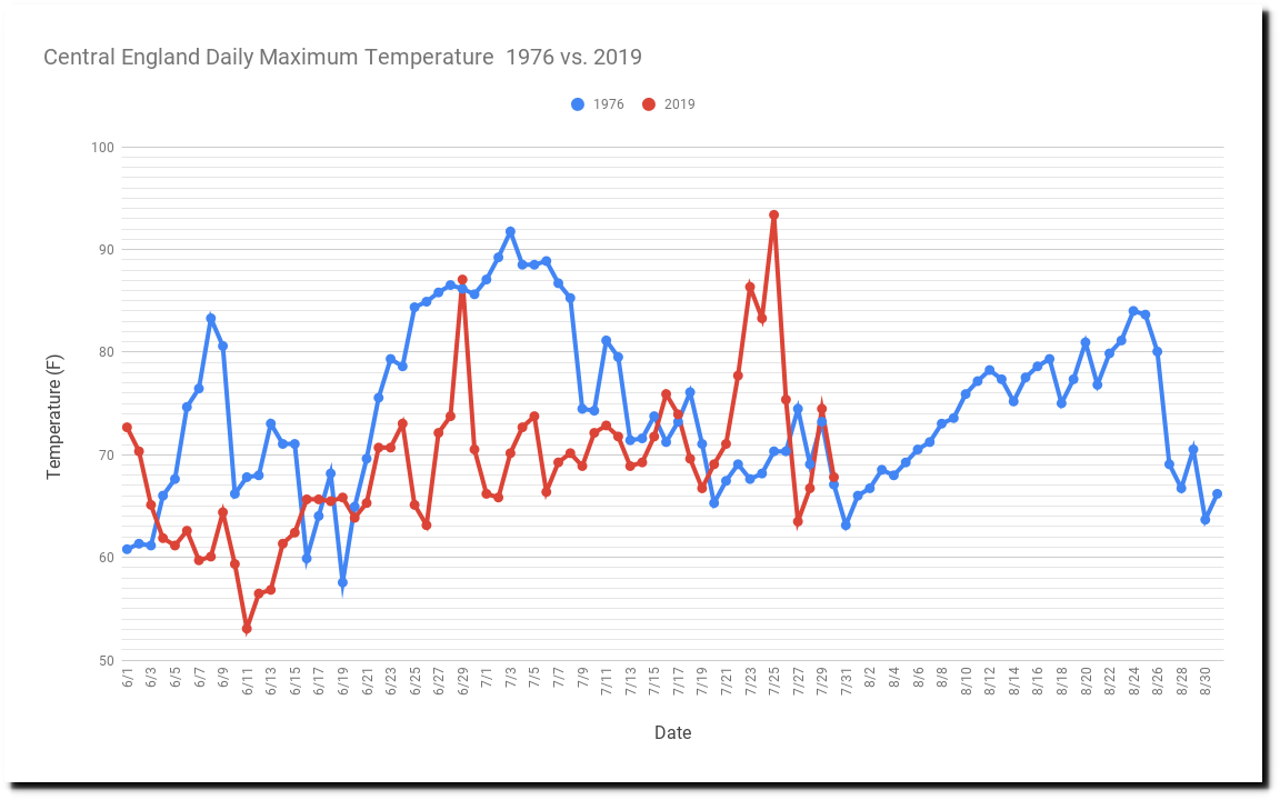
Similarly, the following summer was five degrees warmer than this year.
The 1975 heatwave wasn’t enough to erase post 1940’s global cooling however. That required data tampering by NASA and NOAA.
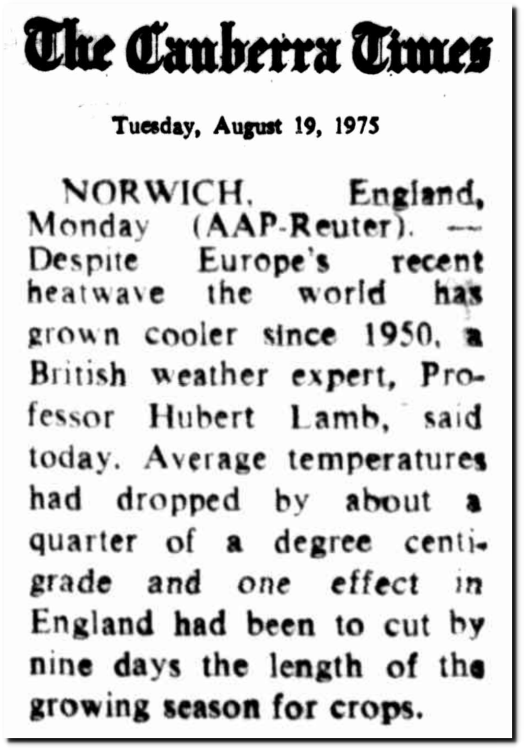
This year’s “record hot” summer in England has averaged five degrees cooler than the summer of 1976.
Same story as in Paris. One hot day is climate, but an entire summer is just weather.
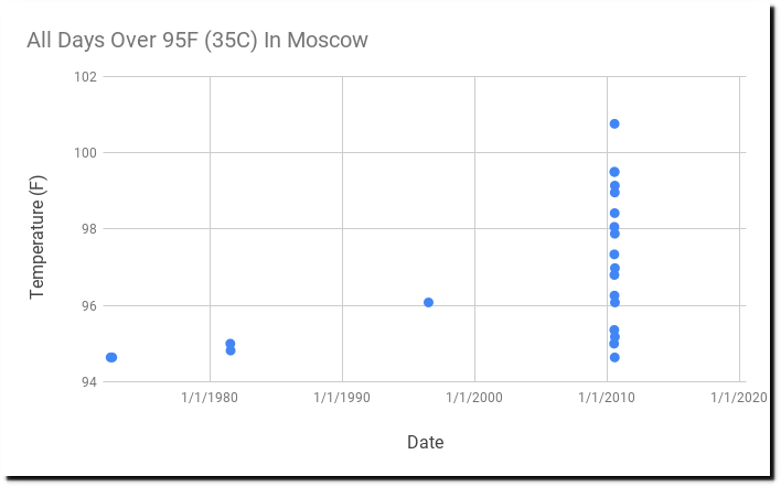
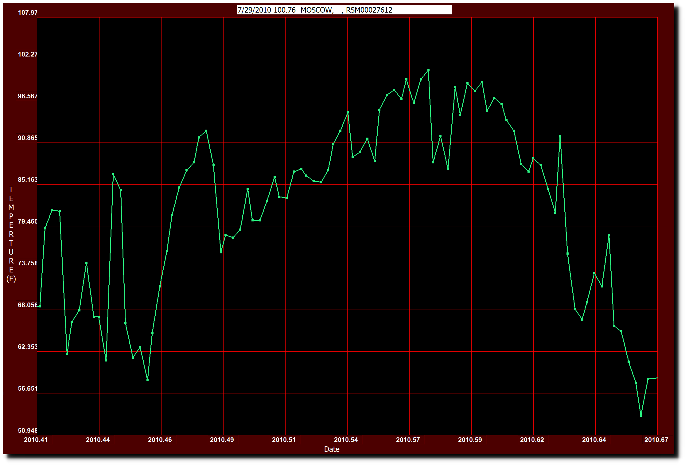
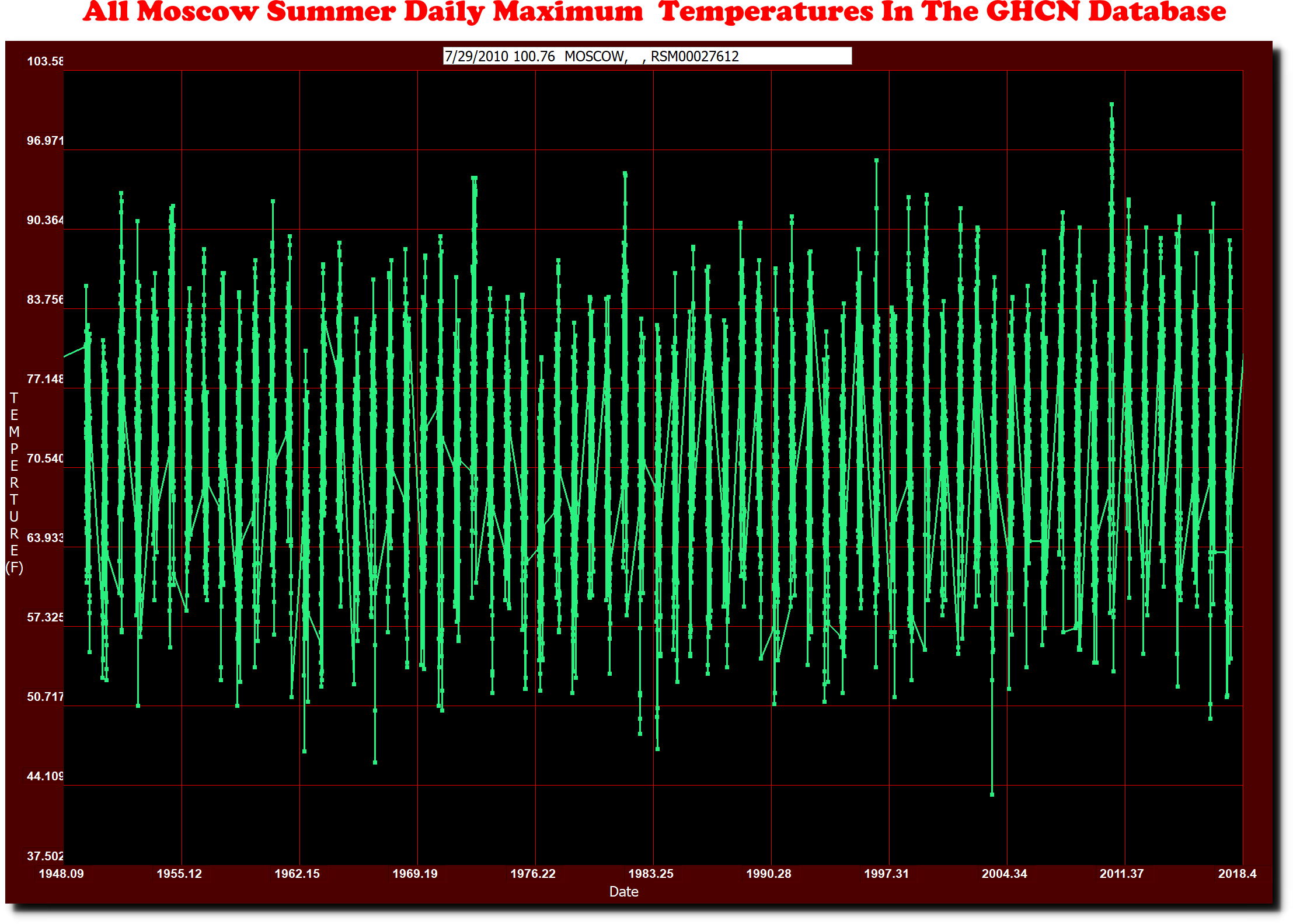
Moscow has had twenty two days over 95F (35C.) Two occurred in 1972, two in 1981, one in 1996, and the rest in 2010.
7/7/1972	95
8/21/1972	95
7/22/1981	95
7/30/1981	95
7/11/1996	96
7/17/2010	95
7/22/2010	95
7/23/2010	97
7/24/2010	98
7/25/2010	97
7/26/2010	100
7/27/2010	96
7/28/2010	100
7/29/2010	101
8/2/2010	98
8/3/2010	95
8/4/2010	99
8/5/2010	98
8/6/2010	99
8/7/2010	95
8/8/2010	97
8/9/2010	96
When the 2010 heatwave occurred, Seth Borenstein announced the end of the world.
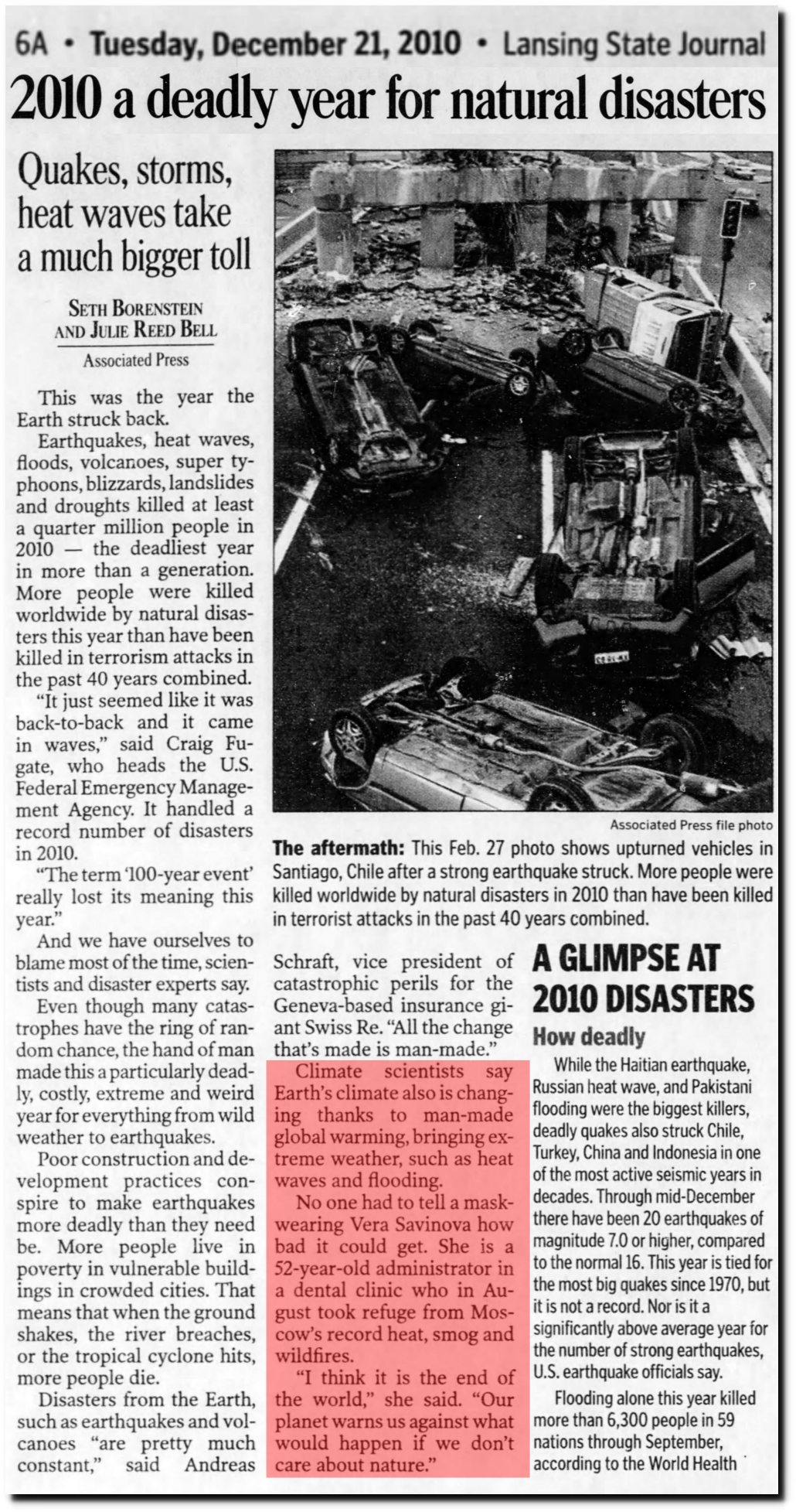
21 Dec 2010, Page 6 – Lansing State Journal at Newspapers.com
There hasn’t been a repeat of the heatwave, and temperatures in Moscow have been cold this summer. So experts moved the apocalypse to Paris and London and Greenland for their three day heatwaves.-
