
We are seeing unprecedented growth of Arctic ice this autumn.
After the shortest melt season on record, and the fastest growth on record, Arctic sea ice is the highest for the date since at least 2004.


Similarly, Greenland has gained a record 200 billion tons of ice since September 1. This is more than 50% above normal.


The record growth of Greenland ice has been associated with record cold, approaching -60C last month in the interior of Greenland.

NASA and NOAA criminals claim that this is the hottest year ever, but they are lying. Arctic amplification is the most fundamental tenet of global warming theory, and we are seeing the exact opposite. Satellites show that 2015 is 0.26°C cooler than 1998.

The NASA hottest year ever claim was created by massively tampering with data. It is a complete fraud.
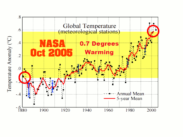
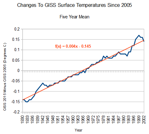
The data tampering includes a scientifically untenable linear increase of 0.3°C between 1930 and 2002. There is no physical phenomenon which could account for this type of linear error. A smoking gun of fraud.
Spreadsheet : Fig.A.20151031.xls
2005 version : Fig_A.txt
2015 version : Fig.A.txt
Arctic ice doesn’t lie, but NASA and NOAA climate scientists do.

Reblogged this on Climatism and commented:
With record Artcic sea ice growth and record cold in the region, It’s little wonder cherry-picking Climate change alarmists have gone cold on the arctic.
On the road to Paris, they are going with the trumped-up “Hottest year ever” card. Along with the usual ‘modelled’ dire forecasts of famine, drought, flooding, exteme this or that…..
What a joke this entire climate fiasco has become. Made more insane in that 39 years ago, the same dire predictions were forecast for humanity in the face of ‘global cooling’ – the exact opposite phenomenon. !?
This will be ignored by the so-called mainstream media
Maybe “Team Reggie” could detonate their perpetually malfunctioning “Brawndo Fueled Blowhard Blowtorch of Ice Armageddon” to get media attention and maybe some government grants for an new one.
Otherwise, all I can say is Great Job Reggie!!!!
Reblogged this on WeatherAction News.
Why are DMi and Sunshine hours not agreeing on this?
https://sunshinehours.files.wordpress.com/2015/10/arctic_sea_ice_extent_zoomed_2015_day_303_1981-2010.png?w=1024&h=682
steven just takes the “wrong” graph.
http://ocean.dmi.dk/arctic/plots/icecover/icecover_current_new.png
is the “better” and newer DMI approach.
Steven perfers to ignore this.
Who cares?
Steven takes the plot he has always worked with. We are aware of the new plot because like you, we can read, but it’s not consistent with the plot he posted for years.
The impact of coastal areas masking was discussed here before. You don’t know that but who cares?
The 15% DMI graph this year is following very closely 2013 and 2014 in the last 40 days. In addition, in 2013 and 2014 solar radiations were high or going up at the end of the year- due to the second peak of the solar cycle, that lasted from Oct 2013 to Jan this year.
Now the radiations are in transition to the low levels of the end of the cycle. That’s when the fun starts for us, the skeptics.
I’m expecting the Arctic ice extent to be *greater*, in the next months, than in the same period of the last two years, both in the 15% and the 30% DMI graphs.
Steve’s post makes perfect sense, if you understand what he said.
The graph tony is using is 30% sea ice with coastal areas masked. Not sure what sunshine hours are using.
MFK is looking at a 15% chart without coastal areas masked. not sure myself what is more accurate but having a higher 30% value probably means that volume is up compared to the most recent 10 years or it could just mean that there hasn’t been a big storm yet to break the 30% ice up.
The amount of multiyear ice (MYI) is increasing because it’s accumulating in the “right place” (N. Canada instead of N. Asia).
This makes it less vulnerable to local storms, I believe.
Another important factor is that the PDO is starting to go down
http://www.climate4you.com/images/PDO%20MonthlyIndexSince1979%20With37monthRunningAverage.gif
AMO has also switched.
Gunna get cold up there!
Hudson Bay held ice throughout much of the summer and remains much colder than usual. Watch for a rapid refreeze of the Bay over the next few weeks. That will be a bit earlier than is typical and that will keep the ice area levels up. Fox basin is freezing over now. Baffin will be filling with ice quickly this month too.
Eastern Canada and the NE of USA will be having another very cold winter.
It would be nice if we have the Great Lakes freeze solid and major blizzards for the first couple of weeks of December both here and in Europe.
I would LOVE to see the Paris Paris-ite gathering snowed out.
Reblogged this on Climate Collections.
The article was obviously written before the EPA discovered that candle-lit Halloween pumpkins contributed to global warming. Here in California where we have more spooks and kooks that any other state, we had a bigger than usual Halloween. All that California pumpkin candle-generated heat is blowing east, and no doubt, causing Hudson Bay ice to boil. I trust you will update your seasonal climate change models to include the “Halloween Pumpkin Effect
Steven, you used the wrong graph. This is the correct graph:
http://ocean.dmi.dk/arctic/icecover.uk.php
Why is it “wrong”?
One issue with the 15% plot is that it only goes back to 2011, where as the 30% plot with coastal masking goes back to 2005.
Regardless of the metric you want to use, the main message to me is that the Arctic ice has NOT melted out as many scientists predicted just a mere 5 – 8 years ago. Don’t you agree that those predictions were spectacular failures of climate science?
Frank, the graph is wrong because it doesn’t include the coastal zones. The text below the graph states what is wrong and where to go to get the correct graph. But Steven Goddard removed that text so you wouldn’t see it, and so you would think the graph was correct. But Steven duped you, apparently. Here is the graph Steven used (with the warning text): http://ocean.dmi.dk/arctic/old_icecover.uk.php
And here is the correct graph: http://ocean.dmi.dk/arctic/icecover.uk.php
“Regardless of the metric you want to use, the main message to me is that the Arctic ice has NOT melted out as many scientists predicted just a mere 5 – 8 years ago.”
That’s the wrong message, Frank. That’s not what is happening. Arctic ice is not growing, let alone showing “unprecedented growth.” Arctic ice continues to decline. Steven Goddard wanted you to get the wrong message, and that’s what you got.