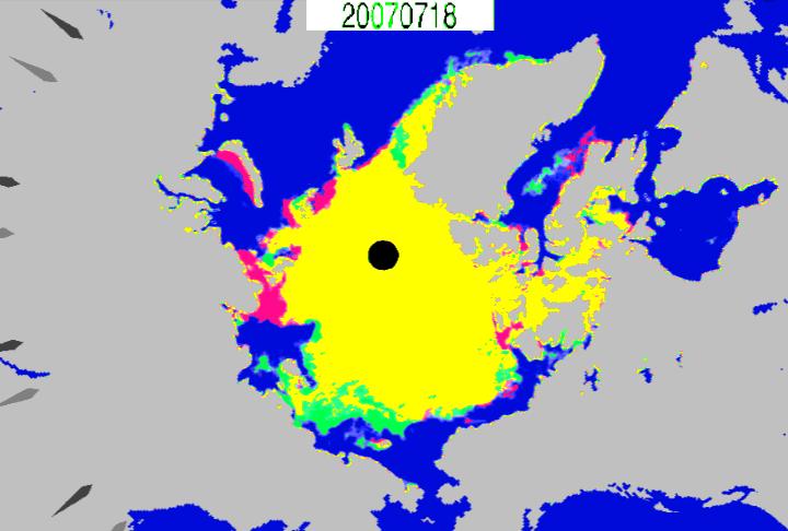
July 18, 2007 showed about the same ice extent as the same date in 2011, but this was due to doomed ice on the Atlantic side of the Arctic (red.) In 2007, the ice on the Pacific side had already started disappearing very fast (green.)
This is why alarmists are probably going to be disappointed by what happens to the extent graphs over the next few weeks. The red area will almost disappear, and the green area will get larger.


“July 18, 2007 showed about the same ice extent as the same date in 2011, but this was due to doomed ice on the Atlantic side of the Arctic (red.)”
That sentence makes no sense to me. What Is “doomed ice”, and in what sense does “doomed ice” “explain” why the ice extent for a pair of dates
are roughly similar? I would expect the ice extent for such a pair of dates to be roughly similar – it needs no explanation.