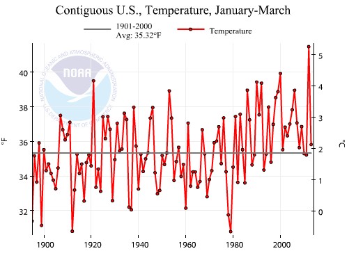
NCDC shows that year-to-date temperatures in the US are above average.
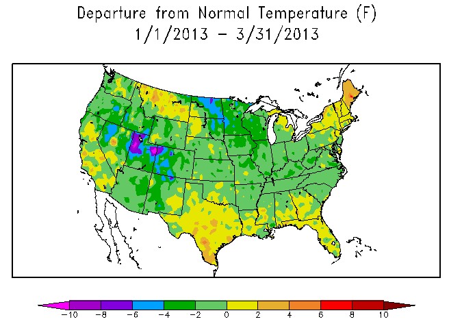
The vast majority of the country was below average for January-March, much of it far below average. This has been a cold year in the US, and NCDC is committing blatant fraud by claiming that it has been warmer than normal.
Current Climate Summary Maps – Powered by ACIS – High Plains Regional Climate Center
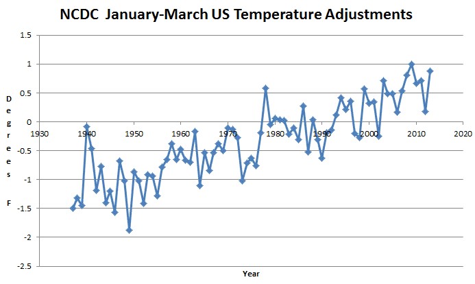
NCDC is manipulating January-March temperatures upwards by more than two degrees relative to the 1930s.
It is time for this data tampering to end. There is absolutely no scientific basis for the ongoing upwards adjustments. No one has even presented a theoretical rationale for what we are seeing.
The game is over for the hockey team.


Up to 8″ of permanent drought in Iowa today and not of the white kind. Its been raining like mad there most of the day. Also a little sanity in the Democratic Senate.
No, it’s all legit. You see that little dark red pixel in Maine? Well, it wasn’t just >10°F, it was >10,000,000°F for a few days (maybe some of Al Gore’s core leaked out from the center of the earth). Or perhaps a localized phenomenon due to unexplained thermometer aberrations.
So if you average it all together, the US actually was warmer than normal.
I don’t get it. The top graph shows 2012 to be much colder than 2011 even though the Spring was quite warm. The graph does NOT show anything regarding the first months of 2013. So what’s the problem?
What on earth are you talking about?
Count the dots carefully after 2000, and you should confirm that the last dot on the right IS for 2013. The much higher dot just before it is 2012.
I thionk Higley, like me, is maybe confused by the 1st graph, as yearly delineations are not clear. I do not know where the 1st quarter of 2013 is on that chart, and can only eye ball to 2000, assuming each point represents one year? The right axis represents what?
2013 on the top chart is showing above the (1901-2000) average. ( Count the dots. The last one is 2013) While the departure shows the same period well below normal for most of the country.
Click first link and March 2013 is now shown as negative anomaly.
I an discussing year to date temperatures, not March. You have to select year to date from the Time Scale menu.
If I’m not mistaken the baseline/normal for the NCDC chart is 1901-2000, whereas the baseline/normal for the ACIS anomaly map is 1981-2010. If so, the anomaly values cannot be compared.
Exactly. Also, if you go to the NCDC site and change the baseline period to 1895 through 2011 or 1895 through 2012, it shows that temperatures are below average.
Oh, and if you set the NCDC data to match the base period used in the ACIS chart (1981 – 2010), it also shows year to date as below average.
Please cut the bullshit. This year has been in the bottom 30 since 1895 and they are upwards adjusting it by almost two degrees relative to 1940.
How could anyone stick up for these crooks?
You’re using graphs that use two different baseline periods. Trying to paper over that fact doesn’t help your case.
This year has been far below average and NCDC shows it above average. Why do promote fraud?
Sent from my Virgin Mobile Android-Powered Device
Again – when you set the NCDC to use the same base period as the ACIS uses, then no, the NCDC data do not state that this year is above average.
Using the 1981-2010 baseline period, as the ACIS uses, the NCDC states that 2013 is 0.93F below normal.
This year has been far below average and NCDC shows it above average.
What baseline period are you using to define average temperatures? Because if your baseline for average is 1981 – 2010, then no, NCDC does not show above average temps.
(Somehow I suspect you won’t answer that question, but I would be happy to be proven wrong.)
What is the methodology for making adjustments?
There isn’t any. The adjustments were supposed to go flat after 1990.
Is there anyway to sue for falsifying public records?
Someone in the MSM needs to pick this up and investigate. If there is not a valid reason, and for the life of me, I cannot figure out what one would be, then this will break open once and for all the credibility questions that many of us in the skeptic camp have had for years. How can we get anyone in the MSM to take notice? Perhaps who ever authored the recent Reuters piece?
The one adjustment NCDC should make — for the urban heat island (UHI) effect — the agency simply ignores, suggesting that “homogenization” takes care of the problem. But homogenization doesn’t account for poorly sited thermometer stations next to airports, exhaust fans and pavement. If anything, NCDC should be adjusting temperatures down. The USHCN network is still in bad shape. Can we really trust all the temperature readings?
[email protected]
For what its worth, I just sent the following to Mr. Doyle.
Dear Mr. Doyle,
I am writing you to suggest that you undertake an investigative journalism effort into the reliability of the temperature data provided by the national organizations in the USA and UK.
I believe in global warning in that CO2 without doubt is a “greenhouse gas”. However, I am a skeptic with respect to the reliability climate models and potentially the accuracy of the underlying data used in them. Further as someone who worked in public policy for three decades, I am all too familiar with the dynamics of policy advocacy and how it can create distortions from sound scientific reasoning.
All that said, I have read on a variety of skeptic blogs that baseline temperature data is constantly being adjusted so as to indicate temperatures were lower in past years and are higher today than actual readings indicate. While there may be a reasonable explanation for this, it certainly appears to be suspect, again particularly when those who produce the data bases have assumed an advocacy role where quite possibly, in their minds, “the ends justify the means” and hence inappropriate adjustments to temperature data are made.
http://stevengoddard.wordpress.com/2013/04/18/ncdc-fraud-smoking-gun/#comment-216664
At a minimum, it would seem that reputable scientists would at least start with reporting baseline data (actual readings) of temperatures and provide full transparency for any adjustments made and the reasons therefore.
Contrary to the stereotypes by many of those who are seriously concerned about global warming, most skeptics are not “deniers”, rather we question the credibility of what we feel has become for many a political cause rather than a scientific endeavor. Hopefully someone in the main stream media will seriously address these credibility issues so that the general public can make better informed decisions about the seriousness of climate change. I hope you will undertake this effort.
Thank you for your consideration.
Sincerely,
Brady Sneath
Tampa, Florida
Ima,
While I commend you for writing that, the problem I have with it is
I am sick and tired of this bullshit nonsense continuing to be perpetrated. CO2 is NOT a fricken “green house” gas. There is NO such thing as a “green house” gas. Quite this stupid nonsense. It is NOT physically possible to have a “green house” gas.
Bravo to you for stepping up to the plate and writing this to a journalist, but cut the bullshit already. You are certainly not representing me nor doing me any favors by continuing to advance a lie. Your actions are noble, but get your FACTS straight first!
You are getting too technical.
From what I have read, such as on WUWT, CO2 causes atmospheric warming. However, its effect declines as concentrations increase and it can only account for about 1/3rd of the warming shown in the climate models. The other 2/3rds is due to “positive forcing” from clouds, humidity, etc. that is not proven. Further the models may not account fully for negative forcing that may offset some of the CO2 impacts. Or for that matter the full impacts from changes in solar output. This is my general understanding of the situation. If I am off base, I would be more than happy to have you, Steve or Anthony or anyone else point out the errors of my ways.
Brady:
The NCDC uses a default baseline of 1901 through 2000 (although you can display data relative to other baseline years, if you wish). The ACIS uses a baseline of 1981 through 2010. Why do you think the baseline should be restricted to 30 years when there is so much more data available?
Explain why it is important to average in 80 years of increasingly tampered data.
Why do you advocate the use of fraudulent data?
Sent from my Virgin Mobile Android-Powered Device
“NCDC is manipulating January-March temperatures upwards by more than two degrees relative to the 1930s.”
I interpret this and the corresponding graph to indicate that NCDC has made adjustments to raw temperature data. If this assumption is correct, then baselines are immaterial to the fact that issue in question is that the temperature data has been manipulated.
If this assumption is incorrect, then I have misunderstood the purpose/message to be derived from the graph.
Who are the Perps? What are their names and positions in the organization?
I think this month will be the hottest ever for a couple of back packers in Boston.