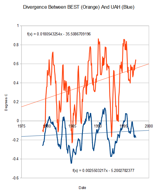
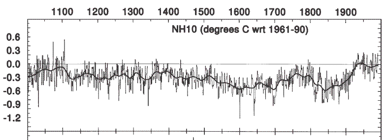
The claimed divergence between Briffa’s trees and measured data is utter nonsense. Until the 1998 El Nino, satellites showed very little warming – while tampered surface data showed seven times as much warming.
The satellite data is in line with Jones, 1998 – which showed very little warming during that period.
The surface temperature record is so corrupted as to be completely worthless for anything other than making hockey sticks.


Thanks Steve for showing the facts as they are.
The woodfortrees UAH graph
http://www.woodfortrees.org/plot/uah/from:1900/to:2014/plot/uah/from:1900/to:2014/trend
has a lower peak at 1998 than RSS
http://www.woodfortrees.org/plot/rss/from:1900/to:2014/plot/rss/from:1900/to:2014/trend
but otherwise they’re very similar.
There was a “step change” at the turn of the century, manifested by the huge ENSO oscillation from 1997 to 2001, the greatest ever recorded I believe.
We’ll probably see another step change in the opposite direction when the AMO negative phase begin.
It will be *the end of the “hiatus”*, but not in the direction that the warmists are expecting.
As recent temps get lower, there will be a need to readjust past temps to continue global warming.
I guess that is why we pay taxes….
Was BEST based on Raw, or Cooked? I thought they used the raw data.
UHI contaminated data. My guess is that stations which showed less warming have been selectively disappeared over the last 30 years.
When “GHCN unadjusted” is compared to raw data records, GHCN show a warning trend. See
http://hidethedecline.eu/pages/posts/temperature-corrections-16.php
Look for Central Park.
Treated as “outliers” and homogenized.