A few weeks ago, some stalker (named Brandon) claiming to be a skeptic was attacking me, saying that my data alteration graphs were incorrect because of how I chose to normalize the data. Had he passed high school algebra, he would have known that the slope of a line is independent of the offset, but here is a quick primer.
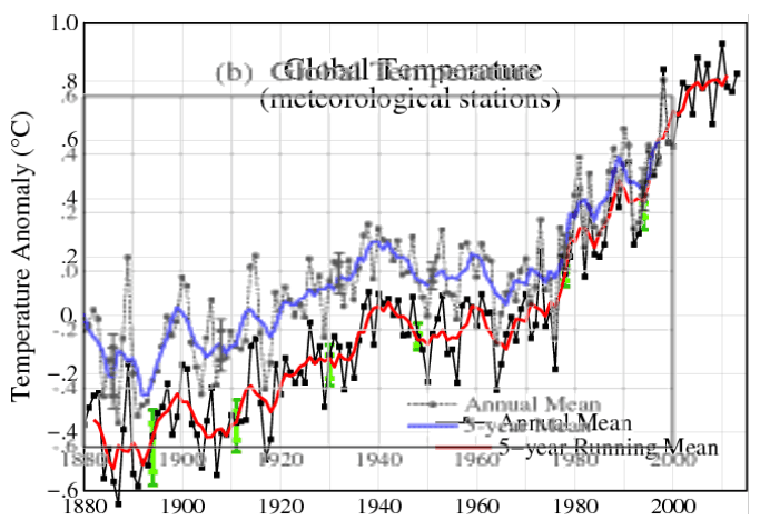
The graph below shows Hansen 1999 in blue, and current GISS in red. The graphs are normalized to the five year mean of the most recent common years, and show how they have cooled the past by almost 0.4C, just since 1999.
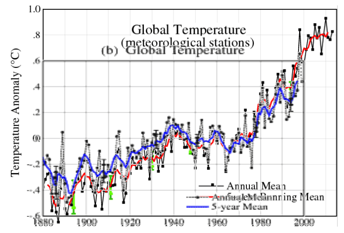
In order to fool simple minded people like Brandon, NOAA/NASA do a nature trick. The graph below shows the two graphs normalized to an anomaly of zero. Note how they cleverly split the tampering between almost -0.2C in the 1880’s, and almost +0.2C in the late 1990’s. This creates the illusion that their tampering isn’t so bad. But it still adds up to almost 0.4C, and is just a way to hide the magnitude of their data crimes.
Using a common baseline of zero is meaningless mathematically, because they have cooled past temperatures during the baseline period. In order to see the magnitude of the tampering, the best methodology is to normalize the most recent five year mean temperatures, as in the top graph.


Brandon! Oh Brandon!, Where are you??? What is your reply???
Figures don’t lie, but liers sure figure!
The word change in ‘climate change’ refers the data only. LIV’s all over the world need a huge wake up call. A climate science fraudster sentenced to do some time in some state pen might do the trick.
State Pen, or Penn State? 😉
The fraudulent criminals need to be sharing time with fellow cell-mate 6′-10″ Gyro Jerry, the considerate inmate who always brings the KY Jelly 😉
Multiple adjustments at different points of the data set without any explanation simply enhance the evidence that this is deliberate data-tampering rather than a single recalculation. Hoisted by their own petard.
Meanwhile the ‘leaders’ of your country do a passable impression of the 3 monkeys.
I am confused as to why you are resting your argument on two stastical outliers in a graph from a 1999 study while denying data that does not have statistical outliers?
Sorry, I don’t translate gibberish