
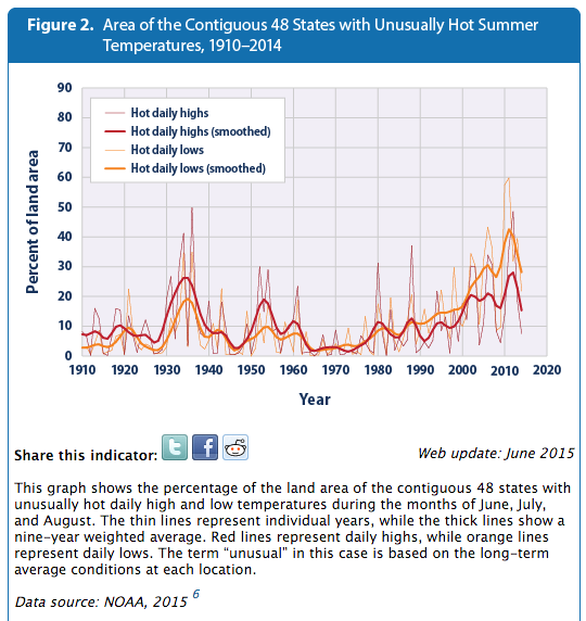
The EPA graph below is based on NOAA adjusted data, and shows that the area of the US affected by hot summer temperatures has increased to record levels.
 High and Low Temperatures | Climate Change | US EPA
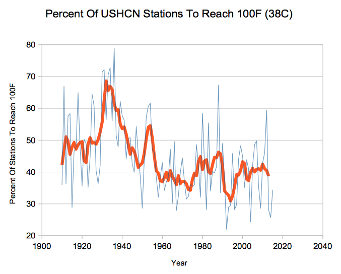
Actual thermometer data shows the exact opposite. The percentage of US stations to reach 100F has plummeted since the 1930’s. This metric should not be affected by any of the published USHCN adjustments.
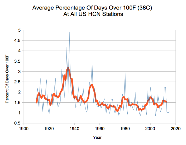
The frequency of 100 degree days has also plummeted.
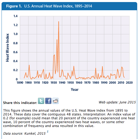
The EPA’s own data shows that heatwaves were much worse in the 1930’s.
High and Low Temperatures | Climate Change | US EPA
The bogus top graph is the result of people tampering with data, and then actually believing the bogus data they generated. The NOAA Climate Extremes Index is junk science.

I expect that because what you are finding is so outrageous, most people on the other side of things just dismiss it out of hand. They just don’t want to know.
Yup.
Cognitive dissonance.
I have found from life experience that the most dangerous type of delusional person, is the one who actually believes their delusions.
WASHINGTON, DC — Humans have triggered the last 16 record-breaking hot years experienced on Earth (up to 2014), with our impact on the global climate going as far back as 1937, a new study finds.
http://wattsupwiththat.com/2016/03/08/claim-human-influence-on-climate-dates-back-to-1930s/
Well that explains everything! Can’t wait for the next “paper”…
WASHINGTON, DC — Humans have triggered the last 162 record-breaking hot years experienced on Earth (up to 2015), with our impact on the global climate going as far back as 937, a new study finds.
Damn them humans!
Damm Gator, if they could have blamed the 1930 on humans earlier they would not have been required to erase the blip.
They thought of what, 60 plus reasons to explain the pause before deciding to get rid of it all together. Now they have made hundreds of adjustments to get rid of the past warmth and eliminate the ice age scare, before deciding it is ok to reinstall it because who done it, why we done it of course.
The “Theater of the Absurd”!
Isn’t it considered science malpractice to change the measurements to corroborate an agenda?
U2 have a song called New York. A lyric line is:
In New York summers get hot
Well into the hundreds
You can walk around the block
Without a change of clothing…
I was born in NYC during its hottest summer, 1966, it has had a sum total of 60 100 degree days in the past 135 years. 4 of which occurred in the summer of 1966 alone.
Lets call “well into the hundreds” 103+. There have been 3 such days since U2 wrote that song and 7 such days in those 135 years; 4 of those dating from the period prior to the summer of my birth.
In other words, the stuff of fiction and lyrics
I will say that the short heat wave of 1977 that followed the famous blackout was a “hot” time in the city: that was a hot month.
I was in New York during the summer of 1966 visiting my grandparents at their beach home in Rockaway. Many nights were too hot to sleep.
My mother cursed me for decades for causing her the torture of being pregnant with me into mid-August that year.
I will add that it was only when i was an adult that I told her that I was born almost 9 months to the day after the November 1965 blackout.
Any time it’s 100 in New York it’s hotter south of there. Nothing special about New York in that department, except it’s hotter than Dublin.
Just google winds of venus, jupiter looses a stripe, jupister gains a spot, jupiter northern lights, saturn northern lights and saturn heat storm. Climate change occured solar aystem wide and has nothing to do with man.
I think it’s time we stopped reporting NOAA failures let’s start reporting their successes … That should reduce dramatically articles on line.
Matter of fact put NASA, IPCC, UN, CSIRO and BoM in there also I will gain an extra day of time each week.
Have they made Muslim feel proud yet? That is like their main objective from the O.
With El Nino past … this year is the start of global cooling. Despite the overwhelming odds against us, we sceptics have won and are still winning the public despite the “warmist year evah” claims from the climate extremists at NASA.
So, what will it be like when the data shows unequivocal cooling? You can already hear the extremists quaking at the knees fearful at the thought of the El Nino cooling.
I can already hear the screams of the data, being tortured into false confessions.
If they are ever forced to explain the bruised and disfigured data they will say it fell on wet basement tiles as it was escorted to the interrogation room. They will also provide a recording of the data blaming itself for not being careful enough and declaring it confessed voluntarily to its crimes against the people.
http://www.quickmeme.com/img/b5/b575e8a9ebe5772616ba6877f3c6bc033d31254eb42c73a224bc6293bc0dbea5.jpg
This reminds me of one of my favorite Dilbert cartoon strips…
http://i.stack.imgur.com/yZQgZ.gif
Hey Scottish Sceptic! “So, what will it be like when the data shows unequivocal cooling?”
My guess is that they will start pushing the “climate chaos” angle. When things go (even) colder and snowier, so much so that it cannot be ignored, they will say, “Oh my gosh! This is just crazy! CO2 is disrupting the climate so much that the weather has become completely unhinged! ANYTHING can happen! Expect the unexpected — drought, flood, heat waves and snow! Be afraid, be VERY afraid!”
If we get ten times as many super snow storms as heat waves, they will just give ten times as much publicity to the single heat wave and the unthinking public will see nothing but chaos.
(I am of course using the word “chaos” in the traditional, non-mathematical sense.)
Is this adjustment independent of the “make-all-measurements-at-midnight” adjustment?
(please don’t shoot the messenger)
Based on the available data, (especially Pulling Back the Curtain), I can see that the “area” of the US which has had an increase could cause the “area” to increase.. This is because the regions showing the warming (and they are) are huge, so averaging out the land area can make that chart actually be reasonable, even with out adjusting the data.
This avoids several issues, like why the regions are showing an increase in hot days and nights The data does show an increase for large regions, but why? I was looking at all the stations for Idaho right before reading this blog post. I encourage an examination of them, like
Kellog
USC00104831 47.5339 -116.1222
Jerome
USC00104670 42.7325 -114.5192
Aberdeen Exp stn
USC00100010 42.9536 -112.8253
Look at the Tmin and Tmax data, annual and monthly, seasonal, and especially snow data and number of days over Tmax. Also check Google maps to see the areas. It’s possible to see both some serious station changes, and changes in the surrounding areas, in the data and using a view from above.
The snow data really shows how some of the stations must have changed, and a lot, as well as how the adjustments to the data aren’t valid at all.
Cambridge
USC00101408 44.5733 -116.6753
There are these trends where the Tmax changes, doing the expected rise and fall, regular cycles, but the Tmin shows a constant rise. That’s not physically possible.
Same for unusually warm days, or night. There are some serious data issues with the regions showing this increasing Tmin climb, that seems to be unnatural in the extreme.
Gail Combs has mentioned several times how the data reported for her area is often egregiously wrong for Tmin, with the reported numbers being several degrees higher than actual.
Hollister USC00104295 42.3528 -114.5739
The snow data can’t be right. It makes the data suspect. This same thing is found all over the actual records. This is the data they are using (and adjusting), but is it correct?
What actually happened, or is happening,, that is the most important thing..
The 168-km third stage of Paris-Nice between Cusset and Mont Brouilly was cancelled on Wednesday after snow forced organisers to halt the race at kilometer 97
http://www.letour.fr/paris-nice/2016/us/stage-3/news/flm/snow-forces-cancellation-of-stage-3.html
How French! 😆
Maybe it’s time we move the race stateside.
http://media.spokesman.com/photos/2012/12/02/out_2_fat_bike_t810.jpg
You just know somewhere, somebody is trying to figure out how to adjust snow data.
The problem they face is huge.
Should it have snowed more in the past (when it was colder), or should it have snowed less? They need to know the answer before they start adjusting the snow totals.
This sounds funny, but it’s actually a real issue.
The matter of snow that is, not adjusting snow data. (precipitation is already adjusted by NOAA)
Should a greenhouse warming world have more snow, or less?
“Should a greenhouse warming world have more snow, or less?”
Based on historical responses, we can safely say that whichever we get, that is the one which CO2 causes. 🙂
Please include graphs for days over 90 and 95.