Nick Stokes, like all climate alarmists, spews mindless gibberish without doing any fact checking.
The NCAR graph is not from Newsweek, 1975. It was widely published in 1974. Here are a few examples. There are lots more out there.
Click on the images to zoom.
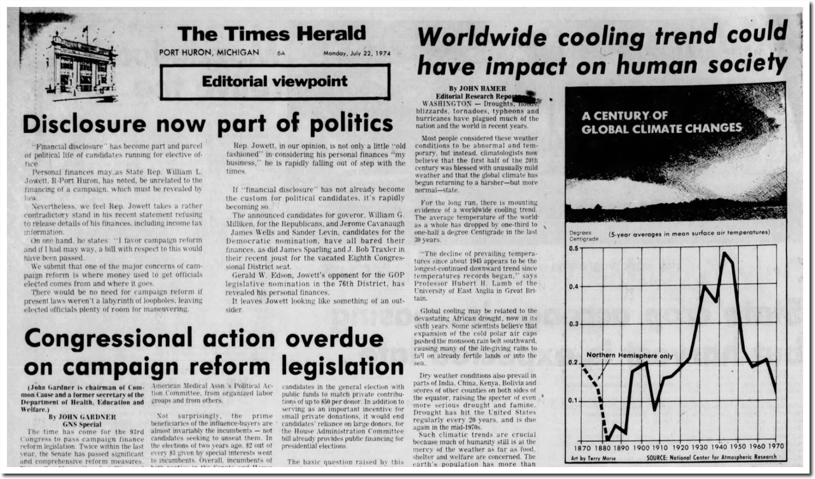
22 Jul 1974, Page 6 – The Times Herald at Newspapers.com
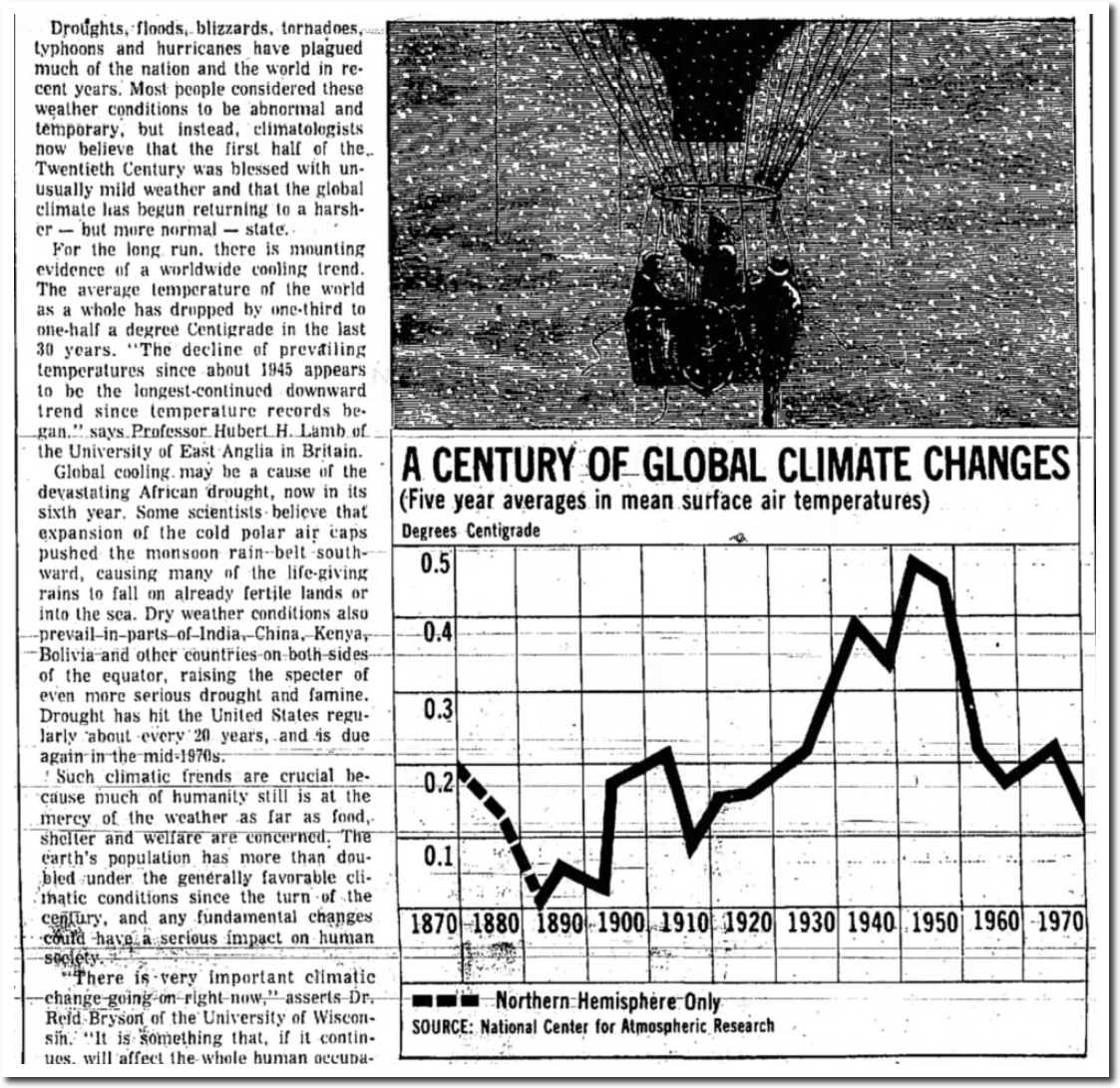
21 Jul 1974, Page 13 – The Des Moines Register at Newspapers.com
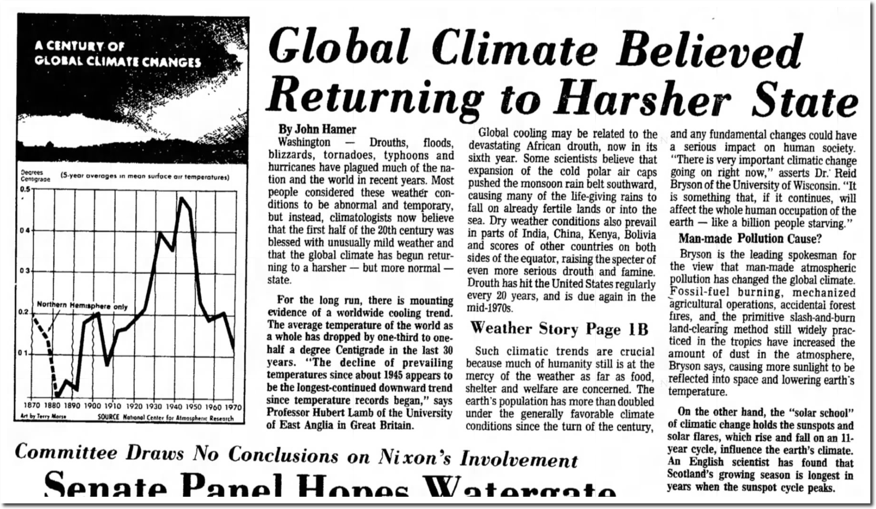
14 Jul 1974, Page 1 – Lincoln Evening Journal at Newspapers.com
The 1974 NCAR graph was completely consistent with what Steven Schneider and Walter Orr Roberts of NCAR were saying at the time. They were pushing global cooling – which was going to kill us all.
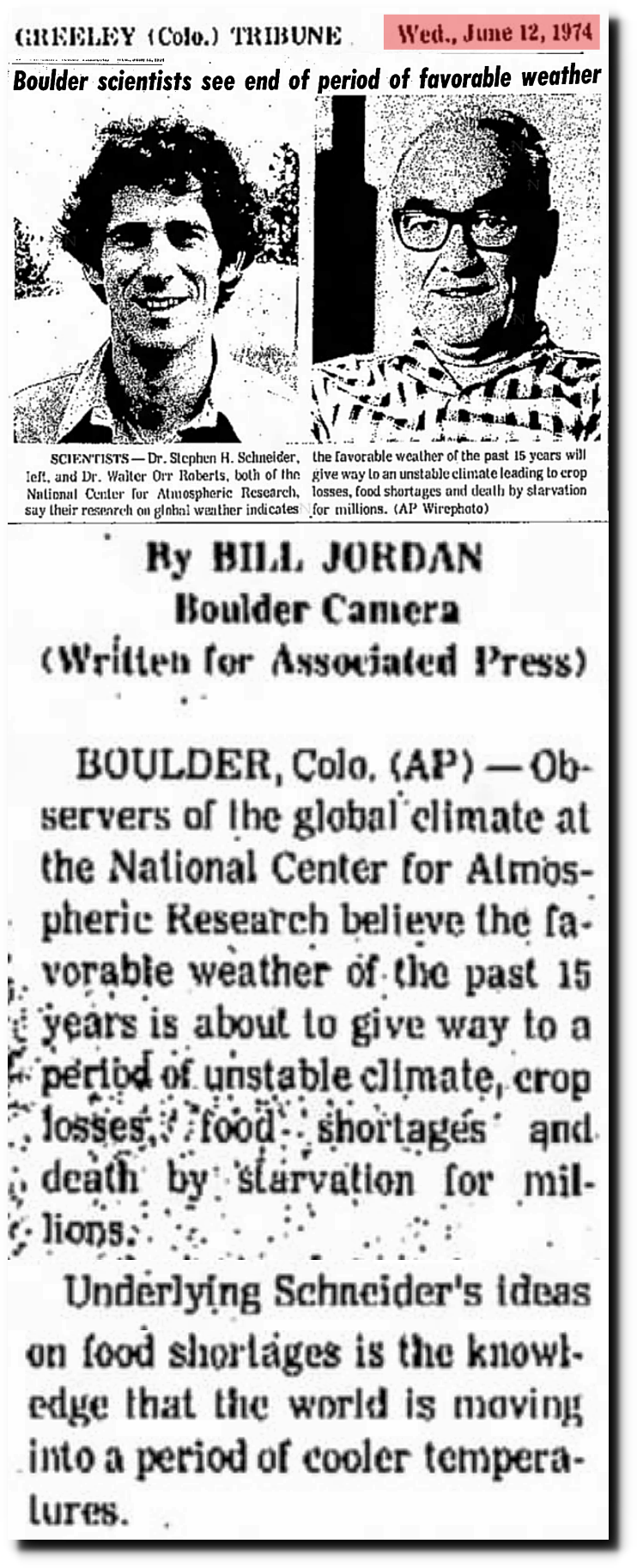
12 Jun 1974, Page 20 – at Newspapers.com
I will deal with Nick’s other idiotic claim in a different post.
Steven Goddard produces these plots, and they seem to circulate endlessly, with no attempt at fact-checking, or even sourcing. I try, but it’s wearing. The first GISS plot is not the usual land/ocean data; it’s a little used Met Stations only
The amount of misinformation in that claim is breathtaking. Nobody attempted to do land/ocean plots in 1974, because they weren’t willing to make up fake temperature data like modern climate fraudsters. GISS graphs were land only until about 2003.
date: Wed Apr 15 14:29:03 2009
from: Phil Jones <p.jones@uea.ac.uk> subject: Re: Fwd: Re: contribution to RealClimate.org
to: Thomas Crowley <thomas.crowley@ed.ac.uk>Tom,
The issue Ray alludes to is that in addition to the issue
of many more drifters providing measurements over the last
5-10 years, the measurements are coming in from places where
we didn’t have much ship data in the past. For much of the SH between 40 and 60S the normals are mostly made up as there is very little ship data there.Cheers
Phil
Mosher coming unhinged a few websites over https://imgur.com/a/Jz0Vv
What an idiot.
I thought the implication of that plot was obvious. I guess not.
There is no implication – the meaning of the plot is quite explicit!
oh Mosh.. You really are a BRAIN-DEAD moron, aren’t you !!!
“It shows you the adjustments are correct.” – Steve Mosher
WTF??
Mosher is a few sandwiches short of a picnic.
Then again, he is admiring your work Tony and using it to justify his fraudulent adjustments.
That is called validation of your data analysis. LMAO!
Tony Heller wins again.
if the adjustments were correct….all of the models would not be running hot
+1000
And the mystery of why they refuse to debate continues…. ;p
This is the basic flaw in all their arguments. If they think Tony is wrong then they’re free to come on here and debate him. They refuse. Instead it’s drive-bys or ad homs from a safe distance on another site. Not good enough.
It goes without saying that NOT ONE of these crack climate experts will debate Tony in an open forum which says it all, or rather, not. The only thing settled about ‘climate science’ is most of its practioners are pushing what they now know to be a blatantly false premise.
Like Nick’s fem fatale victim comment..
“I try, but it’s wearing. ”
All he had to do was ask…if he didn’t want to ask….all he had to do was use the search on Tony’s blog…he didn’t “try” at all
It’s so funny when Tony whips out the charts/articles from the archives and these people are left having to double down since they are so into their beliefs they can’t ever accept they may be wrong.
What you have to understand is that this is all filtered through the screen of Postmodernism, in which – to cut to the chase – whatever you believe is by definition true. Postmodernism is the acme of Narcisissm
Mosher just proved that they adjust the data to fit the theory.
tisk risk didn’t you know that adjustments reduce warming!!!??
Nick doesn’t seem to be too eager to come over on this website and argue the merits of Tony’s work. He just sits there “safe” on WUWT and takes pot shots.
Not the picture of a person who is sure of his position. Nick can fool a lot of people with his gibberish, but he can’t fool Tony. Tony will make him look bad if he comes over here and he knows it. That’s why he doesn’t dare come over here and discuss anything.
Yeah, if I were sure of myself and my position, I wouldn’t be afraid to take on anyone. But that’s not the case with Nick presumably because he is not sure of himself or his position.
That’s what it looks like to me, anyway Nick doesn’t have to come over here for Tony to make him look bad because Tony is aware of his distortions, and calls him out on them. Nick never tries to rebut because he can’t.
Whilst I consider that if Nick has issues with Tony’s graphs, he should come here and debate them with Tony. That is the best way to identify and resolve differences.
That said, I welcome Nick’s presence on WUWT, and I consider that he adds value to WUWT since one can have a sensible exchange with him, and he usually supports his views with evidence. one might not agree with everything he has to say, but it is necessary to have a sensibly argued contrarian view point. If not WUWT would simply be pervaded by group think to the detriment of all.
I consider Nick’s comments (and style) to be very different to Mosher. 4 or 5 years back Mosher would put forward a decent constructed argument, now he just posts drive bys. He is better at Climate etc,
It is unfortunate since Mosher knows quite a lot about the temperature reconstruction series, so he could usefully add to the debate, but he does not appear interested.
What is so silly about this is that Phil Jones in his 1980 paper, and Hansen in his 1981 paper essentially accepted these temperature profiles.
Further, the IPCC Chapter 7 Observed Climate Variation and Change on page 214 in Figure 7.11 also shows that the NH temperatures as at 1989, was cooler than the temperature at 1940, and the temperature as at 1920. Not much cooler but a little cooler.
Yet further, the Official US Dept Energy Report of 1985: Projecting the Effects of Increasing Carbon Dioxide which contains a very similar plot on page 151. Figure 5.1. sets out the annual mean surface air temperature anomalies from 1880-1981: (solid curve) Vinnikov et al. (1980); and (dashed curve) Jones et al. (1982). Figure from Weller et al. (1983), and includes points updated to 1981 by Jones
This plot (figure 5.1) shows Vinnikov through to 1980 putting 1980 at some 0.4 degC cooler than 1940, and Jones through to 1981 putting 1981 about 0.1 to 0.15 cooler than 1940.
This is all mainstream, so why does Nick Stokes join issue.
Nick, is a professional disinformation commenter.
Meanwhile your comment is devastating for Nick to handle.
https://wattsupwiththat.com/2017/09/26/gavins-twitter-trick/#comment-2621406
Nick, is a professional disinformation dissembler. That is his role in life. mind you it does involve commentating at times. I am not sure why when he has access to the facts and the knowledge to put it together he acts in such a contrarian manner.
Perhaps there is a motive outside of science to make him act thus.
Most likely.
Or he just likes being a stirrer.
I would opt for the latter though he is Australian.
“There was very little digitised global data in 1974.”
Therefore, as far as Nick Stokes is concerned, every government sourced global temperature chart & map that starts prior to or references data prior to 1974 is fraudulent.
Wow. That puts one big fat hole in the alarmist warming theory.
They don’t believe their own data record.
Maybe thats why they need to adjust it so much.
The inescapable fact is that there is very little historic Southern Hemisphere data, and we should only be looking at the Northern Hemisphere since this is the only place where there is a reasonable amount of historic data.
I have made that point many times to Nick.
A big problem I have with Nick is his absurd concern, if the NCAR 1974 chart was land only or land/ocean based data.
I wonder if he does this on purpose because it is well known that those charts are LAND only because ocean temperature data was negligible in those days.
Nicks dishonest concern,
“The reason for wanting to see the publication is that then it will be explained what the plot really is. What kind of data is it based on? Newsweek wasn’t saying at all. Is it land only? Land/ocean? It looks to me as if the b&w plot above is supposed to be global but probably land only; there was no systematic SST or NMAT at the time. The NASA 2017 is probably land/ocean. These are things you need to know to ensure it is a fair comparison.”
https://wattsupwiththat.com/2017/09/26/gavins-twitter-trick/comment-page-1/#comment-2621519
what a DISHONEST comment!!!
The dumb ass was already told just above his comment that it was NORTHERN Hemisphere!
He is clearly trying to walk a tight rope.
But the point is that CO2 is claimed to be a well mixed gas, and therefore the signal, if any at all, will be seen in examining just the NH, or just land only, or just ocean only, although the response may well be different or muted.
The same applies to looking at the SH only, or looking at the globe as a whole.
Obviously, it is preferable to compare apples with apples, but if this is so important then all the time series thermometer reconstructions would be thrown out, since at no moment in time are they ever comparing apples with apples. The composition of the sample set that is used in the time series is different almost every year such that no meaningful comparison over time can be made.
Given the coming and going of stations, the change in distribution from high latitude to mid latitude, the change in distribution from rural to urban, the change in distribution towards airport stations, the changes in airports themselves over time (many airports in 1940 had just a grass runway, and all but no passenger and cargo terminals etc), the change in instrumentation etc, the sample set that is involved in the time series reconstruction is a constantly moving feast, and there is never a like with like comparison being made.
One would think that Nick would wish to chuck out reconstructions such as NASA/GISS, Hadcrut etc on the basis that they are never comparing like with like, and this is before the endless adjustments/homenisation and historic revisions that have been made to those data sets!
The fundamental issue in Climate Science is that the data is not fit for purpose. The reason why we cannot measure Climate Sensitivity, ie., the warming signal to CO2 (if any at all), is either because the signal is very small, or that the accumulated error bandwidth of our data sets is so wide that the signal cannot be seen above the noise of natural variability.
We simply do not know whether the temperature today is any warmer than it was in 1940.
There is no geographical or topographical reason to presume that the (contiguous) US, which covers a number of different climatic zones, and which has mountains and valleys, and plains, and deserts, and coasts etc, should be regarded as some outlier for the latitude region say 25 to 48 deg N (or 27 to 48 North), and as Tony has demonstrated, so many time, the US has not warmed since the highs of the 1930s, and if anything it has cooled.
I am far from convinced that the Northern Hemisphere is today any warmer than it was in the late 1930s/early 1940s notwithstanding that during this time man has emitted some 95% of his CO2 emissions.
I consider that we should ditch the thermometer temperature reconstructions, and start from scratch, by assessing say the best 200 sited stations across the Northern Hemisphere, which are definitely free of all manmade change , and then retrofit these stations with the same type of LIG thermometers as were used in the 1930s/1940s calibrated in the same way as used at each station (on a station by station basis), put in the same type of Stevenson screen painted with the same type of paint as used in the 1930s/1940s, and then observe using the same observational practices and procedures as used in the 1930s/1940s at the station in question. We could then obtain modern day RAW data that can be compared directly with historic RAW data (for the period say 1933 to 1945) with no need for any adjustment whatsoever.
There would be no sophisticate statistical play, no area weighting, no kriging, no attempt to make a hemisphere wide set. Simple compare each station with itself, and then simply list how many station show say 0.3 deg C cooling, 0.2 deg V cooling, 0.1 deg C cooling, zero change, 0.1 deg C warming, 0.2 deg C warming, 0.3 deg C warming etc.
This type of like for like comparison would very quickly tell us whether there has been any significant warming, and if so its probable extent.
richard, you’re spot on…100%
No need to retrofit. Just setup the older equipment nearby. Parallel measurements should also yield more accurate adjustments.
Excellent Summary. Yet they just hired 156 folk at 186K per year to manage the billions from the Parris Accord, so this is simply not affordable to those CAGW alarmists.
My simple solution to determine the surface warming is to trust the IPCC physics, which state that all GHG caused surface T change will warm 20 percent less then the troposphere. So simply believe them. If the troposphere has warmed .3 degrees in 40 years then the GHG caused portion of surface warming can only be .25 degrees. This is what their own math says! Therefore any additional warming must have a cause other then GHGs.
( such as wrong adjustments, UHI, etc…)
Interestingly enough, the NZ 7 station series, cleansed of fraudulent adjustments, proves to show zero warming over the last century. Now the west wind drift is so strong that not much southern air gets to miss us over any period of weeks…..
There is a wide range of average climate conditions in the northern hemisphere and there have been plenty of changes in locations for measurement. I would contend you can’t make any meaningful past to present comparisons or plot historical trends unless you have a base of consistent, unbiased measuring locations providing accurate and consistently recorded information.
With that in mind you really don’t have a very robust data set for even the NH. At least not past the 1970’s or so. Many stations are closed. Of those which are still open, most have degraded due to local biases. Many have moved at least once, some have moved 3 and even 4 times.
The Greeley Tribune 1974 snippet is interesting since Schneider was forecasting cooling.
This was shortly after his 1971 paper (Science Volume 173). In 1971, NASA/GISS/NAS/NCAR were well aware of the radiative properties of CO2, the famed basics physics of so called GHGs and the GHE, and the forcing attributable to CO2, and yet Schneider assessed Climate Sensitivity to CO2 to be approximately 0.5degC per doubling.
On page 138 they state:
An 8 fold increase in CO2 is the equivalent of 3 doublings of CO2. This means that the Climate Sensitivity to CO2 was calculated to be less than 0.7degC per doubling.
Figure 1 (on page 138) shows the Climate Sensitivity to CO2, and the Climate Sensitivity to CO2 + water feedback. It is clear from this plot that on a doubling from 300 ppm to 600 ppm, water feedback has very little impact. Less than 0.1 degC. It would appear (from a simple eyeball) that CO2 alone produces a rise of ~0.5degC, and CO2 + water vapour ~0.6 degC (or a little under).
Water vapour feedback appears to only start making a significant difference once CO2 has reached 750 ppm and above.
Just like wishing to erase past data on temperatures, the warmists would sooner that people forget about Schneider’s 1971 paper wherein he had assesses low climate sensitivity to CO2. This was fine in the global cooling era, but had to be disappeared in the global warming era.
.
He comes from the incompetent, corrupt, failed state of South Australia, which says it all really.
IYI (intellectual yet idiot)
Stokes latest comment is flirting with doorway into the twilight zone. He is making tortured comments now.
““It is 1974,Nick! There was NO Ocean temperature data to speak of in those days. Stop with your misleading questions baloney!”
Indeed so. How does it help to say that we’re comparing modern GISS land/ocean to 1974 land only, and that somehow proves the data has been tortured (original claim) or GISS has fudged it or whatever? They are just different things. And it’s no use saying that they are using Land only because they couldn’t get marine data. This sort of fudging is just not honest.
But you could take that 1974 apect further. There was very little usable land data either. People forget two big issues – digitization and line speeds. Most data was on paper. If you wanted to do a study, you had to type it yourself (or get data entry staff). And if there was anything digitised, there were no systematic WAN’s, and what they had would hacve been at 300 baud. So it isn’t a wonder if 1974 analysis deviates from modern. It’s just a miracle they got as close as they did (if you find something genuinely comparable).
As for what Richard Verney has shown, again not a single one matches. There was no IPCC in 1981. NAS was NH data. Hansen’s is even more restricted – just NH extra-tropical. They do look somewhat similar, and that is because NH extratropical was pretty much all they had. That still doesn’t make it comparable to GISS land/ocean.”
https://wattsupwiththat.com/2017/09/26/gavins-twitter-trick/#comment-2621574
“That still doesn’t make it comparable to GISS land/ocean.””
Nope, and that’s the problem, Nick.
GISS land/ocean graph is from a different planet.
Hi
See my comment below which I addressed to you.
Hi Tony
The source of your chart is Figure 5.2 from the United States Department of Energy Report ER-0237 dated December 1985.
The link was difficult to find because there appears to be different versions of the report but the version with your chart is available here:
Link not posted. Here it is
https://www.osti.gov/scitech/biblio/5885458
Angus, is it possible to find what stations were used to produce the data for the 1985 DOE graphic?
I would love to see that raw data verses what they have done with it today.
So SH data was very sparse in the 1970s, and SST data was very sparse as well. ( Should not the word was be “is” prior to some such date. )
If not, then how did non existent data become existent?
Would not the error bars on made up data for the SH and SSTs be very wide?
Regarding the NH chart, is the 1940s warming and 1970s cooling not backed up by Arctic sea ice reports?
Finally, and perhaps most importantly, is the station DATA used to produce the NH cooling ( believed by every major government group at the time) available, and can those raw records be compared to what GISS says today about those specific stations?
We cannot forget their confessed un-scientific desire to remove the blip, nor the fact that they in fact did exactly that.
The NCAR plot is based largely on the work of J. Murray Mitchell, which was confirmed by Vinnikov and by Spirina. Spirina’s 5 year running mean looks a lot like the NCAR plot.
See Spirina, L. P. 1971. Meteorol. Gidrol. Vol. 10, pp. 38-45. His work was reproduced by Budyko in his book Climatic Changes on page 73, published in 1977.
Thanks, yet is the raw data behind that report still available?
I don’t know. It would be a crime to alter the raw data.
To clarify, it would be a crime to alter the raw data and then continue to call the data raw.
Or even data.
So to repeat…” is the station DATA used to produce the NH cooling ( believed by every major government group at the time) available, and can those raw records be compared to what GISS says today about those specific stations?
And if the raw data was changed, then how much and why?
Glad to see a direct response. They too often make sweeping statements to wipe away inconvenient facts.
Sunsettommy
I agree with your analysis that you recently posted on WUWT.
I referred to the IPCC FAR because:
>>>(i) their data plot generally corroborated the NCAR, and NAS plots, which in any event were corroborated by Jones and Widgley (1980 paper) and by Hansen (1981 paper). Jones and Hansen extended the NH plot out to 1980 and confirmed that as at 1980 the NH was still cooler than 1940.
>>>>(ii) the IPCC plot extends the position out to 1989, and confirmed that as at 1989, the NH was still cooler than 1940.
>>>>(iii) I set out details of the Authors to the IPCC paper who endorsed the plot because these were major Team players, eg., Karl, Vinnikov, Bradley, Jones, Trenbeth, Wadhams etc. All these guys were quite satisfied that the data suggested that as at 1989 the NH was cooler than it was in 1940. The recovery of the substantial post 1940 cooling was still not complete.
Note the importance of the recovery from the 1940 -early 1970s cooling, still not being complete by 1989. This was of course why M@nn in MBH98 had to perform his nature trick. The tree ring data was going through to 1995 (it might have been 1996) and it too showed that as at 1995 (or 1996) the NH was still no warmer than it was in 1940!!!
But it was in the late 1980s/early 1990s that the data sets underwent their revisionary rewriting which meant that the adjusted thermometer record now showed warming where previously there had not been a complete recovery to 1940s levels. This was the real reason for the cut and slice. M@nn had identified that the tree rings no longer tracked the adjusted thermometer record. The tree rings did track the unadjusted historic record at least in qualitative terms, ie., they showed no net warming between 1940 and mid 1990s which would have been the position had the late 1980s onwards adjustments not been made to the thermometer data sets!!
This is how it all ties together. The nature trick is only required because of the revisionary adjustments made to thermometer time series set.
Finally, whilst it is obviously preferable to compare apples with apples, I doubt that it makes too much difference in comparing NH temperature sets with global sets or vice versa, since the global data set is comprised of approximately 85% NH station data, and only around 15% SH data, so there is quite some overlap.
It would be wrong to compare SH data sets and global data sets because of the sparse SH sampling.