
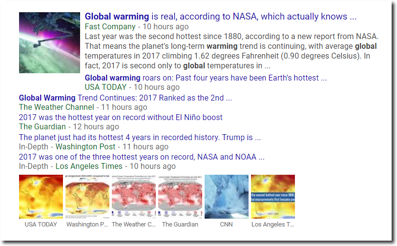
The usual fake news sources are hysterically parroting the standard NOAA and NASA fake news about 2017 being the hottest something or other.
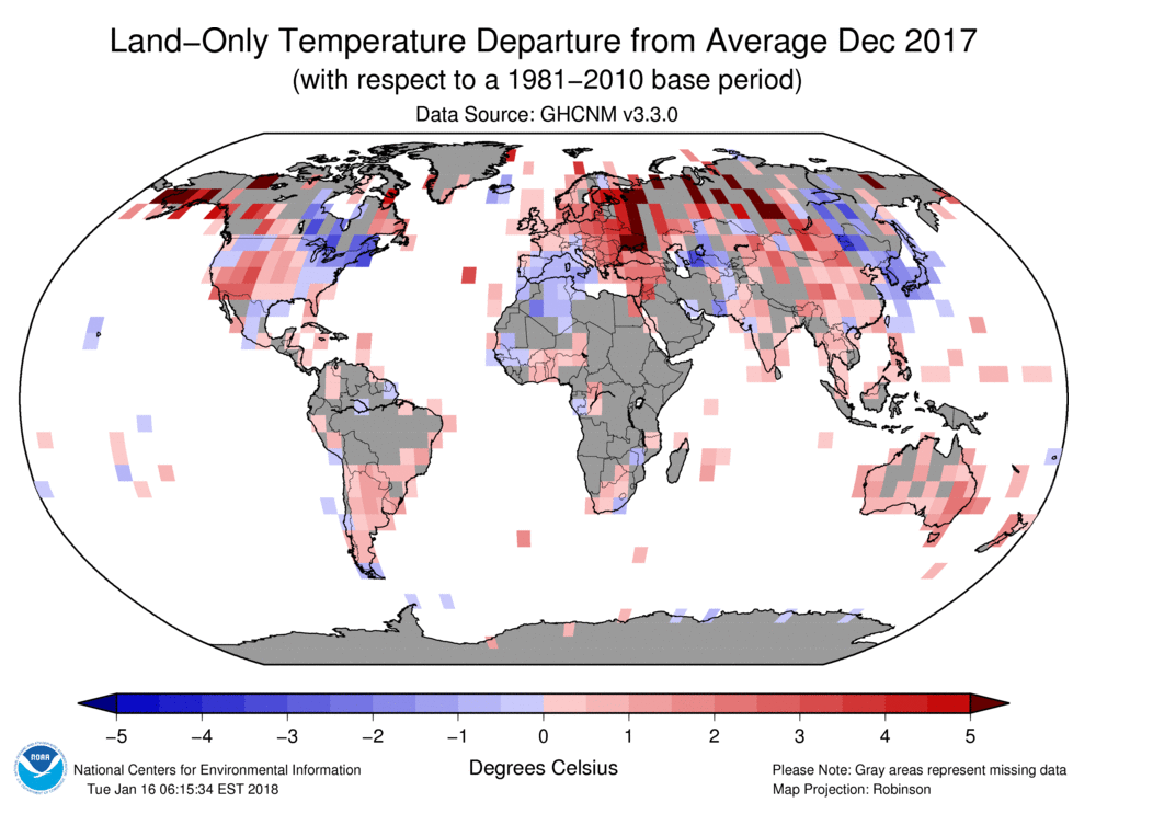
As with every other month, the bright red NOAA map is fake. It shows red almost everywhere!
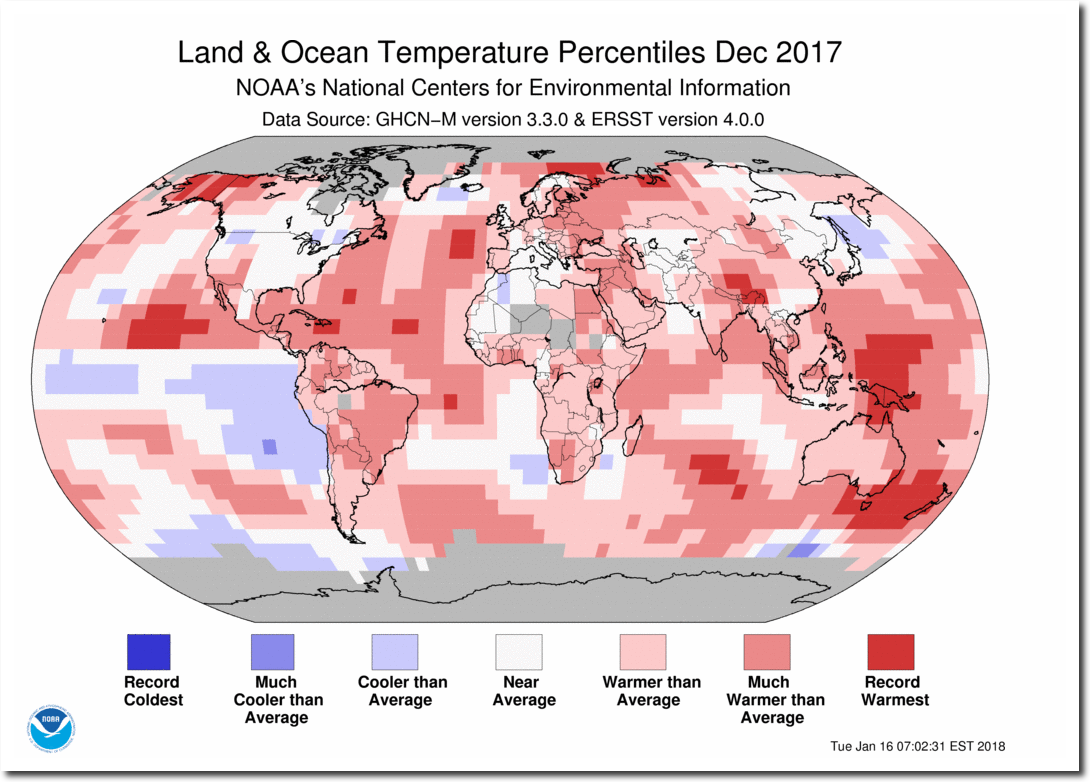
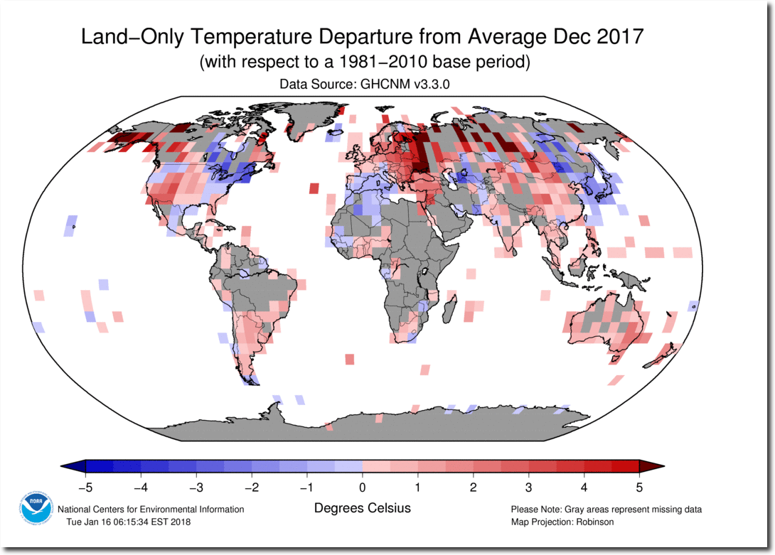
The actual NOAA thermometer map (below) shows 50% of the land surface as missing data, 14% of the land as below normal temperature, and just over one third of the land surface as above normal. NOAA simply makes data up to create the appearance of red hot burning planet.
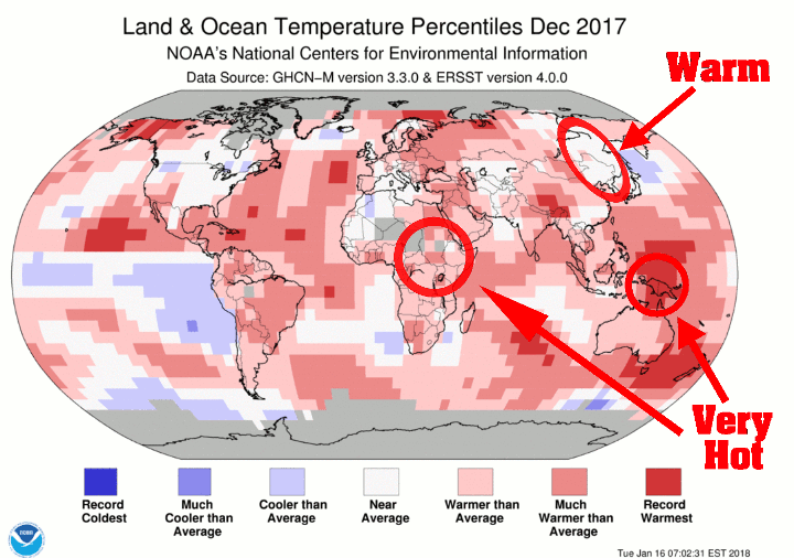
NOAA turns very cold regions to warm, and areas of no data to record hot. The magic of data tampering and fake data.
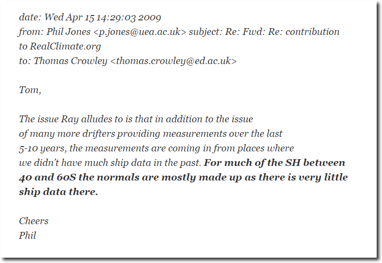
Thanks to Climategate E-mails, we know that the ocean data is also fake.
NOAA and NASA got their red crayons out and colored red everywhere for their useful idiots in the press. But it has nothing to do with climate or science.
