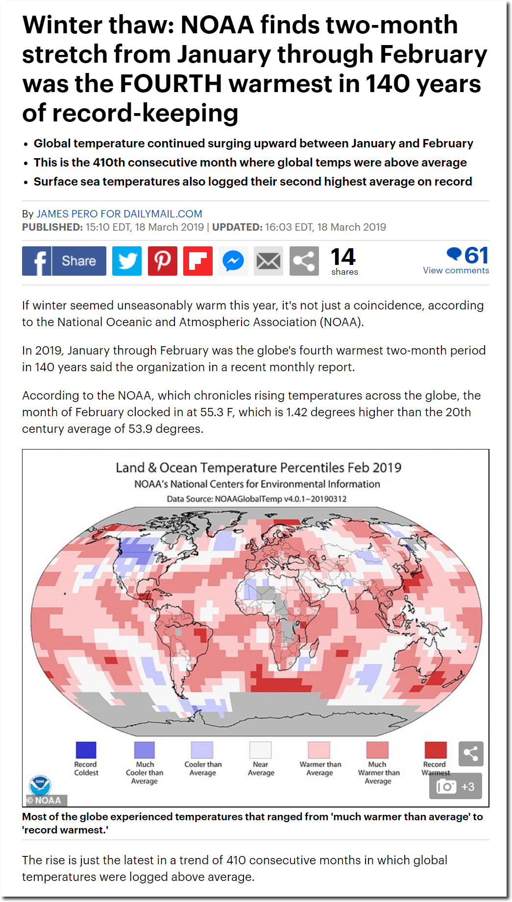
NOAA says last month was “among the eight warmest Februarys on record” in much of the Earth.
According to NCEI’s Regional Analysis, South America, Europe and Oceania had a February temperature that ranked among the eight warmest Februarys on record.
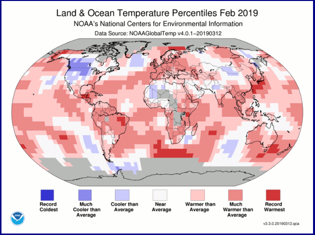
There is no such word as “Februarys” – plural for February is Februaries. But besides the fact they are illiterate, they are also lying. This is the map they use to justify their claims:
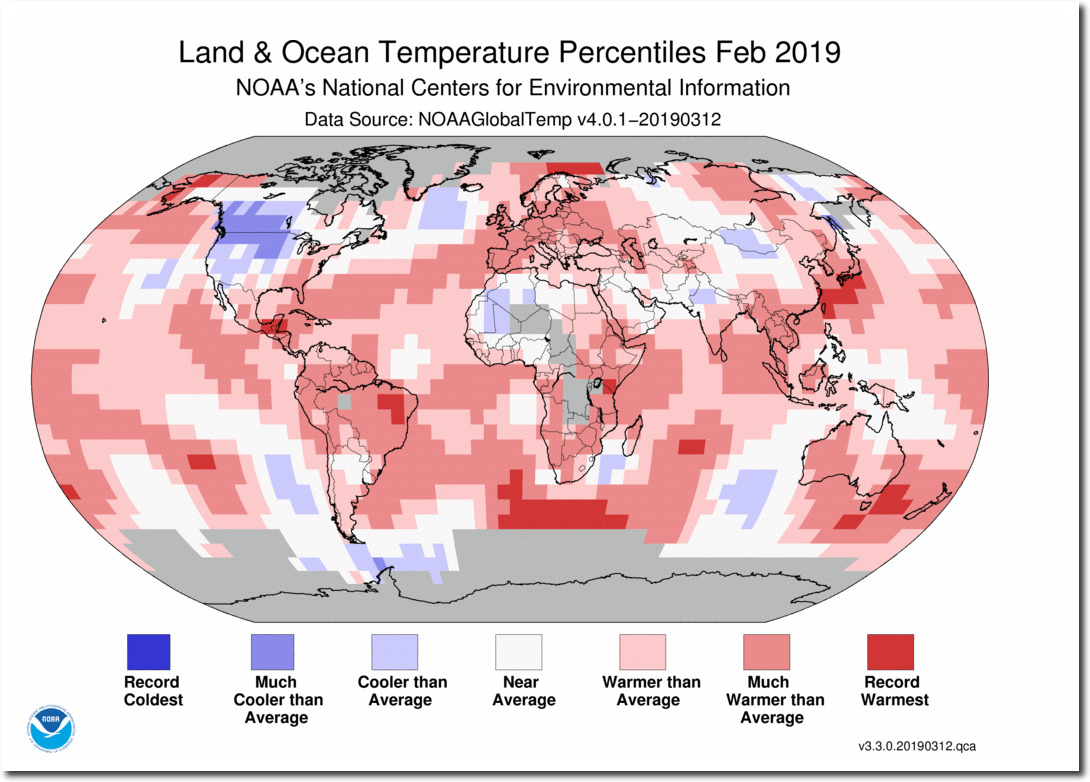
It looks like the world is burning up, with just a few slightly cool areas. It has an official government seal on it, so it must be accurate, right?
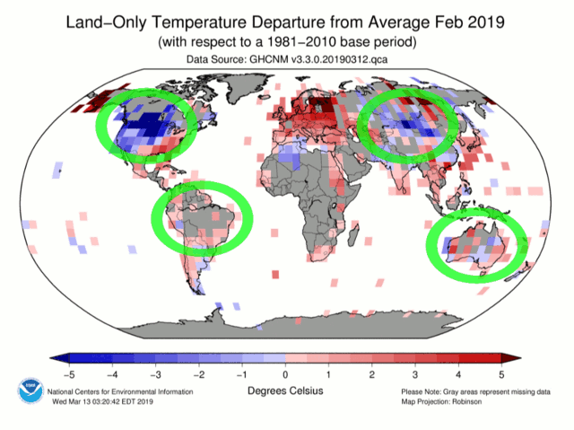
The map below shows where NOAA actually had surface temperatures in February.
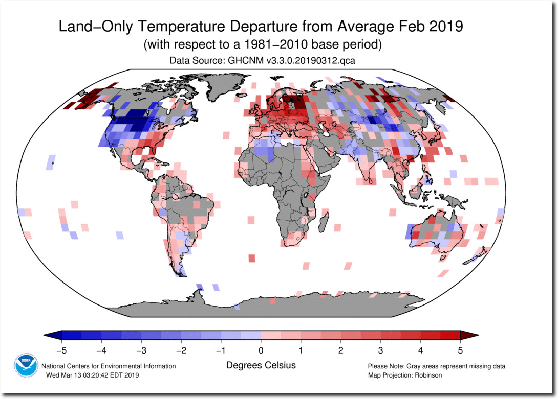
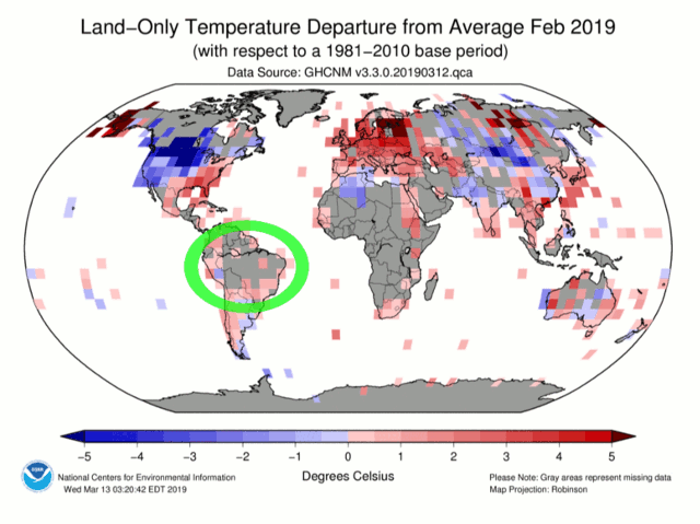
The map looks nothing like the one NOAA presents to the public. By pixel count, 51% of the land area is gray “missing data,” 16% is below normal temperature, and 33% is above normal. The animation below shows how they created one of the eight warmest “Februarys” in South America – by simply making up data, including record warmth in Brazil in locations with no actual thermometer data.
Also note how they made the cold in Asia and parts of Australia disappear.
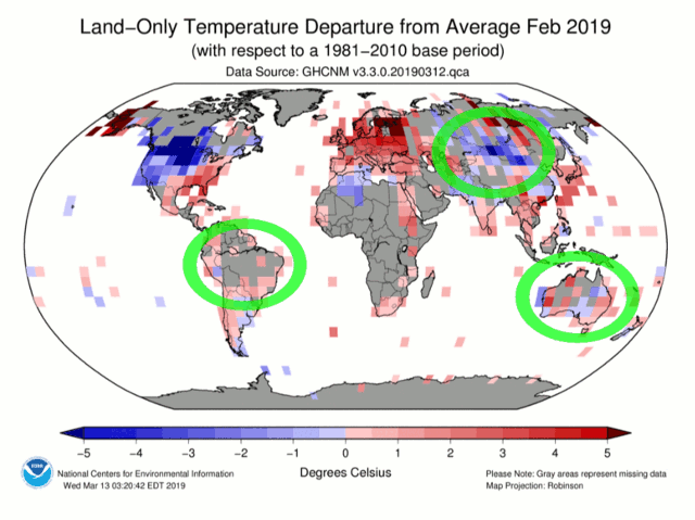
And they largely made the near record cold in much of North America disappear.
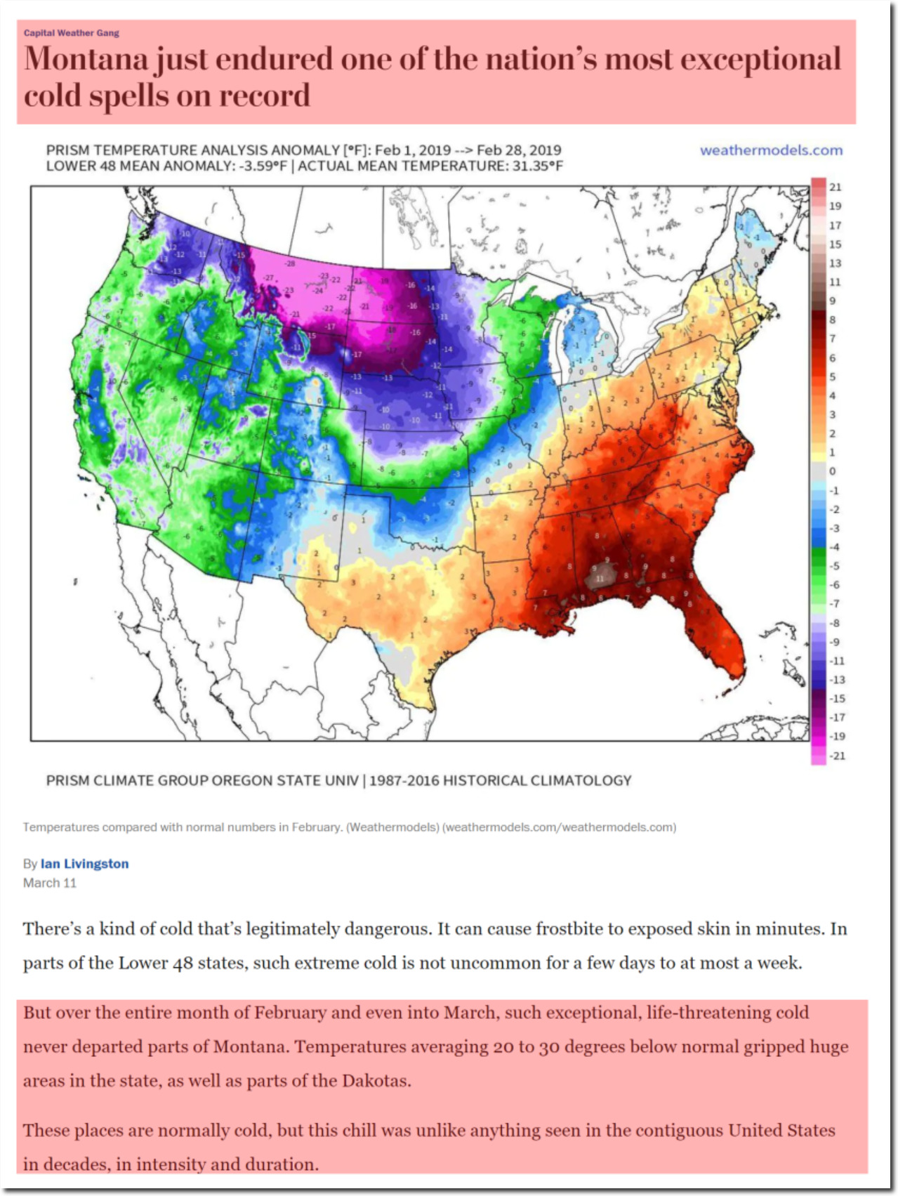
Montana and the Dakotas were 20 degrees below normal, as was much of Canada. Here is how the Washington Post described it:
The February temperature departures from normal were stunning. Several major climate locations averaged 27 to 28 degrees below normal, the most extreme departures in the Lower 48 for a full month since January 1969
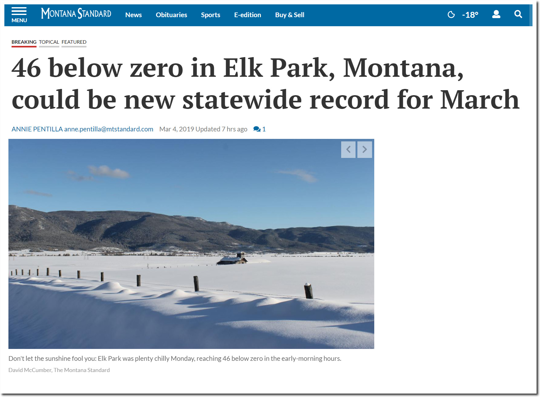
46 below zero in Elk Park, Montana, could be new statewide record for March | Local | mtstandard.com
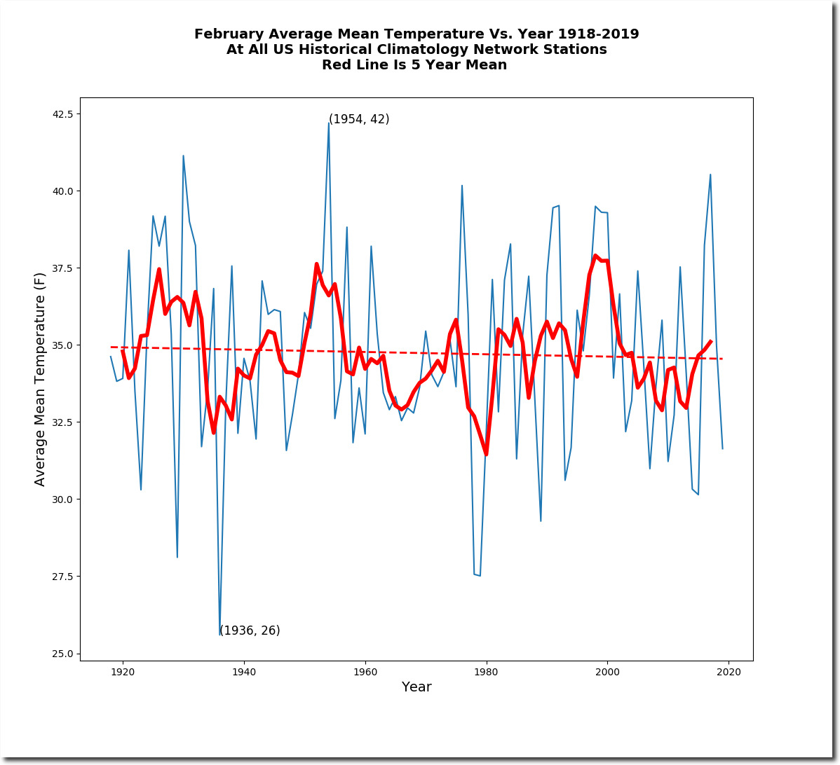
US February temperatures were well below normal, and about 10F cooler than February 1954.
The US data is extremely important, because NOAA actually has very little historical data outside of the US, western Europe and parts of Australia..
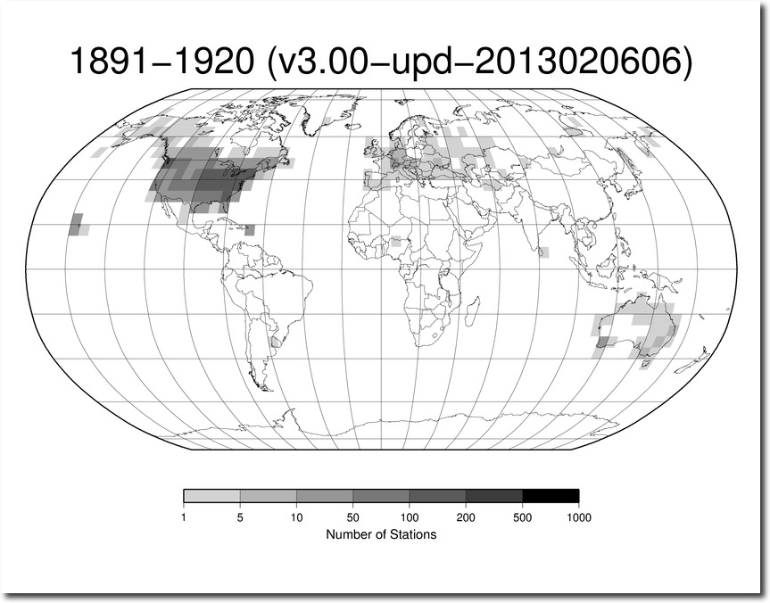
ftp://ftp.ncdc.noaa.gov/pub/data/ghcn/daily/figures/station-counts-1891-1920-temp.png
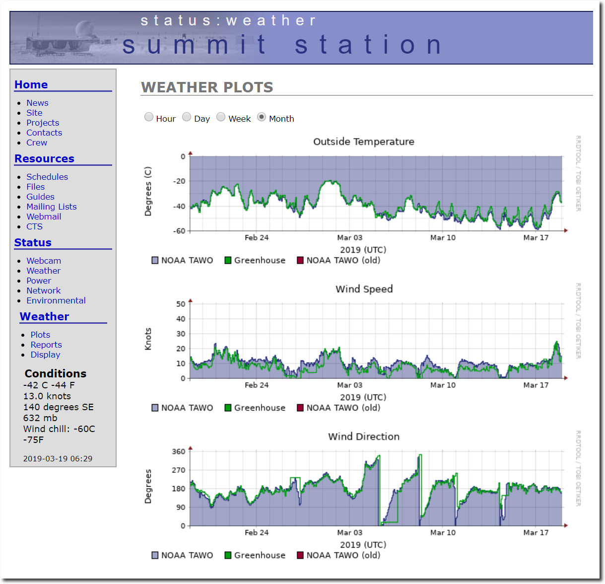
NOAA also claimed to have almost no February data for Greenland, where temperatures have been extremely cold over the past month.
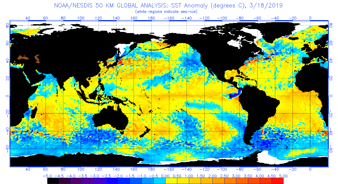
The NOAA land data is fake, and an Orwellian rewrite of record cold at spots. But the ocean data is even faker.
the global ocean-only surface temperature was 0.70°C (1.26°F) above average and the second warmest February since global records began in 1880
They claim to have ocean temperature records back to 1880 – which is patently false. Prior to about 15 years ago, no one even pretended to have pre-1950 global ocean data. And as Phil Jones at CRU said, much of the data they are using is “made up.”
For much of the SH between 40 and 60S the normals are mostly made up as there is very little ship data there.
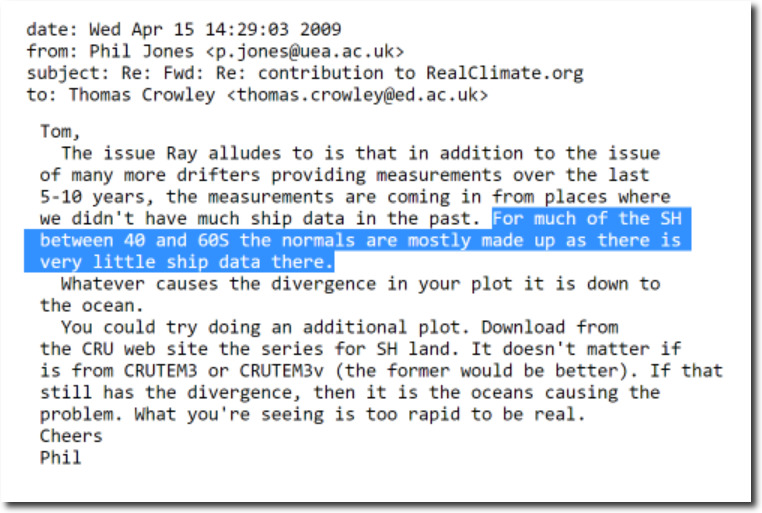
di2.nu/foia/foia2011/mail/2729.txt
Sea surface temperatures are well below normal in much of the southern hemisphere.
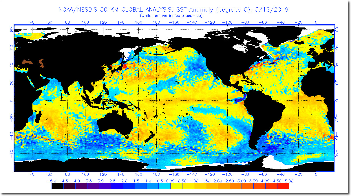
anomnight.3.18.2019.gif (1174×640)
The animation below flashes between the NOAA temperature departure map and the temperature percentile map. You can see how blues disappear, and pink turns to red.
The next step of the process is generation of propaganda like this:
Arctic sea ice extent is very close to the 1981-2010 median edge. Ice doesn’t lie, but government climate scientists do.
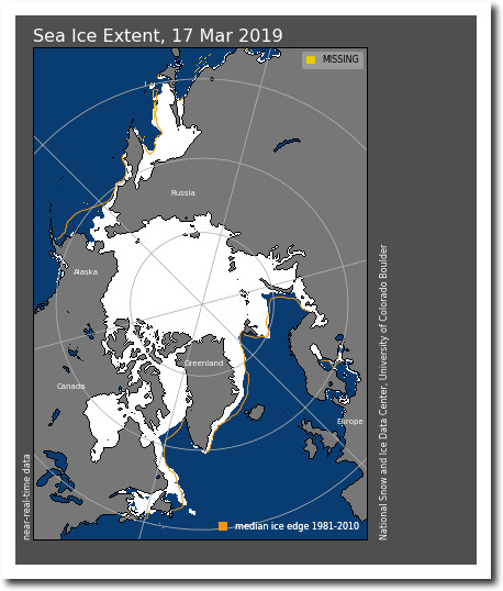
Index of /DATASETS/NOAA/G02135/north/daily/images/2019/03_Mar/
The NOAA red hot map has no basis in science, which is standard practice for climate alarmists with an agenda.
I honed in on my location (Dulles, VA). We were +2 for February – you’d think that would be considered “near normal” but it got the light pink shade. Technically I guess its correct but it’s very deceptive.
they’re reaching desperation level because every year the gap between the temperatures they need and the reality on the ground grows wider. eventually it will become binary and people will be told it never snowed despite record sales of snow shovels and salt. We just came off a phenomenally cold and snowy february in SW WI yet somehow their graph shows us close to average. we rarely got to within 15 degrees (F) of average daily highs and lows.
I have been tracking SW Wisconsin as I have lived in La Crosse since 1968. Interesting, the lack of La Crosse city population growth (10% total since 1950), the measurement station a La Crosse Regional Airport on French Island in the middle of the Mississippi River (little or no new roads or substantial development activity and surrounded by water) makes it essentially the functional equivalent of the longest running USCRN. 146-year temperature history showing no significant variance between 1873-1951 and 1952-2018. In fact they almost look like mirror images of one another (see attached annual mean temperature graph).
This winter was so cold in the USA and many people were forced to pay too much money for heating or could not afford to do so-
so they need this kind of propaganda to counterbalance reality.
Therefore this summer will have the most records ever as they have a lot to “repair” inside people minds to keep the religion alive.
Just as islam is the religion of peace global Warming is everywhere –
except there where you live.(and where data was not adjusted)
Yes. Worst winter in southeast in over a decade.
The trouble is facts no longer matter, only authority.
Just like modern journalism, “climate science” is all about opinion, and has no basis in facts. Fictionology.
This morning’s paper ran a Seth Borentstein special, telling readers that the globe is warming because high temp records are running 2-to-1 ahead of cold temp records. His data had been checked by climate scientists, so it had a very truthy quality. He picked certain stations, might be a clue there, all it said was stations running since 1920 but didn’t say how the stations were selected. I’ll likely enjoy our host taking it apart.
You are right about the distorted and misleading climate reporting by the government and MSM, but the plural of February (a proper noun) is indeed Februarys.
“You are right about the distorted and misleading climate reporting by the government and MSM, but the plural of February (a proper noun) is indeed Februarys.”
No!
Feb·ru·ar·y (fĕb′ro͞o-ĕr′ē, fĕb′yo͞o-)
n. pl. Feb·ru·ar·ies
The second month of the year in the Gregorian calendar. See Table at calendar.
https://www.thefreedictionary.com/Februaries
Both “Februarys” and “Februaries” are used in American English. Historically, in English English, the plural is “Februarys” because February is a proper noun, like “Kennedy” (plural = Kennedys), and for proper nouns, one just adds an “s”. This usage goes back at least 300 years. NOAA can be accused of being useless in many areas of “climate science”, but they are not illiterate in this case.
We’ll, in southern alberta, we had record cold feb., but they have us listed as just below normal……, it should be dark blue!!!
I quickly checked Sea Surface temperatures on KNMI Climate Explorer in the area just South of the tip of Africa that are allegedly at record warm temperatures. They were at to slightly below the mean for February. I could check other locations, but NOAA’s statement does not make any sense.
“Even though there is no evidence, the seriousness of the charge is what matters.”
– Tom Foley, Former Speaker of the House
This fraud being perpetrated on our world is no longer funny in the lease and is really beginning to get me angry. Our kids are the real victims. They can’t even dial a rotary phone, much less read cursive! What next?
Did you see this latest piece of junk science from the AP? Be interested to see what Tony thinks.
https://apnews.com/7d00e38b9ba1470fa526b1da739c5da8
Looking at the graphic in that article …
“Chart shows annual counts from 1958 to 2018 for high maximum and low minimum temperature records across 424 AP-selected NOAA GHCN Daily weather stations.”
My guess is they are pulling a fast one by only considering temperatures in that time range and ignoring higher temperatures from before that and ignoring record lows after that would prove the lie.
We know there have been numerous all time record lows at many USA locations reported just recently.
Tony throws the chart up going back well before the 30’s and the percent hot days metric is always skyrocketingly high during the 30’s. So the AP is definitely cherry picking. These lying liars in the msm are paid to lie sbout this stuff. There’s no other rational explanation.
nejking I saw it and noted above. I’m hoping our host sees it and takes it apart, because it seems to contradict his work (showing more cold temp records than high temp records). I think our friends at NOAA are doing a ‘heat check” of sorts. You know, in basketball a guy makes a couple of shots, if he quickly takes another the announcer calls it a heat check. Here, we have gov’t scientists paid to gather data who clearly don’t care that they put out reports of “hottest winter ever” (or third hottest or whatever number the dart lands on) when my own lyin’ eyes tell me it’s been colder than average the last two winters across much of US, and cold elsewhere. I think they want to see if their friends in the press will ever call them out, no matter how bleeding obvious the lie. They have noticed that the only ones calling them out is skeptics, never the press.
I see Marc Morano already has an article up taking Seth B. down, but I still hope our host finds time to review, he has a gift for finding the data on hi-low records and charting results. Seth B. has a knack for throwing taters for Mr. Heller to mash.
One look at the RSS map for February and you can see that NOAA is producing garbage.
They must be using a climate model to fill the grey bits. That would explain why the temperatures always go up – since the models have crazily high CO2 sensitivity.
It becomes a self fulfilling lunacy of models estimating missing temperatures then climate scientists fitting the resulting ‘temperatures’ to the model output and saying yay, our model fits the data! Incestuous nonsense.
Insestuous fraud.
I was wondering what the satellites are saying.
LA County (CA) did not see 70 once in Feb. The first time since 1969. But NOAA calls it normal. They are making frauds look honest in comparison.
NOAA are not even close. UAH has this February lying a very distant fourth.
Highest was 2016, 2nd was 1998, 3rd was 2010.
uah also had usa48 at -0.03. no. just no.
worst ice for 30 years
https://www.cbc.ca/news/canada/newfoundland-labrador/qajaq-icebreaker-1.5056140?__vfz=medium%3Dsharebar
The Colorado River is poised for an historic runoff year. Every basin in the Upper Colorado is on a 140% type of year, and that is after a week pause. The next three weeks on the GFS have another 3-5 inches of precip across the basin.
The keys to big runoffs, historic runoffs like 1983 and 1984 are: 1. Big water year overall 2. LATE water year…snow into April and even May. Slow runoffs tend to soak into the mountains more where sudden summer temps on snow cause floods.
April 6 is considered peak. If the models are correct we are headed to 150%+ year…and if it stays cold as expected (MJO set up), snow into April could produce a monster flood for the Colorado.
Why is this important: The Colorado is the latest ground for the climate ambulance chase team. Several years ago it was CA’s drought…before that the Great Lakes. So this el Nino may finally come thru. Stay tuned.
What the Upper Colorado Basin looks like
‘Several major climate locations’ – WaPoo
What is a climate location?
A region on a map that can be painted red to “prove” warming.
(size and locations of such regions can change if necessary for PR=regionfluid)
But don’t ask them about the difference between a climate and a weather location.
Then you may find out that they just use fancy terms like major climate location to sound competent and smart and imply that the reader is the opposite as he never heard of a major climate location.
Eighth? If it was really warming “catastrophically”, every new year would be first, wouldn’t it? Eighth must mean that we are cooling off rapidly then….
/sarc off
Words:
Eight warmest must mean there were seven other warmer february months.
It sounds not alarming when you think about it.
In the southern ocean below 35 S the ocean temperature map is essentially blue. One of the very few places where there is red is south of Cape Agulhas South Africa. This is likely due to the Agulhas Current. Around this location, having flowed southwest along the Mozambique and South African coast, the current turns or “retroflects” to the east and flows east at about 40 S at the sub-tropical convergence. If the retroflection point is a bit further south than usual, it brings warmer water into a cold area: hence the small red blob just south of South Africa. NOAA has changed that small blob into an area of 21 of their pixels stretching from 10 W to 45 E, and from 30 S to 50 S. Dearie me.
February may have been amongst the 8 warmest but this is irrelevant. We can all agree that there has been global warming. However, the real key is that temperatures are remaining constant despite ever increasing CO2 levels!!! Where is the correlation? Regression analysis should blow-up the CO2 temperature thermostat regulator.
Not sure who “we” is, but don’t include me in your assumptions.
NOAA even plays games with the words they choose. Notice that any positive temperature deviations are described as a degree of “warmer”. Negative deviations are described as “cooler” except only for record territory, when they finally deign to use the word “colder”. Seems to me that the opposite of cooler in this case would be milder, but that wouldn’t grab attention as quickly and dramatically, now would it?
I am always amazed at how bad thermometers are at reading temperatures and how good homogenization processes are at fixing them, well at least until the next homogenization process comes along.
Adjustments correct for biases.
How would you prefer to correct for those biases?
David Appell,
It is advisable to read and comprehend the argument before objecting.
I’ve not updated on DMI Sea Ice volume in a while. Here are the current stats:
DMI Sea Ice volume for yesterday was 23,410 cu km, which is 96.99% of the 17-year average for the day, and 96.16% of the day’s average in the DMI-charted, 10-year reference period 2004-2013.
Gain since the previous day’s report was 80 cu km, 161.07% of the average gain in the 17-year series, and 190.05% of the reference period day’s gain.
At present, 2019 is 116 cu km above last year’s volume for the day.