
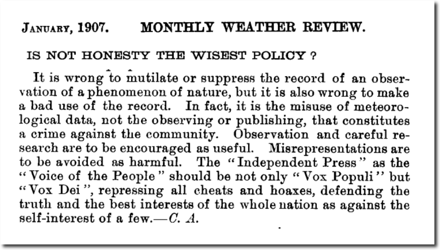
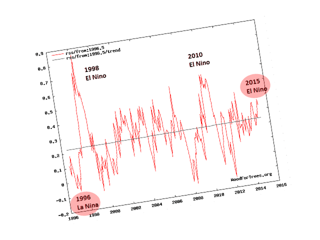
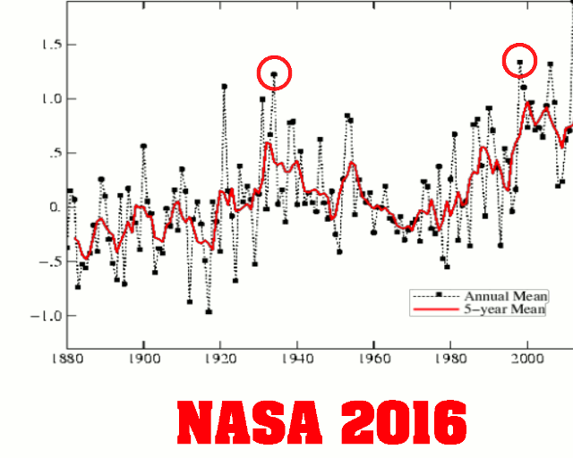
On election day in 2016, both satellite data sets (UAH and RSS) showed a 15 year long hiatus in global warming, and bore no resemblance to the warming trend being generated by NOAA and NASA. I captured this image in a November 16, 2016 blog post.
Gavin Schmidt Promises To Resign | The Deplorable Climate Science Blog
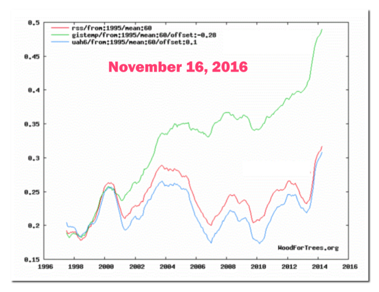
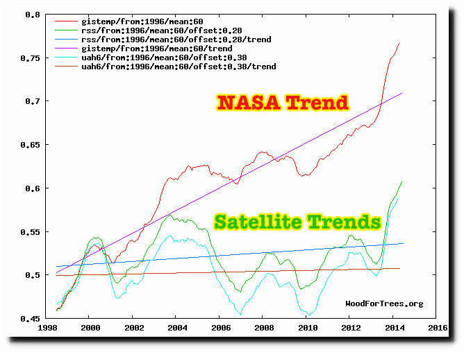
This is what the same graph looks like now.
Wood for Trees: Interactive Graphs
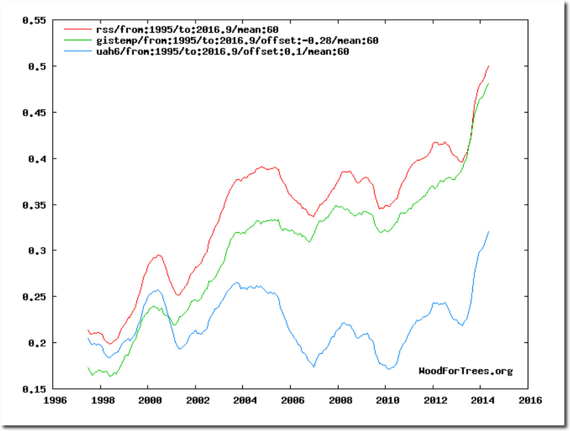
In the next image, I overlaid the current RSS graph on the 2016 image. You can see how RSS was adjusted to match the NASA data.
I predicted this would happen on March 27, 2015.
Look for the satellite data to be adjusted to bring it into compliance with the fully fraudulent surface temperatures. The Guardian is now working to discredit UAH, so it seems likely that RSS will soon be making big changes – to match the needs of the climate mafia. Bookmark this post.
Roy Spencer at UAH made the same prediction on January 9, 2017
“I expect there will soon be a revised TLT product from RSS which shows enhanced warming, too.
Here’s what I’m predicting:
1) neither John Christy nor I will be asked to review the paper
2) it will quickly sail through peer review (our UAH V6 paper is still not in print nearly 1 year after submission)
3) it will have many authors, including climate model people and the usual model pundits (e.g. Santer), which will supposedly lend legitimacy to the new data adjustments.
Let’s see how many of my 3 predictions come true.
-Roy”
Wood for Trees: Interactive Graphs
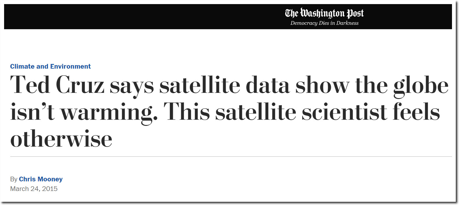
The reason I made this prediction was because Ted Cruz used an RSS graph in a Senate hearing in March of 2015. Carl Mears at RSS then came under intense pressure to make his data match the surface temperature data.
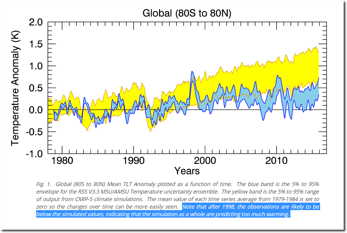
My particular dataset (RSS tropospheric temperatures from MSU/AMSU satellites) show less warming than would be expected when compared to the surface temperatures. All datasets contain errors. In this case, I would trust the surface data a little more because the difference between the long term trends in the various surface datasets (NOAA, NASA GISS, HADCRUT, Berkeley etc) are closer to each other than the long term trends from the different satellite datasets. This suggests that the satellite datasets contain more “structural uncertainty” than the surface dataset.
Ted Cruz says satellite data show the globe isn’t warming
You can see what Mears did to bring his data into compliance. This was his web page in November 2016.
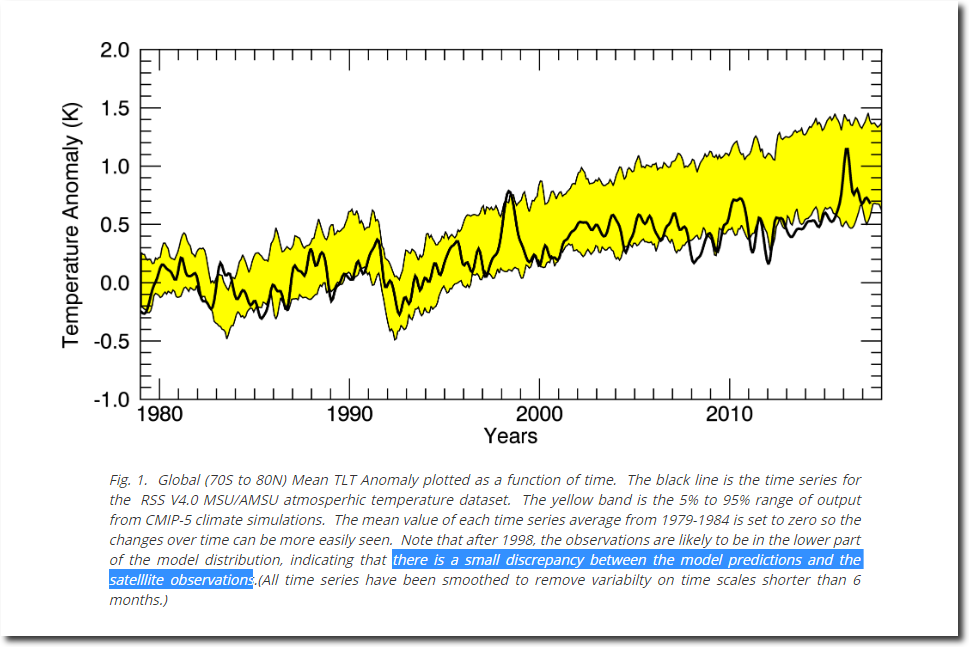
Note that after 1998, the observations are likely to be below the simulated values, indicating that the simulation as a whole are predicting too much warming.
Climate Analysis | Remote Sensing Systems
But under intense pressure, Mears altered his own data to bring it into compliance. The large discrepancy became a small discrepancy.
there is a small discrepancy between the model predictions and the satellite observations.
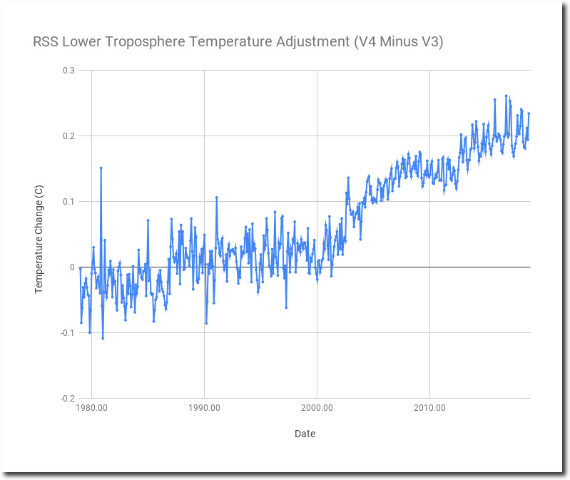
The image below overlays Mears’ old graph (V3) on his new one (V4.) It is clear what he did – he eliminated the blue error interval, and started using the high side of the interval as his temperature.
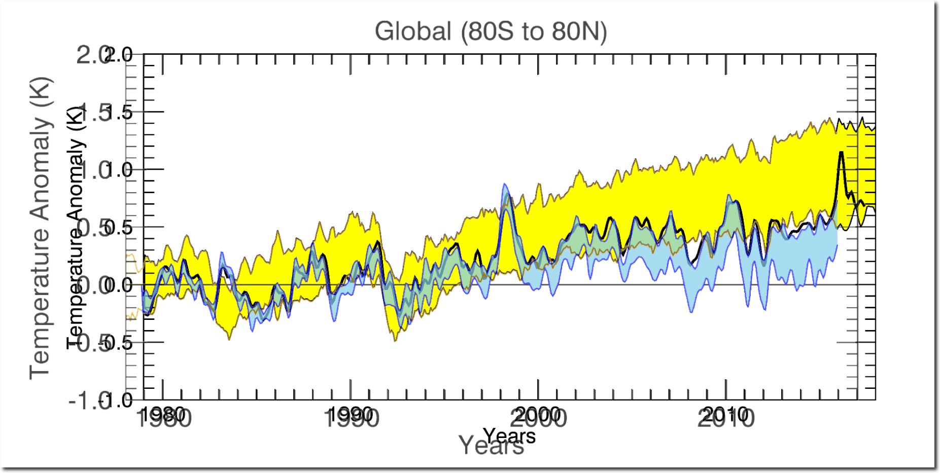
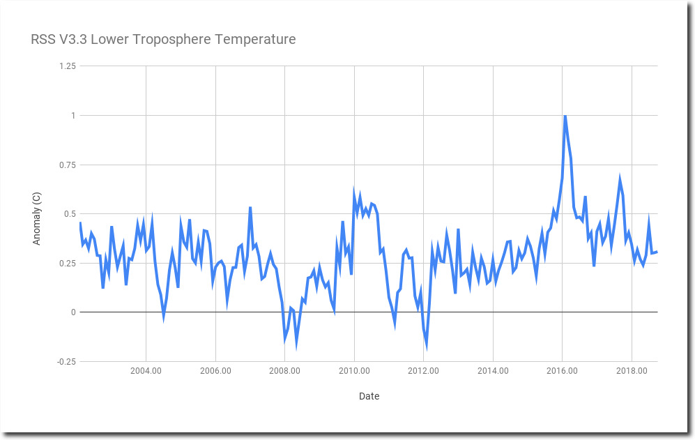
RSS V3 shows no warming since 2002.
The warming was all created by tampering with the data to eliminate the error interval.
The corruption is now complete. NASA has announced that new satellite data matches their surface temperature data. This was done to keep the President’s Commission on Climate Security from having accurate data to work with.
All government climate data goes through the same transition in support of global warming alarm. The past keeps getting cooler, and recent years keep getting warmer.
Government climate agencies appear to be using Orwell’s 1984 as Standard Operating Procedure.
