Disrupting the Borg is expensive and time consuming!
Google Search
-
Recent Posts
- Worst March Drought On Record
- ChartGL Process Control Demo
- The Biggest Money Laundering Scam
- Drought In The Headwaters Of Lake Powell
- Unrealistic Expectations Of Water Availability
- Did Bill Gates Do This?
- Worst March Drought On Record In The US
- The Real Hockey Stick Graph
- Analyzing The Western Water Crisis
- Gaslighting 1924
- “Why Do You Resist?”
- Climate Attribution Model
- Fact Checking NASA
- Fact Checking Grok
- Fact Checking The New York Times
- New Visitech Features
- Ice-Free Arctic By 2014
- Debt-Free US Treasury Forecast
- Analyzing Big City Crime (Part 2)
- Analyzing Big City Crime
- UK Migration Caused By Global Warming
- Climate Attribution In Greece
- “Brown: ’50 days to save world'”
- The Catastrophic Influence of Bovine Methane Emissions on Extraterrestrial Climate Patterns
- Posting On X
Recent Comments
- Gordon Vigurs on Worst March Drought On Record
- Robertvd on Worst March Drought On Record
- Bob G on Worst March Drought On Record
- GW on The Biggest Money Laundering Scam
- Don B on Worst March Drought On Record
- Ulric Lyons on Worst March Drought On Record
- conrad ziefle on The Biggest Money Laundering Scam
- conrad ziefle on The Biggest Money Laundering Scam
- D. Boss on The Biggest Money Laundering Scam
- Bob G on The Biggest Money Laundering Scam
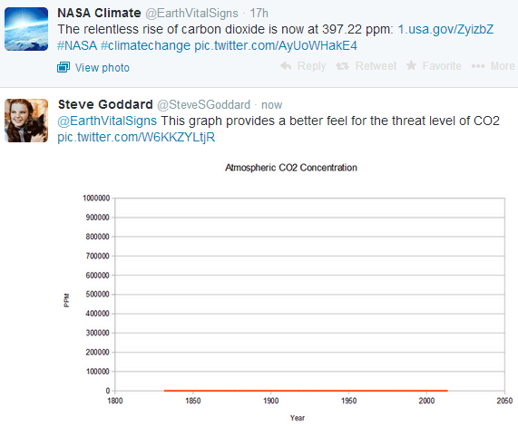
NASA Warns Of The “Relentless Rise In CO2”
This entry was posted in Uncategorized. Bookmark the permalink.


NASA is a huge organization, employing thousands and thousands of people. There are two large divisions. One can invent incredible things like the Mars lander/rover “Curiosity”. The other is completely politicized and can only invent lies and spin.
“Ye shall know them by their fruits.”
But what about my grandchildren? ;^)
Nice graph.
Earth’s temp in degrees K would be similar I thnk.
Given that the temperature is 3 Kelvin, without the sun the temp of Earth would be 3 K.
So the sun, earth systems and cosmic rays keep us from being at that temp. Would be nice to see a graph with 3K as the minimum on the Y axis.
And NASA, how much of that rise in CO2 to 397.224648179301135 etc, ppm – in relative terms (that’s percent,” for you science types at NASA, you know that old “%” sign? – is due to HUMAN activity and how much to NATURAL input? Hmmmm? The world wants to know.
hahahahahahahahahahahahaha, and hee hee hee
“As of 2010, the federal government considers any concentration of carbon dioxide below 5,000 parts per million as safe, according to the DuPage County, Illinois, Health Department.”
http://www.ehow.com/facts_5863170_safe-co2-levels_.html
Your graph effectively shows percent, but perhaps the Y axis should top out at a safe level mark.
“For CO2 to be a danger to humans in would have to reach levels between 30,000 ppm – 100,000 ppm and the danger would be asfixiation not co2 poisining.”
http://wiki.answers.com/Q/Is_Co2_dangerous_to_man_and_at_what_levels
I don’t know why that last range is so high though.
John M Reynolds
As a % of the atmosphere co2 has increased .0034% in thirty years. In design of pot growing areas 700 ppm are needed to improve yield during budding time. That is the design requirement, fun fact
So, talking to your plants may have raised the plant food in the area and contributed to an old notion?
Although ASHRAE recommends co2 levels of 600 ppm you really do not feel anything until 1000 ppm. In schools we set makeup to the 600 ppm figure, hardly goes on. The breath you exhale is about 35000 ppm , or about 100 times atmospheric conditions. I always think there is a subtle deception to confuse co and co2 by powers that be.. co is a poison, deadly at 70 ppm
Plants will continue to suffer from depleted CO2 levels.
…and a fun companion post to this is the chart James did
What temps would look like plotted on a regular thermometer….
http://suyts.wordpress.com/2013/02/22/how-the-earths-temperature-looks-on-a-mercury-thermometer/
Interesting, I heard sometime ago that it was above 400 ppm. I guess the warmists don’t even have dictionary to know what “rise” means.
OTOH, the following chart of NSIDC *obviously* shows an ice extent very close to the average,
http://nsidc.org/data/seaice_index/images/daily_images/N_daily_extent.png
Considering that Greenland’s area is about 2.1 million km2, I’d say that the total “blue area” in the chart minus the “little white areas” beyond the orange line, would give a total of no more than 300-to-400 thousand km2.
Then, why “cryosphere today” is saying that the NH seaice anomaly is nearly *1.2 million km2* negative?
How ~ 350,000 becomes 4 times larger??
I have taken CO2 readings (calibrated meter +-50 ppm accuracy) in around where I live and work (very dense urban areas). I generally get readings in the 450 – 750 ppm range outside. Downtown Manhattan during one day with no wind I recorded just over 800 ppm. My tomatoes seem to like it. Using demand control ventilation (CO2 sensors) is a bit dubious around here.
CO2 levels above 1000 ppm isn’t the main concern. The concern is that higher levels might be an indication of other potentially harmful gasses building up due to not enough ventilation.
OH GOOD!!!
Only another 1100 ppm to go to reach a reasonable level.
Much to do about one silly molecule out of 10,000.
I’d show them this graph:
http://jonova.s3.amazonaws.com/graphs/paleo-climate/berner-scotese-newer-2014.gif
Relentless? We’re at an extremely low point in history; other than at maybe 300 million years ago.