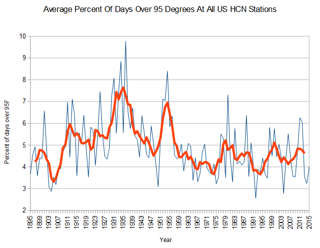
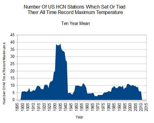
Prior to 1955, hot summer afternoons were very common in the US, but they rarely happen any more. The vast majority of stations set their all-time temperature record in the 1930’s.
Much of the small post-1970 increase seen in the graph above, is an artifact of new stations being added. It has nothing to do with climate.
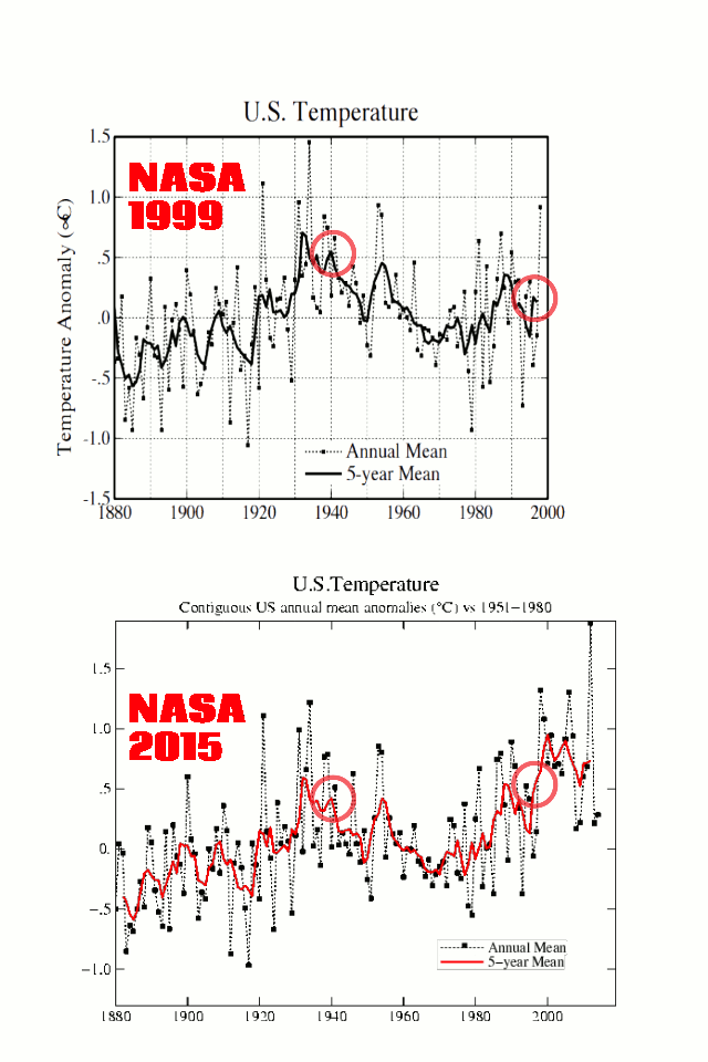
The US used to be much hotter, so NASA is tampering with data to make the heat disappear and hide the decline.


Neat graphs, specially the number of stations thingy. Is the number of stations in use been changing and how did you take that into account?
(statistically comparable numbers are difficult to get when the set changes)
If you plot only stations which have been continuously active since 1920, the shape is nearly identical.
If you look at those charts (which my own findings say are correct and valid) and believe there is an ongoing problem with catastrophic warming, you are a mental case.
O/T
The Daily Mail had an article on Smart meters and increase in cost at prime time. (Something Richard north at EUreferendum has been talking about for a couple of years.) The interesting part was in the comments about Smart Meters catching on fire. So I checked and sure enough.
In U.S. and Canada, “Smart Meter” Fires Spark Alarm
In the UK the rollout has been carried out with characteristic ineptitude, there are at least four different, incompatible varieties of meter, so anyone wishing to change suppliers has got to have a meter change too – at £several hundred a go.
Good, innit?