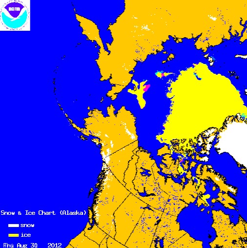
Almost no change since yesterday’s 1% increase.
NIC charts are produced through the analyses of available in situ, remote sensing, and model data sources. They are generated primarily for mission planning and safety of navigation. NIC charts generally show more ice than do passive microwave derived sea ice concentrations, particularly in the summer when passive microwave algorithms tend to underestimate ice concentration. The record of sea ice concentration from the NIC series is believed to be more accurate than that from passive microwave sensors, especially from the mid-1990s on (see references at the end of this documentation), but it lacks the consistency of some passive microwave time series.
National Ice Center Arctic Sea Ice Charts and Climatologies in Gridded Format


Arctic Weekly Ice Extent Archive – From the National Ice Centre.
http://www.natice.noaa.gov/products/ice_extent_graphs/arctic_weekly_ice_extent.html
On the right-hand side, change the ‘Start’ date to 2007 (leave ‘end’ date set at 2012) and ‘Submit Query’.
Be prepared for a little suprise.
Also note that the NIC states Ice Extent @ 6.62 million square kilometers, compared to the NSIDC’s 4.1 million square kilometers.
Very interesting. Thanks for the link!
‘..believed to be more accurate…but it lacks the consistency of some passive microwave timeseries.’ Your highlighter failed you.
Gondo, Gondo, Gondo…….
I knew you would disappear.
Look at worldwide sattelitte timelapse and you will see this B.S.for what it is! Only a fool or someone with an agenda would publish this as proof!!!