An exciting new release for Windows, and the first Mac version.
Version 1.6 allows you to do daily comparisons between two years, like the one below – which shows how incredibly hot the summer of 1936 was.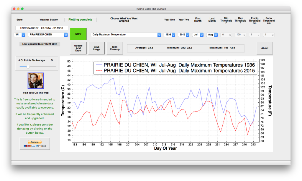
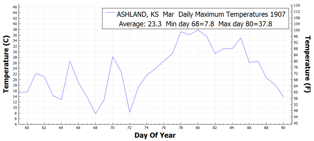
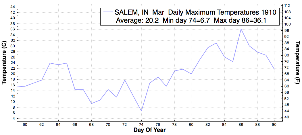
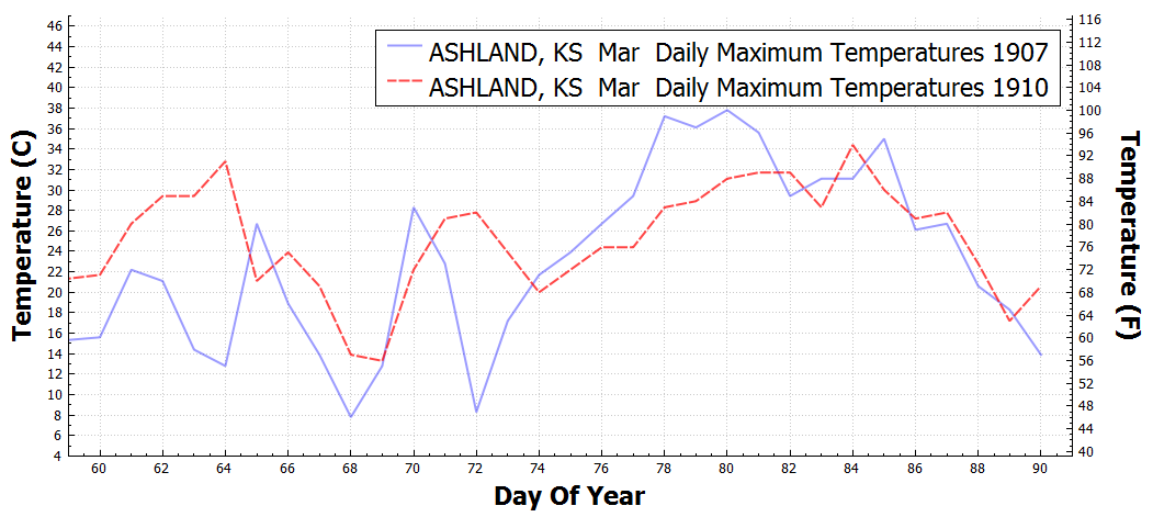
If you select two years to plot, you get a graph like this, which shows the record hot months of March 1907 and 1910.

If you select only one year, you get the average, minimum and maximum for the time period graphed..
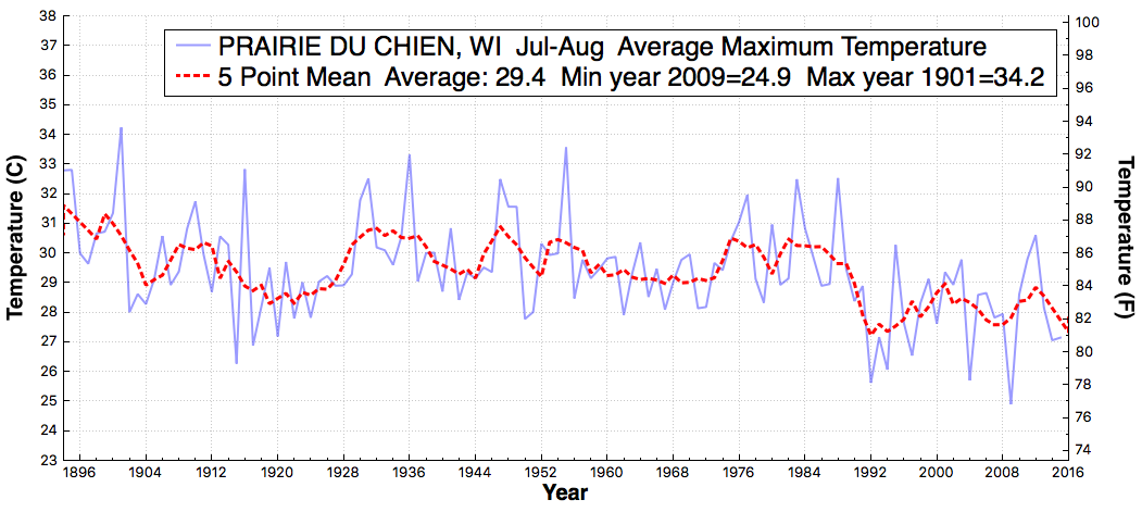
This plot shows how Wisconsin summer temperatures peaked in 1901, and bottomed out in 2009.

Mac download :

Windows download the zip file by clicking here.

Or alternatively replace these two files in your current directory:
PullingBackTheCurtain.exe us_stations.txt
As always, the software is completely free and contains nothing nefarious. Some people get warnings from their virus protection extortion software.


