Biden administration formally launches task force to ensure scientific decisions are free from political influence
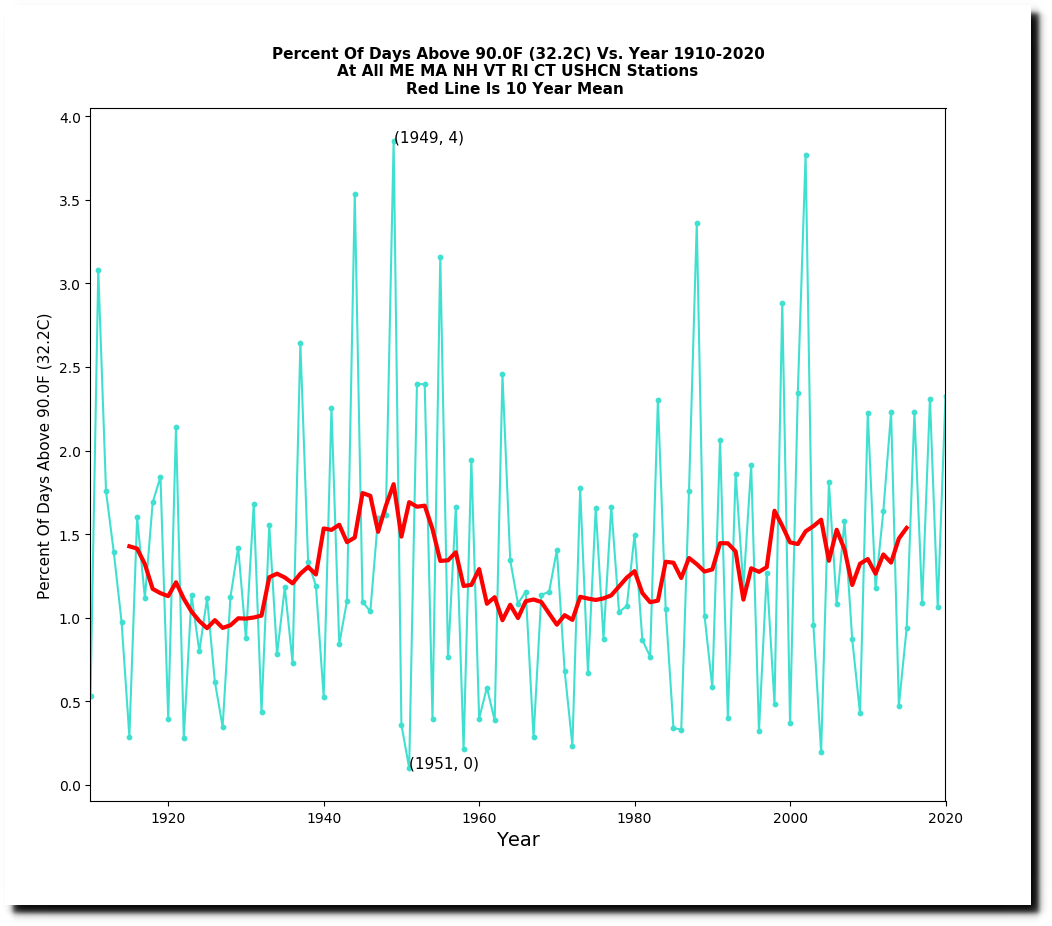
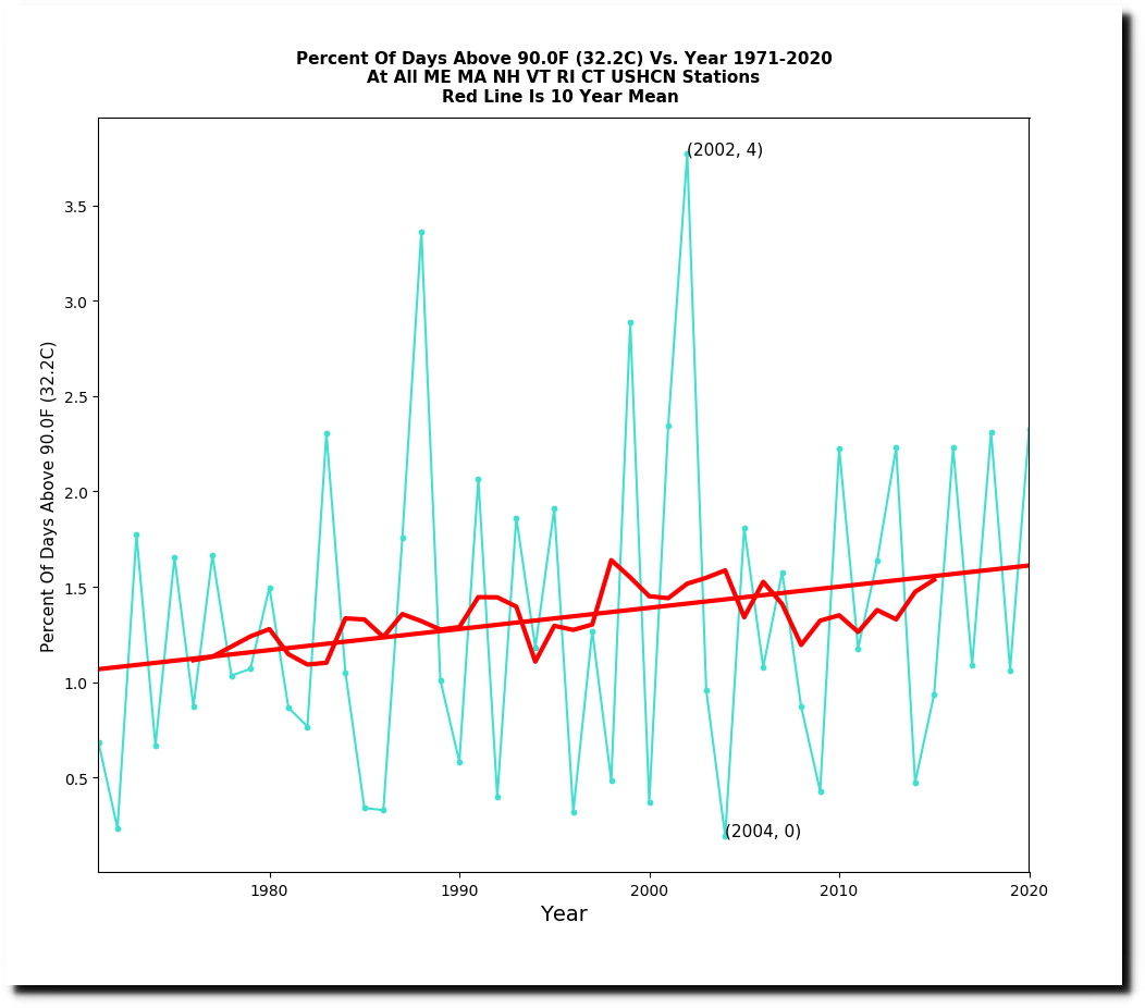
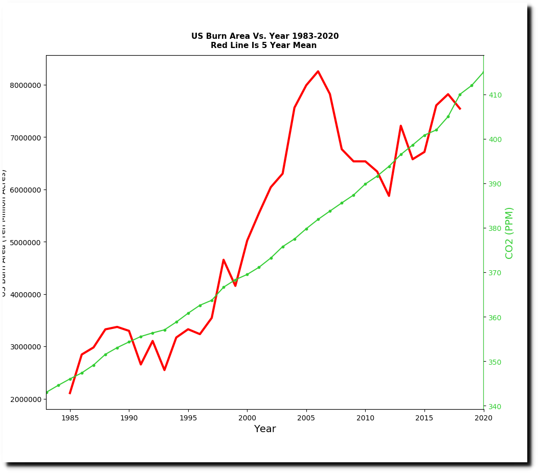
The EPA has a new graph on their website which shows that the US Forest Service collected fire data from 1983 to 1997 and the National Interagency Fire Center collected fire data starting in 1983. According to their graph burn acreage in the US has increased by 400%.
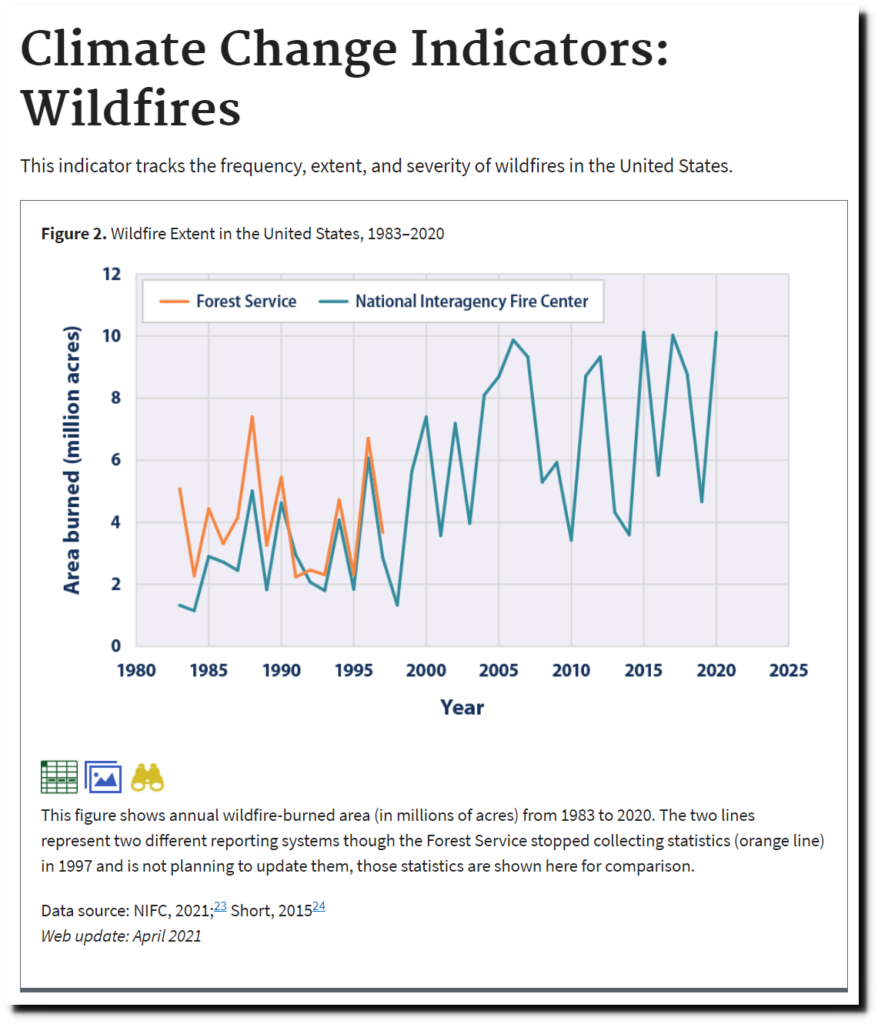
Climate Change Indicators: Wildfires | Climate Change Indicators in the United States | US EPA
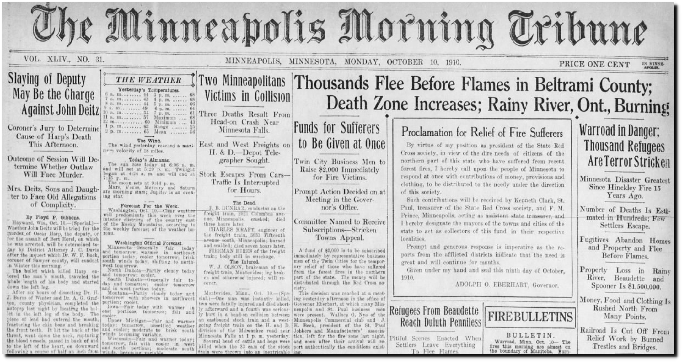
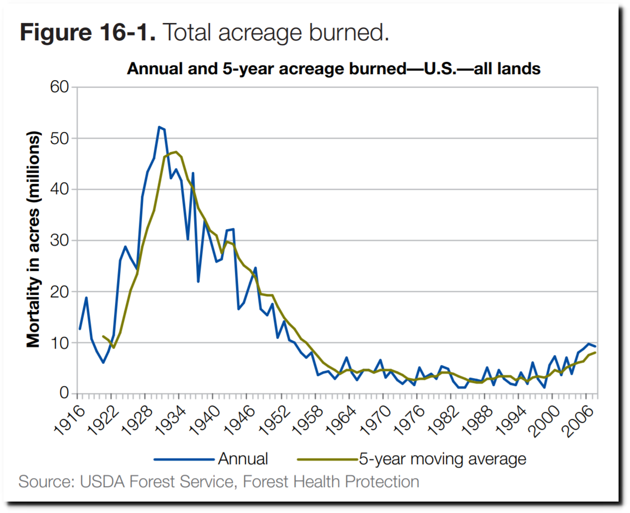
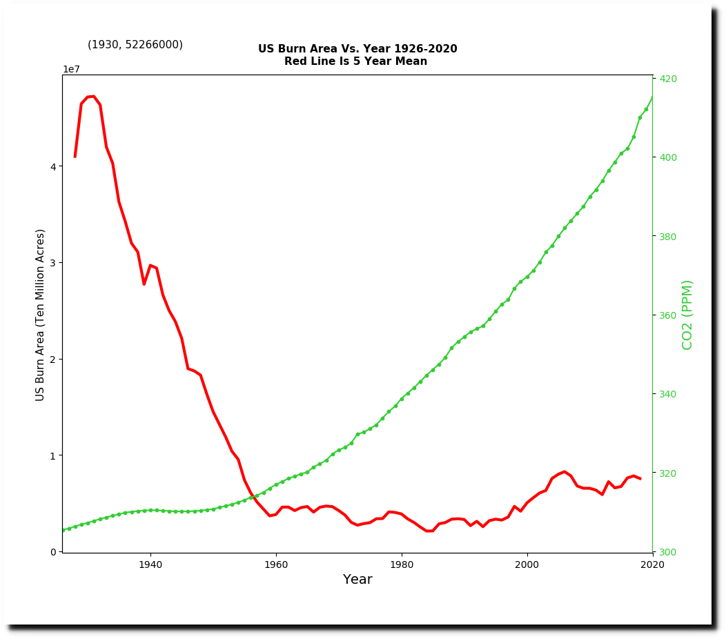
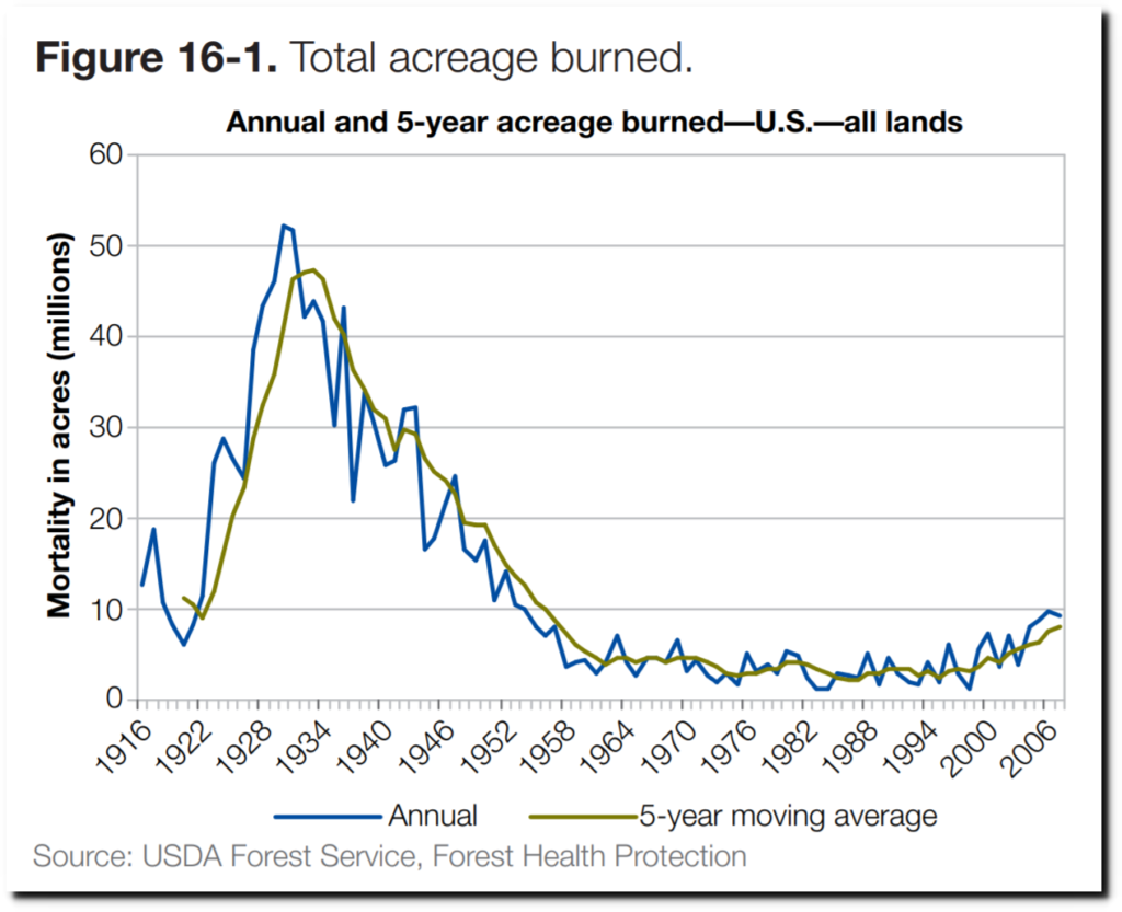
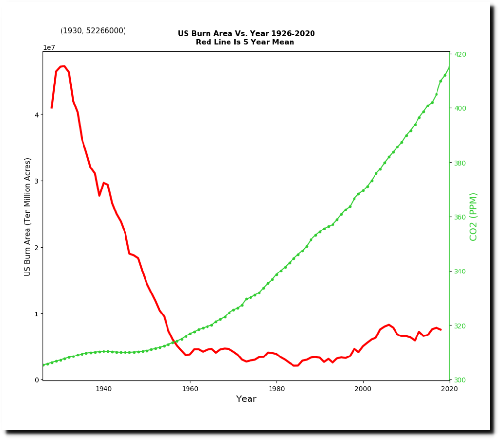
But this report from ten years ago showed that US Forest Service collected fire data from at least 1916 to 2008, and that burn acreage is down 80% since the 1930s.
2010-sustainability-report.pdf
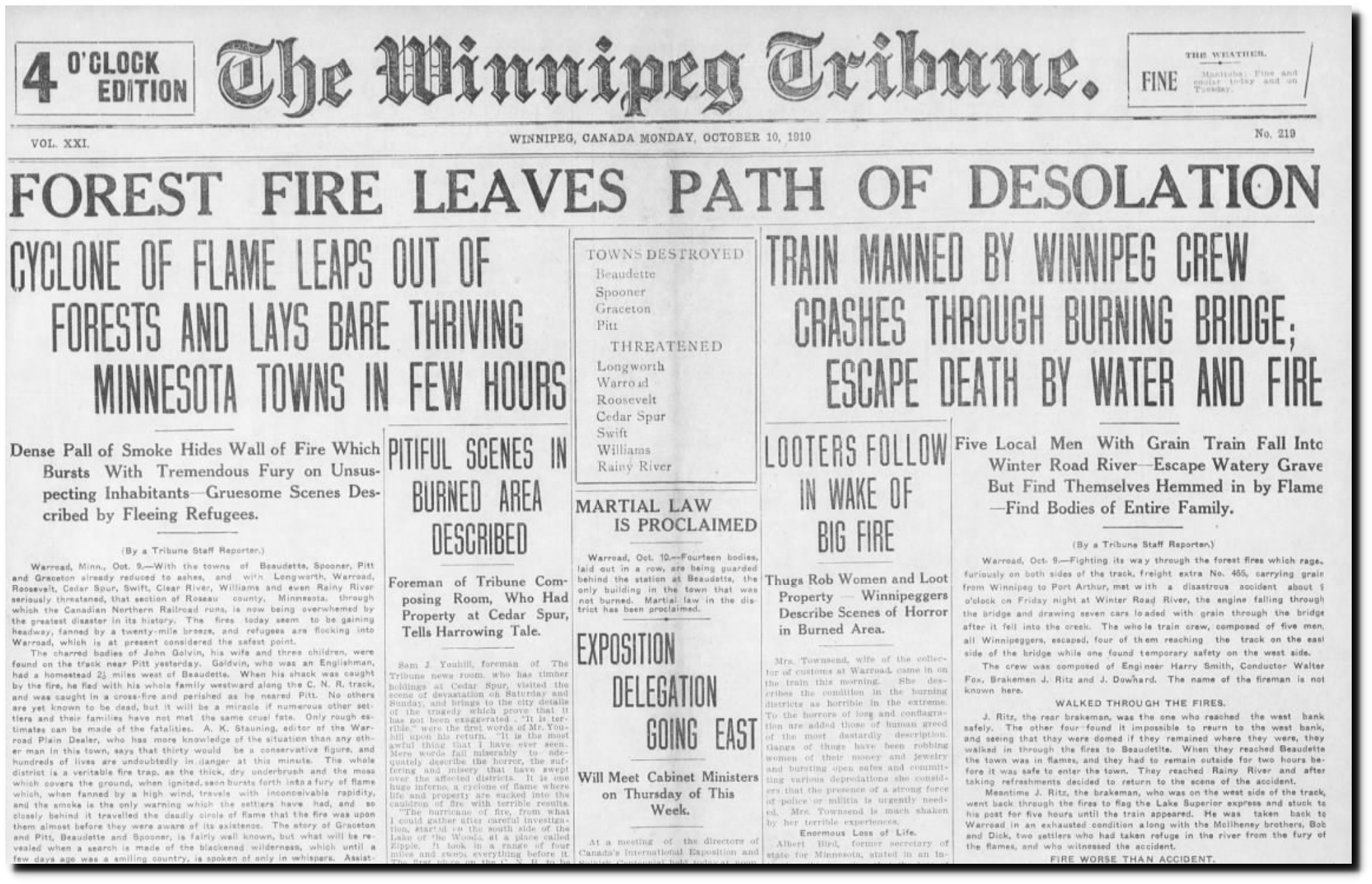
This 1938 New York Times article confirmed the data in Forest Service graph.
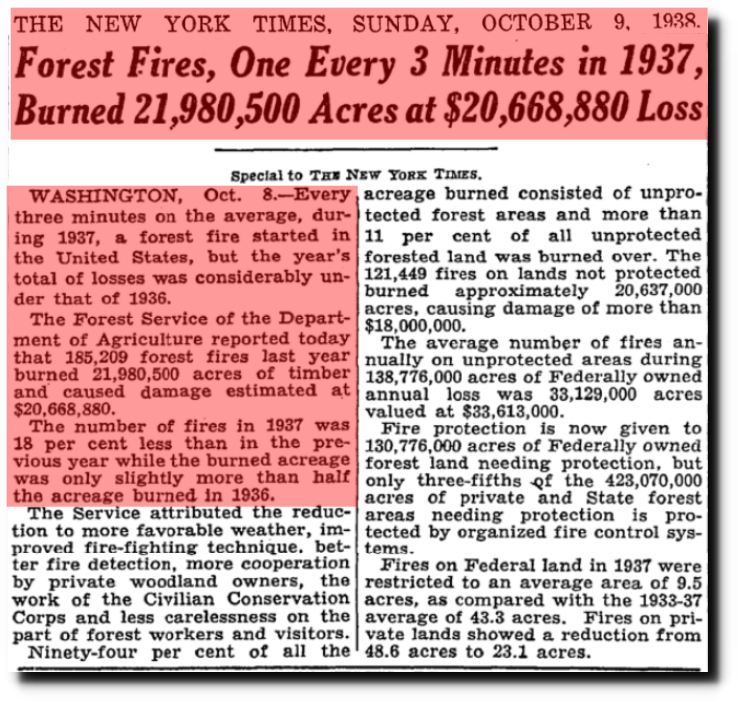
TimesMachine: October 9, 1938 – NYTimes.com
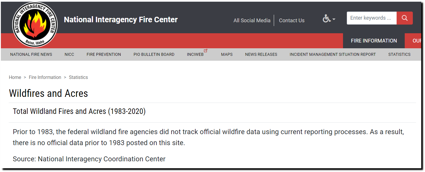
The National Interagency Fire Center website shows burn acreage back to 1983.
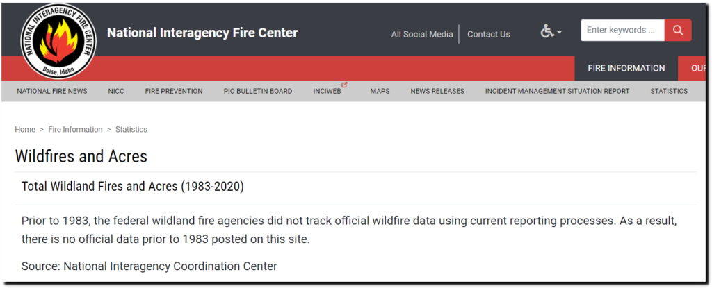
http://www.nifc.gov/fireInfo/fireInfo_stats_totalFires.html
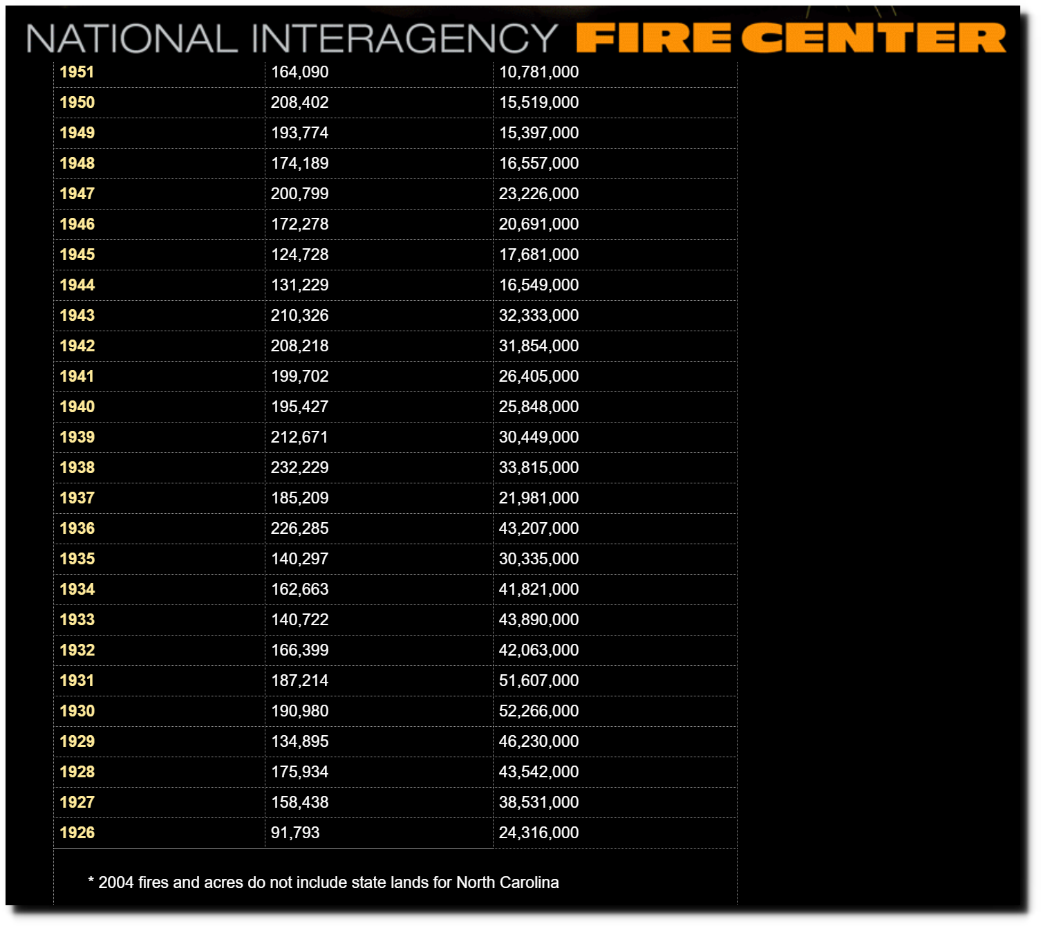
As of January 29 of this year, the same website showed burn acreage back to 1926.
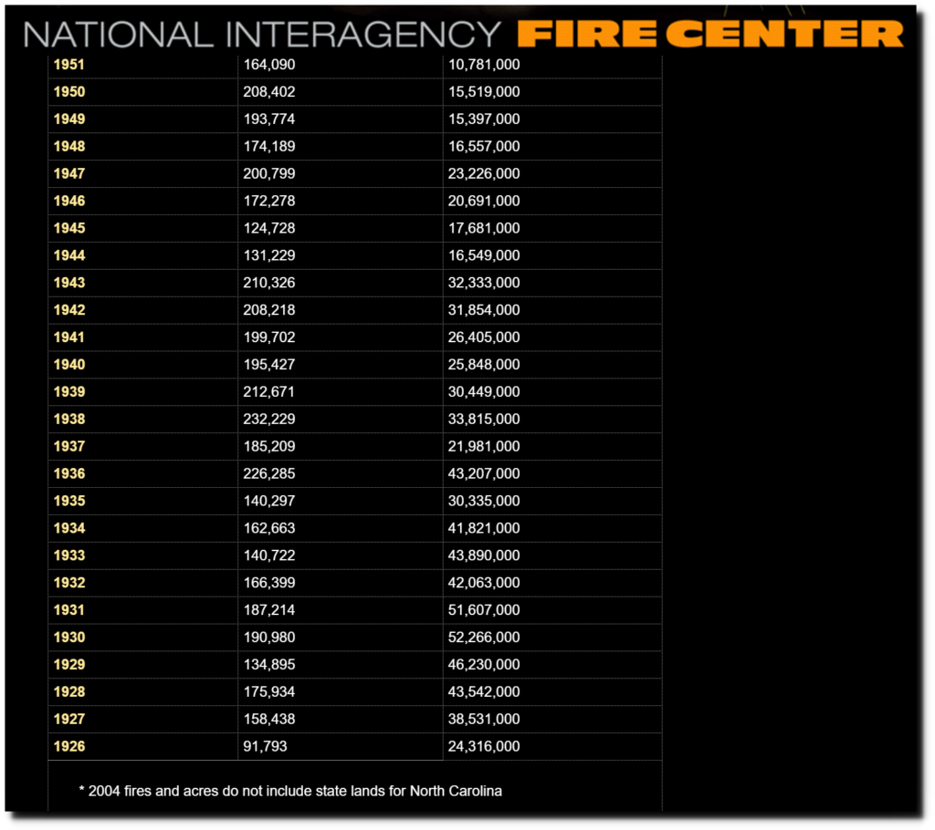
National Interagency Fire Center
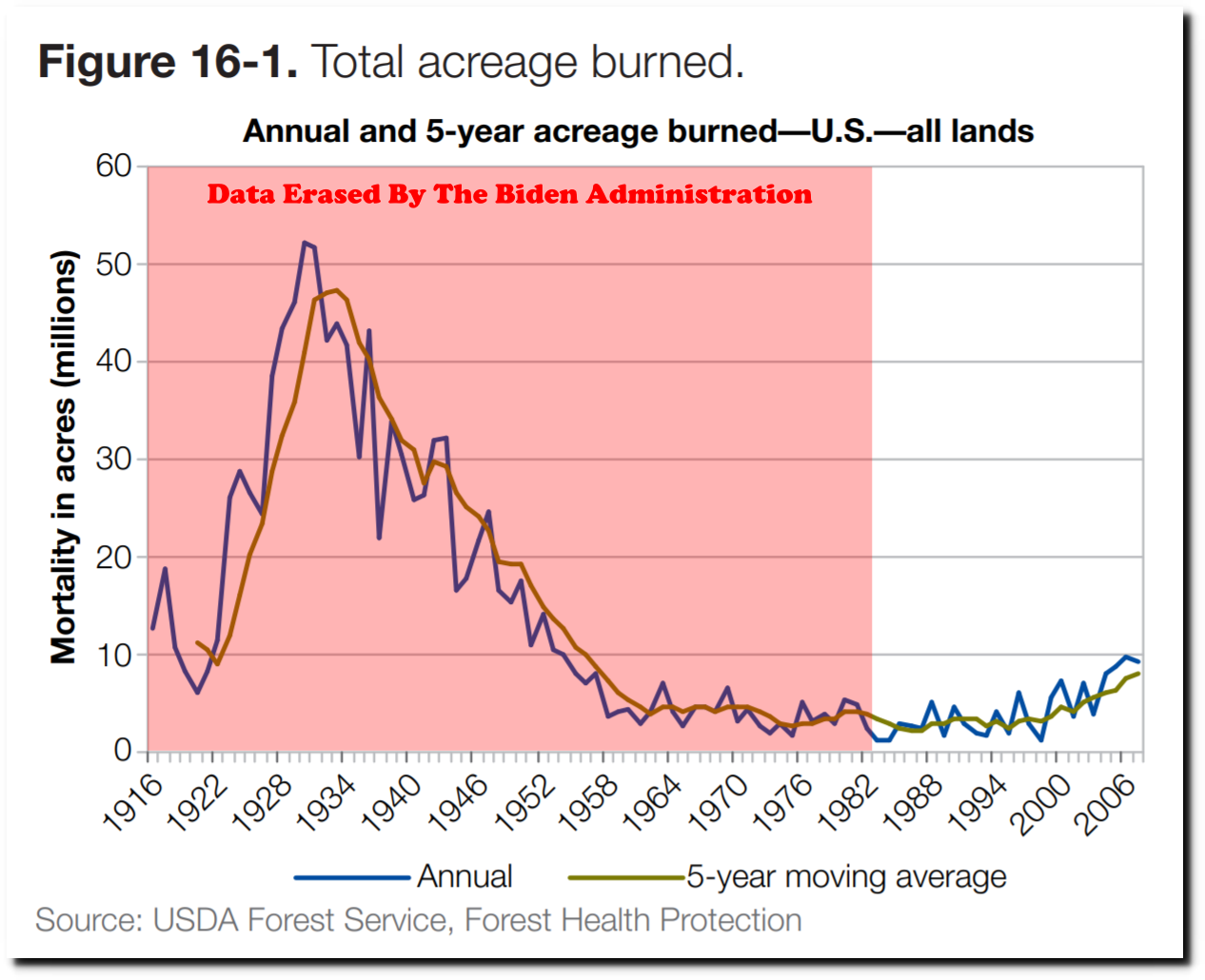
The Biden administration picked the low point of the graph to start their new graph and hid all of the earlier data.

By starting in 1983, they can claim there is a correlation between CO2 and burn acreage.
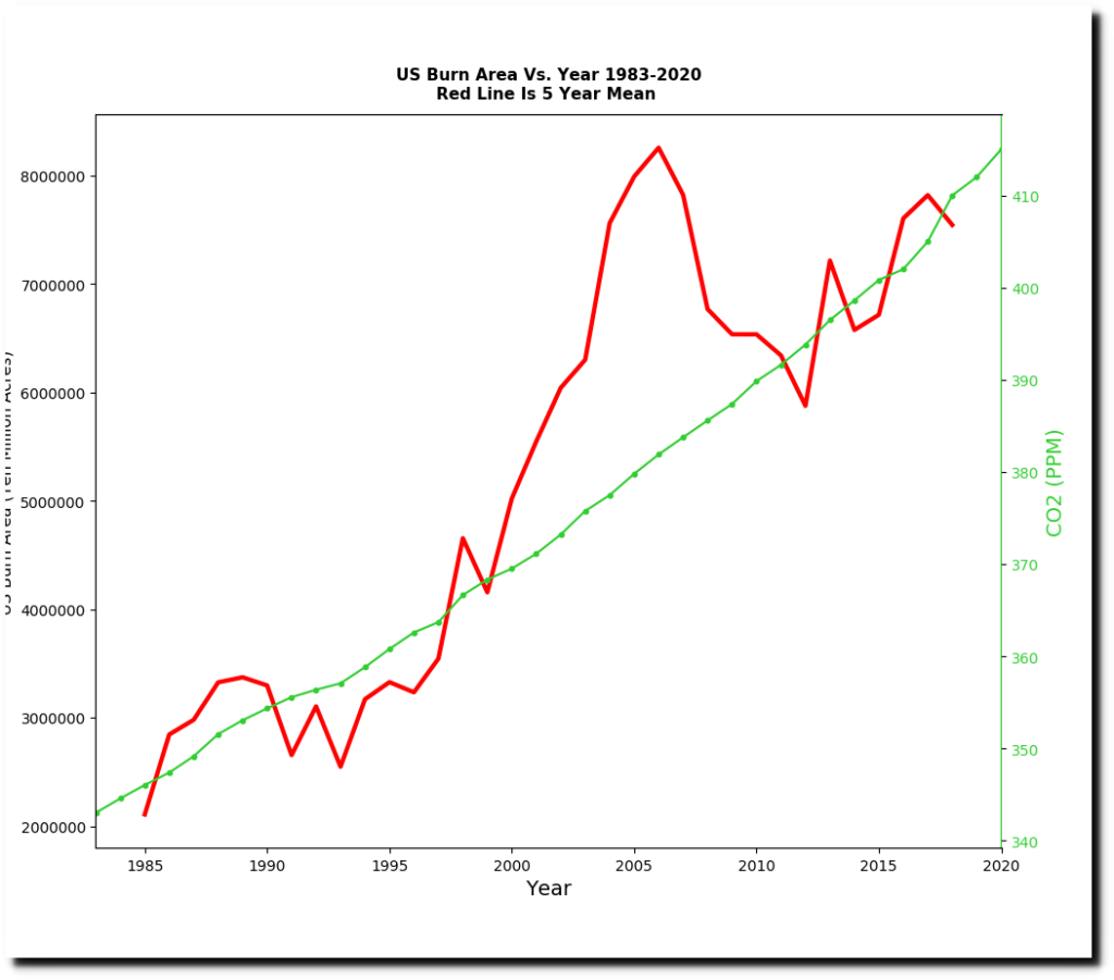
But the complete data set shows the exact opposite.
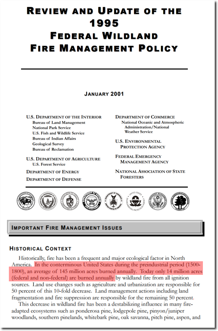
On November 1 of last year, the National Interagency Fire Center had this document on their web site.
“In the conterminous United States during the preindustrial period (1500- 1800), an average of 145 million acres burned annually. Today only 14 million acres (federal and non-federal) are burned annually by wildland fire from all ignition sources.”

Wayback Machine
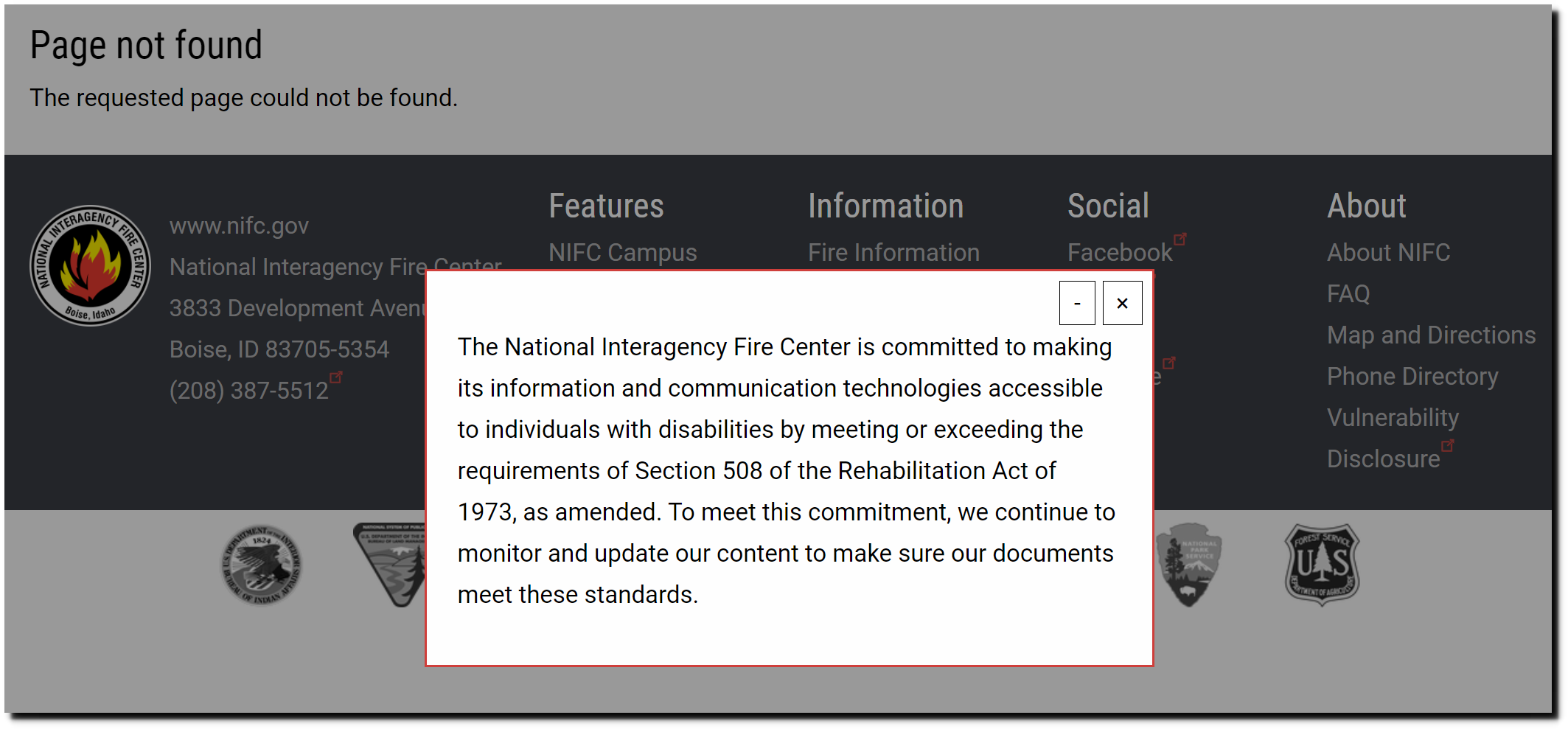
That page has also been erased and now shows this :
“The National Interagency Fire Center is committed to making its information and communication technologies accessible to individuals with disabilities”

Page not found | National Interagency Fire Center