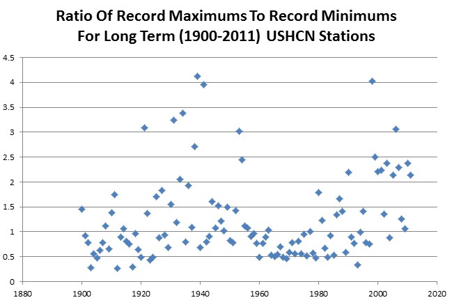
The graph below shows the ratio of record maximums to record minimums for all long term USHCN weather stations. The year 1939 had the highest ratio, and the 1960s and 1970s were among the lowest.
That is why alarmists ignore weather prior to the 1970s or 1960s.
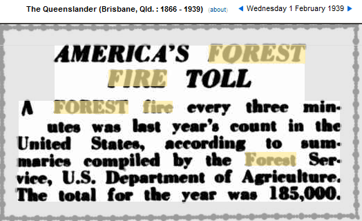
During the record year 1939, the US also had 185,000 fires – compared to 40,000 so far in 2012.


Wait Steven , are you expecting people to think and analyse what they are told ? The warmists expect people to blindly beleve every word the hansens and manns and romms and mckibbens and karls etc. etc. tell them . You can’t have people going around thinking for themselves , they might get the idea that the climate is behaving normally !
Steven,
Very interesting. I wonder what the PDO index would look like superimposed on top. Maybe I’ll take a shot at it after work today. And that one high ratio just before 2000; that wouldn’t happen to be 1998, the year of the super El Nino would it?
Bingo!
Looks like hot cycles and cold cycles. Nothing to do with warming.
Reblogged this on Climate Ponderings.