
In 1981, NASA showed a little over 0.3C warming from 1900 to 1980 at 23°S- 90°S
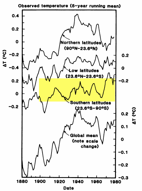
They now show about 0.8C warming during that same time period for 23°S- 90°S
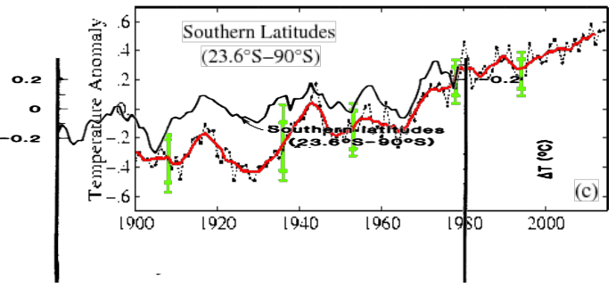
The next image overlays the two graphs at the same scale. Note how Gavin Schmidt massively cooled the past, to increase Southern Hemisphere warming.
Gavin’s data tampering didn’t stop in 1980 however. Since 2001, Gavin erased a 0.2C cooling in that region from 1990 to 2000.
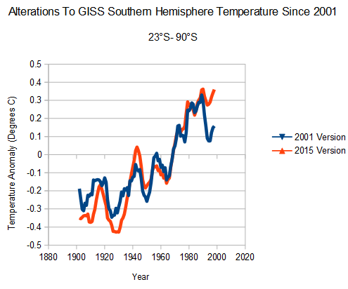
As with the Northern Hemisphere, Gavin has cooled pre-1960 temperatures and warmed post-1960 temperatures.
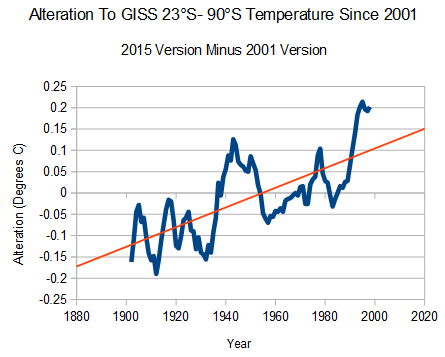
But with Gavin, the data tampering never stops. Since 2004, Gavin warmed 1980-2000 23°S- 90°S temperatures by about 0.1C.
2004 version: Fig.B.ps
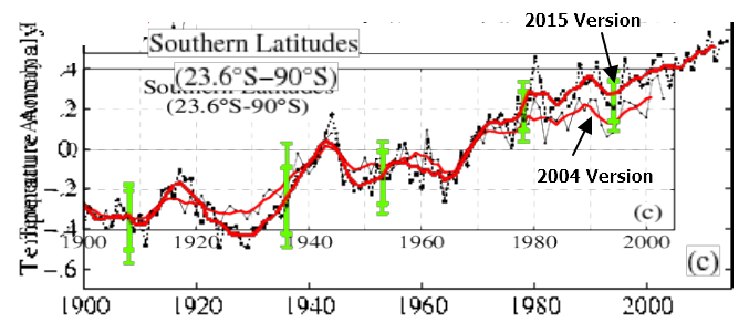
This might be considered surprising, because Gavin knows that Antarctica cooled significantly during that period.
Shindell, D.T., and G.A. Schmidt 2004.
While most of the Earth warmed rapidly during recent decades, surface temperatures decreased significantly over most of Antarctica.
NASA temperature graphs have little or nothing to do with the actual temperature of the earth. They are simply propaganda tools for the White House. Gavin will argue that the addition of fake historical ocean temperatures altered the trend, but buffering by the thermal mass of the oceans would have the opposite effect of reducing warming – not increasing it.
“A lie told often enough becomes the truth.”
- Vladimir Lenin

Hey Tony! “Gavin will argue that the addition of fake historical ocean temperatures altered the trend, but that would have the opposite effect of reducing warming – not increasing it.”
That is a very good point. The thermal mass of the oceans is so enormous that any oceanic rise in temperature (if it actually is taking place; the error bars are so large that it is not possible to say with certainty) would of necessity be less than the change in land temperature. If you add ocean readings to land reading the result should always be less than land by itself.
Steven, do you have evidence that the NASA adjustments are wrong?
[SG: I have evidence that they have massively altered data, they overwrite their data in place, they block web crawlers, they ignore massive discrepancies with satellite and radiosonde data, and they don’t put any disclaimers on their graphs that they are committing this fraud]
Do you have evidence they are correct? Only tampered data agrees with the tampered data.
Martin, proof that the adjustments are wrong is that every time they adjust them, they warm the recent years and cool the earlier ones. Every time. That’s all the proof you need.
Your claim is false, Morgan. I proved your claim false the last time you demanded that I prove it false.
Of course they are right! People are taller now, therefore when people were shorter they had to look up more to read the thermometers. Thus we know the past temperatures were indeed cooler than recorded. Now that were are taller, we read the same thermometer from a higher perspective, thus we are reading them too low these days. All the past must have been colder than the records, and the present must be warmer, just due to the change in perspective in reading the thermometers. Obvious, no?
Hey skeohane! Sadly, your explanation makes more sense than what we have been told by the officials.
Steven, please don’t modify my posts. I encourage you to reply, but not by adding to my post. Please reply in the normal manner, so it doesn’t appear that I am replying to my own post.
Evidence that NASA has altered data, massively or not, is not controversial. NASA publishes the adjustments it makes, along with the explanations and the methods used. NASA doesn’t ignore discrepancies with satellite and radiosonde data. NASA isn’t supposed to only make adjustments that agree with other datasets. If NASA did that you would be all over them like white on rice, and rightly so. So you can’t complain about NASA doing the right thing here. Furthermore, the satellite data you claim is more accurate is the output of a model, and you don’t like models. Bit of cognitive dissonance there. Nor was there any satellite data from 1880 to 1980, so you can’t complain about a discrepancy there.
Not sure what you mean by overwriting their data in place. I think you just mean they have replaced the published original data with the published adjusted data, which, of course, is the correct thing to do. the original data should be published under a different name, given that it is no longer the most accurate data.
Also not sure why NASA should allow access to its data by web crawlers. Why should they allow that? Sounds like a security risk. Get the data from NASA the way everyone else gets the data from NASA.
And no disclaimers are required. They provide access to their data and explain the changes that have been made.
Finally (again), if you have any evidence that NASA has committed fraud with these data, please post that evidence. Evidence of adjustment is not evidence of fraud.
Martin is being paid by Big Oil to make socialist, progressive, manipulative, politically correct intimidating, authority appealing, fraud perpetrating CAGW believers look like complete jackasses.
Where can I get paid to have this much fun, pmc?
Well, then NASA has shown by all the adjustments to the temp record that the record is likely too unreliable to draw conclusions from ?
–
The most recent ,of course, being that the “hiatus” did not occur. And temps have increased without change during these “hottest decades ever” .
–
How strange then that a predicted higher temp effect, ( increasing lower stratospheric water vapor ) did not occur. In fact, lower stratospheric water vapor declined simultaneous to the “hiatus”, that NOAA now claims, did not occur.
Decline in wv began in 97 , Collapsed after 2000. Indicating Cooling in the troposphere .
–
Another drop in water vapor ;
Eos, Vol. 95, No. 27, 8 July 2014
http://onlinelibrary.wiley.com/doi/10.1002/2014EO270001/epdf
Solomon et al 2010 .
–
Water vapor ~ 30% of surface warming 1980s and 90s.
https://www.sciencemag.org/content/327/5970/1219.abstract
–
Exactly as the satellite and radiosonde data shows. No warming since 1997.
–
Or, is the near 20 year drop in water vapor a …coincidence ?
Martin, please show me where I can find every data revision for any location in January of 1885.
It is all documented right. And easily verifiable right. Should only take you 5 minutes to find one.
There shouldn’t be adjustments, Data are Data
wiz, that would mean there would be no satellite data at all, because ALL satellite data is adjusted.
Bullshit, Algorithms are used to interpret digital data in the same way every time. Just as looking at a thermometer and reading the scale that is says 74 degrees is a reading on an analogue algorithm designed to interpret the expansion properties of a liquid.
Adjusting data is looking at that interpretation and saying, “No that is wrong, what it says is 75 but it is really 73.”
The data is still the data but you have ADDED an adjustment.
Nope. The algorithms ARE a model, wiz, and that model has been changed several times. Sorry.
But the output is CONSTANT if the base algorithm is changed. All 74 degree readings become 73 not just the ones in the past.
No, wizz, the model is much more complex than that.
What are you claiming Marty. That the algorithm that interprets satellite data has been changed and not then not applied to the whole data set but selectively to show no cooling trend? That would be fraud if it is true and libel if baseless.
Careful how you tread Marty.
wiz, the algorithms are different for different frequencies, different altitudes. there are differences is sensors, degradation models of sensors, degradation of satellite orbits, lots of biases and errors must be accounted for in the model.
Yes and proved true against weather balloon data before being implemented. The people who use satellite data are engineers and real scientists who use base lines controls and constants to prove their algorithm output, not tree ring tea leaf reading shamans who are constantly proved wrong and will not freely release their method.
Here is the REAL model used to adjust the temperature record.
You want the temperature to match the increase in CO2 so you adjust accordingly. After all that is what the IPCC/NOAA/ MET/BOM is tasked to do. SIMPLES.
https://stevengoddard.files.wordpress.com/2014/10/screenhunter_3233-oct-01-22-59.gif?w=640
You do not even need to ‘adjust the data’ Just cherry pick the stations!
The Graph of Temperature vs. Number of Stations
http://www.uoguelph.ca/~rmckitri/research/nvst.jpg
The station loss is in upper Canada, as I have already shown and show again, the former Soviet Union, China, Africa and South America. (rural stations) Many of these stations are still operating but ignored.
As early as 1991, there was evidence that station closure beginning in the 1970s had added a permanent upward bias to the global average temperature. SEE: Willmott, Robeson and Feddema (“Influence of Spatially Variable Instrument Networks on Climatic Averages, Geophysical Research Letters vol 18 No. 12, pp2249-2251, Dec 1991) They calculated a +0.2C bias in the global average due to pre-1990 station closures. Another paper tests whether the homogeneity corrections in gridded (aka KRIGED) data are adequate to remove non-climatic influences and found they are not.
This is why Marty the Gorebot’s insistance that the haphazard hit or miss GISS estimated Global temperature is superior to full coverage satellite data is so laughable.
…………
Here is the Canadian drop out. The black triangles are the stations used. Note the stations were not closed they were just DROPPED!
https://diggingintheclay.files.wordpress.com/2010/04/canadastations1975.png
“From over 600 individual temperature series and more than 540 combined series with records of more than 20 years, the thermometer record in Canada peaked in approx. 1975”
https://diggingintheclay.files.wordpress.com/2010/04/canada-bypopulation.png
“By 2009 there are less than 30 locations reporting temperature that are used by the Global Historical Climate Network (GHCN) prepared by the U.S. National Climate Data Center (NCDC); this data is also used as the input to NASA’s GIStemp program.
You can see the locations of the stations on the map (left) and the most obvious ‘hole’ is the lack of stations above latitude 60N. Yukon, Nunavut and Northwest Territories make up 39% of Canada, but between them have only four stations: Dawson and Whitehorse (Y), Eureka and Coral Harbour (NT).”
Another look at the sampling problem
The chart is a bit hard to read.
In the white area on the right each section has two latitude bands represented.
Such as dark blue Northern Polar (90 -70°N) and light blue Northern col (70 -50°N)
Within each section the colored bar chart represents stations in the time period from 2009 to 1709.
http://2.bp.blogspot.com/_vYBt7hixAMU/SzpY-r3HTbI/AAAAAAAAALI/bIMyN3qFjGE/s1600/March+of+the+Thermometers.bmp
And here is another chart from 2010:
https://diggingintheclay.files.wordpress.com/2010/01/totaland25.png
Graph showing the total number of stations in the NOAA/GHCN database and the
(black line) percentage that are adjusted by year as of 2010.
Steven may not have actual evidence of FRAUD but I sure as heck do!
I live within walking distance of a state of the art weather station at a local airport installed in 2001.
This state of the art station produces continuous and a min/ a max for the day. On the next day that data is ‘adjusted’ up between one and three degrees F and again a year later it is often ‘adjusted’ up.
THIS IS SOMETHING I WROTE A YEAR AGO in 2014 about the data from that state of the art station:
For example April 28 2014 5:35 AM (Min Temperature) was 54.5 °F
That was changed to Min Temperature 57 °F
For the same day Max Temperature was 68 °F (Cold front with rainy weather came through) That was changed to Max Temperature 81 °F
……
Well they really blew it. They wiped out freezing temperatures and 6 inches of snow that made headlines in the local newspaper in my area in the beginning of February [2013]. They replaced it with temperatures above freezing and rain with NO SNOW. It was so damn cold I had 2 inches of ice form in 12 hours on my stock tanks after I refilled them with warm water. (Goats can die from drinking cold water so I add boiling water to the well water to bring it to lukewarm.)
…..
On top of that I was keeping track of the days with highs 90°F and above in 2013. There was a total of FIVE DAYS, one day at 95°F and 4 days at 91°F as I mentioned several times last fall at WUWT.
I looked at the data this spring [2014] and low and behold there were FIFTEEN DAYS instead of FIVE!!! Ten of those days occurred by the end of July so I would not have missed them. (see below)
As a Lab manager of a Quality lab for decades I learned the tricks for spotting ‘Flinching’ and other telltales of data fraud. (I got fired for catching the upper levels pet lab tech who was ‘Adjusting’ numbers so batches would pass and ship… RESULT THREE PLANE CRASHES. Glad I wasn’t there when the fecal material hit the fan. She of course got fired to placate the FAA.)
One method for catching fraud is to look at the last digit and determine the count. If the data set is large enough the numbers should be equal. Since this is high temperature you would expect either equal numbers or a tapering off with more numbers at 0,1,2 3 than at 7,8,9
There were 105 days 90 and above for the three years I looked at so that is enough data to see a trend. The data is in °F but looked funny so I also included °C.
Temperature ———- COUNT
(32.2 °C) 90 °F..——..6 ALL in 2013
(32.8 °C) 91 °F..——..41
(33.3 °C) 92 °F..——..4 ALL in 2013
(33.9 °C) 93 °F..—–..10
(34.4 °C) 94 °F..——..0
(35.0 °C) 95 °F..—–..17
(35.55 °C) 96 °F..—..10
(36.1 °C) 97 °F..——..0
(36.67 °C) 98 °F..—..16
(37.2 °C) 99 °F..-..0
(37.77 °C) 100.°F-..1
Now that distribution is weirder than snake shoes. ALL the data for 90 °F and 92 °F is in 2013 and it just so happens to add up to the extra 10 above 90 °F that wasn’t in the same data set last year [2013].
If you discount the 90 °F and 92 °F from 2013 (since they just mysteriously appeared) you get
(32.8 °C) 91 °F
(33.9 °C) 93 °F
(35.0 °C) 95 °F
(35.55 °C) 96 °F
(36.67 °C) 98 °F
(37.77 °C) 100.°F
32.2 °C is 90 °F where as 89 °F is 31.67 °C so that might explain the promotion of 89°F to 90°F as numbers got changed back and forth from °C to °F to °C. But it does not explain all the 96 °Fs instead of 97 °F which is 36.11 °C. As I said weird.
As a lab manager I would be asking some very pointy little questions of anyone who reported these type of numbers over a sixth month interval.
THIS IS THE DATA:
April 2004 (6)…April 2010 (1)…April 2013 (0)
2 days – 91F……..1day – 91F………(high 86F)
4 days – 93F……………………………………..
May 2004 (17)…May 2010 (4)….May 2013 (0)
6 days – 91F…….4day……. – 91….. (2 days 88)
6 days – 93F…………………………………….
2 days – 95F…………………………………….
1 days – 96F……………………………………
2 days – 98F…………………………………….
June 2004 (11)…June 2010 (18)…June 2013 (3)
1 days – 91F…….5 day – 91F………90F – 2
7 days – 93F……..5 days – 93F……………
none ……………….2 days – 95F………..95 F – 1
2 days – 96………2 days – 96F…………….
1 days – 98F……..4 days – 98F…………….
Jul 2004 (24)….Jul 2010 (15)…..Jul 2013 (7)
……………………………………………….90F – 3
4 day – 91F 91F – 4…………91F – 1
11 days – 93F 93F – 4………..92F – 3
1 days – 95F. 95F – 2
days – 96F 96F – 2
7days – 98F 98F – 2
………………………….100F – 1
Aug 2004 (12)…Aug 2010 (13)…Aug 2013 (4)
……………………………………………….90F – 1
1 day – 91F 91F – 4………….91F – 2
8 days – 93F 93F – 3………….92F – 1
3 days – 95F 95F – 5
0days – 96F 96F – 1
Sept 2004 (0)…Sept 2010 (11)..Sept 2013 (1)
0 days – 91F 91F – 5…………91F – 1
0 days – 93F 93F – 3………..
0 days – 95F 95F – 1
0 days – 96F 96F – 2
Well, they have to adjust data to fit their models
There are thousands of thermometers at multiple locations throughout the world that say there has been no significant warming since 1940. Can you disprove all of that data, other than to say that those with a vested interest in scaring people by manipulating the data are saying it is wrong?
We just need a real leader in the White house who will inspire us…
We choose to learn how to read thermometeres. We choose to learn how to read thermometers in this decade and do the other things, not because they are easy, but because they are hard, because that goal will serve to organize and measure the best of our energies and skills, because that challenge is one that we are willing to accept, one we are unwilling to postpone, and one which we intend to win, and the others, too.
It is for these reasons that I regard the decision last year to shift our efforts in learning how to reading thermometers from low to high gear as among the most important decisions that will be made during my incumbency in the office of the Presidency.
Never fear, gator, Bernie is on the way.
https://www.youtube.com/watch?v=G8GwT7ZotCg
“NASA temperature graphs have little or nothing to do with the actual temperature of the earth.”
This is actually true, and can be demonstrated using available data, anyone with internet access can actually show it. (you don’t even need to generate your own graphs) The problem is so bad, and the idiocy so large, at this very moment it’s possible to show that GISS not only is wildly inaccurate, it doesn’t match NOAA,, andof course doesn’t match the satellite data, or the surface station data.
“Steven, do you have evidence that the NASA adjustments are wrong?”
Everybody has the ability to look at the evidence. Even with the efforts of GISS to make it very difficult to even look at their data, and impossible to verify their adjustments, it’s still easy to show they have become so wildly careless with their changing of the data, that it no longer even has any resemblance to the actual historic facts.
The problem with adjusting and changing data, is the each time you do it, it introduces errors, there is no way to avoid this. But then the errors get compounded, and it reaches a point, which we have seen many time illustrated here, that it is no longer possible to justify the presented data.
Because you can’t keep adjusting and adjusting, and then make it somehow still match what actually is happening.
Of course there is no point in even trying to show this to anyone who has made up their mind, that door is closed, locked and impossible to even knock on.
Since only about 10% of the worlds population lives in the southern hemisphere
http://www.businessinsider.com/90-of-people-live-in-the-northern-hemisphere-2012-5
the argument for UHI being the cause for adjustments is negated. So what is the justification for adjustments to the S. Hemisphere temperature record being essentially the same as those they’ve made for the N. hemisphere?
It is even worse than that RAH. Australia is a CO2 SINK! It EATS CO2 and is not making CO2.
https://media2.stickersmalin.com/produit/100/stickers-devil-smile-R1-143760-2.png
Same with the rest of the Southern Hemisphere…
http://ds.data.jma.go.jp/ghg/data/kanshi/co2map/pcone/201312_01_01.gif
That was 2013. We in the north are doing much better now…
https://wattsupwiththat.files.wordpress.com/2014/12/oco2-global-2014.jpg
And if you really thought that CO2 was ‘uniform’ and coming from mankind:
http://ds.data.jma.go.jp/ghg/kanshi/co2map/co2pmapplot_e.html
http://ds.data.jma.go.jp/ghg/kanshi/co2map/co2pmapplot_e.html
I will try that again
http://ds.data.jma.go.jp/ghg/data/kanshi/co2map/pcone/201307_01_01.gif
http://ds.data.jma.go.jp/ghg/data/kanshi/co2map/pcone/200909_01_01.gif
Notice how Australia is completely out of the picture as a source of CO2 but you can not say the same for Africa and South America or the Pacific Ocean for that matter.
I have a silly question; silly in that I am not any kind of a Scientist.
How can a rain forested area such as those found in South America and lower Africa be producing an excessive amount of Carbon Dioxide? Don’t green growing plants absorb CO2 and produce Oxygen?
Now, using my same flawed logic, the oceans would produce excess CO2 due to all the fish and sea mammals sucking up all the Oxygen and breathing out Carbon Dioxide.
Am I correct?