If The Data Doesn’t Match Theory, Change The Data

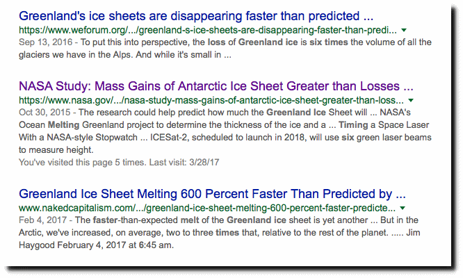
Professional climate fraudsters claim that Greenland is losing ice 600% faster than predicted.

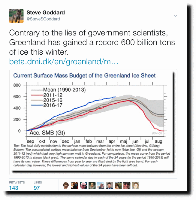
As of yesterday, the Danish Meteorological Institute (DMI) showed Greenland surface mass gain for the winter at a record high. This is a direct contradiction to the lies being spread by climate alarmists.

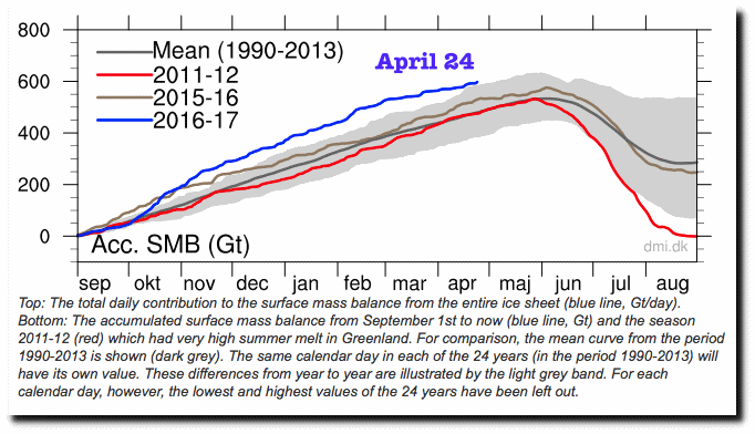
Greenland Ice Sheet Surface Mass Budget: DMI

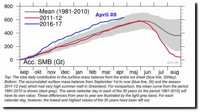
The DMI data was being widely cited by skeptics as evidence against global warming fraud, so today DMI changed the graph. They changed their baseline dates, and no longer show 2017 as being a record high.

We have seen this identical story hundreds of times. Climate data being altered to avoid criticism from global warming alarmists. Apparently DMI doesn’t want to have gunfire directed at their office, like John Christy and Roy Spencer had after Bill Nye’s “March for Junk Science.”

Climate alarmists are Brownshirt thugs. They don’t represent science. They represent the darkest side of human evil.

h/t Tom Woods

I tweeted this last night.

This entry was posted in Uncategorized. Bookmark the permalink.

64 Responses to If The Data Doesn’t Match Theory, Change The Data

  1. Brad says:

    Did DMI give any reason, hopefully supported by logic and data, as to why they changed their baseline? Or did they just cherry pick to make the current trend not seem so obvious? Also, wouldn’t a change in global climate create a consistently lower curve with both lower winter ice accumulation and higher summer melt? Having only a higher summer melt and consistent winter gain, such as in the 2011-2012 season would be an indicator of another phenomena, such as a seasonal weather change, not a global change in climate.

  2. Steven Fraser says:

    Its interesting to note some of the other changes in the chart. In the section on the site, they allude to a methodology change made earlier in the year. In addition to what you call out, Tony, I think we can see the application of the change in the two traces for this year and the 2011-12 year when compared with the scales.

    First, both the blue and the red line have been raised to higher values when compared with the scale. Blue is a bit hard to see, but red is much easier. Note that the end of 2012 melt season ends at zero in the 24th plot, and (eyeballing) about 40 Gt in the 25th. Similarly, the peak for red was about 535 Gt in 24th chart, and abut 585 in the 25th, an approx increase of 50Gt. 50 Gt increase over 535 is in the neigborhood of 9%, increase, or expressed another way, the former algorithm underestimated the SMB compared to the new one. Blue shows a similar change to a lesser extent, though we have not reached the peak yet.

    The second thing to note is that this year’s track, when compared with the 1981-2010 climatology, compares favorably on the high side. We know that the end of the 1970s had lots of sea ice. The chart now shows how SMB compares with the period just after that, which we never could see before.

    Thirdly, an effect of the change in the baseline is that we can now see, on both the high and the low side of the grey area, that the modeled melt season ends in august. The values begin to rise prior to Sep 1, On the high side, in the middle of the month, and on the low side, in about the last week.

    Based on the persistent storm in the area, I think we will see some additional advances in the next couple days.

  3. Brad says:

    Also, I think the grey area represents two standard deviations of the mean, not record max and min. So adjusting the baseline makes this years increase in gains no longer statistically significant, as of early April.

    • Steven Fraser says:

      Brad, the text under the charts says that the grey area is from the daily values over the comparison period, omitting the daily highest and lowest values. From that description, it is not possible to make a statistical comment. The omission is ingenuous, as it prevents comparing any year with the ‘records’ for high and low, even though they do it themselves in the description of 2011-12. Because of this approach, the worst year in the comparison period is not on the chart, nor is the best.

      As far as I can tell, they make no claim to the relationship of the grey area to the full range, other than to say that the daily mins and maxes are not included in it. They also don’t include modelling error bars, sadly.

  4. GW says:

    So when is this swamp going to get drained ? I’m beginning to doubt it ever will, especially given the rumored rise in influence of Jared Cushner and Ivanka, and the diminishment of Steve Bannon.

    • rw says:

      I think that in the coming years, Mother Nature will be pressing down on the scales with ever greater insistence. This is why it’s important to begin to figure out how to leverage this thing. The Global Warming Bus really is heading for a cliff.

      Incidentally, I just got hold of a copy of a book written by Anita Gordon and David Suzuki entitled, “It’s a Matter of Survival”. On the front cover right under the title it says, “We have just one decade in which to avert the environmental destruction of our planet dot dot dot”. The book was first published in 1990. (The edition I have is 1991.)

  5. CheshireRed says:

    These types of stats’ and articles absolutely infuriate alarmists, hence they shut them down. I remember a while ago another Danish organisation altered or amended its data (I think it was the sea ice data set.) Again their data was killing AGW arctic ice melt theory sooooo….the data had to go! We really ARE dealing with criminals.

    • Steven Fraser says:

      IIRC, it was the DMI 30% sea ice calculation.

    • Stewart Pid says:

      It was DMI …. same group of climate crooks who stopped reporting their old ice extent data that had a different coastal mask but what other differences I don’t know. However it never showed the drastic sea ice melting that that newer and much scarier chart showed and so the older chart had to be disappeared.

  6. Latitude says:

    Yesterday they claimed they were accurate…
    …today they say they were not accurate yesterday

    No matter what they say today….it will not be accurate in the future

    ..and that’s the way climate science works

    • Steven Fraser says:

      Yep. Further, I think they should re-plot the aggregate, historical SMB trend, since we can show from their own chart, in just 2 of the years, several % differences in SMB at the end of the year. To me, that means that the slope of the SMB absolute value timeseries has changed in favor of more Ice, and their statement about ice loss will need to be revised if it is to be accurate.

    • rw says:

      Clearly they have their own Winston Smith toiling away.

      • Nick Perrin says:

        Great reference rw at 7:38.
        I would add that this post shows we now have the internet plugging the memory hole.

        Thanks Tom Woods for doing the leg work.

        I used to trust DMI – but now- uncertain.

        Nick.

    • Peter Crozier says:

      I am as confused as any with the figures. Sea ice apart it is quite clear that European glaciers are shrinking rapidly. My personal observations have been in the Swiss alps over the years and from photographs. Is this connected to the growth or decline of polar ice?

  7. Cam says:

    I have a feeling it’s to allow the years of their info to match (and be compared to) NSIDCs which also runs 1981-2010. Interesting thing is, NSIDC only shows about 25% for the average maximum melt each year whereas DMC has it over 30%.

    http://beta.dmi.dk/uploads/tx_dmidatastore/webservice/e/n/i/b/m/Melt_combine.png
    http://nsidc.org/greenland-today/

    • Steven Fraser says:

      I put the DMI average melt % at about 37%, based on the new plot.

      Interesting on the link you posted, this year’s melt curve is currently below average.

      Also, comparing the end-of-year grey areas, the range shifted up a little, and got a small amount wider. The average moved up more than 1/2 the range change, which indicates the presence of more SMB years in the distribution, but not moving up the max very much. I conclude that this is a combined effect of the 1980s added, and the early 2010s being removed.

  8. RAH says:

    DMI may have to adjust some more to tamp it down. From what I’ve been seeing the forecasts are for a heck of a lot more snow to fall up there over the next couple weeks.

  9. John Niclasen says:

    Interesting to find this post here, as I saw the exact same thing before going here.

    The same data is also found on this site with more information:

    http://polarportal.dk/en/groenlands-indlandsis/nbsp/isens-overflade/

    By coinsidence, I took a copy of their graphics two days ago, and now we can see the changes clearly. The snapshots are of Apr 17 2017. The old one on the left is the view from Apr 23 2017. The new one on the right is from today, Apr 25 2017.

    It seems, the whole thing is recalculated, so there are changes in the graphics showing Greenland too, not just the graph below.

    The light gray area in the graph is explained as:

    “These differences from year to year are illustrated by the light grey band. For each calendar day, however, the lowest and highest values of the 30 years have been left out.”

    The light gray area hasn’t changed for a few years, as can be seen at the Internet Archive,

    https://web-beta.archive.org/web/20170915000000*/http://www.dmi.dk/uploads/tx_dmidatastore/webservice/b/m/s/d/e/accumulatedsmb.png

    , and the graph hasn’t reached such high values as indicated by the new light gray area in recent years. The consequence is, that this years very high values now lies within the light gray area, and will probably continue to do so the rest of this season.

    “Climate science” at work.

  10. John Niclasen says:

    News from Polar Portal about the changes:

    http://polarportal.dk/en/nyheder/arkiv/nyheder/new-improved-surface-mass-balance-on-the-polar-portal/

    It is a “new and improved surface mass balance data product”.

  11. Robertv says:

    But in the new graph the ice gain is even bigger this year.

    From 600 to 650 in just 1 day

    • Robertv says:

      I would call that a record 1 day gain.

    • John Niclasen says:

      Yes, you are right. In the new version, today value is around 640 Gt, where yesterdays version is 600 Gt.

      But as the new mean (1981-2010) is around 80 Gt higher at the end of the season in late August, it will be more likely, that a year ends below rather than above the mean.

      • dave1billion says:

        I’d noticed that.

        Raising the lower border of the shaded grey area is, to me even worse than changing the envelope at the higher end.

        Previously, ending the year with a net gain of 75 GT would be at the lower end of the “1990-2013 mean curve”. That value would now be 150GT.

        Note also, that the red 2012 line, although

        So an annual net accumulation of 100GT would show up as significantly outside of the “grey area”.

        It will be interesting to see where the values end up at the end of the August.

      • Latitude says:

        “Finally, we should be clear that the period over which the observations or model simulations are made is important. On the polar portal we currently use a model reference period of 1990-2013 (the grey band in the top figure) that is relatively short and covers a period with relatively low precipitation when compared with the few longer records available from DMI weather stations. In the next few weeks we expect to update the surface mass balance product to reflect a newer improved version of the underlying model and this will also be referenced to a more standard 30 year period of 1981-2010. ”

        http://polarportal.dk/en/nyheder/arkiv/nyheder/heavy-snowfall-in-greenland/

    • Robertv says:

      You can’t compare 1981 – 2010 with 1990 – 2013.

      But it is still a 40 Gt gain in 1 day.

    • AndyG55 says:

      If you look at the grey average line and where it finishes, the recalculated values shows that there has been MORE ice gain per year on average, than they showed before. from about 235 to 285, an increase in 50Gt above what they had before.

      I repeat.. they now show MORE average yearly SMB gain.

  12. AZ1971 says:

    Continually adjusting the data (it’s not really “adjusting” per se, but has the same effect) reduces the effectiveness of drawing any conclusions when it comes to long-term climate change. One always has to consider the baseline period from which a graph is drawn, as it can range from 1901-2000 to 1960-1990, 1981-2000, and any permutation inbetween.

    At this point, I’m burned out on trying to decipher all of the various meanings between proxies, temperature profiles, etc. because what is claimed today likely won’t be relevant in 6 months from now.

  13. McLovin' says:

    Wow. WTF?

  14. AndyG55 says:

    The changes that are happening in Greenland ice mass are meaningless in the longer term.

    Here is a graph of Total Greenland Ice mass since 1900.

    If anyone disputes the graph they should present their own corrected version.

  15. Dave Burton says:

    Increase snow & ice accumulation on the Greenland Ice Sheet is consistent with reduced Arctic Ocean sea ice coverage:
    http://www.sealevel.info/feedbacks.html#seaevap

    • Latitude says:

      I figure it’s like lake effect snow….
      …when it hits Cleveland

    • Steven Fraser says:

      The storms that dump the large snowfalls come to Greenland from the Atlantic. The SMB daily distribution gives us that clue. Watch over the next few days as the storm climbs up the east coast.

    • Timo Soren says:

      Wow, 20 years ago, less ice meant less snow for Greenland. Even up to 2005.

      Nature 2004: Gregory
      Nature 2005: Barnett (cited more than 20oo times)

      Now, we have less ice means more snow for Greenland but NOT a gain supposedly:
      AMS 2008: Hanna. Increased snow. But more loss.

      We were also suppose to see loss of snow in the Antarctic.

      When they don’t get it one way, they write another article to get it the other.

      • Colorado Wellington says:

        That’s the working of the underlying universal doctrine. Whatever happens in the universe, it shows man’s fingerprints. The Goddess of the environmentalists is a cranky deity and she likes articles about man’s evil deeds. If they don’t write another one she’ll get really pissed. You wouldn’t want that, would you?

  16. Ross King says:

    I once was seconced — as an MBA — to the finance Dept. of a major Electric Utility, which was subject to annual ‘Rate-Fixing’ hearings before the Utilities Commission of the jurisdiction in which I lived.
    the Hearings were semi-judicial insofar as evidence adduced was subject to cross-examination.
    My job was to present relevant information IN THE BEST LIGHT POSSIBLE, USING EVERY GRAPHIC DEVICE POSSIBLE!
    This was data-manipulation at its best/worst, all designed to persuade the Commission but also put-down the antagonists to my Client’s presentations.
    Plus ca change, plus c’erst la meme chose! The “Art” of Persuasion is perhaps ‘King’ among professionals in this day.
    Used to be that the World was run by Engineers, then Accountants, then H.R. professioanls, then Lawyers, then Corporate Governance types, then StockExchange, share-maximizing types, then Tony Blair Spinnerama-dazzle (believe the aura — not the substance!), then Obam-aura (ObamOrdure?) without substance but with vacuity and spinelessness.
    Data become the triflings of the influence- and power-pedalling, aided and abetted by the sycophantic cabal of sinecure-seeking so-called scientists, many (most) of whom have long-lost their probity in pursuit of fame & fortune … so much for ‘Intellectual Honesty’ which many (most) of the aforesaid have long-since eschewed as a Basic Principle for the Credible Professional.

  17. if you do the maths: Delayed melting of glaciers you’ll find that much of the Greenland ice-sheet is still warming up from coming out the ice-age. Or at least, the bulk is warming and the surface will have stabilised.

    And what do they say is happening: the bulk is reducing but the surface is growing. So, exactly what we’d expect as we cool away from the interglacial peak.

  18. Timo Soren says:

    A change from 610 (approxmate daily highs) to 700 is a HUGE change in their algorithm.

    Without a good explanation and again an immediate change, indicates they have just lost all respect since this is their second strike.

    When a season high is adjusted by 15%: they have a lot of explaining to do before hand or otherwise they just become a footnote and we need not bother check with them for data ever again. It must all be assumed to be BS.

  19. Timo Soren says:

    Here’s a back of the envelope calculation to show EITHER they had crap models before or crap models after.

    A. 15 % variation in daily (second high max) from model 1 to 2
    in other words, they don’t know what they are talking about from day to day.
    B. Greenland is approximately, 1.8 million sq km of ice sheet. If they had an error of 5cm over the entire ice sheet we get 5cm*1m/100cm*1km/1000m*1800000 sq km = 90 km^3 = 90 GT. Hence, they are claiming from yesterday to today that they have had to adjust the entire Greenland icesheet, at high season, by 5cm due to refreeze and percolation?

    I smell a lot of BS.

  20. sam says:

    Can I get some insight to this GRACE satellite business (for us laymen).
    My understanding is; For example Greenland’s Surface Mass Budget is increasing. So if I had an ice cream cone with 1 scoop on it, I put another scoop on it-it’s base area is still the same but it now has a larger ‘Surface Mass Budget’ and it weighs more. The more scoops you add the higher the SMB and weight. In simple terms Greenland is getting bigger & heavier. This is my understanding of that DMI chart that TH always puts up.

    But the global warming people like to refer to this strange Gravity Recovery & Climate Experiment satellite which they claim Greenland is actually ‘loosing MASS’ okok.. so a block of ice has more MASS than a equal sized block of fluffy snow-with alot of air bubbles in it. So I guess the ‘theory’ here is that although Greenland and Antarctica are getting bigger and bigger-they are actually loosing MASS because they’re like really fluffy, so if I walk on the Greenland ice sheet i’m supposed to sink into it like it’s a snowy quicksand? That’s what they claim?! Am I correct in my assumptions? I would be interested in THs opinion of this GRACE business or any other educated person’s opinion of this ‘experiment’. How definitive is it? Is it just total hogwash? Does it claim a certain level of reliability-like that report that said last year was the hottest year on record(36% reliability). HELP ME understand (someone) tx in advance!

    • gator69 says:

      GRACE only measures gravity anomalies, and gravity is not a constant. The following video shows how gravity changes over time and geography, meaning that “adjustments” must be made to ferret out ice mass changes. So alarmists have an enormous fudge factor they can use to obtain whatever outcome they desire.

      https://www.youtube.com/watch?v=APZN3HiUNq0

    • AndyG55 says:

      Both Greenland and Antarctica lie over the top of active volcanic zones with large sacks of moving magna below the surface. The constituents of these magmas can vary considerable from granites (2.6-2.7 tonnes/m³) to basalts (2.8-3.0 tonnes/m³).

      (The Iceland volcanic sack which causes those rather regular nuisance volcanoes actually runs under the upper half of Greenland)

      These movement can cause HUGE gravity anomalies far greater than very small losses or gains of surface ice..

      GRACE once “found” a huge mountain in Indonesia, where none existed.

      It was proven monumentally wrong over Antarctica, where it showed losses of mass, when the Antarctic was actually gaining.

      Gravity measurements for ice mass.. totally unreliable.

      Anyway.. even if you take those GRACE based ice losses into account , you still get the following graph for Total Greenland Ice Mass.

      They are tiny, and insignificant.

  21. dennisambler says:

    Recycling is necessary to save the planet……

    http://www.nature.com/nature/journal/v443/n7109/abs/nature05168.html

    “The Greenland ice sheet – which holds 70 percent of the world’s fresh water – is shedding ice at an accelerating pace, according to a study released this week.”

    From 2004 to 2006, the rate of loss more than doubled compared with the prior two-year period, according to an analysis of satellite data by two researchers at the University of Colorado at Boulder.

    The Greenland sheet is the second-largest ice mass on Earth – surpassed by Antarctica. It lost the equivalent of 164 million cubic miles of ice from April 2004 to April 2006 – more than enough water to fill Lake Erie.

    The paper by Velicogna and John Wahr appears in this week’s edition [2006] of the journal Nature. The loss of ice appears to be linked to climate change and a 4.4 degree increase in recorded Greenland temperatures in the past 20 years, Velicogna said. ”

    In 2013, the same authors produced a paper showing the errors implicit in GRACE data: http://escholarship.org/uc/item/0s14p47d#page-7

  22. Jim Steele says:

    DMI has been shifting the baseline for years. Previously published average mass loss of 280 +/-58 gigatons/year using GRACE satellite data, or the maximum loss of 570 gigatons in 2012-2013, there was only an insignificant loss of 6 gigatons from June 2013 to June 2014, or mere 1% of the previous year’s loss. Their graph shows 2012 melt season still left 120 GT of ice as seen below

    http://landscapesandcycles.net/image/118081809.png

    So I predicted 2015 should show increasing Greenland ice. But DMI lowered their baseline suggesting that 2012 lost all its ice accumulated ice as it did on April 24th, and estimated Greenland was once again losing lots of ice.

    Now they are bumping the baseline up again but not as much as 3 years ago. Shameless tampering, but proof the science is not settled!

    • John Niclasen says:

      Four eksamples found via Internet Archive.

      Beside changes in Mean and min/max light gray area, notice the big change in the red curve for the 2011-12 season – one and the same year in the past.

      • John Niclasen says:

        The early 2014 version had a different scale of the y-axis. In the following animation, I’ve scaled the y-axis of the 2014 version, so it can be compared with the latest version from 25-Apr-2017.

  23. Graham says:

    As I see it, this post makes 2 points. First, the baseline fiddle to mask the record ice gain. Valid point.
    Second is Goddard’s tweet of the graph with the original baseline and the comment, “…gained a record 600 tons…” That gain, however, is of surface ice, is it not? In fact the body of ice has shown net loss according to DMI: “…satellites measuring the ice sheet mass have observed a loss of around 200 Gt/year over the last decade.”
    Would that figure be the basis of the alarmist headlines? I say “alarmist” because warming since the Little Ice Age will melt ice. What’s the big deal?

Leave a Reply

Your email address will not be published. Required fields are marked *