
If temperature graphs showed cooling, climate scientists would be creating stupid theories to explain global cooling instead of stupid theories to explain global warming – and there are lots of reasons to be incredulous about temperature graphs.
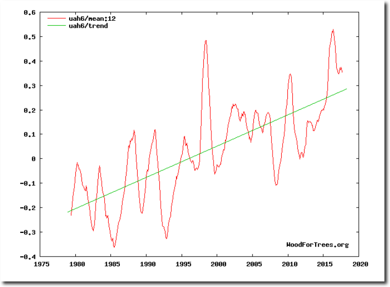
Satellite temperatures from the University of Alabama at Huntsville (UAH) show about 0.5C warming since 1979.
Wood for Trees: Interactive Graphs
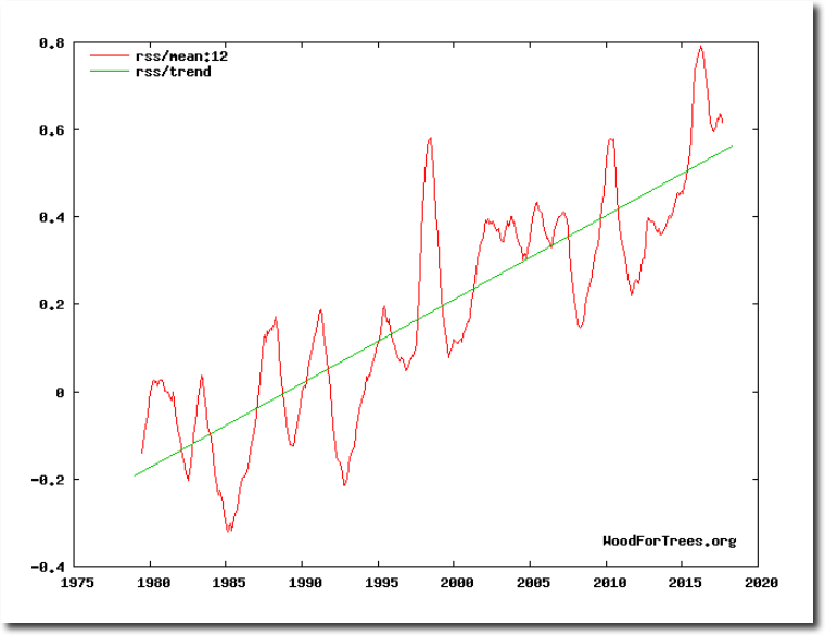
Satellite temperatures from Remote Sensing Systems (RSS) show about 0.8C warming during that period.
Wood for Trees: Interactive Graphs
RSS used to show about 0.5C warming, but under pressure from the climate mafia, Carl Mears recently increased his recent temperatures by 0.3C.
Climate Mafia At Work | The Deplorable Climate Science Blog
Both satellite data sets graphs are misleading, because they start in 1979, right at the coldest year of the past century for much of the world.
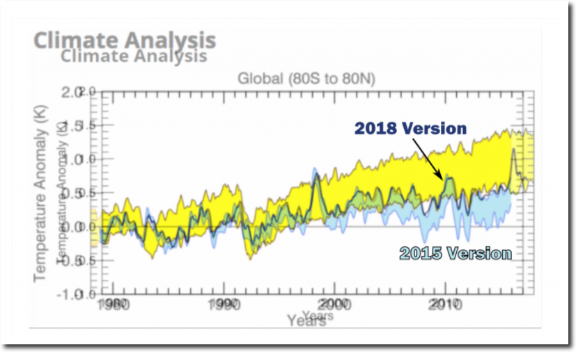
Data.GISS: GISS Surface Temperature Analysis
In 1990, NASA reported that the atmosphere did not warm during the 1980’s.
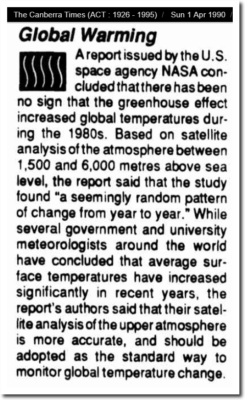
01 Apr 1990 – EARTHWEEK: A DIARY OF THE PLANET – Trove
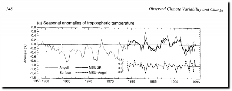
The 1995 IPCC report showed no troposphere warming from 1958 to 1995, measured by satellites and weather balloons. All of the claimed warming has magically appeared since then.
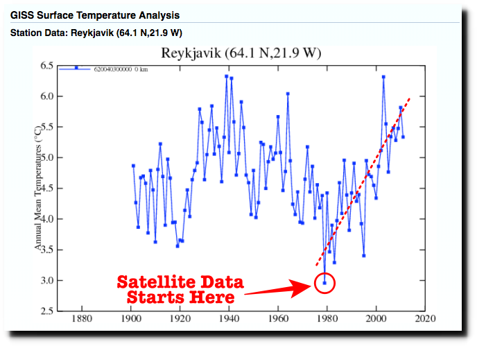
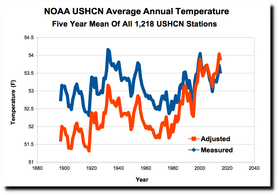
And surface temperatures are magically altered to cool the past and create warming.
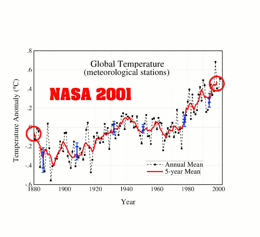
The most common technique is to simply make the warm 1930’s and 1940’s disappear.
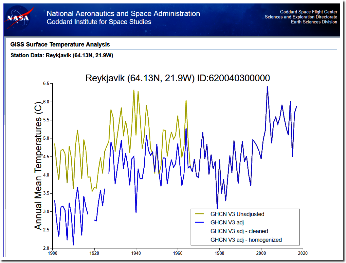
Data.GISS: GISS Surface Temperature Analysis
Almost all climate science research depends on the accuracy of these graphs, which is one reason why climate science is lost in space.
