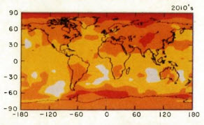
This is what Hansen forecast for the 2010’s. Blazing heat all over the planet. Note the exceptional heat at the poles!
http://pubs.giss.nasa.gov/docs/1988/1988_Hansen_etal.pdf
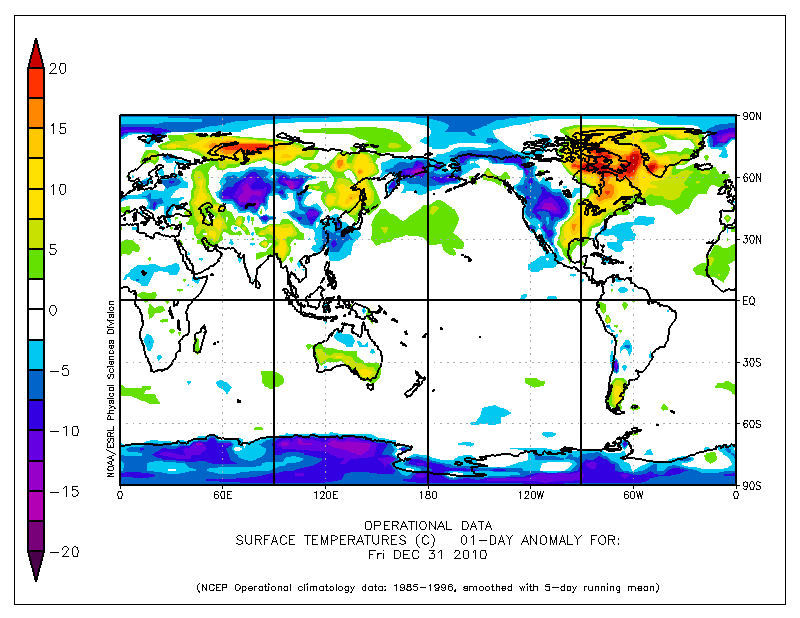
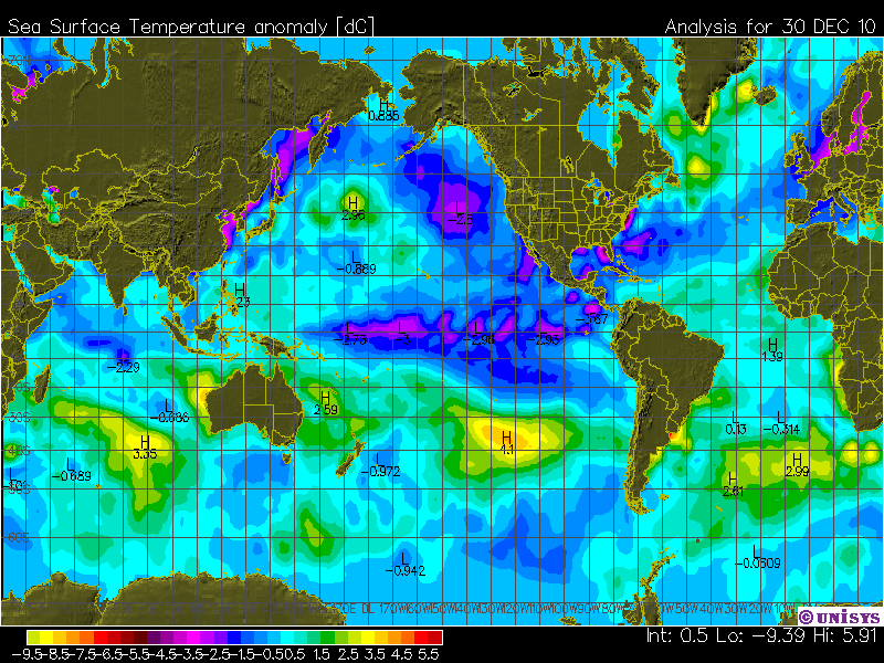
And this is what we got. Where is the red? One little patch in Nunavut, and the poles are freezing.


The temperature scales are different. Try this one:
http://data.giss.nasa.gov/cgi-bin/gistemp/do_nmap.py?year_last=2010&month_last=11&sat=4&sst=1&type=anoms&mean_gen=0112&year1=2000&year2=2009&base1=1951&base2=1980&radius=1200&pol=reg
Bob, either way, JH missed it by a wide margin. I believe that’s the point of the article. You can’t really point to specifics, because Hansen’s study isn’t specific, other than his apocalyptic maps. I’m surprised he didn’t have scenario A-Z.
Case in point, the map you’ve shown looks similar to Hansen’s Jun-Aug 90’s Scenario A map. But then, look at the maps. He’s bet all on red and black and still managed to be wrong.
I think it should have been noted by anyone who brings up GISS that GISS is the only set that shows 2005 the hottest year ever (now to be already beaten by 2010). Others show 1998 the hottest and no year since then hotter. This point should lead off every and any discussion about GISS. It should also be pointed out in those discussions that James Hansen is a radical environmental activist. Both of these points are vitally germane to any talk about GISS. It is remiss to not point them out. It cannot be justified to leave these points out—regardless of how much of a gentleman you think you are being in not bringing them up. If these two points really are meaningless then it should also be no problem to bring them up. Because, apparently, some feel there are logical explanations for why these things are not germane to GISS data. So, it stands to reason, that following these two points with their logical explanations would be needed so to eliminate any doubts about what is going on at GISS.
But that doesn’t happen. Logical explanations are not given by those, on both sides, who think it some sort of ethical faux pas to bring up that GISS data is different than other data sets post 1997 and that James Hansen is a radical environmental activist. There’s some sort of unspoken rule that no one is supposed to do it. Odd that.
By the way, for those who think James Hansen is not at “radical” level please tell me someone who is more radical than him so I can put things in perspective. There must be several who are more radical in their global warming beliefs than him that will make him look softcore in comparison and not really like a radical. So please list them. Then I will be corrected in my view that James Hansen is one of the most, if not the most, radical global warming environmental activists in the world.
Bob, it is great to see you here. Please come back for more than just a drive by!
Hee, Hee,
Yes, the Anomaly from 2000-2009 vs 1951-1980.
So…..
We are only a tiny bit warmer than that modern ice age!
I just love that red spot exactly at part of the north pole above Sweden.
Who was stationed there to do the measurements in 1951?
And, if you play with it, you find that guy at the north pole accounts for a lot of the warming/red… Santa must have gotten a furnace to keep warm.
LOL in Oregon
Bob Tisdale says:
December 31, 2010 at 10:49 pm
The temperature scales are different. Try this one:
Your map is for 2000 to 2009.
GISS started making changes some time after 1997. What they were at this point I don’t know. But characteristics of GISS started to change. I had thought most had seen these videos already. I’ll post them again for those who haven’t:
Does GISTemp change? part 1
http://www.youtube.com/watch?v=6ROMzxA4A9c
Does GISTemp change? part 2
http://www.youtube.com/watch?v=w8ZhWZj8zfQ
You’re also comparing a decadal average prediction to one day snapshots during a La Nina winter. Meaningless.
So cooling is warming? Areas of red mean 10C cooling?
You know better than to suggest that ocean temperatures vary significantly from day to day, Bob.
Bob, my experience with GISS maps are that they are totally “meaningless” anyway. They paint they’re boxes with whatever color they feel like regardless of a thermometer reading or not. Is it unfair to characterize a mischaracterization?
Honestly, I haven’t figured out why GISS doesn’t just replicate Hansen’s 88 map of infurno and say “see, we were right all along.”
I agree with Bob here…I don’t think there’s much value in the comparison until at least 2015. I don’t think he meant the “one day snapshot” as literally being a problem with 1 day…instead, I think he meant that you’re looking at one day in 2010 and comparing to a prediction that’s supposed to be the average of 2010-2019.
I don’t think Hansen’s prediction is going to pan out, but I think it’s too early to compare to this particular plot. I think Bob is saying the same thing.
-Scott
So you see all that heat building up in the oceans which Hansen has been warning about for the last 30 years?
Scott says:
January 1, 2011 at 12:48 am
but I think it’s too early to compare to this particular plot.
A real problem is comparing James Hansen’s predictions to GISS data. GISS should be compared to other data sets, not to itself. It looks like some are trusting GISS data. Why would it matter what GISS shows for 2000 to 2009? It is more important to compare GISS to UAH, CRU, and RSS. At least it is to me.
I don’t know why people don’t automatically point out that it is flawed to compare Hansen to Hansen.
I am not sure how much if any the Poles are affected by La Nina?
PaulH:
There is a delayed reaction with the warm oceans fro the ElNion reaching the poles later. I forgot the offset that some use but it is in the months. It is also part of the Global Ocean Conveyor Belt thing that is not yet fully understood.
Severe Arctic Outbreak Forecast for Mid-January
http://www.accuweather.com/blogs/news/story/43765/severe-arctic-outbreak-forecas.asp
Hansen Had a scenario A that was labeled BAU. Because BAU is the closest to current emissions that needs to be used as a comparison. The retroactive claim that Hansen meant scenario b as most likely would only work if it had been labeled most likely to start with. The entire purpose of that graph was to claim: The Sky is Falling and he should have been fired for the grand standing method he used to present it. Because the end results was to get additional funding for NASA he was rewarded. The only reference to GISS should be ridicule even if reference material is exaggerated. GISS has cost all taxpayers real money just like any other chronic disease!
Off for some fun seeing the new year in.
Best wishes to all. May this year be even better than the last. Happy New Year!
James “suyts” Sexton
Al Gore was right, though. The Earth HAS got a fever.
In fact, it has got so bad that the patient has started shivering. (:-
Happy New Year!
You need a unthreaded or tips or something, typical Chelsea gets the show on the road but no background:-)
Anyhow, have a quick look at BH’s latest:-
“Now available for 2011, the University of East Anglia Naked Calendar.”
http://www.bishop-hill.net/blog/2010/12/31/the-naked-climatologist.html?lastPage=true#comment10999255
On a serious note, St Johns is a good cause, so please spread the word if possible.
Regards
And on a personal note, well done Mr Goddard, big jump, well landed, enjoyed, a very good year to you and yours.
But it’s the hottest year on record, so Hansen’s map is correct. How dare you confuse me with the facts!
On a very, very personal point I do not like the look of that NCEP score, that needs to change quickly, I doubt that the present day Western World will cope with an extended version.
Have fun!
Good to see your usual fulsome style! You are the funniest blog on the internet. Congratulations!
Thanks
Steven,
And all – Happy New Year – it’s been a great year to be skeptical, but then again it always is good!
Temperature here just at about midnight in the desert southwest of the US is about 32 deg F.
I think the point has been missed. CAGW doesnt factor in freezing cold snaps, it is rampant and doesnt allow it to happen. An average of 6 degrees warmer at the poles wouldnt allow a -20 degree anomaly on any day of the year IMO…that is what is rammed down out throats, milder weather everywhere, with rampant Co2 destroying climate..
I sure hope Hansen is right. I live in Canada along with 30 million other freezing souls and will tell you straight up it isn’t a lot of fun growing ice 11 months of the year. Not to mention the heating bills. Global warming has my vote. Why is it taking so long? It isn’t like I can afford waterfront, so what do I care if Gore’s new house gets flooded out? He should know better than to buy in a flood zone.
What was the one day snapshot earlier in the year before El Nina though, where there was no El Nina or Nino or such, ie the move over point? That would be interesting.
That warm weather in NE Canada means another year in 2011 when the NW passage will be open again me thinks.
Happy New Year to this always interesting blog !
Andy
I hope no one is suggesting James Hansen’s data can be trusted. Not really, right?
Las Vegas now in Northern Europe:
http://www.lasvegassun.com/news/2010/dec/31/las-vegas-tap-record-its-coldest-new-years-eve-hig/
Maybe the cause can be found at the following link.
http://wattsupwiththat.com/2010/12/20/australias-white-summer-monbiots-red-fury/
Here is some reality in the ‘hottest year on the record’ for you:
Snow in Brazil
Hundreds of penguins dead of cold in Brazil
Snow in Florida
Snow blankets city in SW Saudi Arabia
Snow and cold in Algeria
Snow in Ain Draham, Tunisia
6 million tropical fish dead due to cold in Bolivia
Argentina’s beaches whitened by snow
Blizzards hit the French Mediterranean
Thailand province is a cold-stricken area
Record cold in Cacun, Mexico
6 million head of cattle dead in brutal Mongolian winter
and
25,000 excess winter deaths in UK last winter – 2009 / 2010
Vivaaaaa La Vegas
Of course yo probably realize the Las Vegas thing is al totally BS. How would I now?Because I spent 53 years in Las Vegas and spent a couple of New Years freezing me rear off. I was living there when it snowed on new Years eve and we walked out of the topless club to have a snow fight. That was in the 1970s! I was there when the temperature did not get over the low 20s during the day in early January. That was in the early 90s!
The National Weather Service was measuring the temperature on top of a terminal building at McCarran Airport which became the Executive terminal. The temperature record for Las Vegas is so bad Joke does not describe it. Most of the people that lived there did not believe what the weather service was saying. It was just for those using the airport.
Freak weather could have been predicted
UK Met Office is being held back by a lack of computing power, says its chief scientist Julia Slingo.
“”The science is well ahead of our ability to implement it””
http://www.nature.com/news/2010/101230/full/news.2010.685.html?s=news_rss&utm_source=feedburner&utm_medium=feed&utm_campaign=Feed:+news/rss/most_recent+%28NatureNews+-+Most+recent+articles%29&utm_content=Google+Reader
=========================================================
You have two choices:
a. They know what they are talking about and are liars.
b. They are delusional crack pots.
I understand the Piers Corbyn uses a laptop.
Amino Acids in Meteorites says: “Your map is for 2000 to 2009.”
Of course it is, the first map that Steve posted was for the 2010s and they haven’t happened yet. That’s how absurd this post is.
stevengoddard says: “So cooling is warming? Areas of red mean 10C cooling?”
Poor attempt at spin, Steve.
You continued, “You know better than to suggest that ocean temperatures vary significantly from day to day, Bob.”
I apparently have to be very straightforward with you. The point of my comment was that you were comparing a decadal prediction to one day snapshots with the intent of misleading your readers. Also, let’s get more basic. The decade prediction you’re using as a reference has not happened yet. The period illustrated on that maps is the “2010s”. So your post is a bit premature, is it not?
Oh maybe the ocean will gain a few hundred trillion joules today.