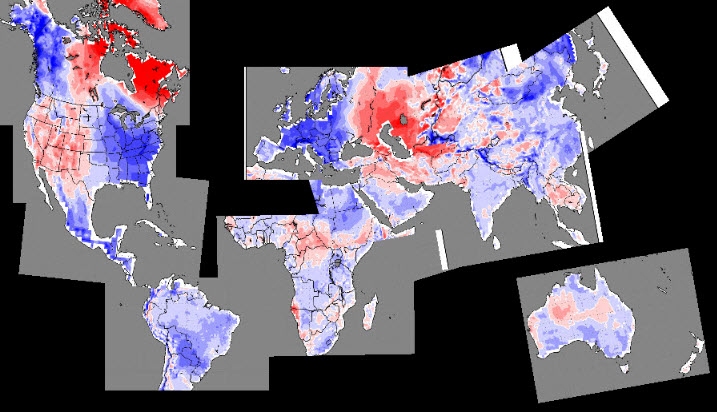
I stitched them all together.
Disrupting the Borg is expensive and time consuming!
Google Search
-
Recent Posts
- Is Antarctica Melting?
- High Speed Analysis And Visualization
- El Nino To The Rescue?
- Fake News Update
- Growth Of Antarctic Sea Ice
- 65 Years Of Progress!
- El Nino To The Rescue?
- Worst March Drought On Record
- ChartGL Process Control Demo
- The Biggest Money Laundering Scam
- Drought In The Headwaters Of Lake Powell
- Unrealistic Expectations Of Water Availability
- Did Bill Gates Do This?
- Worst March Drought On Record In The US
- The Real Hockey Stick Graph
- Analyzing The Western Water Crisis
- Gaslighting 1924
- “Why Do You Resist?”
- Climate Attribution Model
- Fact Checking NASA
- Fact Checking Grok
- Fact Checking The New York Times
- New Visitech Features
- Ice-Free Arctic By 2014
- Debt-Free US Treasury Forecast
Recent Comments
- conrad ziefle on Is Antarctica Melting?
- Gordon Vigurs on Is Antarctica Melting?
- Bob G on Is Antarctica Melting?
- conrad ziefle on High Speed Analysis And Visualization
- Bob G on 65 Years Of Progress!
- Bob G on 65 Years Of Progress!
- Gordon Vigurs on 65 Years Of Progress!
- arn on 65 Years Of Progress!
- arn on 65 Years Of Progress!
- Bob G on 65 Years Of Progress!


I wonder, can this be automated? Would make a nice weekly publication.
I have a template now and can generate them in about five minutes.
Agree. Would like to see this as a weekly feature. Very interesting. Gives the cold shakes, except that I have the good fortune to live in the climate paradise of So Calif. The warmth is lovely at the moment. Since it will this crazy state will soon become a bankrupt paradise — too many socialists — at least I won’t have to pay very much for heating or cooling.
I looked up COLA: “All imagess are generated by COLA and do not represent the actual forecasts issued by the National Weather Service. These products are not a substitute for official forecasts and are not guaranteed to be complete or timely. The underlying data are the direct product of the various operational forecast models run by the National Centers for Environmental Prediction, National Weather Service, NOAA and are supplied without interpretation or correction.”
Wonder if any of the data is “cooked” (ahem, er, “adjusted”). If so, then is the forecast even colder than indicated?
The interesting part is that the red parts in the North of America Russia and even Turkey are covered in snow as well.
So if red in reality is blue, the blue in reality should be…
We need a sat map.
We now have snow in the Med, North African coast, Turkey, Greece into the Middle East, Israel, Lebanon, Syria…
http://www.bbc.co.uk/news/world-middle-east-11979285
More coming.
This year, thanks to Global Warming a record number of people will be celebrating a White Christmas.
Not bad for the hottest year on record.
They made it hot whereever nobody lives so you can’t tell LOL
Those little gaps with no data are “Hansens Hot Spots”.
“Hansens Hot Spots” and manipulation equate to “Hotest Year on Record”!
Very clever.
Do white areas mean no data? If so have New Zealand and Tasmania given up.
White means no anomaly expected in those locations. This is a forecast rather than a historical record. Shades of red being warmer and shades of blue being colder than average or normal. The Base period for normal / average is what causes the deviations. Using a longer base period would result in less deviation.
There is a very intense “Baffin Bay Block”, a area of high pressure in the upper atmosphere that makes NE Canada warm, but it also makes most of the civilized world cold.
It’s hot where the polar bears live. They are all going to die! The Inuits are going to need air conditioning for their igloos or they will die too!
Andy W:
Really hot being -40 rather than -50!