

I took the NSIDC Arctic (red) and Antarctic (blue) graphs, overlaid them, stretched the Antarctic y-axis to make the scales identical, and offset the y-axis to make the current Arctic extent line up with the average Antarctic extent.
By doing this, you can visually see that the negative Arctic anomaly is smaller in magnitude than the positive Antarctic anomaly. This means that global sea ice extent is above normal for the date.
(This would be a lot simpler if NSIDC published the numbers they use to make these graphs.)
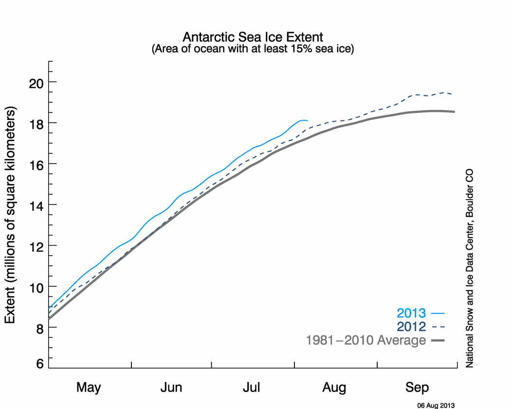
The ice is melting very slowly in Antarctica because temperatures there are running far below normal.


This means that global sea ice extent is above normal for the date.
Does that mean the cryosphere global anomaly is half baked????
http://arctic.atmos.uiuc.edu/cryosphere/IMAGES/global.daily.ice.area.withtrend.jpg
Extent vs Area. They are measuring different things
Thank you… thats my new thing to learn today… I always thought they meant the same thing…
Ice extent is the cumulative area of all polar grid cells of the Northern Hemisphere that have at least 15% sea ice concentration, using the NORSEX algorithm.
Ice area is the sum of the grid cell areas multiplied by the ice concentration for all cells with ice concentrations of at least 15%.
Ice extent and ice area are calculated for a grid resolution of 25 km. The difference between extent and area for our data is always positive. This difference represents the area of the open water in the pixels partly covered by ice (i.e. ice concentration less than 100%).
In other words, ice area takes into account that there is a fraction of open water in pixels with ice concentration above 15 % and below 100 %”.
Ice extent does not include this effect and gives therefore a higher number of square km than ice area.
http://arctic-roos.org/observations/satellite-data/sea-ice/ice-area-and-extent-in-arctic
I don’t think the y-scaling is quite right. The originals don’t go to zero (and don’t have any extra marks to show that). So aligning the axis doesn’t help….
It is correct.
Again on the Y-axis. In the same distance on my screen one scale goes 2, 4, … 20, and the other goes 5, 10, …20. The 20s appear to line up, but the bold 5 is below the lighter 4, the bold 10 is below the lighter 10, and the bold 15 is below the lighter 14. The scale with bolder numbers appears to be stretched more than the other scale. If you’re trying to compare like extents I don’t think it’s working.
I thought all the ice was gone, how did they do this???
http://www.alaskadispatch.com/dispatches/arctic/7659-arctic-snow-kiting-trek-makes-guinness-record
NSIDC monthly sea ice extent and area data can be found here
ftp://sidads.colorado.edu/DATASETS/NOAA/G02135/
They don’t make their daily data available, like JAXA does.
Actually, global ice extent being above normal is in line with the model predictions.
This is because I have just written a new model. It would seem that making code available to all is very ‘in’ at the moment, so I’ll freely distribute the model in pseudo-code format:
If ice-extent changes or ice-extent doesn’t change
Print “This is entirely as predicted by my excellent and trustworthy model.”
End-if
I’d just like to pause a moment to observe that this site seems to use an intelligent font. When I wrote ‘in’, surely I used the same character for the two apostrophe thingies. Yet your font knows better. Is this a new conscious, thinking font? It’s mind blowing.
Unlike climatologists the program seems to know which thingy belongs where. “like” ‘this’
i would also guide you towards http://arctic.atmos.uiuc.edu/cryosphere/IMAGES/global.daily.ice.area.withtrend.jpg
plus, if you claim your speak about global ice – as per your title, please include nono polar glacier data too – it’d be great to see how all ice area on a global level has really changed. I think it is a very dangerous game to mess about with other people’s graphs – you could go direct to nsidc to get the real balance between N and S polar ice coverage. Please be aware 1) of the abuse of science 2) the consequences of tricking people into false assumptions…