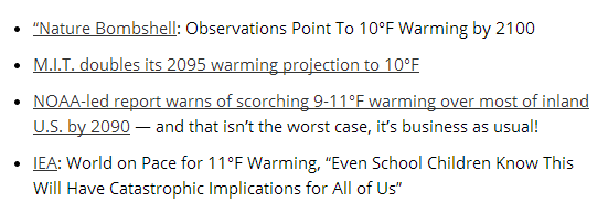
Joe Romm was a key player in the Clinton/Lewinsky/Gore/Hillary White House, and now runs one of the most wildly dishonest blogs on the Internet.
Below, I plotted Joe’s fake GISS temperatures to scale with his warming projection, in red. See if you can find the stain on the blue dress.


Yes, that is wild Bill’s legacy. The stain on the blue dress and “don’t you think you should put some ice on that”.
Along with the only elected President to ever be impeached. And to have his law license revoked by a federal court for lying under oath. The list just goes on and on and on.
At this point, what difference does it make?
It makes a difference because Hiltary is gearing up for a run for the presidency, so polishing up the old scandals is in order. Of course Hitlary has Benghazi and some ‘splaining to do.
MORE POPCORN!
He is also a great admirer of Anita, you know, the one who looks to Chairman Mao during those difficult times when she experiences internal strife with difficult questions that require a mentoring figure, to provide guidance and the right answers 😉
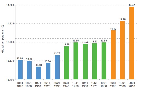
So in the forties, temps were 13.95 and in the seventies, temps were 13.95? I guess that explains how the consensus of all climate scientists was that we were locked into global cooling, with catastrophe looming. And the coldest decades were 1900 to 1920, explaining, I guess, all the glacial and Arctic melting those years, and ships transversing the Arctic in summer of 1923.
Chart: decadal Köppen climatic boundaries
The bottom chart is the 20th century changes by decade. Most of the decades cluster around the same area. 1900s, 1930s, 1920s, 1980s and 1990s are all vying for the warmest.
The 1970s are the odd man out being significantly colder compared to the other decades.
The Köppen climate classification is a widely used, vegetation-based empirical climate classification system.
Given the mucking about with the temperature data AND the fact that temperature is a rotten measure since it neglects the influence of water on energy, the vegetation-based empirical climate classification system is a better method for seeing what is actually happening.
You can also look at the Northern Hemisphere Snow data.
October http://www.ncdc.noaa.gov/sotc/service/global/snowcover-nhland/201310.gif
November http://www.ncdc.noaa.gov/sotc/service/global/snowcover-nhland/201311.gif
December http://www.ncdc.noaa.gov/sotc/service/global/snowcover-nhland/201212.gif
January: http://www.ncdc.noaa.gov/sotc/service/global/snowcover-nhland/201301.gif
February http://www.ncdc.noaa.gov/sotc/service/global/snowcover-nhland/201302.gif
and
March http://www.ncdc.noaa.gov/sotc/service/global/snowcover-nhland/201303.gif
That is six winter months showing snow fall returning to “normal” that is returning to the snowfal of the 1970s decade that was abnormally cold according to the Köppen climatic boundaries.
These Köppen boundaries are for the Midwest in the USA. They are in the middle of a continent and are much less likely to be influenced by oceans. Frank Lansner in his Original Temperatures Project explains this concept.
Seems Joe Romm thinks the Isthmus of Panama has reopened and Drake passage closed.
http://jonova.s3.amazonaws.com/graphs/lappi/65_Myr_Climate_Change_Rev.jpg
See Bill Illis comment
http://wattsupwiththat.com/2013/07/12/new-ideas-on-antarctic-ice-sheet-formation/#comment-1362477