
Prior to NASA and NOAA rewriting the temperature record, the late 1960’s were colder than the late 1890’s.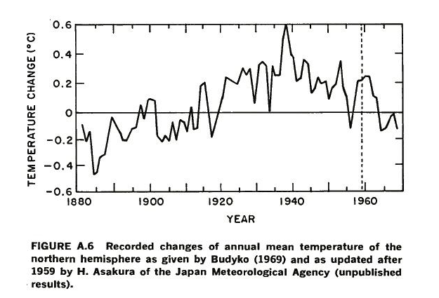
Disrupting the Borg is expensive and time consuming!

Google Search
-
Recent Posts
- Analyzing The Western Water Crisis
- Gaslighting 1924
- “Why Do You Resist?”
- Climate Attribution Model
- Fact Checking NASA
- Fact Checking Grok
- Fact Checking The New York Times
- New Visitech Features
- Ice-Free Arctic By 2014
- Debt-Free US Treasury Forecast
- Analyzing Big City Crime (Part 2)
- Analyzing Big City Crime
- UK Migration Caused By Global Warming
- Climate Attribution In Greece
- “Brown: ’50 days to save world'”
- The Catastrophic Influence of Bovine Methane Emissions on Extraterrestrial Climate Patterns
- Posting On X
- Seventeen Years Of Fun
- The Importance Of Good Tools
- Temperature Shifts At Blue Hill, MA
- CO2²
- Time Of Observation Bias
- Climate Scamming For Profit
- Climate Scamming For Profit
- Back To The Future
Recent Comments
- Bob G on Analyzing The Western Water Crisis
- Bob G on Analyzing The Western Water Crisis
- Bob G on Analyzing The Western Water Crisis
- Hank Phillips on Analyzing The Western Water Crisis
- Hank Phillips on Analyzing The Western Water Crisis
- Hank Phillips on Analyzing The Western Water Crisis
- Hank Phillips on Analyzing The Western Water Crisis
- Bob G on Analyzing The Western Water Crisis
- conrad ziefle on Analyzing The Western Water Crisis
- Bob G on Analyzing The Western Water Crisis
Reblogged this on Catholic Glasses.
Same goes for the arctic rowers and their images. Also I guess they haven’t gotten around yet to updating their second image to show the 2013 extent. They’re probably too busy out there on the lecture circuit and all.
https://www.facebook.com/pages/Mainstream-Last-First/143857365738368
you know, this stuff is, in the best sense of the word, unbelievable.
Ever wonder why climate scientists like to start graphs in the 1970’s?
Cos they’re German and we can’t mention the war or the 1940’s?
The Köppen climate classification, a widely used, vegetation-based empirical climate classification system shows why. the 1970s were the odd man out compared to the rest of the 20th century.
That’s a pretty enlightening chart Gail. I like it.
More confirmation that the 1970’s was a cooler decade.
An IQ > 17 can understand it which cuts out 97% of alarmists. Meanwhile they think they have discovered fire…….Some 20- 50,000 years after the original human.
It is rather interesting when you consider the places the Polar Vortex hits and Steve’s linking of the Polar Vortex and the Laurentide Ice Sheet that sat on the USA during the Wisconsin Glaciation.
You can then add in Frank Lanser’s discovery that geography determines temperature trends, and his division of temperature stations into Ocean Air Affected stations and then Ocean Air Shelter stations. The Original Temperatures Project
This goes back to ENSO and whether or not the Pacific or Atlantic are in their cold or warm phases. From the work Frank has done so far CAGW is an artifact of Ocean oscillations.
In a comment at that link Frank says:
“….the OAS / OAA differences are not at all a result of UHI on the coast.
In many countries, the coast stations are actually smaller places, a lighthouse often. And the OAA data – the ocean air affected stations far from the coast – are often hill or mountain stations, quite rural.
And this “rural-ness” of OAA stations is used be BEST to claim that UHI is not a problem.
This BEST claim is Just as STUPID as claiming that the emperor is not naked when he in fact is, because “the smart guys says so”….”
I should also add that since the earth is 70% ocean, the satellite temperatures also reflect ocean oscillations.
One of the scientists I do follow has placed a ditto on Steve’s and others contentions, in regard to the massive and bogus global surface temperature manipulations. The twisted political scientists using tax-payer funds to achieve a progressive agenda is truly criminal activity!
Steve Goddard recently posted some results from his analysis of the official U.S. surface temperatures (USHCN, from NOAA) suggesting spurious warming occurring around 1998. I also showed evidence of this back in 2012.
Fromm 24 January, 2014 at Roy’s page:
Steve’s post reminded me that it’s been over a year since I’ve updated the U.S.-average Integrated Surface Hourly (ISH) temperature data, using my Population Density Adjusted Temperature (PDAT) algorithm that corrects for changing urban heat island (UHI) effects. This is still an unpublished method, and so should be considered more of a sanity check on the official NOAA USHCN product. But it does support Steve’s contention that there’s something funny going on in the USHCN data.
http://www.drroyspencer.com/2014/01/u-s-temperatures-1973-2013-a-alternative-view/
Fascists rewrite history and truth. Lies are now science. The cult of warm is fascist in every sense of that word. The communal run by a cult is uber alles. The individual, life and truth – they mean nothing.