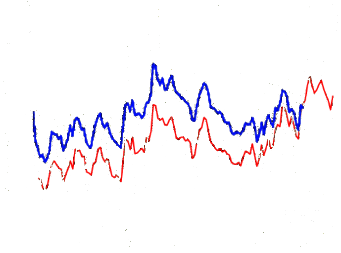
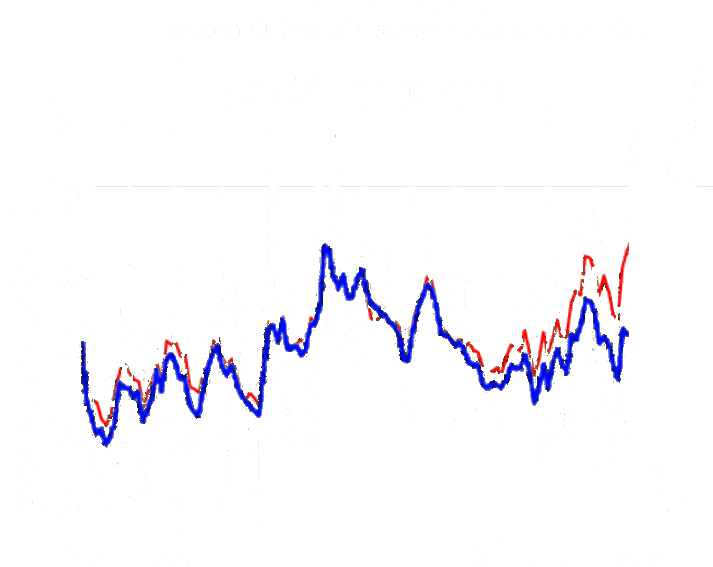
I removed all of the black lines and numbers which confuse Brandon the stalker.
In the blue 1999 version of US temperatures, 1932 was much warmer than 1997. In the red 2014 version, 1997 is warmer than 1932. The total amount of tampering up to 1997 was 0.5C.
Here is another way of looking at it, normalized to 1932. In this view, 1997 has been tampered upwards by 0.5C. No matter how you line them up, the total amount of tampering is always going to be 0.5C.


Even the adjusted data ruins the Marxist storyline:
http://s22.postimg.org/h73fr7elt/NOAA_Update_B.gif
Yes, and by removing the 1940-1970 cooling, they change the data from a sine wave into a hockey stick.
ROFL
That is funny. You’ve had to dumb down the data so that Brandon might understand it.
My bet is he is red/blue Color blind with a bung eye so it will still make no sense.
Maybe try an inkblot plot and see how he goes?