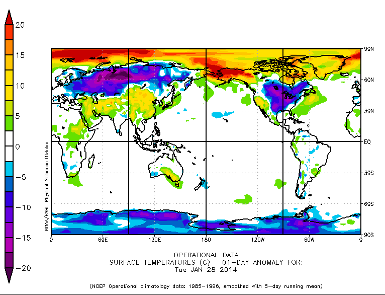
Please ignore the fact that most of the Northern Hemisphere and Antarctica are running far below normal.
Disrupting the Borg is expensive and time consuming!
Google Search
-
Recent Posts
- The Real Hockey Stick Graph
- Analyzing The Western Water Crisis
- Gaslighting 1924
- “Why Do You Resist?”
- Climate Attribution Model
- Fact Checking NASA
- Fact Checking Grok
- Fact Checking The New York Times
- New Visitech Features
- Ice-Free Arctic By 2014
- Debt-Free US Treasury Forecast
- Analyzing Big City Crime (Part 2)
- Analyzing Big City Crime
- UK Migration Caused By Global Warming
- Climate Attribution In Greece
- “Brown: ’50 days to save world'”
- The Catastrophic Influence of Bovine Methane Emissions on Extraterrestrial Climate Patterns
- Posting On X
- Seventeen Years Of Fun
- The Importance Of Good Tools
- Temperature Shifts At Blue Hill, MA
- CO2²
- Time Of Observation Bias
- Climate Scamming For Profit
- Climate Scamming For Profit
Recent Comments
- arn on The Real Hockey Stick Graph
- arn on The Real Hockey Stick Graph
- Gordon Vigurs on The Real Hockey Stick Graph
- Peter Carroll on The Real Hockey Stick Graph
- Robertvd on The Real Hockey Stick Graph
- Robertvd on The Real Hockey Stick Graph
- Gordon Vigurs on The Real Hockey Stick Graph
- Jack the Insider on The Real Hockey Stick Graph
- Bob G on The Real Hockey Stick Graph
- conrad ziefle on The Real Hockey Stick Graph


2%….until its above Normal….then it becomes 97%….
We need a Warmist to come on and explain again how global warming causes global cooling.
The hotter we get the colder we get, or something like that. Anyway, it is always hilarious.
Too bad they can’t use Mercator’s projection to make the north pole and Alaska look really big and the Goode Homosoline projection for the southern hemisphere. Think of all the red ink they’d use.
But Greenland is hot! The ice cap is melting! We are all going to die!
I’m more concerned with S. America. It’s widely known that increasing normalcy is strongly associated with rising carbon (not CO2, carbon because that makes no sense)
The more normaler it gets the worser it are.
Not only does the projection make the north look really big, but here are no surface weather stations in that red blob in the upper left. Go figure.
It really does look like the Artic has a huge hot spot — maybe they should prepare for an onslaught of Spring Breakers!
Australia takes up even less than 2%; then there’s the fact we have far less emissions (sorry alarmists, the “per head” argument doesn’t change the total volume, which is what counts according to alarmists own theories). Meanwhile, we’ve spent $7bn on a close enough to zero result:
http://www.theaustralian.com.au/national-affairs/policy/billions-in-tax-but-only-03pc-fall-in-carbon-emissions/story-e6frg6xf-1226818073028#
(paywalled, but the summary is damning enough)
..but hey, Joo-liar said we’re “doing the right thing” and “leading the way”. In terms of complete and utter lunacy, yes.
Aurora Australis at Casey station bringing the latest much-needed supplies before winter . It could be a long one.
http://www.antarctica.gov.au/webcams/casey
http://www.antarctica.gov.au/webcams/aurora
ftp://sidads.colorado.edu/DATASETS/NOAA/G02135/south/daily/data/SH_seaice_extent_nrt.csv
The WMO announce that 90% of the excess heat produced by humans has been absorbed into the ocean and that (unlike the IPCC) they are 100% certain global warming is happening. That would explain why there is almost no anomaly on the ocean surface! You would have to be 100% delusional or insane to make this stuff up.
http://m.theaustralian.com.au/news/health-science/was-the-sixthhottest-year-on-record-un-says/story-e6frg8y6-1226819287966
And the charts only go back to 1950, not 1850 as in the announcement. Because the 1930’s never happened.
http://main.omanobserver.om/?p=54317
If the US makes up only 2% of the World’s surface how much of the World’s Climate Science does it make up ?