
One of the most fundamental mistakes which wannabee scientists make, is to attempt to apply precision to a problem which hasn’t been sanity tested for accuracy.
It should be obvious to everyone that the current data set is not sane.

What I am doing is what professionals call “sanity testing” – and the adjusted data fails miserably. The problems are too numerous to enumerate, but here are a few of them.
1. Anomalies, infilling and gridding.
The image below represents a grid cell. The U’s stand for Urban, and the R’s stand for rural. Let’s say that the U anomaly is 1.0 and the R anomaly is 0.0. The average anomaly of this grid cell is 6/8 = 0.75
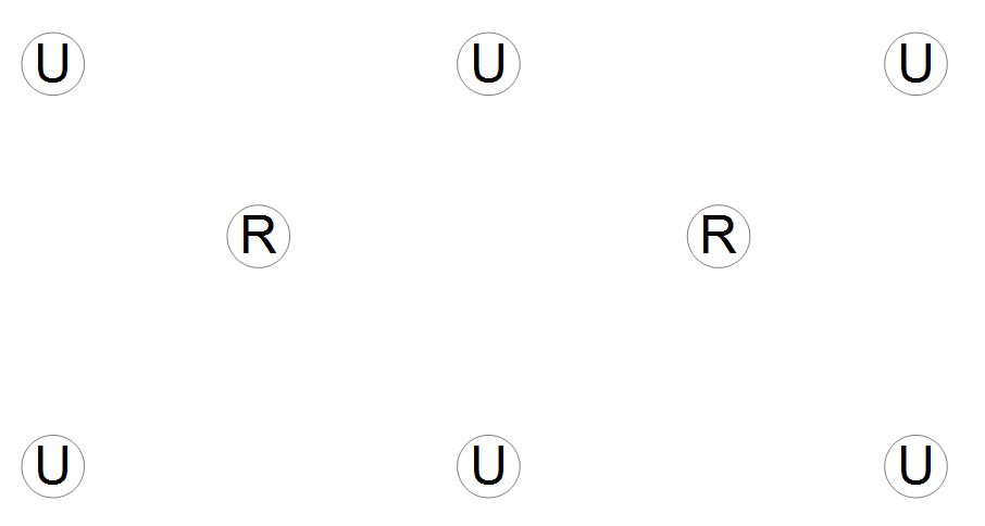
Now, let’s take away one of the rural stations – as has been happening to the network. Because of infilling, the rural station now gets effectively counted as an urban station – due to it being infilled with data from its urban neighbors. The anomaly of the grid cell goes up to 7/8 = 0.875. The infilling aggravated the rural station loss, rather than improving it.
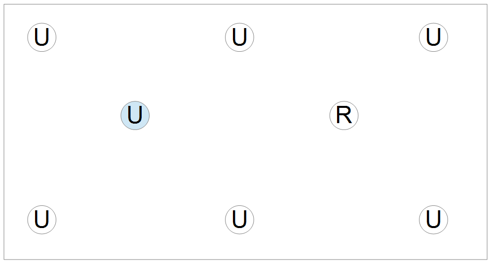
Anomalies, infilling and gridding simply smear data together. This might be a good idea with a truly random error distribution, but that isn’t what we are dealing with.
By using absolute temperatures, I am able to do sanity checking – which is impossible using Zeke’s method. Zeke skips the sanity checking, and goes directly to trying to generate false precision.
USHCN is losing station data at a phenomenal rate since 1990. If current trends continue, they will have no station data by 2020. Does Zeke plan to eventually use one station to represent the entire country, like Phil Jones does for the southern hemisphere in 1851?
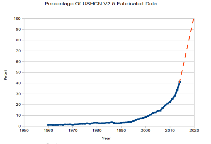
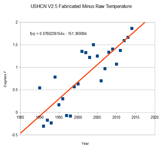
Now, lets look at the raw measured data vs. the fabricated data – i.e. station data which has no raw data to back it up. The raw data shows no trend since 1990. The fabricated data shows a massive warming trend. This a huge red flag that the adjustments are garbage.
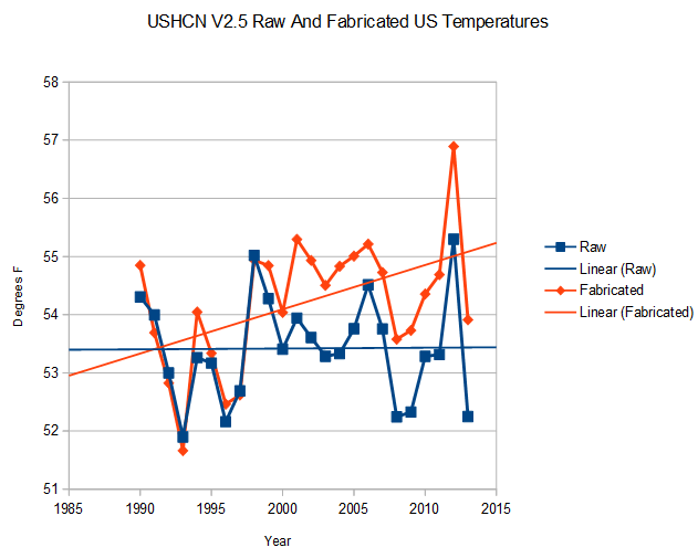
The fabricated data is diverging from the measured data at a mind-boggling rate of almost 8 degrees per century.
The next experiment is to see what happens if data is removed from all the stations with complete records. The blue line below shows temperatures for all stations with no missing data since 1990. The red line shows the same data set, with 30% of the data randomly removed.
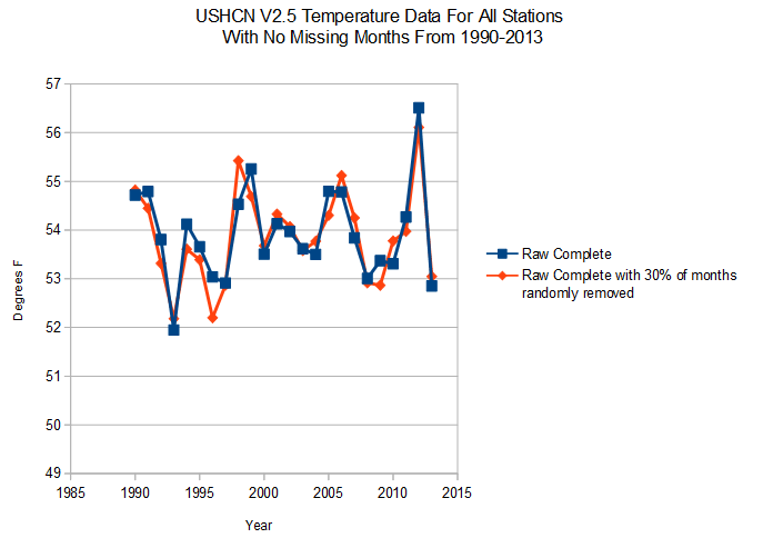
Not surprisingly, random data loss has very little impact on the temperature. Much of science depends on that very principle. This shows us unequivocally that whatever is causing the massive data loss at NOAA is not random. It has a huge bias to it.
Zeke and crew want to smear over all this, and obtain high precision on a garbage data set with very low accuracy. I want to find out what is wrong with the data set.
Not a very subtle distinction. This is a critically important issue, and it would be very helpful if people who should be helping bring it forward would do the right thing.

According to NOAA the world is ready to simultaneously combust, according to their corrupt anomaly data. Fight the good fight Steven,
Remember the “tipping point”? … Originally, the “tipping point” meant a point of no return where the globe would spiral out of control and heat up until the oceans boiled and evaporated. Funny how I haven’t heard the term “tipping point” in quite a long time.
Calm, cool, collected.
Scientific.
Let’s hope the lukewarmers can swallow their pride and help to destroy this scam, once and for all.
In most other realms of human activity, these revelations would be devastating. There would be prosecutors, news trucks with huge antennas camping on bureaucrats’ doorsteps, police, FBI, IRS, lawyers, all swarming the offenders’ offices and homes.
The global warming scam reveals the depths of corruption of the anti-Normal American dominant culture.
Florence survived Savanarola, Italy survived Mussonlini, but both were changed. What will be left once the scammers are run out of town on rail?
They’ll do the right thing. As soon as the budget for the alphabet soup of bureaucracies is set for the next 40 years. It’s all about the money.
Joe (and Jane) six pack may shy from the science, both the physics and the statistical processing, but will recognize the stability of their own local climate over the years. Eventually they will just ignore the false alarm bells.
Not only that, but you need to consider that the urban temperature should really only be assigned to the area of the urban centre, These are usually quite small in comparison to surrounding rural areas. The equal area weight is another way to make sure that urban trends carry a much more larger weighting than they should.
That bad grammar was due to changes in what I was going to say. Then not proofing properly .
much more larger… lol !!!
Steven,
If your example was indicative of what was occurring in the network, we’d see a difference between the anomalies when infilling occurs and when it doesn’t. In practice, U.S. anomalies with and without infilling are practically identical: http://rankexploits.com/musings/wp-content/uploads/2014/06/USHCN-infilled-noninfilled.png
Menne found similar results in his paper: http://i81.photobucket.com/albums/j237/hausfath/ScreenShot2014-06-24at80004PM_zps20cf7fe9.png
The paper is here: ftp://ftp.ncdc.noaa.gov/pub/data/ushcn/papers/menne-etal2009.pdf
Infilling is actually pretty useless, as it just mimics the effect of spatial interpolation. Its only really there so you can average absolute temperature (if you really want to) without running into climatological biases due to missing stations. I’d personally prefer that NCDC eliminate it.
If you insist on averaging absolute temperatures as the best approach, I’d suggest trying it out on global temperatures. You might find that the world is warming 100% faster than NASA/NOAA estimate! Just like with USHCN, if you average absolute temperatures when the station network composition is changing, you will end up with biases that are often the same magnitude as the trends you are looking for. This is why everyone uses anomalies.
So how do you explain this?
You are simply proving my point that you can’t see the issues with data loss, when using anomalies.
Its a combination of biases in your “measured” data due to changing station composition and the effect of various adjustments (TOBs and Homogenization). No one is questioning the fact that the data have adjustments; its just that infilling is not one that makes a difference.
Here is what that graph should look like (though this is a year or so old): http://rankexploits.com/musings/wp-content/uploads/2013/01/USHCN-adjusted-raw.png
The percentage of 90 degree days in the 1930s was much higher than any recent decade. The percentage of 100 degree days was much higher in the 1930s than in any recent decade. The percentage of 110 degree days was much higher in the 1930s.than any recent decade.The number of record daily temepratures was much higher in the 1930s than in any recent decade. The number of record monthly temperatures was much higher in the 1930s than any recent decade. The number of all-time station records was much higher in the 1930s than in any recent decade. The number of all-time state records was much higher in the 1930s than in any recent decade.
I call BS on your graphs showing that recent temperatures are higher. it is simply incorrect.
Here is a version that more closely mimics your graph: http://i81.photobucket.com/albums/j237/hausfath/USHCNrawhomogenized_zps13dbe858.png
Its the same data but up through the end of 2013 with a 5-year smooth applied. I’m sorry to say that the most recent decade did exceed the 1930s slightly in the raw data. Of course, once you correct for TOBs and MMTS transitions its quite a bit warmer than the ’30s.
Menne, 2009 shows that the TOBS adjustment in the 1930’s was close to zero. Where does the the other 1.5F come from?
TOBS was supposed to go flat after 1990. Why does it keep going up in V2 until 2005?
Maximum temperatures were much higher in the 1930s. What your data tells me is that UHI is having a large effect on nighttime temperatures, and isn’t being adjusted properly.
TOBs is not flat because TOBs changes continue up to present? http://rankexploits.com/musings/wp-content/uploads/2012/07/TOBs-adjustments.png
No idea why it was flat in USHCN v1…
You have to remember that the zero-point on the y-axis is somewhat arbitrary. Because NCDC’s algorithm assumes that current temps are accurate and adjusts everything relative to current temps, the TOBs adjustments end up cooling the past by ~0.2 to 0.3 C. The sum of TOBs, homogenization, and infilling graphs in Menne’s paper gives you the total adjustment.
Maximum temps also had a downward step change of ~0.5 C due to the introduction of MMTS instruments, which means that the past max temps are biased high: http://rankexploits.com/musings/2010/a-cooling-bias-due-to-mmts/
Even if you ignore MMTS, present temps are hotter than the 1930s if you properly account for TOBs biases.
According to Menne, 2009 – V2 uses the same TOBS algorithm as V1 So how come they are different?
.
If I had to guess I’d say that USHCN v1 didn’t actually update their TOBs metadata after setting up the network in the early 1990s, but I really have no idea. There are documented TOBs changes in stations up to present, however.
The weather bureau anomaly map from July 1936 shows unbelievable heat – much higher than July 2012 – yet NCDC shows July 2012 just as hot.
Zeke Hausfather says:
June 25, 2014 at 3:44 am
Maximum temps also had a downward step change of ~0.5 C due to the introduction of MMTS instruments, which means that the past max temps are biased high: http://rankexploits.com/musings/2010/a-cooling-bias-due-to-mmts/
Even if you ignore MMTS, present temps are hotter than the 1930s if you properly account for TOBs biases.
You conveniently ignore that max temps are not increasing and that max mins are what is causing temperature rise. This means temps are becoming *more* moderate. Thanks for the links re mmts..
A question for Zeke:
“Because NCDC’s algorithm assumes that current temps are accurate and adjusts everything relative to current temps, the TOBs adjustments end up cooling the past by ~0.2 to 0.3 C.”
One interpretation of what you wrote is that around half the global warming measured trend is nothing more than an artifact of a methodology that implements an unphysical (reversed arrow of time) adjustment on historical temperatures. In which case, doesn’t that support some of Steven’s skepticism?
A question for Steven:
RSS has independently measured a warming trend of 1.2C per century based on the last 30 years of data. Does your method approximate this trend? If not, doesn’t this suggest a problem in your method?
My method shows a nearly identical US temperature trend as RSS since 1979.
Steve 1, Zeke Nil.
So that’s why we’ve seen a return of the dustbowl?
Oh, wait…
Zeke,
if more interpolated data is good, why don’t y’all just make up stations where you don’t have any and fill all the grids?!?!! I think even you will call that a stupid idea. If so, why can’t you understand that making up ever more data is STUPID if not actually dishonest?!?!?!
Tell me about how more breakpoints and splices affect the trend. Every one adds a tiny bit right? How many splices and break points equal .1c of trend Zeke??
Zeke, infilling heats up the USA as I’ve shown you.
http://sunshinehours.wordpress.com/2014/06/11/ushcn-2-5-estimated-warming-by-year-and-month/
So why don’t you just…. post the “average temperature” for every year in which you calculate an “anomaly”. Put Steve’s argument to rest. Prove him wrong. Post the “data”, you must have it, it’s the only way to calculate an “anomaly” after all. Show us dimwits the numbers, show Steve how wrong he is. So simple. Why don’t you just bury this argument with “data”? BANG. Done. Go away Steve Goddard. Why not? I do not understand this fear of letting everyone see the guts of your argument…
He would rather blather on other blogs to get back slapped and recognized for the genius he believes he is.
When they finally get enough hockey sticks we can have a game.
I think Zeke is about to become a denier hahahahaha
Going by CET and Armagh RURAL surface temps, probably the ONLY reliable records since 1460 there has been no change in world temperatures(to this date).Rural, cloudy, wet, low temps (about 14-20Cmax).So SG is correct. Sorry!
Should be 1640.
Steve, keep asking the questions, the best five words in the English language re:-
Why
What
Who
When
How
Zeke Hausfather
Re Because NCDC’s algorithm assumes that current temps are accurate
Why?
What?
Who?
When?
How?
I think this post is very cathartic. In fact, the way I have read the comments is as a “real time” testing of Steven’s hypothesis and confirmation that government scientists are fudging the numbers. Its happening here in Australia in exactly the same way, so this is no surprise to me.
Government departments corrupt and adjust all data: economic, health, education, manufacturing, agriculture, mining, defence (especially war casualties), Intelligence (oxymoron) and now ESPECIALLY science (meteorology especially).
Alarmists, on the other hand, believe government PR when it mirrors their world view, because of their innate need to have their world view validated. When it doesn’t meet their worldview, Alarmists go feral.
PS The ACF met with Algorithm in melbourne today at the Church of the Sacred Heart of Carbon.
He made the news as usual, even though the Vic drought broke on his arrival and there were huge snow dumps on the Australian Alps. He really is the climate Moses.
Yes … the usual response by the warmists’ camp is “go read such and such paper by so and so ”
Good to see a give and take with cross examination.
I’m a broken record when it comes to a Climateaudit.org blog post by Steven McIntyre called Trends in Peterson 2003. http://climateaudit.org/2007/08/04/1859/
The rural records show no warming and, as the analysis shows, the urban areas clearly suffer from UHI. The analysis also shows that as the cities become larger, the UHI is also greater.
So why even have urban sites in the USHCN filnet equation?
The US is, in many ways, unique in that it has a robust set of temperature records, but the rest of the world does not. As a consequence, cities in undeveloped countries with populations bordering on 150,000 are considered “rural”. So now, even if you use all “rural” temperature records for your HCN filnet calculations, the resulting answer is still contaminated with UHI.
And the climate scientists know this. It has been a topic of conversation on many skeptic climate sites. So these climate scientists to continue using these UHI contaminated sites in forming a temperature record borders on criminal.
” I’m a broken record … ”
Maybe a better analogy would be “a (repeating) tape loop” …
Tape loops are intentional, ‘broken record’ indicates a skip from track to track (usually) because of an unintentional surface scratch on the record.
.
Zeke, what are your thoughts on the numerous articles about very rapid glacier melt in the 1930s? If the thermometers were wrongly reporting higher temperatures and needed to be adjusted cooler, why were glaciers melting at a noticeably rapid pace? This seems to back up Steve’s numbers.
Melting temperature of ice was lower then. Inflation, you know…
Opps I meant HIGHER melting temperature. With this temperature anomaly adjustment I feel perfectly quualified to be a NSA climate scientist.
OOPS, NASA
The visual of the difference in slop between one set of 30% data randomly dropped and the actual slope is striking. I wonder what a Monte Carlo comparison of slopes would yield? I have a strong suspicion that it would be essentially the same.
We are being told to go back to a serfdom based on a few tenths of a degree and Zeke says
NCDC’s algorithm assumes that current temps are accurate and adjusts everything relative to current temps
# uncomfortable
“NCDC’s algorithm assumes that current temps are accurate and adjusts everything relative to current temps“
WHAT THE F… That is the most idiotic thing I have ever heard. Try telling that to an FDA inspector or the IRS!
BIG CLUE Zeke,
The Data is ASSUMED to be the data and any adjusting is done by increasing the error bars around the data points PERIOD!
SHEEsh…
So, more and more stations are dropping out; those stations dropping out are overwhelmingly rural; UHI is not being adequately adjusted for in urban centers….and yet current temps are presumed to be accurate? Get outta here!