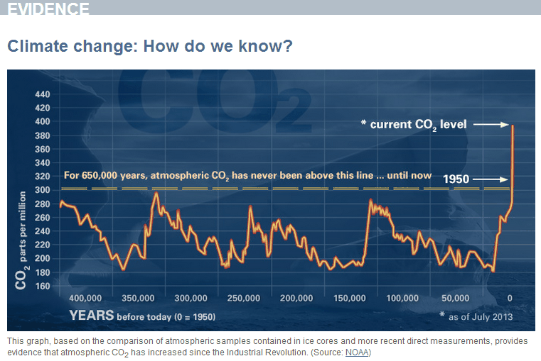
NASA knows that climate change is real, because trace amounts of a colorless, odorless, normally undetectable gas have risen. It is difficult to comprehend how anyone can be that stupid.
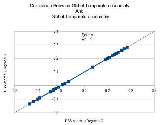
I have discovered an even better correlation. Perfect in fact.
As the oceans warm, they outgas CO2 – and vice-versa, That is why the CO2 curve follows the temperature curve in the ice core record.
The geniuses at NASA are correlating carts to horses.


Disturbing propaganda from NASA, indeed.
Exactly! >>> https://www.youtube.com/watch?v=r6pdZ19Ydh4
Now plot both temp and co2 with similar scales (on top of each other). The recent anticorrelation is impressive.
The lie is the comparison is to two data sets that are not comparable.
The proxy data (CO2 from Ice Cores) are known to be 2000-3000 year averages of the data due to the lack of tight seals in the core data. The proxy data are available so they have not been fudged, as there are too may copies.
http://www.ncdc.noaa.gov/paleo/vostokco2.html look at comparison of Ice age to gas age in the data to see the averaging effect.
First we know NASA and NOAA fudge currrent data to fit their models. Second if the CO2 data are 2000yr to 3000yr averages the peaks and the troughs are cut off so to make an apples to apples comparison of the old data with the current data we need to process the data by averging with all the data since 1000 bc to now. If you do this processing on the data set, we have absolutely no abnormal peak. There are too many data points in the set to have current numbers have much affect on the 300 year average. The numbers NASA is using are patently false and it is a ruse for people ignorant of data and how to make comparisons of different types of data sets.
Please tell NASA that. Thanks.
And the analog ice core CO2 proxies do not agree with the digital stomata CO2 proxies. Because the ice core measurement is analog it requires calibration, the digital stomata counts require no calibration.
I agree that the averaging period of the proxy data were extended to the instrumental “data” you would not see any hockey stick-like end on the 50 yr period all the societies are making pronouncements about. What NASA is calling “DATA” is actually averages of averages of anomolies of low resolution proxy and instrumental data reconstructions. If the data was of high precision why would it be nesessary to make any adjustments at all?
Does anyone really believe they can measure CO2 levels like that?…
…and that they aren’t fudging the CO2 data too?
…I have a bridge
…..I have some prime real estate in the Florida everglages.
The truth is out there for those who wish to see:
http://www.geocraft.com/WVFossils/PageMill_Images/image277.gif
From here:
http://www.geocraft.com/WVFossils/Carboniferous_climate.html
The real problem is CO2 STARVATION! Plants would like it back up to ~ 1000 to 2000 ppm.
C4 plants developed because of CO2 starvation. The C3 pathway of photosynthesis is the better pathway in terms of energy efficiency.
And the lag time is about 800 years or so. So what happened 800 years ago? Can you say Medieval Warm Period?
and the CO2 history doesn’t even show a bump for the MWP or the LIA…
..it’s all total BS
Dear NASA please adjust your chart scales so the smallest increment is 1% and redraw – now feel the ‘sense of perspective’ that gives you.
Indeed… it’s not a hockey stick when put accurately to scale….
Just a sliver in the long, straight shaft of the stick..
http://s852.photobucket.com/user/etregembo/media/VostokCO2vsTemp_zps0015f6c1.png.html?sort=3&o=8
Why isn’t more rebuttal made with higher resolution methods of paleontological C02 measurements? for example, plant stoma. Plant stoma measurements (the pores in plant leaves that absorb C02 from the atmosphere) show that atmospheric concentration of C02 were as high as they are today about 13,000 years ago. Plant stoma are a very high frequency measurement of C02.
Stop making sense … :p
I’ll bet the CO2 concentration plots well to the rise of the S & P 500
It actually does. But temperature variations correlate better to the stock market, than the fairly linear CO2 trend. And temperature variations correlate to inflation rates as well, with a 3-year lag:
http://www.mcoscillator.com/learning_center/weekly_chart/a_cooling_planet_means_price_inflation/
And arctic ice area correlates well to GDP, albeit inversely, i.e. more ice equals less economic activity, as you might have imagined:
http://www.mcoscillator.com/learning_center/weekly_chart/is_shrinking_arctic_ice_a_bad_thing/
This is one of the best analogies I’ve seen on here… or anywhere else. ..
The horse following the cart…
I prefer Donkey it is so much more appropriate for the USA.
So, what’s the correlation between raw temp data and adjusted temp data?
Magnitude of the difference is directly proportional to funding received and inversely proportional to the integrity of the researcher.
Well, on this one I did a calculation—kind of involved, the last century warming of 0.75 deg C, (which may be incorrect) would only cause the oceans to emit about 5ppm per volume.of CO2.
If it is requested, I can show the chemistry (about a page) at a later date.
Actually I think the scamsters have been nailed in Australia this is really HUGE mark the date and the story. Prosecutions could follow.
http://www.theaustralian.com.au/national-affairs/climate/bureau-of-meteorology-altering-climate-figures/story-e6frg6xf-1227033735740?nk=5a18f813b3e74420b63d34f594cd5f84#
REASON Australian government now an official anti-warming organization LOL
Eliza, The Australian is subscription only so a synopsis would be nice. Or maybe a link to Jo Nova discussing the article?
Link to the Jo Nova article:
http://joannenova.com.au/2014/08/the-heat-is-on-bureau-of-meteorology-altering-climate-figures-the-australian/
If that graph of CO2 is correct (lol) then it is a classic example of a predator/prey mechanism.
(predator = plants, prey = CO2)
CO2 goes gets gradually used up by plant life until it hits the 180ppm level, at which point a large proportion of plant life dies off, releasing that CO2 back into the atmosphere, (maybe with a secondary trigger for plant die back)
Then the cycle repeats.
Now look at the far right, that is us, saving the planet from yet another massive die back. !!
We should be proud that we are doing so, not doing what is probably THE MOST STUPID THING HUMANKIND HAS EVER DONE, in trying to restrict the emission of CO2. !
CO2 is the building block of all life on earth. When are these idiotic climate pseudo-scientists going to wake the **** up and realise this undisputed truth. !
We cannot let the CO2 level drop to such disastrously low levels EVER AGAIN. !!!
A breath of sanity.
+100000…
II have never understood the problem with this grafiek. It only shows that when CO2 is on its minimum temperatures go up fast and that when it reaches a certain maximum temperatures go down and you can’t stop the decline until it reaches its minimum.
http://www.skepticalscience.com/images/Milankovitch_Cycles_400000.gif
Cool Robertv… I didn’t know we could post images… Did you just use an [IMG] tag?
Test:
Late night shot at High Rock Bay, Keweenaw
Michael, do a control U
This allows you to see the HTML mark-up.
That is how I figured it out.
(Copy and paste)
The interesting thing is the revisionism at work.
The ice core data shows time periods of CO2 = 180 PPM yet the C3 plants did not all die out.
In my old notes from ~ 2007 I found “ under 200 pm CO2 trees starve” http://biblioteca.universia.net/ficha.do?id=912067
but the link no longer works… Now all the searches turn up papers showing 180 ppm or lower….HMMMmmmm
I then check a couple of studies in 2010 and found the 180 -200 ppm CO2 for trees is now based on “models” derived from the ice cores. GRRRrrrr
Here is an example of a recent search:. Notice the obvious answer to the question posed, that the ice core data is flawed as Dr Zbigniew Jaworowski stated** is never even entertained as a possibility.
** FALSE LOW PRE-INDUSTRIAL CO2 IN THE ATMOSPHERE
Determinations of CO2 in polar ice cores are commonly used for estimations of the pre-industrial CO2 atmospheric levels. Perusal of these determinations convinced me that glaciological studies are not able to provide a reliable reconstruction of CO2 concentrations in the ancient atmosphere. This is because the ice cores do not fulfill the essential closed system criteria. One of them is a lack of liquid water in ice, which could dramatically change the chemical composition the air bubbles trapped between the ice crystals. This criterion, is not met, as even the coldest Antarctic ice (down to –73oC) contains liquid water[2]. More than 20 physico-chemical processes, mostly related to the presence of liquid water, contribute to the alteration of the original chemical composition of the air inclusions in polar ice[3]. http://www.warwickhughes.com/icecore/
I saw a very similar bait and switch style argument for Climate Change last summer at Timpanogos Cave on a family vacation. They had a set of informational panels displayed near the trail head, with a very similar (if not exactly the same) graphic of the CO2 levels spiking in the last century. That’s the bait, which they then nonchalantly switch into Global Warming and then launch directly into the horrific impacts that would occur if temps were to rise by 5+ degrees.
It’s pretty sickening, actually.
That is why I keep dragging out “The earth is at the end of the Holocene and about to descend into glaciation” There are enough papers to back it up and it leaves the Warmists with nothing much to say.
If they do try to refute it I haul out Ruddiman’s Hypothesis and as the final sledgehammer JOE ROMM!
It’s always fun reading a comment that says that anyone who disagrees with the author must have brain damage. That sort of argument is akin to any North Korean leader. In any case, the arguments placed here are based on flawed logic, and highly subjective, based on an idealogy called “faith”. Science is objective and questioning… but wait! I must be brain damaged. 🙂
Moron alert