
The image below animates NSIDC’s ice age maps since mid-summer 2012, and shows how a huge mass of old, thick ice has moved into the western Arctic over the past two years.
This puts Arctic alarmism on the endangered species or extinction list. The Arctic is rapidly returning to the state it was in in the 1980s and 1990s, with lots of old ice in the western Arctic.

That’s impressive.
Old, senile ice. Probably can’t walk without a cane. 🙂
They don’t make ice like they used to.
This is shame. Just a shame. Along with climate scientists everywhere, I cannot tell you how badly it makes me feel to think that humanity may not be under imminent threat of catastrophic climate change.
The folks at blogspot have your statement from last year posted, concerning no smooth sailing through the N.W. Passage in 2014…
http://northwestpassage2014.blogspot.com/
The Canadians are also practicing for search and rescue, as they should 😉
Some nice pictures – so far.
Why that’s a fine gaffer. Stout double ender with a lot of freeboard. Dont make ’em like they use-ta.
they just threw in the towel.
Similarity between pro-AGW and sketics. We both want that red multi-ice to be flushed out into the Atlantic. Differences between pro-AGW and skeptics. Pro-AGW want that ice to be flushed out for political gain. Skeptics want it flushed out because a warmer Earth means a greener and more prosperous Earth.
Note: If we can’t enjoy a warmer Earth, then yes, we will enjoy seeing the pro-AGW fall apart.
Wanna play “Spot the difference” with me again Tony? Here’s one I prepared earlier for Anthony:
https://twitter.com/jim_hunt/statuses/499120971153158144
Can you see all the open water between Point Barrow and the so called “huge mass of old, thick ice”?
I never understand your points. I look at your picture and it just confirms Tony’s image. From Tony’s image I see a lot of 5+ meter thick ice mixed with 1 meter thick ice. It’s not a solid 5+ meter thick slab of ice and I don’t think anyone has ever said that. So in your pictures I see a lot of thick ice with some water being seen between them confirming Tonys image and the fact that the melt season is about to end just means next year there will be more 5+ meter thick ice in the area where there wasn’t just 2 yrs ago and it’s much closer to the shore as confirmed by your picture.
“Beware of false knowledge; it is more dangerous than ignorance.”
All Mr. Hunt wants to do is bicker and quibble. He’s having great difficulty accepting that the models and ‘party line’ are that ‘false knowledge’.
The simple fact is those models gave a time range for an ‘ice free Arctic’. The earliest date put out has come and gone, much like the end of the world in 2012. Granted the press did more to spread that date, but it was still the ‘authorities’ and models that came up with it, in the first place. There is more ice this year, than last and it’s older ice, too. So he tries to disprove reality by using a different dataset than Tony and then compare the two. Comparing each dataset, to itself, shows the same damn thing…MORE ICE!
And what is realy scary, to the ‘true believers’ is that what has happened this year and last will continue…and not just hold the line but continue to increase.
Tony’s image shows lots of red stuff at Point Barrow and points north. My “real life” image shows a couple of hundred kilometers of open water instead, then some very low concentrations for a few hundred more.
Back in April both IceBridge and Cryosat-2 showed no 5 meter thick ice anywhere near Point Barrow, or the other end of the Beaufort Sea for that matter. In case you hadn’t noticed, a lot of sea ice has melted since then.
Q.E.D. ?
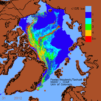
BTW, I think you’ll find red represents 5 years plus, not 5 meters plus.
Jim, Jim, JIm–I’m so glad your BS (Bad Science) appears here for all to see, and history to record.
I guess you just forgot to show the REST of the Arctic sea ice extent, like the massive buildup “across” the Pole. Funny how your “selective” data-gathering always “slants” to your belief system. I guess that’s the only “science” you know.
Poor Jimbo, it’s sad when your much-vaunted pseudo-religion comes crashing down about your ears, isn’t it?
Nowadays, it’s you lot that are the deniers, sunshine.
Perhaps we can come up with an organisation to wean you off your addiction to trying to terrify people with a 12-point plan – we could call it Alarmists Anonymous.
Do you fancy signing up?
Well…it looks like the only thing that Tony did was to take 2 yrs worth of maps published by the NISDC and compile them into an animated gif…so any complaints about what is/isn’t where someone thinks it should be need to be directed to the NISDC, since it’s made from their maps.
The NSIDC map is probably accurate. The last date they have updated is week 31, and the ice has moved some since then.
http://pafc.arh.noaa.gov/icemap.php
Comparing on Aug 12 picture to the NSIDC GIF with week 31 being the last frame…
The avg date in week 31 was July 31 I believe, so it’s nearly a two-week discrepancy. Also, the week-31 frame shows a noticeable retreat of the ice from the northern Alaskan shore, so I don’t see why there’s any sort of claimed discrepancy.
-Scott
Jim Hunt,
Let me get this straight. The graphs are produced by NSIDC – CCAR and Colorado University. Are you calling them liars??
HAHAHAHAHAHAHAHAHAHAHAHAHAHAHAHAHAHAHAHAHAHAHAHAHAHA
The winds blew off shore for a week to produce that corridor of open water north of Barrow. If the winds swing around that ice is perfectly capable of swinging around and coming back south.
Any yacht that cruises the coast of Alaska needs to be wary of ice blowing ashore from the north, especially as they pass Barrow. A fellow tried it too early this year, and was trapped in miles of ice for ten days before being rescued by an ice-breaker.
The window of opportunity for a safe passage is much smaller this year, and any boat that sails past Barrow runs a danger of being trapped east of there when the ice extent expands in September.
Jim, I see no need to employ the words “so called” when discussing the “huge mass of ice.” It creates an unnecessary tone of insinuation and antipathy. It also denies the fact that mass of ice is definitely huge, and is filling waters that were ice-free two summers ago. Just looking at the animation our host supplied demonstrates a sailor could have sailed five hundred miles towards the Pole north of Barrow in the summer of 2012, and would have seen only an occasional berg, while this year those waters are packed.
While you do make a point, stating the ice has blown off shore at Barrow, you also seem to be completely missing our host’s point. I am reminded of an old quote about, “Straining at a gnat in another’s eye while ignoring the plank in your own eye.”
At the risk of repeating myself, I refer you back to the US Navy’s latest Arctic sea ice thickness visualisation:
https://twitter.com/jim_hunt/statuses/500291982783426560
That shows thickness and not age. How thick is the so called “huge mass of old, thick ice in the western Arctic” in actual fact?
Yawn. We’ve already been through all this. The map you post is missing a meter of ice. It does not match the army map at http://www7320.nrlssc.navy.mil/hycomARC/navo/arcticictnowcast.gif
If you chose to believe there is a meter less ice, you have to ignore the current army map. I chose not to ignore it.
Sorry. I meant Navy map.
Mr. Hunt a.k.a. Snow White is once again being economical with the truth.
At no point does he confess that the Global HYCOM+CICE 1/12 model in which he is placing so much faith, is an experiment.
http://www7320.nrlssc.navy.mil/GLBhycomcice1-12/skill.html
“Real-time experiment with the 1/12° Global HYCOM+CICE NCODA 3dvar (daily mean as background), NAVGEM forcing, ISOP”
Again, Jim points to a metric that is ~2 weeks further along in the melt season than what SG was showing.
While I disagree with terms like “huge mass of old, thick ice” because of the lack of quantitation, Jim’s track record certainly doesn’t seem any better.
Maybe we should start using the value 2 weeks after the minimum as the “yearly minimum” beginning in 2014? Would Jim approve?
-Scott
You mean this little tidbit…
Disclaimer: This 1/12° Global HYCOM+CICE system and web page are a demonstration and are not an operational product. NRL is providing the INFORMATION on an “as is” basis. NRL does not warrant or represent this INFORMATION is fit for any particular purpose, and NRL does not guarantee availability, service, or timely delivery of data.
Ha! Ha! Ha! That’s even better, (Bangs head on desk for not picking up on that myself).
Well spotted, Sir (or Madam).
Tis Sir…
Hey Jim, what do you mean by “SIPN” in your tweat – Secure Internet Protocol Network? Social Information Processing Network?
I’m going with Stress-Induced Pressure Natriuresis (hypertension) based on your failing frantic desire to be the smartest guy in the room.
No Hugh. I’m referring to the Sea Ice Prediction Network
FYI – http://www.arcus.org/sipn
I think “snow white” is referring to the fact that he’s actually a girl & how dare you talk to a lady that way!
Ice free or free ice?
Comments open or comments closed?
For Heaven’s sake Reggie get up there now!
I’m sick of watching this Hunt guy ‘quibble’ over the size of an ice-cube.