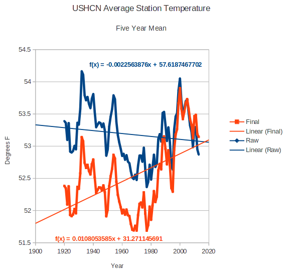
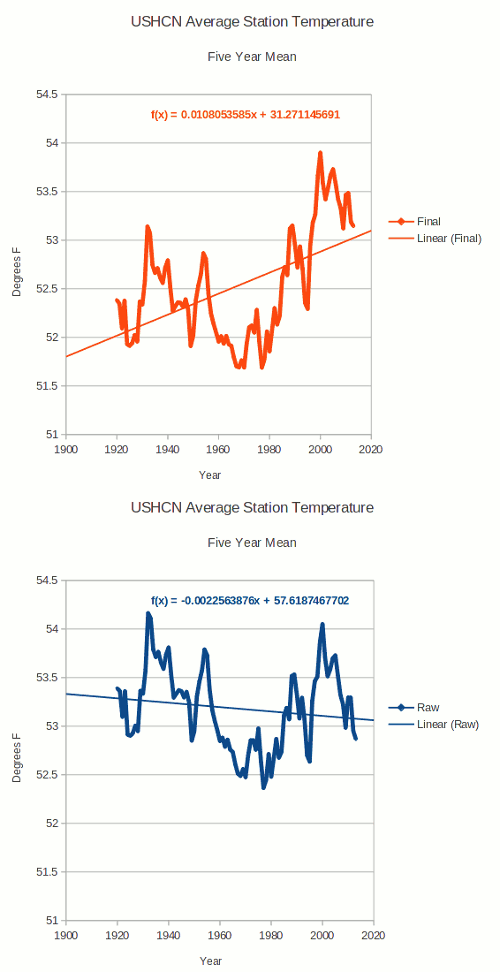
US measured temperature data (blue below) shows that we have been cooling for nearly a century. But the temperatures reported by NCDC (red below) show the opposite, that the US is warming.
Measured : ushcn.tavg.latest.raw.tar.gz
Reported : ushcn.tavg.latest.FLs.52i.tar.gz
The animation below shows the change from the thermometer data, to the fake data which NCDC releases to the public.
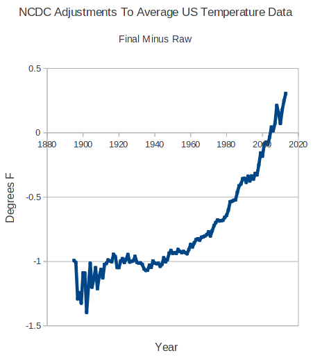
They accomplish this transition by an impressive 1.6 degrees of data tampering, which cools the past and warms the present. Their hockey stick of adjustments is shown below.
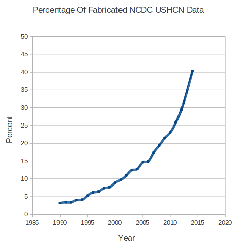
Note the sharp rise in data tampering shown in the graph above. This is largely due to just making up data. Since 1990, they have been losing station data exponentially, shown below. When they don’t have data for a particular month, they just make modeled temperatures up for that station, and infill the missing data with imaginary temperatures.
The amount of fake data is currently 40%, and if trends continue, nearly all of their data will be fake by the year 2020.


Thank you, Steven, for having the courage to report what is:
1. Global temperatures are falling
2. Stars make & discard hydrogen
3. Neutrons repel neutrons
4. We live in a democracy
Instead of what is reported:
1. Global temperatures are rising
2. Stars collect & consume hydrogen
3. Neutrons attract neutrons
I don’t ever discuss stars or their composition. Please don’t attribute that to me.
Except the brainless ones in Hollywood. 😉
And Washington. LOL
Oops forgot NASA as well.
We live in a Constitutional Republic not a Democracy. Democracies do not work and the closer we get pushed toward being one the further down the drain we will go.
Thread bomber.
A+ work!
+100
(And, I especially appreciate the “hockey stick” representations of the “adjustments”!
And that is why we pay taxes.
Tony, I have a question concerning the infilled temperature that perhaps you know the answer to. My understanding is this: when a temperature reading is missing (for whatever reason) a new temperature is estimated and infilled. This new temperature is based on the historic pattern of what that location read in the past compared to the surrounding stations. My question is this; when the pattern of temperature relationships is looked at so that the infilled temperature can be estimated, do they use only the pattern of raw readings, or do they base new infilled temperatures on the pattern of ALL previous readings — including earlier infilled readings? Here is why it matters to me. Suppose that the algorithm for creating infilled data is based on all earlier readings (including earlier infilled readings for that same location.) Suppose that the initial algorithm creates an infilled reading that is slightly too high (and that certainly looks like something that you have already demonstrated to be true.) Once a slightly too high infilled temperature is input, the next time the algorithm attempts to create infill temperature for that location, the historical pattern of temperature relationships will already be biased slightly too high (because of the earlier too-high infilled temperature) — which means that the next infill be be even a bit higher than the first infill, and so on and so on and so on, with each infill biasing the patterns to make the adjustments increase logarithmically. If infills were based strictly on earlier raw readings (without earlier infills), you might conceivably (though unlikely) get a system that was relatively accurate, but if the infill algorithm is used as part of an iterative process, the adjustments suffer from positive feedback and become increasingly wrong and increasingly gigantic.
Oh! I almost forgot to say, “thanks”. THANKS!
I don’t know. As far as I know their source code is not available.
I do know that almost all of the warming since 1990 is due to infilled data.
Tony, it is just stunning what they are doing — and they still claim to be scientists! If they are, in fact, using a system of infilling that incorporates a sort of positive feedback, that might explain not only the magnitude of their corrections, but the sheer volume of infilled data as well. As you have pointed out, they seem to be infilling not only data that is truly missing, but often seem to be replacing existing real data with infilled readings as well. Because their readings are being continually biased upward, they may be dropping existing readings because they appear to be outlying data. In other words, the algorithm initially produces a small (but continuously growing) bias to infilled readings. The erroneous infilled reading then produces a trend that makes real data look like outliers, so the new (and real) data is increasing dropped and then infilled with continually increasing numbers.
Rinse and repeat.
If they have a subroutine which routinely checks older historic data for newly created supposed outliers, then that would even explain the never-ending adjustment and re-adjustment of temperatures from decades ago.
This is crazy! And without transparent publishing of their methods there is no way to verify their output. This is not even ethical, and it for darned sure is not science.
Jason–great insight. Your hypothesis describing the unstable nature of NCDC adjustments is quite plausible.
Also, by doing it that way, if/when they get ‘caught’, they just blame the algorithm and say that anything was an unintended consequence of a poorly written program. Then make an update and a host of arbitrary corrections to the existing mess…and carry on.
Hi Tony,
I’m new to your website and finding it interesting. I consider myself a Global Warming agnostic for the most part (but a skeptic in general), since whether or not GW is or isn’t happening (in the variations of what that means to people), my response is largely the same (ie less government involvement usually = better). But I’m always interested in learning the truth about pretty much everything, and definitely want to understand more about any false data.
That said, I’m curious, and sorry if this is a stupid question, but why is temperature data sometimes missing at stations in the first place?
Good question!
Except they already said their algorithm is working just fine.
So was v2…now they are at v3, right?
😀
Headline on Drudge about a possible 10-year pause in “warming.” I think they mean a 10-year continuation of the cooling trend.
Oh that’s comes from a new paper the abstract of which was linked at this site and others yesterday that claims the heat is being stored in the depths of the Atlantic. Excuse # 32 or 33 of something like that. There are so many now I’ve lost track. Ah, here it is http://wattsupwiththat.com/2014/08/22/a-new-twist-on-an-old-grade-school-science-project/#comment-1715146
Sorry wrong link. Here it is http://wattsupwiththat.com/2014/08/21/cause-for-the-pause-32-cause-of-global-warming-hiatus-found-deep-in-the-atlantic-ocean/
Ya just have to admire their dogged determination to explain away the pause.
For such a “settled science” such issues should have been “settled” decades ago.
Now climatology had degenerated into the “new theory of the month club”.
A hilarious fate for a “settled science”. Or rather it would be funny if they weren’t eating billions in taxes for those new “theories”.
And undermining the credibility of science.
How about doing an entire paper on the data fiddling and infilling?
There is no need, I found the definitive answer nearly 2 years ago:
US Temperatures Have Been Falsely Adjusted According to the Level of Carbon Dioxide in the Atmosphere
Billions for climate “research” with a predetermined conclusion. But we can’t afford a few dollars to keep thermometers operating, in order to determine what is actually happening with the climate in the real world.
Those adjustment graphs also measure the Warmistas increasing desperation as the inexorable pause continues to drive the CAGW theory into the dust.
I was gonna say it’s a graphic representation of their panic and funding cuts.