Most people assume that temperature graphs from NOAA and NASA are generated by averaging thermometer data and honestly reporting their findings. This belief is based on a blind belief in authority, rather than evidence.
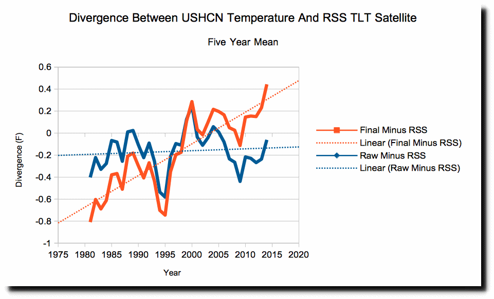
NOAA publishes two US temperature data sets – raw and final. In the graph below, the raw (measured) temperature data is shown in blue, the reported (final) data is shown in red, and satellite temperatures of the troposphere over the United States since 1979 are shown in green.
Both the raw and the final data sets show too much warming, likely due to Urban Heat Island effects in the raw data, plus massive data tampering in the final data.
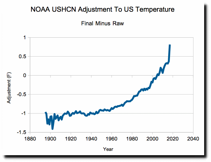
The comparison versus satellite data shows that NOAA should be adjusting past temperatures upwards, and more recent temperatures downwards. But they do the exact opposite. They massively cool the past, and increase recent temperatures. The adjustments total more than two degrees Fahrenheit since 1900.
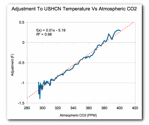
The adjustments being made almost perfectly match the increase in atmospheric CO2. This is an indication of ultimate junk science. They are altering the data precisely to match their theory.
Science doesn’t get any worse than this.


