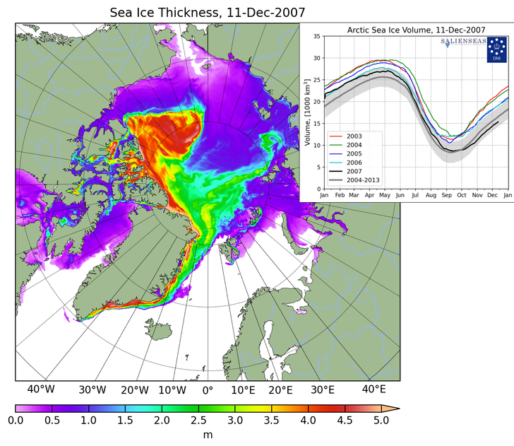
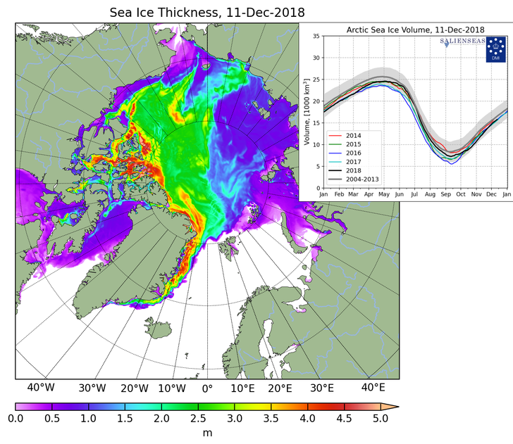
There has been a large expansion in the area of the Arctic covered by thick sea ice over the past eleven years. Nearly two thirds of the Arctic Ocean is now covered with ice more than two meters thick.
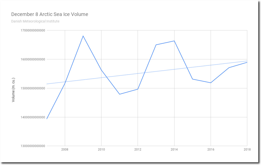
http://ocean.dmi.dk/arctic/icethickness/txt/IceVol.txt
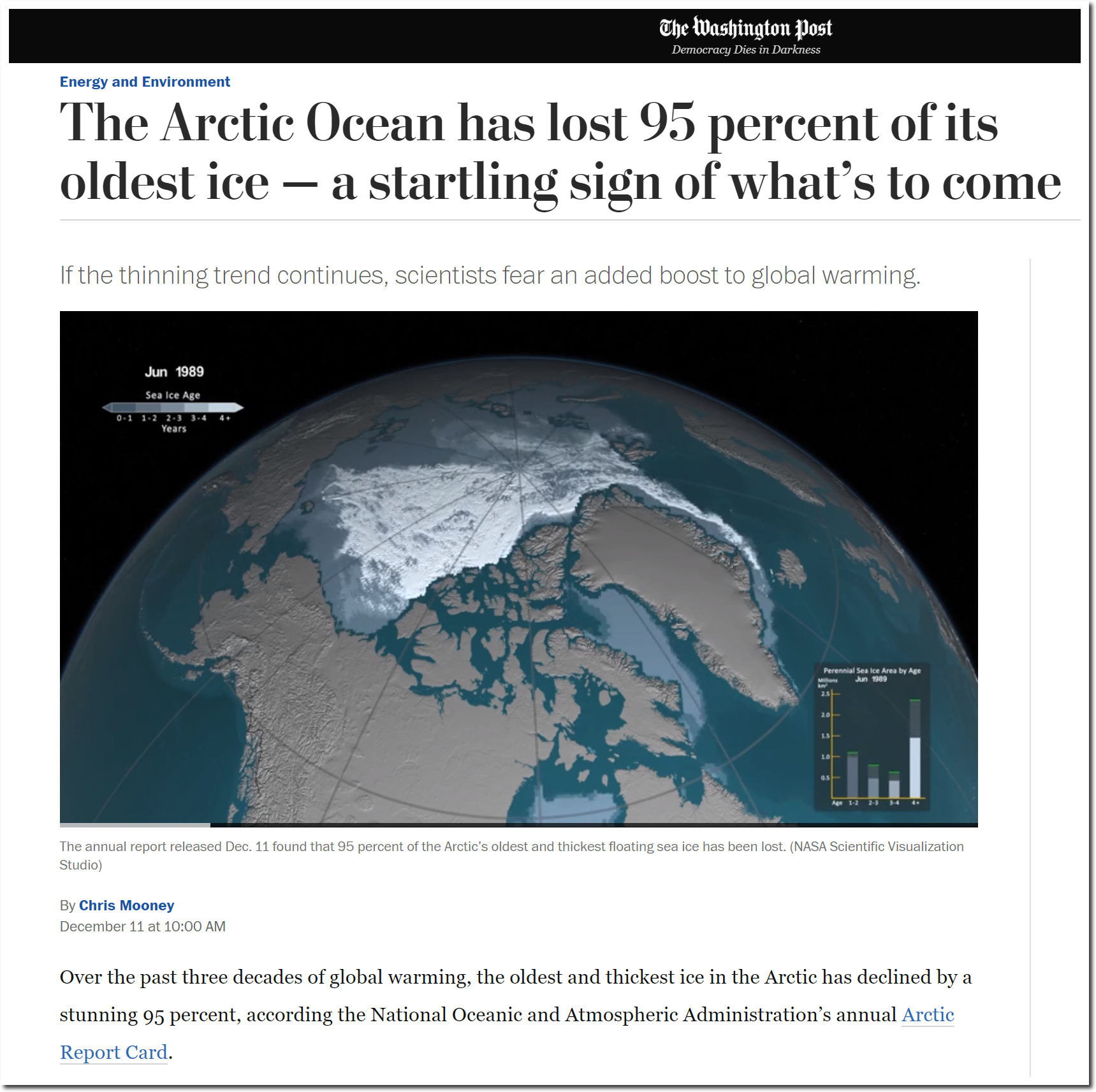
The Washington Post somehow forgot to mention this, and says we are all doomed.
They (the warmists) needed to draw attention to “old ice” since “new ice” is expanding far beyond their expectations.
Yes. It’s ‘a startling sign of what’s to come.’
The Russian chart:
http://www.aari.ru/odata/_d0015.php?lang=1&mod=0
No big change during the last 10 Years.
Chinese map at the bottom of this article showing much less Arctic ice 600 years ago.
http://www.ancientpages.com/2015/05/09/new-controversial-evidence-ancient-chinese-visited-america-2500-years-ago/
Oh yes, Sea Ice Extent. The IPCC reports over the years have manipulated the data. First off it goes back to 1973 as Tony has pointed out many times. Currently they only graph it since 1979. The pre-1979 time line has been dropped off. Well it’s interesting, the pre-1979 data was graphed for the first three assessment reports FAR SAR and TAR
So a collection of those graphs of Arctic Sea Ice Extent is in order:
https://i.postimg.cc/zv4549gB/image.png
Trend lines for the FAR SAR and TAR have been added graphically for comparison. By the time the TAR (Third Assessment Report)was published, the data for the pre-1979 time line had been changed to show a decline. the Orwellian rewriting of data seems to be a hallmark of climate science.
I think Tony has put up posts that show that Sea Ice Extent has been documented earlier than 1973. I’m just disorganized enough not to be able to fine it.
Yes, there is one going back to the early 1900’s.
Walsh and Johnson (1979) published a 600-month graph of the Sea Ice area anomaly values (1953-1977), I have included a snap.
Steve , Many people have seen the graph of pre 1979 ice in the IPCC-FAR report
https://notalotofpeopleknowthat.files.wordpress.com/2015/04/image87.png
Figure 7.20: (a) Northern Hemisphere, and (b) Southern Hemisphere sea-ice extent anomalies. Data from NOAA (USA).
Did you know it came with a discussion?
7.8.2 Sea-ice Extent and Thickness
Especially importantly, satellite observations have been used to map sea-ice extent routinely since the early 1970s. The American Navy Joint Ice Center has produced weekly charts which have been digitised by NOAA. These data are summarized in Figure 7.20 which is based on analyses carried out on a 1° latitude x 2.5° longitude grid. Sea-ice is defined to be present when its concentration exceeds 10% (Ropelewski, 1983). Since about 1976 the areal extent of sea-ice in the Northern Hemisphere has varied about a constant climatological level but in 1972-1975 sea-ice extent was significantly less.
So from IPCC, starting at a high point on the left side of the chart falsifies the slope.
*****************
March 2, 1975 & the Trib is confirming that:
The current start of Arctic Sea ice is a high point. In the last decade, the Arctic ice and snow cap has expanded 12 per cent,
There was a ‘Little Ice Age’. No scientist is forecasting a full-scale Ice Age soon, but some predict that in a few decades there might be little ice ages like the ones which plagued Europe with severe winters from 1430 to 1850.
“Wilson Smith, you missed another one.”
Wilson Smith? Was that the name of Winston’s imaginary inflatable friend.
steve case: I have my own screencaps of those charts. There is an annotation below the graph in the TAR (page 125), which says this:
————
Figure 2.14: Monthly Arctic sea-ice extent anomalies, 1973 to 2000, relative to 1973 to 1996. The data are a blend of updated Walsh (Walsh, 1978) Goddard Space Flight Center satellite passive microwave (Scanning Multichannel Microwave Radiometer (SMMR) and and Special Sensor Microwave/Imager (SSM/I)) derived data (Cavalieri et al,. 1997) and National Centers for Environmental Prediction satellite passive microwave derived data (Grumbine, 1996). Updated digitised ice data for the Great Lakes are also included (Assel, 1983).
————-
Its worthy of some comments.
First, the chart goes through 2000, however all the cited papers are from 1997 or before. This disproves the IPCC claim that only peer-reviewed published results are used as source.
Second, its not possible to tell how the ‘blend’ was made, for example, where the junctures and overlaps between the various methods are located.
Third, and IMO most critically for the comparisons with earlier charts: the ‘Great Lakes’ are included. A close comparison with the FAR and SAR graphs (which you provide) shows that the earlier years of low values are no longer graphed as they previously were, as the Great Lakes values reported in the 1983 paper were included, and the subsequent years (after the report) cannot contain these values.
The paper is available at
https://journals.ametsoc.org/doi/10.1175/1520-0493%281985%29113%3C0291%3ACOGLWW%3E2.0.CO%3B2
It was submitted in January, 1984; Finalized in September, 1984 and published in March of 1985. Its particular focus was to identify how the Great Lakes Ice was quite different (lower) in 1983 than in prior years, and the associated causes (El Nino weather patterns) and effects. The paper does not calculate the Lake Ice % anomaly. The closest it comes is to list the Lake Ice % values from 1963-1983. However, it does so on a yearly basis, not monthly, making the merging of these values into the SAR Monthly chart problematic at best to understand, and there is no chart remotely like the one in the TAR.
I hope this is helpful.
Steven Fraser says:
December 13, 2018 at 5:00 am
…and there is no chart remotely like the one in the TAR.
Thanks – that speaks to what I am saying.
In a catastrophically warming climate Wintertime Arctic Sea Ice Growth Slows Long-term Decline: NASA
https://www.nasa.gov/feature/goddard/2018/wintertime-arctic-sea-ice-growth-slows-long-term-decline-nasa
This could be the Warming Hole again:
The bizarre ‘warming hole’ that defies climate change in the US by causing some areas to get COLDER instead of hotter
https://www.dailymail.co.uk/sciencetech/article-5392183/The-bizarre-warming-hole-defies-climate-change.html
So they are back to the Old ice game…this is the ultimate rigged science game…nobody can definitively say that is 3 year old ice…so many ways to fudge numbers. More junk science.
Agreed. Not only that, but the precipitous decline post-2007 was due to prolonged and sustained wind fetching, not warmer Arctic temperatures. They love to ignore the actual phenomenon in favour of promoting their ideological cult.
Everything is Reversed Now:
1] No Ice Free Arctic – Growing Arctic
2] No End of Snow – Increased Snow
3] No Increase of Hurricanes – Hurricane Drought
4] No Sea Level Rise – Due to Increase Snow in Antarctica
5] No 18 Year Pause – Satellites Mal-
6] No Tipping Point in 2020 – Due to Models Over Predicting (now 2050)
7] No Permanent Drought in TX or CA as Warmer Air Holds more Moisture
8] Hurricanes – Faster & More Powerful => Slower, Weaker & Inundating.
9] Islands Disappearing now Growing
10] Warming Hole – Produces Freezing Temperatures
11] World Getting Windier (2011) now Winds are Stilling
12] Coral Dying now Resilient
I wonder if the trend reversal will continue with the other stuff, like coffee tasting better, beer being more plentiful, less famines and migrations, Third World prosperity and World Peace, etc ?
It is something to think about.
The article written by Loony Mooney is dishonest and misleading, notice how they ignored the rest of the Interglacial period?
WUWT had a story recently whereby NASA were claiming that global warming was causing an increase in Arctic ice:
https://wattsupwiththat.com/2018/12/11/nasa-global-warming-promotes-arctic-sea-ice-growth/
Orwelian doublespeak is now the normal in “climate science” circles
1979 was after a decade or more of the coldest period in the Arctic since the early 20thC
https://notalotofpeopleknowthat.files.wordpress.com/2018/12/dmi.gif
Hardly surprising sea ice was up
I worked in the High Arctic in 1979-80….Eureka set the North American Record cold month in Feb ’79 (I arrived in March thankfully)…-47.9C mean….
and yes, we had very thick ice in the Fjord as we measured it monthly (even have the photo to prove it)…yes, it was a very cold time….and it was still known as the global cooling timeframe…
How does this impact ME?
It doesn’t.
How does it impact anyone else?
It doesn’t.
Over the past three decades of global warming, the oldest and thickest ice in the Arctic has declined by a stunning 95 percent,
And
Over the past three decades of LIVING, the oldest and MOST AGED POPULATION in FLORIDA has declined by a stunning 95 percent. THEY DIED, HOWEVER YOUNGER PEOPLE HAVE NOW BECOME THE OLDEST.
Be berry, berry aufwaid.
At the end of this story, the ice extent will no doubt be back where it was during the last iteration of the AMO, but this time with younger ice. (facepalm)
Overall though, the ice thickness from 2003-2007 is still higher than the ice thickness from 2014-2017.
Cherry picking again Little Man?
A more meaningful statement would be that there is currently more ice in the Arctic than the average of the past 9000 years. Why don’t you ever mention that?
“Overall though, the ice thickness from 2003-2007 is still higher than the ice thickness from 2014-2017.”
Which killed how many people?
The NSIDC has ice extent creeping deep into the Bering Strait and the Hudson Bay is showing completely ice covered. There’s definitely a gap in the east but as I like to ask alarmists, how much Arctic sea ice do we need???
In related news, this site may have been mentioned hereabouts before but in case not. Presentation of early ice extent maps 1893-1961 originally sourced from DMI.
http://hidethedecline.eu/pages/posts/arctic-sea-ice-data-collected-by-dmi-1893-1961-259.php
Mick.